Disclaimer: This is my original work with details sourced from reading the comic book and doing personal research. Anyone who wants to use this article, in part or in whole, needs to secure first my permission and agree to cite me as the source and author. Let it be known that any unauthorized use of this article will constrain the author to pursue the remedies under R.A. No. 8293, the Revised Penal Code, and/or all applicable legal actions under the laws of the Philippines.
When I was still collecting comics back in 1993, I was more focused on the X-Men 30th anniversary celebration and the expansion of the Marvel 2099 universe organized by Marvel Comics, and the launch of the Ultraverse by Malibu Comics.
Along the way, I heard some buzz about Valiant Comics and Defiant Comics. That same year, Valiant Comics generated a lot of buzz among comic book collectors with the launch of Turok: Dinosaur Hunter #1 and the release of Bloodshot #6. Why Bloodshot #6? It’s because of the literary debut of a character who went on to become an one of Valiant’s icons.
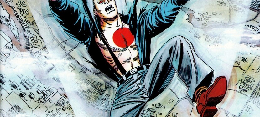
The cover.
Here’s a nice look back at Bloodshot #6 published in 1993 by Valiant Comics with a story by Kevn VanHook drawn by Don Perlin.
Early story
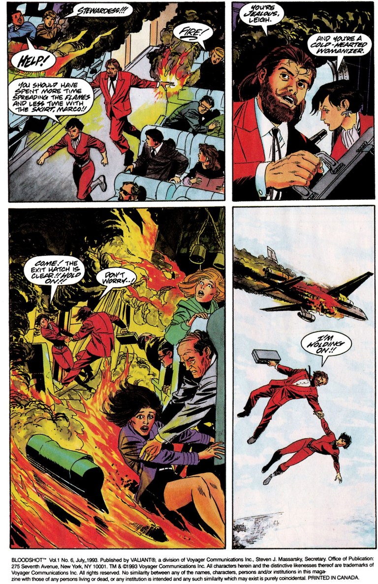
The story begins inside a commercial airplane flying over Sydney, Australia. There is a guy wearing reddish business attire socializing with a lady while standing. A lady in red approached him telling him that he should take his seat as they are in the glide path. The guy in red attire approaches a seat man wearing green business attire, asking him if the vacant seat near him was taken.
The seated man tells him to get away. The guy in red places his right hand on him causing a fire during the flight. What happened turned out to be an assassination. The guy and lady in red rush to the nearest emergency exit and it turned out their names are Marco and Leigh. They jump off the plane which explodes several feet away from them. Marco and Leigh left in the air not worried about falling down.
Meanwhile at the airport in London, Bloodshot arrives and is greeted by his pal Malcolm. They arrive back at their residence in London’s east end. Bloodshot has something to do. Over at France, Alicia Guerrero meets with Montblanc at his office and they discuss the courier assignments that involve acquiring a set of components and the three (of four) intercontinental flights that ended in tragedy.
Quality
Bloodshot shortly after arriving from the airport.
As far as storytelling goes, this comic book sure has a lot of intrigue and espionage leaving the title character Bloodshot with much less spotlight (in terms of narrative, not page appearance). It’s not a problem for me as a reader because the writer Kevin VanHook really took his time to emphasize what has been going on, what’s within the web of international secret operations (that involved killing and explosions) and what’s at stake. Of course, the deepening of the plot makes way for Bloodshot to get involved in a less action-oriented but more intelligent way. That being said, action scenes are subdued for the sake of storytelling. Along the way, illustrator Don Perlin did a good job visualizing the deep plot. Perlin also tried his best making the mission briefing of Bloodshot (which even for its time was cliched) look interesting.
Fans of Bloodshot who love action scenes of shooting and striking, as well as displays of his special abilities, won’t find much of such stuff here.
Conclusion
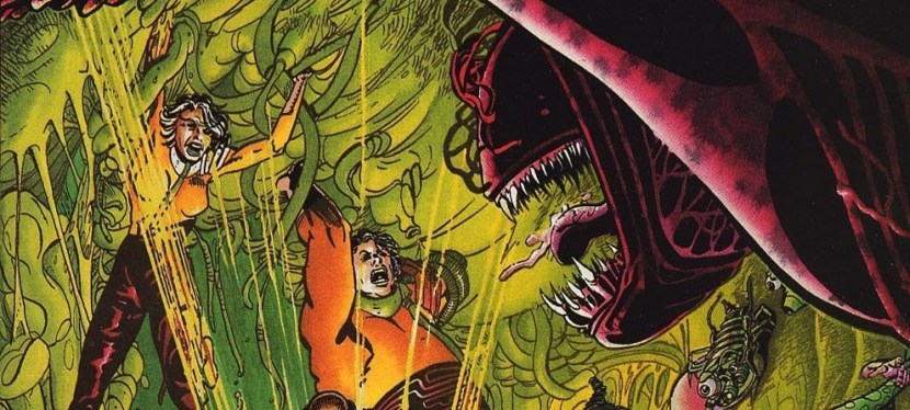
Tragedy high up in the sky.
To make things clear to those who are wondering, Bloodshot #6 is significant for fans of Valiant Comics as it marked the first appearance of Colin King who is actually the iconic Ninjak. That fact, however, does not really define the overall quality of this comic book and Colin King’s literary debut is very brief. That way I look at Bloodshot #6, it’s a good comic book laced with a good amount of intrigue and espionage.
For those who are based in the Philippines, Bloodshot #6 is one of the rare American comic books of the 1990s that mentions the Philippines (with Manila as a flight destination) and even showed a few images of it as a location.
If you are seriously planning to buy an existing hard copy of Bloodshot #6 of 1993, be aware that as of this writing, MileHighComics.com shows that a near-mint copy costs $28.
Overall, Bloodshot #6 is recommended for those looking for gripping, espionage storytelling with the title character. As a collector’s item, the comic book is a must-have for as long as Ninjak and Bloodshot remain popular.
Thank you for reading. If you find this article engaging, please click the like button below and also please consider sharing this article to others. If you are looking for a copywriter to create content for your special project or business, check out my services and my portfolio. Feel free to contact me as well. Also please feel free to visit my Facebook page Author Carlo Carrasco and follow me at HavenorFantasy@twitter.com
Disclaimer: This is my original work with details sourced from reading the comic book and doing personal research. Anyone who wants to use this article, in part or in whole, needs to secure first my permission and agree to cite me as the source and author. Let it be known that any unauthorized use of this article will constrain the author to pursue the remedies under R.A. No. 8293, the Revised Penal Code, and/or all applicable legal actions under the laws of the Philippines.
As seen many times in the history of American comic book publishing, there is the ever-present male superhero with the clean short hair, a muscular build, a tight body suit and a cape. Such a superhero has the so-called classic ability to fly and as well having superhuman strength. To put things in perspective, this is the so-called Superman influence on superhero comics. Superman is undoubtedly an icon of not just American pop culture but also of the United States culture in general.
Considering Superman’s iconic status, it is no surprise that many other publishers imitated the character to add some zest into their own superhero comic book franchise. For the Ultraverse of Malibu Comics, their own parallel to DC Comics’ Superman is none other than Prime (who is also inspired somewhat by Shazam/Captain Marvel).
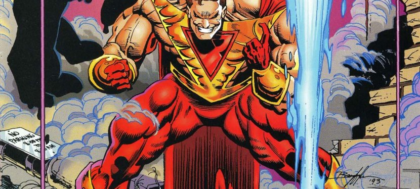
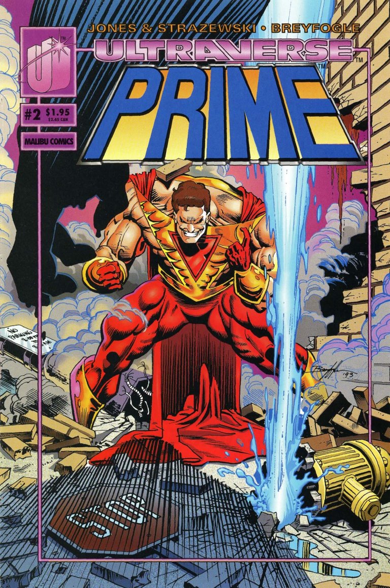
A great looking cover by the late Norm Breyfogle.
For this retro comic book review, we’ll take a close look at Prime #2, the Ultraverse comic book published by Malibu Comics in 1993 with a story co-written by Gerard Jones and Len Strazewski, and art by the late Norm Breyfogle. Previously, I reviewed Prime #1 which you can right here.
Early story
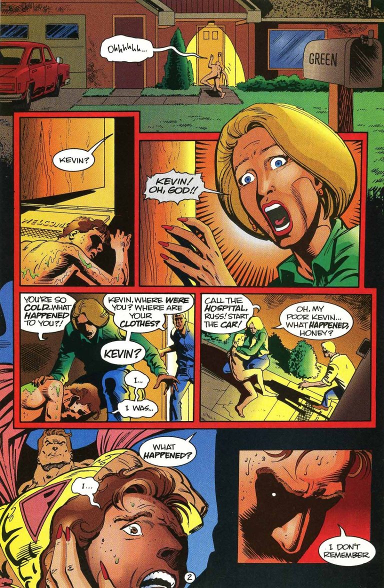
The story begins with teenager Kevin Green struggling heading home in the suburb at night completely naked. After Kevin falls down just outside the front door, his mother opens it and was shocked to see him naked (with some traces of green slim on his skin). Kevin could not recall what happened to him.
Imagine yourself being naked walking home in the middle of the night within the local community.
Shortly after, Kevin is in the hospital with his parents. The doctor could not figure out what’s wrong with Kevin and only stated that his failure to remember could be the result of psychological trauma. Alone in the room, Kevin watches TV news footage of Prime (himself under disguise) and his parents arrive. His mother tells him that he will be okay.
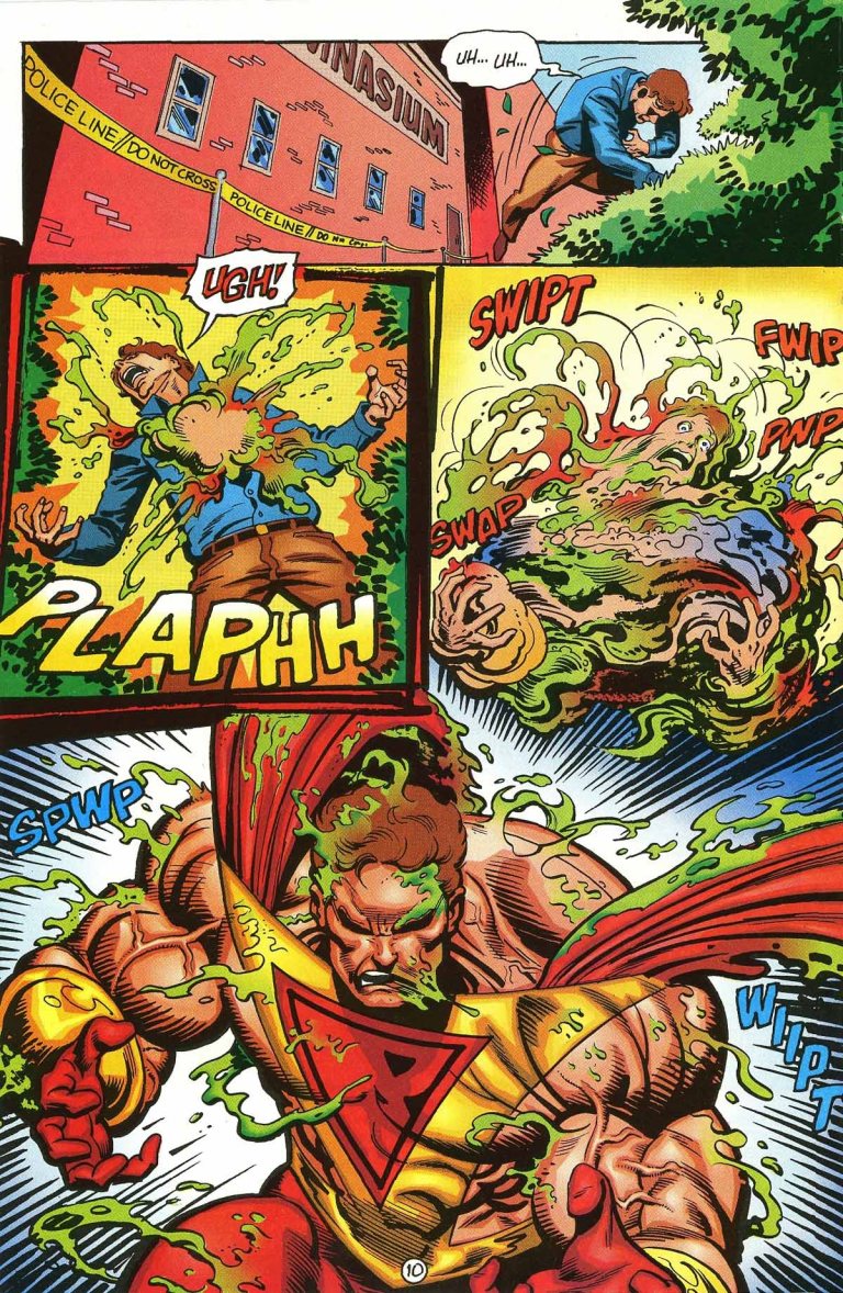
Meanwhile in a discreet location, two men are analyzing the recent appearance of Prime in Somalia. One of them orders the release of Organism 8….
Quality
Prime #2 is clearly a strong follow-up to the launch issue. Co-writers Gerard Jones and Len Strazewski crafted a story that took its time to flesh out Kevin Green/Prime while simultaneously building up suspense and details regarding a sinister force that has links with the government, and they won’t stop until they get their target Prime.
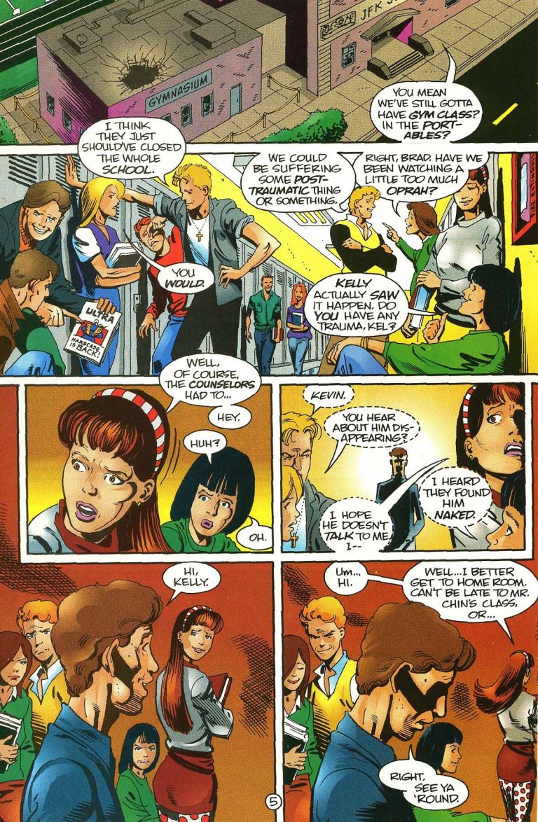
On character development, this comic book takes a deeper look at the private life of Kevin (who only appeared as himself at the end of issue #1) especially at his high school. Here, the school is still recovering from the damage Prime caused (including hurting the school’s coach).
The highlight in this comic book is the exploration of the friendship between Kevin and Kelly. As such, the suspense related to the two really started to build up given the fact that in issue #1, Kevin appeared in front of her not as himself but as his superhero form as Prime. Kelly found it cool that Prime talked to her although she’s disturbed to see him seriously injure their coach. Kevin himself is struggling with the weight of not only keeping his superhero identity secret but also with the consequences of the violence he caused as Prime. Even worse, many students in his school find him a freak but Kelly remains sympathetic to him.
At school…
Visually, this is still a very good looking comic book. Norm Breyfogle’s art is very lively whether he draws out the local community that Kevin belongs to, draws the action scenes, draws the monstrous Organism 8, and emphasizing more of Prime. I also love the way Breyfogle drew the facial expressions. For the newcomers reading this, Breyfogle’s style has a cartoonish look but never backs down with comic book-style spectacle.
The spectacle of this comic book, unsurprisingly, looks very good. The action scenes show a lot of power and seeing Prime and Organism 8 hit each other is no less brutal.
Conclusion
Norm Breyfogle’s great visuals on Kevin Green becoming Prime!
While Prime #1 was a tremendous creative kick-off for its superhero and its own series, Prime #2 is a very solid progression. This comic book marked the beginning of the build-up of suspense as well as the friendship between Kevin and Kelly, and ultimately it was a fun and compelling reading experience.
If you are seriously planning to buy an existing hard copy of Prime #2, be aware that as of this writing, MileHighComics.com shows that the near-mint copy of the regular edition costs $4 while the near-mint copy of the newsstand edition costs $8.
Overall, Prime #2 is highly recommended.
Thank you for reading. If you find this article engaging, please click the like button below and also please consider sharing this article to others. If you are looking for a copywriter to create content for your special project or business, check out my services and my portfolio. Feel free to contact me as well. Also please feel free to visit my Facebook page Author Carlo Carrasco and follow me at HavenorFantasy@twitter.com
Disclaimer: This is my original work with details sourced from reading the comic book and doing personal research. Anyone who wants to use this article, in part or in whole, needs to secure first my permission and agree to cite me as the source and author. Let it be known that any unauthorized use of this article will constrain the author to pursue the remedies under R.A. No. 8293, the Revised Penal Code, and/or all applicable legal actions under the laws of the Philippines.
I remember back in 1993 how excited I was with Marvel Comics’ celebration of the 30th anniversary of the X-Men. Back then the X-Men line of comic books had the Fatal Attractions storyline which was not a crossover but a story arc that connects with the X-Men, Uncanny X-Men, X-Force, X-Factor, Excalibur and Wolverine monthly series highlighted by specific comic books that had hologram cards on the cover.
It was an exciting time. Of course, many geeks who followed the X-Men closely knew that the very comic book that would mark the 30th anniversary was Uncanny X-Men #304 (dated September 1993) which was previewed with a Magneto hologram card on the cover.
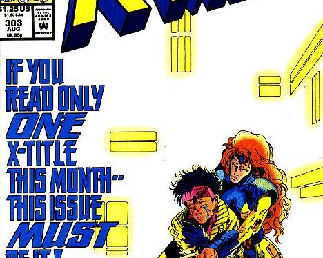
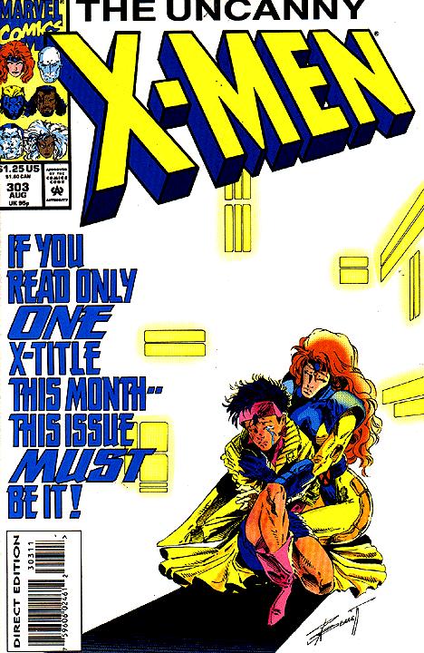
Of course, before getting to that comic book, it’s nice to take a look back at one of the comic books that was released before it. I’m talking about Uncanny X-Men #303 which had a dramatic and even somber looking cover with the words: “If you read only one X-title this month—this issue must be it!”
The eye-catching cover.
Are you curious now? Let’s take a look back at Uncanny X-Men #303 published in 1993 by Marvel Comics with a story by Scott Lobdell and artwork by Richard Bennett.
Early story
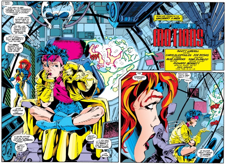
The story begins with Jean Grey finding Jubilee sitting on the chair (read: Cerebro) doing some makeshift fireworks with her power. She noticed that the youth is troubled. Jubilee expressed her thoughts and mentioned that life stinks. Jean asked her if she wants to talk about it but Jubilee asked if talking would change anything. As the two talk on, it turns out that Xavier’s mansion is nearly deserted.
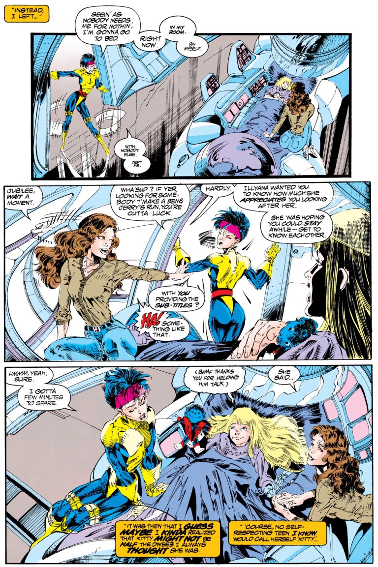
The story then shifts to what happened just several hours back. Jubilee was spending quality time with Colossus’ sister Illyana who is lying on a bed in the med-lab. Illyana was sick and nearby was Charles Xavier and Moira McTaggert struggling to figure out what to do for the blonde girl.
Moira tells Professor X that they need a fresh perspective on the information they have about the genetic deterioration within Illyana, and they need a miracle. Xavier replies that once the gold team of the X-Men returns, he is certain that they can find some treatment to arrest the disorder’s progress.
Suddenly, Illyana recognizes someone special from her past…
Quality
By today’s standards, Uncanny X-Men #303 is a good comic book to read and it is an effective way of setting up events leading into the 30th anniversary story of the next issue. On its own, the comic book is clearly very dramatic and cleverly uses nostalgia that is meant to resonate with readers who were fortunate enough to read issues of Uncanny X-Men which had Kitty Pryde/Shadowcat as a newcomer (around the time of the classic Dark Phoenix Saga).
Kitty Pryde and Illyana symbolize the X-Men youth of the 1980s while Jubilee symbolizes the 1990s.
As X-Men comic book history showed, Kitty Pryde was the resident teenage girl of her time and eventually she bonded by Colossus and got close with his sister Illyana whose own exploits involved a lot of twists and turns (she was even a young adult for a time) and made her own mark with The New Mutants.
Nostalgia aside, the writing done by Scott Lobdell is pretty good. The wordy approach to presentation kind reminds me of the descriptive writing and character expression styles of Chris Claremont (who left the X-Men franchise in 1991). More importantly, Lobdell’s writing shows he researched the characters Illyana and Kitty Pryde. After seeing those two reunited in this 1993 comic book, I recognized them not just visually but rather in terms of personality. In addition to characterization, the dialogue is richly layered and the script’s pacing was good (I was never bored even though this comic book clearly lacked action scenes). On Jubilee, this comic book is very notable for showing her NOT being annoying.
The art by Richard Bennett, in my view, is satisfactory at best. He’s not a bad artist but his style gives this comic book and the characters a rather imbalanced visual presentation. In fairness, Bennett did his own research on the history of the X-Men and his drawings about key moments from the past (example: The New Mutants) added to the nostalgia. Bennett’s best showing in this comic book happened during the most dramatic moments, especially in the 2nd half.
Conclusion
Jean Grey and Jubilee.
I really like this comic book. Even though it lacked action scenes, Uncanny X-Men #303 remains engaging by means of emphasizing the characters while touching into past of the X-Men. It is through dramatizing and defining the characters that made this comic book worth reading until now. Even if the nostalgia does not resonate with you, you will still feel for the characters.
By the time you finish reading this comic book, you will feel prepared for the big 30th anniversary story of Uncanny X-Men #304. In fact, this is an essential read in order to truly enjoy and understand Uncanny X-Men #304.The art could have been better, though.
In case you are interested to acquire an existing copy of Uncanny X-Men #303, take note of the rates from MileHighComics.com. As of this writing, a near-mint copy of the regular edition is priced at $5. The near-mint copy of the 2nd printing (gold cover) costs $128 while the near-mint copy of the newsstand costs $15.
Overall, Uncanny X-Men #303 is recommended.
Thank you for reading. If you find this article engaging, please click the like button below and also please consider sharing this article to others. If you are looking for a copywriter to create content for your special project or business, check out my services and my portfolio. Feel free to contact me as well. Also please feel free to visit my Facebook page Author Carlo Carrasco and follow me at HavenorFantasy@twitter.com
Disclaimer: This is my original work with details sourced from reading the comic book and doing personal research. Anyone who wants to use this article, in part or in whole, needs to secure first my permission and agree to cite me as the source and author. Let it be known that any unauthorized use of this article will constrain the author to pursue the remedies under R.A. No. 8293, the Revised Penal Code, and/or all applicable legal actions under the laws of the Philippines.
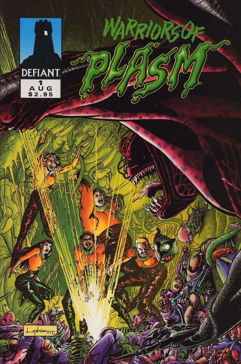
It’s truly amazing to see how a grand vision imagined by a veteran comic book creator gets realized into published form with the help of a creative team whose members listened very closely to him. Such a thing happened with Warriors of Plasm #1, published in 1993 by Defiant Comics with a story written by former Marvel Comics editor-in-chief Jim Shooter and drawn by David Lapham (with ink work by Michael Witherby).
Before starting this retro comic book review, let’s take a short look back at the history of Jim Shooter whose tenure as Marvel’s editor-in-chief include such epics like Secret Wars and Secret Wars II. After getting fired by Marvel in 1987, Shooter and his team of business associates tried and failed to acquire Marvel. Not settling for failure, they went on to establish Valiant Comics which made its presence felt in the superhero comic book market. After being ousted by Valiant, Shooter and some others established Defiant Comics.
That being said, here is my review of Warriors of Plasm #1.
The cover drawn by Lapham.
Early story
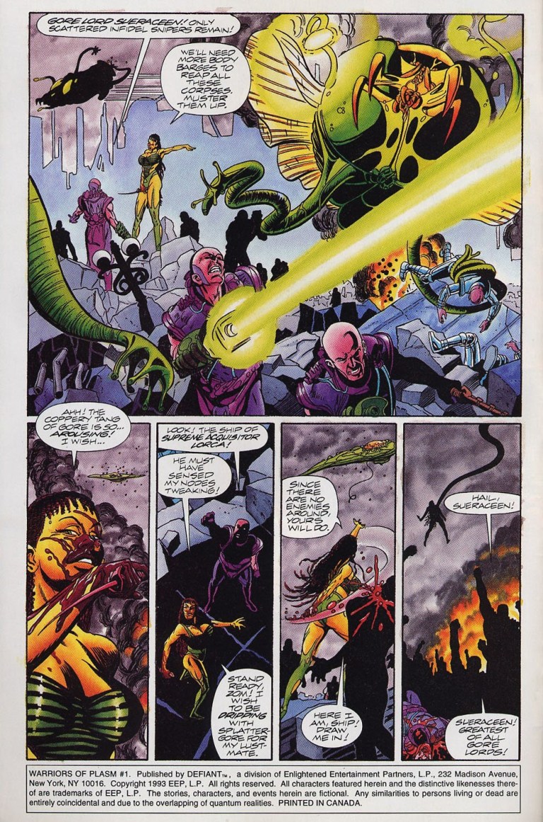
The story begins in the middle of a huge battle. Inside a living, organic ship (a flying creature precisely), acquisitor Lorca leads his force of invaders gradually defeating a resistance force. On the ground, a huge portion of the home city of the resistance has crumbled and Lorca’s fellow soldiers there have gained control of the war zone.
Lorca’s ship moves close to the ground to pick up high gore lord Sueraceen. As it turns out, Lorca and Sueraceen are lovers (the lady referred to him as her lust-mate) and their reunion is nothing less than sensual and expressive. As they talked, the biomass (referring to the inhabitants of the defeated city) will be incorporated genetically and organically into their world, and live again as part of their ecosystem.
After sending Sueraceen back on the ground to resume her duty of leading the troops, Lorca and his crew flew back to space to enter the Org of Plasm, an organic, fleshy space station complete with resources, inhabitants and an actual city inside.
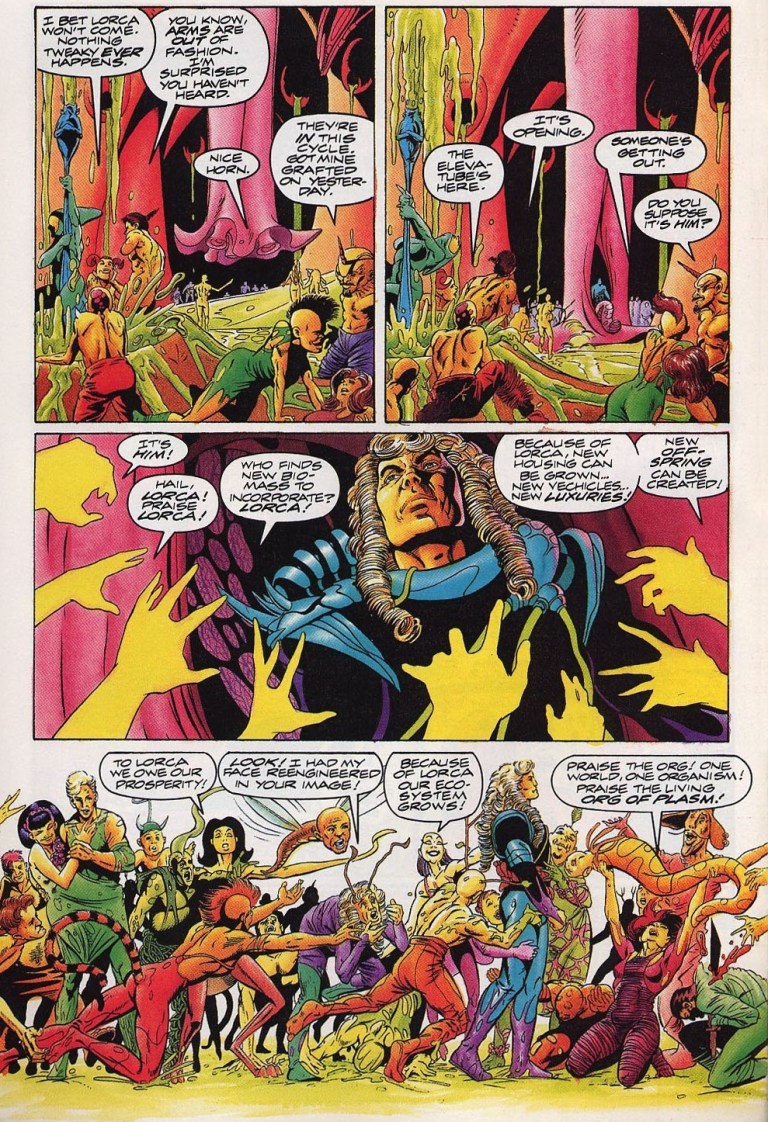
Admirers, followers and idolaters tried so hard to get Lorca’s attention.
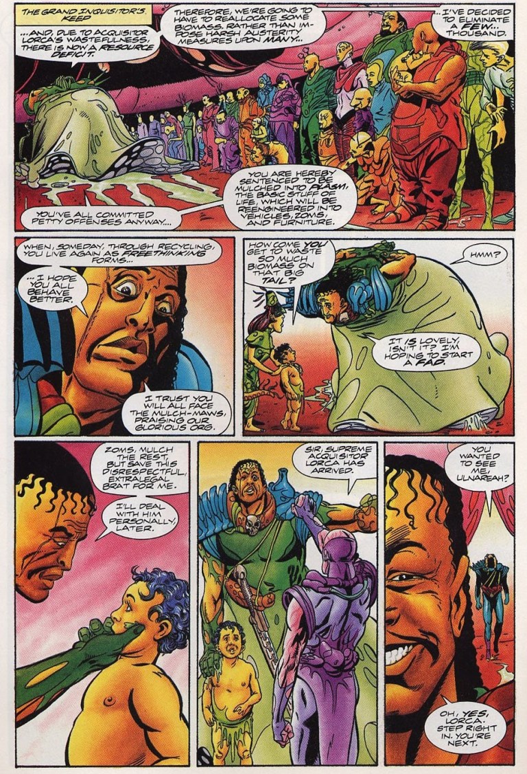
Given his prominence, Lorca is highly respected, even idolized, by his fellow people. One particular idolater even genetically reshaped his face to look like Lorca. Alone in a private chamber, Lorca is capable of cloning which is illegal. More intriguing, however, is that he has been developing a top-secret project with an intention to overwhelm the rulers of the org.
He begins his project with the holo-orb which is focused on planet Earth. As it turns out, organic beings from Lorca’s world are already present on Earth, spying on ten thousand people. Suddenly, the ten thousand got touched by the organic beings which instantly sent them back to the Org of Plasm.
Quality
Warriors of Plasm #1 is not just a high-quality comic book. It is also a great showcase of the talents of Jim Shooter, David Lapham and others molded together to form a true, sci-fi epic that remains very unique to read to this day.
Very intriguing art and visual designs by Lapham.
When it comes to storytelling, structuring and character development, the former Marvel Comics editor-in-chief scored great points which is not surprising given his tremendous experience in comic books. With great art by Lapham, this comic book opened with literally strong arms that pulled me into an all-new, sci-fi universe that is like no other. Within the first few pages, I felt deeply immersed into discovering the universe and quickly realized Lorca’s role, what his side was doing and more. The script and arrangement of panels for the art were executed with high efficiency. Really, I never felt lost reading this comic book.
As I kept reading further, I discovered more about the culture of Lorca’s people, how they operate and traveled efficiently with organic materials and living beings that served their needs without the use of technology (no metals, no computers, no fossil fuel and no digital stuff). This comic book shows how deep and engaging Jim Shooter’s imagination really is and illustrator David Lapham lived up to the difficult task of realizing the visual concepts.
And then there is the dialogue which is really deep and engaging to read. Lorca, Sueraceen and the many other supporting characters involving the org and the surviving few from planet Earth each have unique personalities. Clearly Shooter planned each character with a purpose. What is even more intriguing in this comic book is that the line between good and evil was cleverly blurred.
The art by David Lapham, whose past credits include Magnus Robot Fighter, Harbinger and Shadowman for Valiant Comics, really outdid himself. The characters are really well defined visually but what really stood out was his work on the Plasm world and the functioning organic environment. Of the many works of the illustrator, Warriors of Plasm is his most memorable work.
Conclusion
While it is true that Defiant Comics no longer exists and Warriors of Plasm’s full potential as an entertainment franchise was never realized, this particular comic book is, in my honest opinion, still one of the best new comic books ever launched in 1993. Its epic science fiction concept opened very strongly and remained very engaging right until the very last page. I can assure you that by the time you reach the end of Warriors of Plasm #1, you will want to go out and search for the next issue.
On the battle zone is gore lord Sueraceen leading the troops.
If you are thinking about acquiring an existing copy of Warriors of Plasm #1, please take note that as of this writing and based on the latest rates at MileHighComics.com, a near-mint copy of the regular edition costs $4, $26 for the near-mint copy of the edition with five signatures, $7 for the Jim Shooter-signed edition, and $30 for the signed-and-numbered edition.
This comic book is a 1990s classic. As such, Warriors of Plasm #1 is highly recommended!
Thank you for reading. If you find this article engaging, please click the like button below and also please consider sharing this article to others. If you are looking for a copywriter to create content for your special project or business, check out my services and my portfolio. Feel free to contact me as well. Also please feel free to visit my Facebook page Author Carlo Carrasco and follow me at HavenorFantasy@twitter.com
Disclaimer: This is my original work with details sourced from reading the comic book and doing personal research. Anyone who wants to use this article, in part or in whole, needs to secure first my permission and agree to cite me as the source and author. Let it be known that any unauthorized use of this article will constrain the author to pursue the remedies under R.A. No. 8293, the Revised Penal Code, and/or all applicable legal actions under the laws of the Philippines.
After the end of publishing their landmark maxi-series Crisis on Infinite Earths, DC Comics gained an all-new slate to literally fill up by rebooting their entire superhero comics universe. They started the new universe (now referred to as the Post-Crisis Universe) with Superman, Batman and some others.
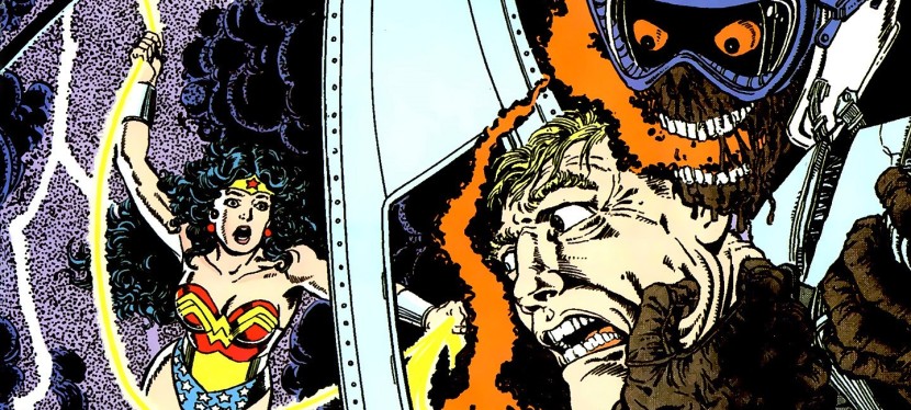
Then in late 1986, DC Comics reintroduced the post-Crisis version of Wonder Woman creatively led by the legendary George Perez (who was assisted by writer Greg Potter) with the release of the comic book Wonder Woman #1 (cover dated February 1987). That particular comic book retold (in great detail with Greek mythology) the origin of the Amazons who were reincarnated women (the souls of which came from women whose deaths were caused by men). The Amazons and Hippolyta (Hippolyte in this comic book) eventually got betrayed by Heracles and his men leading to a period of tremendous hardship. Beatings were obvious and rape was implied.
After getting freed, they are sent to the island of Themyscira. It was there when Hippolyta learned that she died previously as a pregnant woman. Using the clay of the island, the Amazons’ queen formed an infant girl. Then after communicating with the midwives in the spiritual realm, the soul of Hippolyta’ unborn daughter arrived into the clay child. This marked the birth of Princess Diana who would become Wonder Woman. For the newcomers reading this, Diana is the only Amazon who grew up from child to adult in Themyscira.
Right here is my retro comic book review of Wonder Woman #2 published in 1987 by DC Comics with the story done by George Perez and Greg Potter. The art was done by Perez.
Cover drawn by George Perez.
Early story
The story begins in man’s world, at an American military base. Colonel Steve Trevor meets with his superior General Kohler who tells him that he has been chosen for a special mission which involves the use a new, modified fighter plane. Steve reacted that the coordinated provided lead to nothing out there. The general instructs him to shut his mouth and do what he was ordered to do.
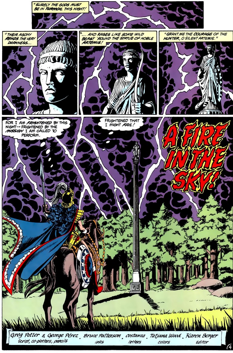
In Themyscira, Princess Diana is set to start her first-ever mission as Wonder Woman. Her mission pits her against a god gone mad, and her mother Hippolyta and the Amazons are deeply concerned. Suddenly, the Lasso of Truth from Olympus arrives which Diana picks up. Immediately after that, the messenger of the gods Hermes arrives marking the first time in centuries that any Amazon saw him.
After a brief talk, Diana travels away with Hermes who could only guide her. They disappeared suddenly surprising the Amazons and Hippolyta who was not given an opportunity to bid farewell to her daughter.
Quality
As expected, Wonder Woman #2 has great qualities with regards to storytelling, characterization and artwork. With Greg Potter assisting George Perez, this comic book told not one but three story arcs each with a good amount of details and, amazingly, such stories were told rather efficiently complete with very believable dialogue. I’m talking about impressive writings and descriptions of the characters, apart from Wonder Woman herself, that include the Amazons, the gods and goddesses of Olympus and the American military.
The story also comes with a very nice touch of discovery which readers can easily relate with through Wonder Woman. As Diana develops and learns more, the reader gets connected with her even more. This is the Queen of Superheroes I’m talking about and the writing is truly excellent.
At the same time, continuing with what was first presented in Wonder Woman #1, this comic book also explores how much of a threat Ares (god of war) truly is not only to Wonder Woman and her Amazons but also on people in man’s world. The build-up of the tension is really nice and the pay-off is worth it.
Unsurprisingly, this comic book has great looking art. It’s done by George Perez after all supported with ink work by Bruce Patterson. Perez knows how to dramatize characters, pull of amazing shots of action and other forms of spectacle, and most of all, illustrate the very visual elements of Greek mythology complete with other visual concepts of the fantasy genre.
Conclusion
As it is clear it is not the launch issue of its monthly series, Wonder Woman #2 is still very significant as it marks the first-ever mission of Wonder Woman in the post-Crisis universe of DC Comics and also her first encounter with a modernized (for the 1980s specifically) Steve Trevor. Remember the first time Diana and Steve met in 2017 Wonder Woman movie? Remember how Wonder Woman reacted to see a mortal man for the first time ever as played by Gal Gadot and Chris Pine on the big screen? You will see some common elements between the film and this comic book about the two characters. Even the Amazons’ reaction to Steve alone makes this comic book worth reading and it should encourage readers to go back to first issue to understand the details about the Amazons’ culture and mindset.
Heavy inspiration about Greek mythology, culture and arts is evident not only in the artwork by Perez but also on the script itself.
If you are seriously considering acquiring an existing copy of Wonder Woman #2, be aware that according to MileHighComics.com as of this writing, a near-mint copy of the regular edition costs $24, while a near-mint copy of the newsstand edition costs $49. As for the other edition that does not have a month printed on the cover, a near-mint copy costs $77.
Overall, Wonder Woman #2 (1987) is highly recommended!
Thank you for reading. If you find this article engaging, please click the like button below and also please consider sharing this article to others. If you are looking for a copywriter to create content for your special project or business, check out my services and my portfolio. Feel free to contact me as well. Also please feel free to visit my Facebook page Author Carlo Carrascoand follow me at HavenorFantasy@twitter.com
Disclaimer: This is my original work with details sourced from playing the video game Resident Evil 3 Remake and doing research. Anyone who wants to use this article, in part or in whole, needs to secure first my permission and agree to cite me as the source and author. Let it be known that any unauthorized use of this article will constrain the author to pursue the remedies under R.A. No. 8293, the Revised Penal Code, and/or all applicable legal actions under the laws of the Philippines.
Even though 1999’s Resident Evil 3: Nemesis was a side-story and its concept was smaller in scale compared to the acclaimed Resident Evil 2 (1998), I still had a lot of fun with that game and its key features made it very worthy of replaying. Like last year’s Resident Evil 2 remake, RE3 was remade and shortly after it became available on April 3, I got to play it, finished it three times and I should say I also had fun with it.
You must be wondering…how much fun is the Resident Evil 3 Remake? Is it anywhere as deep as the remake of RE2? Does this new game honor the legacy of its original counterpart from 1999? Is it worth the full retail price? Let’s start with this game review focused mainly on the single-player story campaign.
Early Story
Raccoon City ruined.
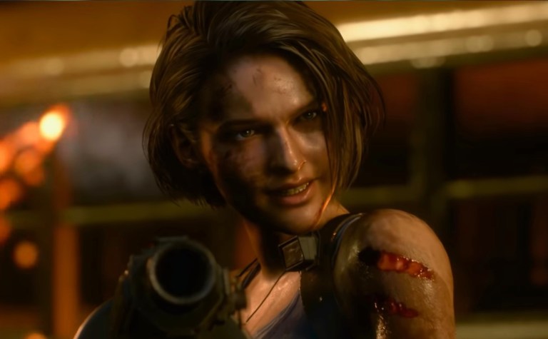
The story begins on September 28, 1998 with Raccoon City getting infested with zombies as a result of an outbreak of T-Virus (directly connected with the events that led to Resident Evil 2). People have no choice but to run for their lives as the police struggle to save civilians. Meanwhile, Jill Valentine is inside her apartment making moves to leave the city since the city police force don’t believe her story about what happened at the Spencer Mansion (Resident Evil).
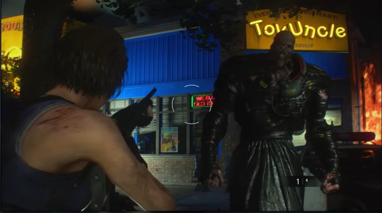
After answering a phone call from a very concerned Brad Vickers, a huge human figure (Nemesis) covered in dark material suddenly breaks through the wall and attempts to kill her. Jill fortunately fights back and after enduring a few close calls, she manages to get away from the monster and out of the building.
She makes her way to the street where she meets Brad Vickers and together, they face an onslaught of many zombies. After barely getting inside a joint, Brad (who got bitten by a zombie) struggles to keep the door closed and urges Jill to run away to survive. Now on her own, Jill has to find ways to survive and get out of the zombie-filled Raccoon City
Gameplay
An encounter with Nemesis is often intense.
Like last year’s big budget remake of RE2, RE3 Remake is a 3rd person shooter mixed with exploration, item management, problem solving and the like. As required to move the story forward, you will control Jill to collect items, manage them carefully with the limited space for carrying, fulfill objectives and meet characters at key points of the story. Along the way, you will encounter zombies, grotesque monsters and, of course, Nemesis.
There are some notable differences from RE2, however. The most obvious difference is that RE3 remake was designed to be somewhat faster-paced (note: it’s not like the characters you control really run fast) and more action-oriented in terms of shooting as well as evading. In obvious tribute to the 1999 RE3, this game allows you to dodge attacks from zombies/monsters/Nemesis. If you succeed with perfectly timing your dodge, you will be granted a few seconds (with some slow motion) to immediately fire back at the enemy that you evaded.
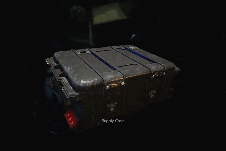
If you damage Nemesis enough, he will drop a supply case which often contains a very useful item.
Unlike RE2 remake, the personal knife does not degrade and therefore it could be used as many times as you want. However, when a zombie grabs you to bite you, there is no prompt to use the knife to fight back and avoid getting bitten (this particular function was normal in RE2 remake). Another new thing in this video game is the presence of item boxes which you can “open” by shooting or using a knife to break it.
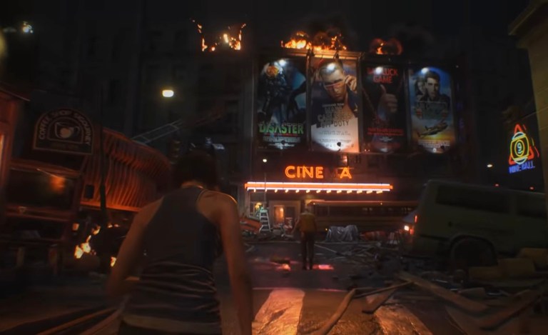
Because the in-game environment of RE3 remake includes the ruined streets and alleys of Raccoon City, you get more spacious places move around. Of course, this means more zombies occupying certain spaces for you to kill or strategically pass by. With the street-and-alleys set-up, there are a few red barrels that are explosive (you can destroy many zombies with one blast) and a few generators that electrocutes and stops monsters (even Nemesis) to shoot at.
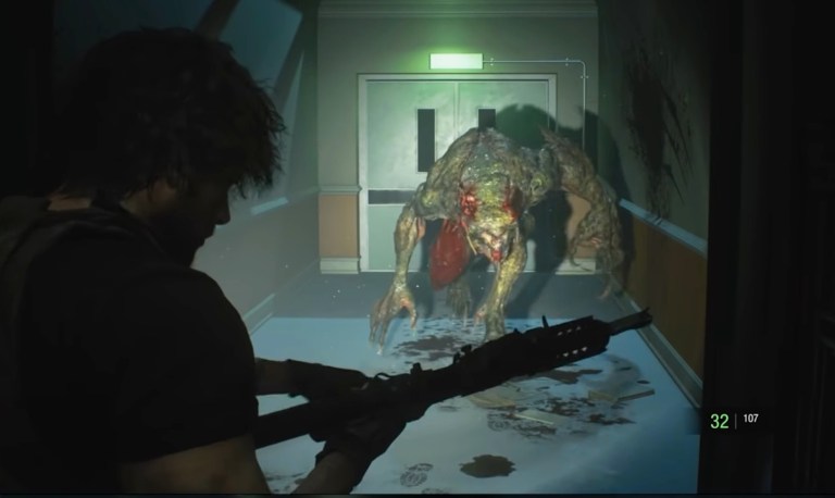
The return of the Hunter Beta is a welcome challenge!
When it comes acts and action, Jill gets to fight using the knife, grenade, flash grenade, handgun (including the burst gun), shotgun, magnum and the grenade launcher while Carlos uses the assault rifle (apart from the knife, grenade, flash grenade and handgun). Jill can evade, enter tight spots and use the lock pick while Carlos can do the defensive strike. For the most part, the controls are responsive which is good.
In terms of gameplay, RE3 remake is faster and more action-oriented counterpart to RE2 remake.
Presentation
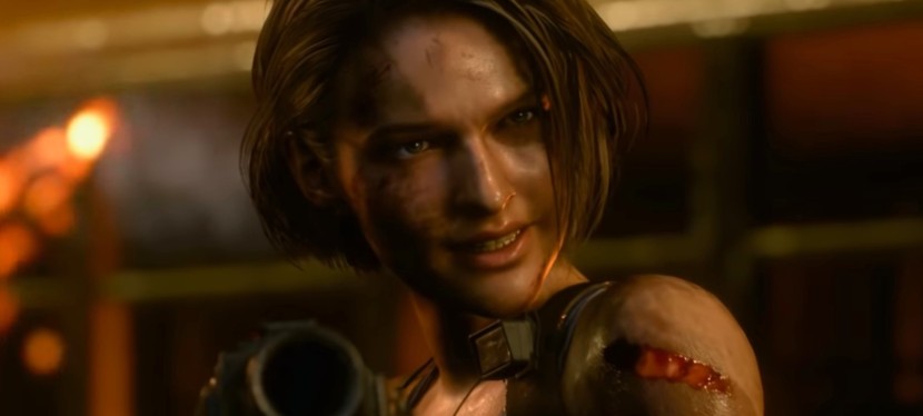
As far as production values are concerned, RE3 remake is more cinematic and has improved visuals technically and artistically. For the visuals, the photo-realism has been pushed forward more by the game developers on the characters, the monsters and their in-game environment. The protagonist Jill Valentine looks very lifelike and with model Sasha Zotova’s likeness used, she sure beats Gears 5’s heroine Kait when it comes to photo-realism and looking very human. The facial expressions are top-notch and I love the way how in-game lighting showed its effects on the environment on the characters.
The photo-realism and impressive facial animation are not limited to Jill, obviously, as other characters like Carlos, Mikhail (who was made to look older this time), Tyrell and the villainous Nicholai (who was made to look younger and slimmer than his previous version) really look great. On top of that, the voice acting is excellent across all the characters. That being said, Carlos now sounds more mature and believable as a person which is a tremendous improvement over the voice of his original version in 1999.
And there is Nemesis, the one over-sized bio weapon that targets members of S.T.A.R.S. Nemesis was redesigned with photo-realism in mind and he sure looks monstrous, especially in the later stages in the game. Compared to his original version in 1999, Nemesis is very strong, can use weapons of his own, uses a tendril to pull Jill to him, can actually leap ahead of Jill and even mutate zombies on the spot. Another noticeable difference that’s been dividing fans of the original RE3 and this game, is that Nemesis in this remake is limited to scripted events in key locations and as such, he is not the constant stalker that Mr. X was in the RE2 remake. In the RE3 game of 1999, Nemesis would randomly appear and run after Jill. That’s not the same experience in this remake which is disappointing.
Another disappointment I have state here in relation to encountering Nemesis (and other monsters) is the absence of live selection sequences which was a defining feature of the original RE3. Once you encounter Nemesis in this remake, it’s either you avoid and outrun him, or you can fight him and strike him hard enough to stop him temporarily (and make him suddenly drop a huge equipment case for you to pick up). You encounter the Hunter Beta or the Hunter Gamma or the Pale Head zombie, it’s either you kill them or they kill you. Without the live selection sequences, there is really no variety in the encounters.
When it comes to the in-game environments and the overall story structure, this game is noticeably shorter and locations are noticeable smaller and more linear. This is another disappointment because the ruined city environment failed to live up to expectations as it was designed to be limited in terms of places to visit and explore. Even the ruined city environment in 1999’s Resident Evil 3 has literally more locations to explore compared to this remake. Also don’t expect to see the city park, the city graveyard and city clock tower from the old game to appear as explorable levels here.
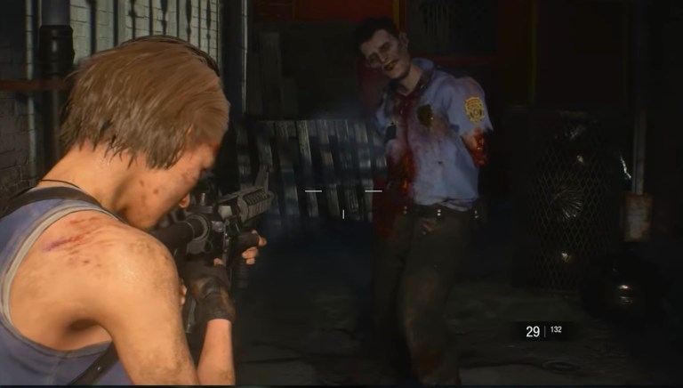
One of many in-game zombies players will encounter.
The game designers apparently knew fans would notice what places from the old game are lacking, and so they heavily expanded exploration in the medical center and they even included a secret passageway into a certain underground facility which made the game still feel fresh.
On the story structure, RE3 remake followed the concept of the original game but made a major twist which really caught me off-guard the first time I finished this game. It’s a nice twist and I never imagined that I get to use a specific character (note: as with the old game, only Jill and Carlos are playable in select sections) visiting a notable location.
When it comes to the presentation of the characters compared to the 1999 game, I can say that Jill is pretty much like her past version but says some lines with sarcasm and makes clear to Carlos that she’s tougher than she looks. Having played the past Resident Evil games, I can tell that this remade Jill Valentine is struggling with the frustration over the mission at the mansion since her superiors refused to believe her (note: lack of evidence and the destruction of the place). Ultimately, this remake succeeds in telling a very defining story about Jill which added more to her status as an icon of the Resident Evil franchise as a whole.
Carlos meanwhile is a more believable character thanks to not only the above-mentioned improved voice acting but also because of better writing. As for Nicholai, he’s more motivated by greed and mentions working for an unnamed client. He’s the type of character who annoys you and makes you wish he would be killed. Mikhail does not change much apart from looking older but Tyrell’s role here is heavily expanded.
Horror? Unsurprisingly this game has some elements of horror but nowhere does it come close to what was presented in the RE2 remake. It’s an action-oriented game after all but that’s not to say it’s the mindless, blazing guns festival like Resident Evil 5.. Also I should mention that there are very few puzzles here.
Conclusion
We gamers want more value for our money, Capcom!
Resident Evil 3 remake is action-packed, engaging and a fun video game to play even if you are not a fan of the long-running video game franchise. It has very high production values and the best cinematic cut-scenes in any RE game to date. What prevents this game from achieving excellence, apart from having a smaller concept compared to RE2 remake, is that the game is rather short and there is only ONE ending. This makes this game’s replay value much lower when compared to the original RE3 of 1999 which had more than one ending and references to other RE characters displayed (each time the 1999 game got finished). Sure the remake rewards players with points for fulfilling challenges and allows them to use the points to acquire post-game stuff in the in-game store, but this does not make up for the short length and single ending.
If there is anything Capcom should do to boost the replay value as well as the overall value of this remake, it’s for them to produce and release a story driven DLC (downloadable content) to expand the story campaign and add an additional ending. By now, the game makers should realize they missed several opportunities to deepen and make the remake great.
Overall, Resident Evil 3 is recommended only when its price is at least 50% off.
Thank you for reading. If you find this article engaging, please click the like button below and also please consider sharing this article to others. If you are looking for a copywriter to create content for your special project or business, check out my services and my portfolio. Feel free to contact me as well. Also please feel free to visit my Facebook page Author Carlo Carrasco and follow me at HavenorFantasy@twitter.com
Disclaimer: This is my original work with details sourced from reading the comic book and doing personal research. Anyone who wants to use this article, in part or in whole, needs to secure first my permission and agree to cite me as the source and author. Let it be known that any unauthorized use of this article will constrain the author to pursue the remedies under R.A. No. 8293, the Revised Penal Code, and/or all applicable legal actions under the laws of the Philippines.
Recently I mentioned how much I enjoyed reading X-Men 2099 #25 which marked the end of the initial direction of the futuristic mutants transitioning into a new creative direction that is no less intriguing. From being nomads, the X-Men of the future suddenly became authority personnel in Halo City (read my review of X-Men 2099 #26) which was nicely told.
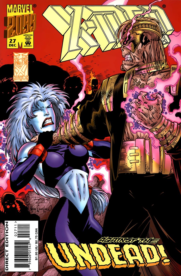
Now we can proceed with a look back at X-Men 2099 #27, published in 1995 by Marvel Comics with a story by John Francis Moore and art by Ron Lim.
The cover.
Early story
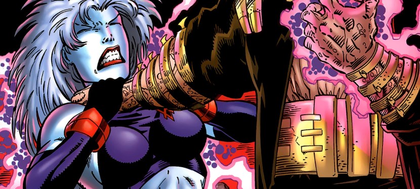
The story begins a short time after the incident at Halo City. Tim Fitzgerald, AKA Skullfire, has been captured by the Undead. As it turns out, Serpentina (who actually died in X-Men 2099 #3) is among them. One of the Undead performs a ritual on Skullfire who finds himself somewhere in the afterlife.
Meanwhile at Halo City, the X-Men, who are now operating as the city’s Protectorate, report back to their boss Somers at the city’s administrative tower. As Meanstreak states that he could not find any trace of Skullfire’s mutant energy signature, Shakti responds by confirming that their missing teammate is dead. This outrages Luna (who got romantically involved with Skullfire).
“I don’t care what Shakti or anyone says! Tim is not dead! I’m going to find him and if you’re not going to help me,” Luna said. “Stay out of my way!”
At this stage, the X-Men discuss what to do next knowing that as authority personnel, they have obligations to attend to.
Quality
When it comes to the story, X-Men 2099 #27 is indeed an engaging follow-up to the previous comic book which ended with a strong twist. The energy from that twist carried on nicely here as John Francis Moore efficiently explored more of the Undead complete with a resurrected and even deformed Serpentina, while still being able to develop the X-Men struggling with their new roles.
A lot really went on with the plot. Not only was Xi’an revisited to be unsure and guilty of himself, there is also the sub-plot of a man spying around Halo City secretly doing his mission as well as further development of the X-Men’s boss.
What I like best about this comic book is the continued development of Skullfire, specifically his continued struggle with his purpose. As seen since X-Men 2099 #4, Skullfire’s humanity gradually slipped away becoming a more visceral, and even somewhat unlikable member of the team. John Francis Moore took this trend several notches higher now that he has been captured by the Undead which involves Serpentina, the one former X-Men member who oriented him about their team. A story like this motivates me to read the first three issues of X-Men 2099.
On the visuals, Ron Lim continued to deliver good stuff. His art on the Undead continues to be scary looking and, unsurprisingly, his take on action scenes remains good.
Conclusion
Skullfire with the Undead. Can you spot Serpentina?
X-Men 2099 #27 continued the reinvigorated storytelling engagement as the series brought the futuristic mutants further with the bold new direction that started in issue #25. In other words, it is a creative success and it is clear that John Francis Moore and Ron Lim were laser-focused on redefining 2099’s X-Men. Fun and intriguing to read.
If you are seriously considering buying an existing hard copy of X-Men 2099 #27, be aware that based on the listings of MileHighComics.com, as of this writing, a near-mint copy of the comic book’s regular edition is $4 while a near-mint-copy of the newsstand edition is priced at $8.
Overall, X-Men 2099 #27 is recommended.
Thank you for reading. If you find this article engaging, please click the like button below and also please consider sharing this article to others. If you are looking for a copywriter to create content for your special project or business, check out my services and my portfolio. Feel free to contact me as well. Also please feel free to visit my Facebook page Author Carlo Carrasco and follow me at HavenorFantasy@twitter.com
Disclaimer: This is my original work with details sourced from reading the comic book and doing personal research. Anyone who wants to use this article, in part or in whole, needs to secure first my permission and agree to cite me as the source and author. Let it be known that any unauthorized use of this article will constrain the author to pursue the remedies under R.A. No. 8293, the Revised Penal Code, and/or all applicable legal actions under the laws of the Philippines.
Believe it or not, there was a time when the iconic superhero Spider-Man had additional arms on both sides of his body which made him even more like a spider. Such a story was told in Amazing Spider-Man #100 and #101 published decades ago by Marvel Comics.
In 1992, Marvel Comics published What If #42 to revisit the old crazy story and tell an alternate reality of it. Take note that this comic book we’re about to examine together was released the same year Marvel celebrated the 30th anniversary of Spider-Man.
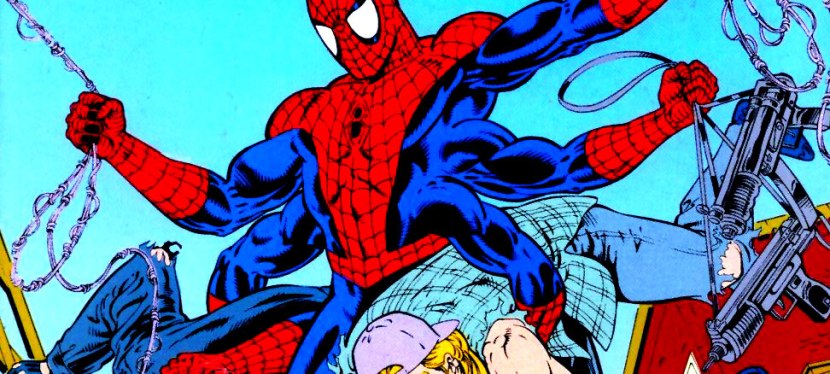
A very eye-catching cover.
Here’s a look back at What If #42 written by Michael Gallagher and drawn by Kevin West. The hot question: What if Spider-Man had kept his six arms?
Early story
The comic book begins with the Watcher telling readers a recap of what happened to Spider-Man in Amazing Spider-Man #100 and #101. It is recalled that Peter Parker got fed up with being Spider-Man as it complicated his personal life with a bunch of problems. After he attempted to eliminate his super powers by creating and using a potion, Peter Parker suddenly grew four additional arms instead.
In reaction, Parker reached out to his friend Dr. Connors/Lizard (who was in Florida) who granted him access to his laboratory in Long Island. Tried as hard as he could, Parker could not come up with a solution.
Meanwhile, many miles away, the vampire Morbius harms the crew of a ship on the sea before diving into the water. Morbius gets overwhelmed by multiple sharks and dies. His death, as it turns out, marked the end of the solution to Spider-Man’s extra arms problem. Morbius had an enzyme unique only to vampire body chemistry which would have cured Spider-Man’s condition.
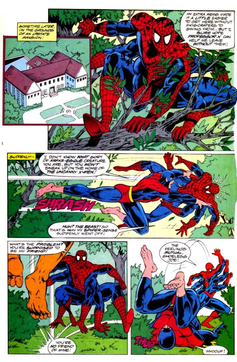
Spider-Man and Beast of the X-Men.
This leaves Spider-Man with an even longer lasting problem leading to a new reality.
Quality
The story is well written and nicely paced. There is a nice balance between storytelling, characterization and action here. As far as the alternate reality of events go, What If #42 is a smash in the sense that it nicely explores what would happen not only to Peter Parker had he actually kept those extra arms of his, but also what would happen to the people around him as well as balance of superheroes in the state of New York. If you just imagine yourself as Peter Parker having four extra arms, try visualizing how your personal life got destroyed and your connections with people you care about getting strained or even cut off. Nobody in real life would want to end up living like a freak, and this concept is well emphasized with Spider-Man.
Character development on Spider-Man is well done. As you read his lines and thoughts, you will feel the pressure and hassle he is experiencing with the extra arms. You’ll wonder how his Aunt May would react not only to those new arms but also his prolonged absence. As Peter Parker becomes very determined to find a solution in the absence of Morbius, you’ll even relate with his struggle. On top of these, the dialogue was well written and there were even a few intriguing moments.
I also enjoyed the way the comic book creators emphasized the shared universe of Marvel Comics here. You will see the X-Men and Fantastic Four plus several more Marvel characters make appearances.
Along the way, there is a nice scene at the Daily Bugle (the newspaper where Peter Parker works as a photographer) showing how sinister and abusive J. Jonah Jameson really is as he remains obsessed with destroying Spider-Man by means of distorted presentation of news. In this age of fake news, sinister propaganda, distorted views and local community print media publications being operated by people who don’t really know journalism, the Daily Bugle scene is pretty relevant by today’s standards.
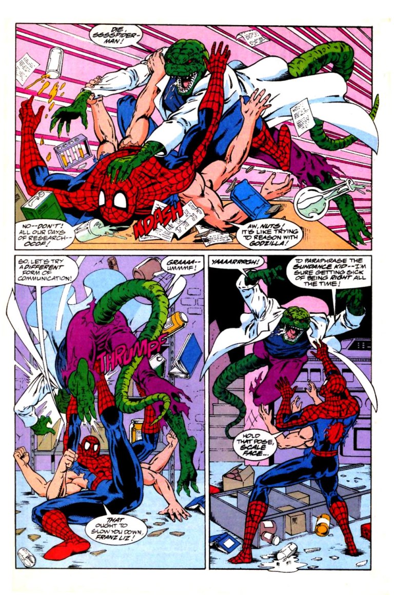
As such, Michael Gallagher’s script and story structure here are very strong. For the art, Kevin West did good work. Not only was I able to recognize the Spider-Man-related characters and other Marvel superheroes, West’s notably made the Lizard look visceral enough and the same can be said of his take on Venom. The comic book art had a nice flow as the story was told and West provided enough impact on the action scenes.
Conclusion
What If #42 is a pretty good comic book to read exploring how things would have been had Spider-Man kept those extra arms and really looked truly spider-like. Apart from the good quality of storytelling and visuals, the presence of other Marvel Comics universe characters further add some depth into the story as Peter Parker struggled to find a solution to his problem.
Spidey and Lizard!
This is the kind of story that I don’t believe we will ever see happen on the big screen. It’s just too jarring and even shocking for Sony Pictures and Marvel Studios to actually show Tom Holland as Spider-Man with extra arms. Such a cinematic move will surely outrage fans and might even put a dent on the credibility and believability of the Marvel Cinematic Universe.
If you are seriously considering buying an existing hard copy of What If #42, be aware that as of this writing based on the ratings of MileHighComics.com, a near-mint copy of the regular edition is at $12 while the near-mint copy of the newsstand edition is priced at $39.
Overall, What If #42 is recommended.
Thank you for reading. If you find this article engaging, please click the like button below and also please consider sharing this article to others. If you are looking for a copywriter to create content for your special project or business, check out my services and my portfolio. Feel free to contact me as well. Also please feel free to visit my Facebook page Author Carlo Carrasco and follow me at HavenorFantasy@twitter.com
Disclaimer: This is my original work with details sourced from reading the comic book and doing personal research. Anyone who wants to use this article, in part or in whole, needs to secure first my permission and agree to cite me as the source and author. Let it be known that any unauthorized use of this article will constrain the author to pursue the remedies under R.A. No. 8293, the Revised Penal Code, and/or all applicable legal actions under the laws of the Philippines.
When X-Men 2099 #1 was released in 1993, it was an instant hit with comic book collectors and became one of the top-selling comic books in America during its month of release. That was no surprise not simply because the comic book speculator boom was still in effect back then, but also because the X-Men 2099 monthly series was launched at a time when Marvel Comics spent a lot of money promoting the 30th anniversary celebration of the X-Men franchise and, on the other hand, agreed to expand the Marvel 2099 universe apart from Spider-Man 2099, Ravage 2099, Doom 2099 and Punisher 2099.
And there I was eager to witness how the 2099 universe got expanded through the futuristic X-Men whose adventures took place far away from New York. After reading the first two issues, I was hooked already on X-Men 2099. And then X-Men 2099 #3 appeared at the shelves of the local comic book store with a rather intriguing cover.
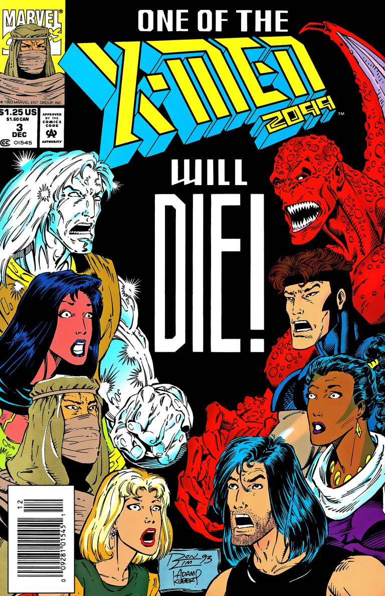
The intriguing cover complete with a coloring error (Tim’s red hair ended up black).
I admit that after seeing that cover, I became more eager to find out if anyone from the futuristic mutants would actually die. By that time, the story that started with issue #1 turned out to be a 3-part story with the objective of establishing X-Men 2099 to readers.
Anyway, let’s start with the retro comic book review of X-Men 2099 #3 published in 1993 by Marvel Comics with a story by John Francis Moore and illustrations by Ron Lim.
Early story
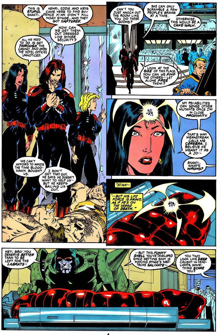
Picking up shortly after the events of issue #2, the comic book begins with Xi’an’s cocooned body being transported back to headquarters by Junkpile (who turned traitor on the X-Men) while captured X-Men team members Meanstreak and Metalhead were placed into liquid-filled chambers. Team member Krystalin managed to elude capture while her teammates Serpentina, Cerebra, Skullfire and Bloodhawk are temporarily free.
The free X-Men members try to infiltrate the place to rescue their teammates.
Lytton, who took over the family corporation since the death of his father Noah Synge, is running a brutal operation. His sister Desdemona does not fully trust him. Bloodhawk flies and breaks into a building in Las Vegas causing trouble for the Synge security personnel.
On the side of the chaos, Shakti/Cerebra, Tim/Skullfire and Tina/Serpentina quiet grab uniforms of Synge security personnel to infiltrate the place to rescue Meanstreak, Metalhead and their cocooned leader Xi’an…..
Quality
When it comes to storytelling, the creators delivered a satisfying ending to the 3-story arc complete with actually killing one of the X-Men 2099 members. John Francis Moore was successful in creating a 3-part story that ultimately gave me clear views of the respective personalities of each X-Men member (examples: Tim is the newcomer who is slowly finding his purpose, Shakti is the strong lady with leadership values who supports the leadership of the reformed Xi’an, Bloodhawk is a hard-headed rebel, etc.) while also succeeded in telling a cohesive story that placed the mutants in conflict with the Synge corporate family.
The twist regarding the murder of Noah Synge (the patriarch) was decently pulled off and the executed death of an X-Men 2099 member actually raised the stakes for the team. By the end of issue #3, the purpose of the futuristic X-Men became clear and was different enough from the mainstream X-Men. Unlike Charles Xavier’s mutants, Xi’an’s X-Men have to reclaim their heritage in a totally different America where corporations ruled the cities and outlaws ruled the wasteland and wilderness of the American southwest region. The X-Men of 2099 are nomadic and they don’t have the facilities nor a safe place to live in which Charles Xavier’s X-Men had.
Desdemona, Junkpile and the cocooned Xi’an.
When it comes to art, I noticed that Ron Lim exerted more effort not only with visualizing John Francis Moore’s script but added noticeable visual details on key moments in the comic book. Seeing Tim/Skullfire so enraged followed by a violent impact of action was unforgettable when compared to other highly charged, emotional scenes Lim drew in his other works. Lim also delivered good stuff with the action scenes and further visualized the look of Las Vegas of 2099. His design of Desdemona, however, really looks uninspired and generic.
Conclusion
On its own, X-Men 2099 #3 is a good and fun comic book to read complete with a good amount of characterization. To really know the X-Men on a personal level, you really have to buy issues #1 and #2. On the creative side of things, I like the fact that John Francis Moore kept references to Charles Xavier’s X-Men to a bare minimum which nicely kept a strong focus on the X-Men of 2099 and the world they live in.
For the comic collectors reading this, if you are seriously considering acquiring a hard copy of X-Men 2099 #3, be aware that according to Mile High Comics, a near-mint copy of the regular edition costs $4 while the near-mint copy of the newsstand edition is priced at $8.
Overall, X-Men 2099 #3 is recommended.
Thank you for reading. If you find this article engaging, please click the like button below and also please consider sharing this article to others. If you are looking for a copywriter to create content for your special project or business, check out my services and my portfolio. Feel free to contact me as well. Also please feel free to visit my Facebook page Author Carlo Carrasco and follow me at HavenorFantasy@twitter.com
Disclaimer: This is my original work with details sourced from reading the comic book and doing personal research. Anyone who wants to use this article, in part or in whole, needs to secure first my permission and agree to cite me as the source and author. Let it be known that any unauthorized use of this article will constrain the author to pursue the remedies under R.A. No. 8293, the Revised Penal Code, and/or all applicable legal actions under the laws of the Philippines.
Are you a fan of Venom and you want to find out how he was presented within the realm of alternate realities within the Marvel Comics universe as told through their What If? monthly series?
Join me in exploring something new in What If #44, written by Kurt Busiek, drawn by Luke McDonnell and published in 1992 by Marvel Comics.
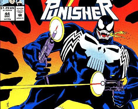
The key scenario here: What if Venom had possessed the Punisher?
The cover.
Early story
The story begins with Venom already armed with guns moving around the city. In broad daylight, he stalks criminals walking down the street. Using the symbiote’s ability to alter his looks, Venom approaches a certain Mr. Vance (accompanied by bodyguards) and kills him quickly in public.
It turns out, Venom is actually Frank Castle/Punisher already with the symbiote. With his intent to eliminate crooks, this new Venom daringly goes up against the gangs even without the usual hardware (weapons) since the symbiote already provides him with uncanny weapons.
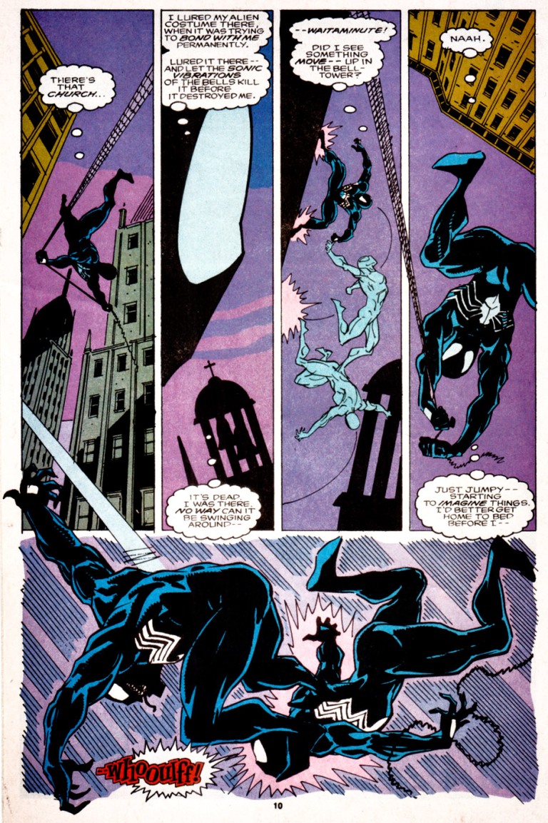
Elsewhere in the city, Spider-Man (wearing his black suit that shared the same style as Venom) swings by a lady who begged him not to hurt her. This sparks Spider-Man’s curiosity since he believes that he succeeded in killing the symbiote that tried to possess him.
Punisher/Venom goes against the criminals!
In another part of the city, Daredevil senses Venom passing by and recognizes the heartbeat as that of Frank Castle. He also senses other readings that something is odd. He decides to take a close look at Venom/Punisher.
Quality
Let me start with the core concept of this comic book: it’s a bold and great concept to explore, and it was well executed! To put things to perspective, I personally witnessed the debut of Venom in 1987 and back then seeing Eddie Brock/Venom as a new mortal enemy of Peter Parker’s was a tremendous event of its own. On top of that, having Brock already with the symbiote forming Venom together established an undeniable consequence that goes back to the alien world in Secret Wars where Spider-Man first got the symbiote. Gradually through the years in real life, Venom became one of the greatest super villains of not only Marvel but in superhero comics in general.
That being said, to show the Punisher getting possessed by the symbiote made a nice alternate reality. Frank Castle lost his family and this alone drove him to become a vigilante and often used lots of guns and explosives in his one-man war against crime. To see him have the symbiote and become the new Venom is both interesting and intriguing. I won’t forget how the Punisher used the symbiote to organically form guns on his arms and actually fire bullets.
One of the things I like most in this comic book was the presentation of the encounter between Spider-Man and Punisher/Venom. It’s a great alternative to the classic first encounter between Spider-Man and Eddie Brock/Venom!
Ultimately, Kurt Busiek’s storytelling is strong and engaging. Art by Luke McDonnell is serviceable at best but he really exerted effort to add impact on the action scenes which are plentiful to see.
Conclusion
Punisher/Venom and Spider-Man!
I really enjoyed reading this comic book. To put things in perspective, What If #44 was released several months before the Punisher and Venom actually appeared together in Venom: Funeral Pyre #1. This comic book was also released before Venom got his own mini-series with Lethal Protector.
If you are serious in collecting a hard copy of What If #44 soon, be aware that as of this writing and based on the ratings of Mile High Comics online, a near-mint copy of the regular edition costs $51 while a near-mint newsstand copy costs $153.
Overall, What If #44 (1992) is highly recommended.
Thank you for reading. If you find this article engaging, please click the like button below and also please consider sharing this article to others. If you are looking for a copywriter to create content for your special project or business, check out my services and my portfolio. Feel free to contact me as well. Also please feel free to visit my Facebook page Author Carlo Carrasco and follow me at HavenorFantasy@twitter.com