A Look Back At UltraForce #1 (1994)

There is nothing like seeing squabbling individuals (each with a unique talent or two) realize that they have to end the division between them and work together to solve a problem that affects everyone.

Tropes like that are common in superhero comic books, animation, movies and other forms of media. The concept of having superheroes is precisely the key element behind the UltraForce of the Ultraverse.

To put things in perspective, UltraForce is a team of superheroes (called Ultras in the Ultraverse) composed of Prime, Hardcase, Prototype, Topaz, Ghoul, Pixx and Contrary. The team was formed to protect the public while, at the same time, keep their fellow Ultras (examples: Mantra, The Strangers, Night Man, etc.) from getting out of line with the general public and their government leaders.

Previously, I discussed what would it be like had superheroes conspired with government officials and corporate media as told in UltraForce #2. For this article, we take a look back at the formation of the team in UltraForce #1, published by Malibu Comics in August 1994 with a story by Gerard Jones and art by the legendary George Perez.

RCO001_1463648135.jpg
Great cover by George Perez.

Early story

The story begins with a disaster as fighter planes get pulled down to the ground by an unknown force. A pilot who ejected and flew by parachute finds himself pulled down as well. Down on his back, he feels intense pain and could not get himself up. His body begins to get destroyed when a voice is heard.

“You thought your little flying toys would stop me. You thought your mastery of light and air made you invincible. And no creature of the dark, hidden places could possibly beat you. Now feel the weight. Feel what we feel. The weight of the core of the Earth. The weight of eons of darkness. The age of light and air is done. Prepare for a new age. The age of Atalon!”

Inside a ship above the desert, Hardcase reacts as he watches multiple monitors showing current events highlighting people’s fear of the Ultras, citizen demanding controls, Hardcase reported as saying “only Ultras can control Ultras”, plus an image of Prime and Prototype in action. With him were Contrary, Pixx and Ghoul.

“No!” said Hardcase. “I won’t go through that again!”

Harcase clarifies to his companions that, due to his past with The Squad ending in tragedy, he won’t join a group and end up counting friends’ bodies again. Regarding his reported quote in the media, he stated that he specifically said that government could never control Ultras plus he did not say an UltraForce should try to do it. Being an actor in Hollywood, he decides to go to the media and wash his hands of this.

Contrary, who is the schemer in the team, asked him, “Won’t the public fear Ultras more and more…unless someone steps up to teach Ultras how to function in the world?”

Hardcase asked if she was the one to do the teaching.

Pixx butts into the conversation telling them that Prime and Prototype are about to approach the press. After calling Pixx an attentive student, Contrary tells Hardcase she is the to teach the Ultras which she claims is her business.

In front of the press, Prime (who is a kid inside that overly muscular body) talks impulsively to them and Prototype (who is receiving communication feed from Ultratech which seeks a public coup with the idea of him gathering the team) who states that an UltraForce is needed and that he will recruit one.

This sets off Prime to act even more impulsively over who has credit over the UltraForce idea. Behind the scenes, Ultratech’s Leland and Hardcase watch as things turn wrong (between Prime and Prototype) in front of the press.

RCO006_1463648135~2.jpg
An incident like that in front of the media is enough to mislead the public into thinking negatively about who got covered in the press. There are those who acted badly in front of the press and there are media operators who practice journalism wrongly.

“They’re going to force the government to crack down on Ultras!” – Hardcase.

Concerned that the embarrassment could start a civil war between Ultras and Normals (the people), Hardcase tells Contrary he wants to leave the ship to prevent things from getting worse. Contrary gets on his way saying she was going to talk to Prime and Prototype and even have their ship fly after them.

Hardcase disagrees with her idea and insisted she should not be near the mess (about Ultras and the public) until she comes clean with all her secrets and explain what her academy for Ultras is about.

“Is this the same Hardcase who didn’t want responsibility of leading other Ultras…laying down the law for me?” – Contrary

Eventually Contrary sends Hardcase away and tells Pixx to bring their ship to the Redstone Arsenal.

Meanwhile, in Los Angeles, Topaz appears suddenly in the middle of a football game causing confusion to the players and the spectators.

RCO015_1463648135.jpg
The power of Prime!

Quality

I absolutely enjoyed reading UltraForce #1 for the fact that it has a very engaging story, great art, in-depth characterization and a great presentation of superheroes banding together for a higher cause. It is the complete package of what a fun yet thoughtful superhero comic book should be!

The story written by Gerard Jones shows lots of signs that things were carefully planned not just for the comic book but for the Ultraverse as a whole as it focused on the concept about the Ultras being on the edge of getting misunderstood by the general public (the people who don’t have powers) who in turn relied on the news coverage of corporate media (which itself has lapses or made deliberate moves that did not give the viewers an accurate look at the events that happened) to take a look at beings with powers.

This concept kinda reminds me of the traditional concept behind the X-Men. Charles Xavier founded the X-Men to train mutants to use their gifts for good while trying to establish a bond of understanding and tolerance between mutants and humans.

UltraForce’s concept of the fragile link between Ultras and ordinary people really went deep as it involved not only the media but also the private sector, the government leaders and the armed forces. Heck, in Prototype #1 the corporation Ultratech made its move with Ultras by having a flying, armored guy representing them. In Prime #1, the element of militarism was involved.

The comic book’s concept is nicely reflected in Hardcases thoughts below.

“Great. The military, the media, the eyes of the world…dying for a sign. Are Ultras for them or against them? And what sign are we giving them?”

Gerard Jones also achieved a great job with the characterization. Prime is the impulsive powerful superhero who is also a loose canon because he’s really a kind inside the large, muscular body of a man. Prototype is piloted by a young guy working for a corporation and along the way, he has trouble balancing himself between duty and personal interest. Hardcase, who has been living with guilt as one of two surviving members of The Squad, struggles between his internal struggle and keeping the peace between humans and Ultras. The way I remember these three notable Ultraverse lead characters from their respective comic book series, their personalities were successfully replicated and developed in this comic book.

Contrary meanwhile is subtle yet brainy and strategic figure of the team. For the most part, she is mysterious and yet already has a clear vision about mentoring people with super powers. She is easily the most defining member of UltraForce who does not have her own comic book series. Topaz, who comes from a society of women, is clearly the Ultraverse parallel to DC Comics’ Wonder Woman. She appeared in prior issues of Mantra and her addition to UltraForce added more depth and variety. Of course, given her background, working alongside men is a challenge for her personally. Pixx and Ghoul, meanwhile, contributed nicely as supporting characters in this comic book. For the villain King Atalon, he succeeded in presenting himself and his group as a credible threat to the world. Not only is he powerful in combat, he is very driven with a mission for his kingdom and his people strongly love him and support him.

Even though this was just the first story, UltraForce #1 is already a nice exploration of each member’s personality and the personal relationships between them. How these characters formed a team was not only convincing but was done with a lot of depth and focus. At the same time, the dialogue written for each character is lively to read. Take note how Atalon reacted to Prototype’s attack on him.

“Didn’t your Dr. Einstein tell your people decades ago that great gravity could bend even energy? But you never do listen to your own wise men, do you? Just like my people. We wise ones must find ways to make you listen.”

Spectacle and action? There’s lot of them in this comic book. More than enough to satisfy anyone who enjoys reading superhero stories that pack a lot of hard-hitting action, intense moments of damage on the surrounding made only possible by superheroes, energy blasts and the like.

This bring me to the next aspect of the comic book….George Perez’s great art! I should say that Malibu Comics made the best decision to hire Perez for UltraForce #1 given his established talent of drawing multiple superheroes in high detail (with that distinct style on drawing human faces) and ensuring that what was written on Gerard Jones’ script would come out not only looking great but also always look very lively. I love the way Perez drew the facial expressions of Hardcase, the visualization of Prime’s immense strength, Pixx looking really like a teenager, the high level of detail on the backgrounds, Ghoul’s creepy look and much more. No doubt about it, each and every panel drawn by Perez is great to look at!

Conclusion

I really love reading and re-reading UltraForce #1. It succeeded in its goal of getting the divided superheroes together to form a team in convincing fashion complete with a clear and present danger (Atalon and his people) that justifies the events. It’s got great writing and art, very engaging characters, heavy action and a good amount of characterization. The good news about this comic book is that it can be found in good supply online and you don’t have to worry about paying high prices for it. As of this writing, you can order a near-mint copy of UltraForce #1 for only $4 at the website of Mile High Comics. Apart from comic books, there were some action figures of UltraForce released and there was a short-lived animated series of it on TV.

If you are a comic book reader who is dissatisfied with today’s comic books (and even superhero movies), if you are reader looking for a great superhero team reading experience, or if you want the best superhero comic book experiences of not only the Ultraverse but of the 1990s as a whole, then UltraForce #1 is highly recommended! This comic book is a classic of its decade!


Thank you for reading. If you find this article engaging, please click the like button below and also please consider sharing this article to others. Also my fantasy book The World of Havenor is still available in paperback and e-book format. If you are looking for a copywriter to create content for your special project or business, check out my services and my portfolio. Feel free to contact me as well. Also please feel free to visit my Facebook page Author Carlo Carrasco and follow me at HavenorFantasy@twitter.com
A Look Back At Friday The 13th Part VIII: Jason Takes Manhattan

When a filmmaker has high concepts but ends up receiving insufficient resources to realize them, disaster normally strikes not only the film crew but also the fans.

This was precisely what happened in the horror movie Friday The 13th Part VIII: Jason Takes Manhattan, written and directed by Rob Hedden. Released on July 28, 1989 in the United States, the movie was the result of Paramount Pictures’ rejection of proposals on making a direct sequel to Friday The 13th Part VII: The New Blood involving that film’s lead character Tina Shepard (played by Lar Park Lincoln).

Hedden, who previously worked for another movie studio and participated in the unrelated Friday The 13th TV series, was hired to make the sequel and he had the idea of bringing the horror icon Jason Voorhees out of Camp Crystal Lake (and its related locations) and came up with concepts of having one story set on a cruise ship (for a claustrophobic horror experience) and another story set in New York City (which includes ideas of having notable locations there as key places for misadventures and action).

“Everything about New York was going to be completely exploited and milked,” Hedden said in an interview. “There was going to be a tremendous scene on the Brooklyn Bridge. A boxing match in Madison Square Garden. Jason would go through department stores. He’d go through Times Square. He’d go into a Broadway play. He’d even crawl onto the top of the Statue of Liberty and dive off.”

The movie studio liked Hedden’s concepts and gave him a budget. The big problem was that there simply was not enough money granted (a little over $5 million) and it was too expensive to film on location in New York (I wonder if Hedden actually made some research about the city as he came up with his New York ideas). Although the given budget was the BIGGEST for a Friday The 13th film at the time, Hedden had no choice but to combine the two concepts into one single narrative. As if insufficient funds were not bad enough, Hedden implemented another concept to look at Jason as a child through the hallucinations of the film’s lead – Rennie Wickham (played by Jensen Daggett). Of course, the hallucinations led to spending some money on “special” effects, make-up, and set-up.

Now, we can start taking a close look at Friday The 13th Part VIII: Jason Takes Manhattan.

Screenshot_20190829-162355_YouTube.jpg
Kane Hodder as Jason on location at Times Square in New York.

The movie begins with shots of New York City (with several spots of Vancouver, Canada pretentiously presented as spots of the more famous city). Over at Camp Crystal Lake far away, a guy and his girl prepare to make love riding a boat floating on the lake unaware that Jason is deep underwater (following the events of Part VII). Through expository dialogue, the guy tells his girl about the legend of Jason who had murdered several people who came near the camp.

Due to an anchor cutting an underwater power cable, loose electricity reanimates Jason (played by Kane Hodder) who went up to the boat to kill the guy and the lady, one by one.

Very soon, a group of graduates from Lakeview High School prepares to embark on a cruise ship for their much-awaited visit to New York. Beyond logic, the scene shows that Crystal Lake is magically connected to the Atlantic Ocean and the background scenery shows that they are in Canada (note: back then it was more affordable to shoot scenes in Canada and pretend to be in the US).

At this point, the film introduces the final girl Rennie who is a gifted student but remains terrified about water since childhood. The leading man meanwhile is Sean (played by Scott Reeves) who is handsome but lacks the heart to follow the footsteps of his successful father who is the captain of the ship. Rennie and Sean both show signs of pain and lack from their respective past and these elements, predictably, make them a matching pair for moviegoers to follow.

Aside from the two, the film introduces mostly disposable characters like Rennie’s overbearing uncle (who happens to be a teacher in the same high school she attends and was clearly written to be the one character to irritate moviegoers into being sympathetic with Rennie and others), the good-natured lady teacher, the hard rock musician, the aspiring filmmaker, the jock, the pretty bad girl, the dude who talks without taking a look, the doomsayer, etc.

Just before the ship leaves, Jason climbs his way up to join the trip. Then he’s stalking starts.

Quality

Friday The 13th Part VIII: Jason Takes Manhattan was very bad when it was first released more than thirty years ago. By today’s standards, this film has aged terribly. Its quality is even worse now.

Let’s start with the most obvious flaw – the movie failed to live up to its promise of Jason’s taking Manhattan. The film’s subtitle is a big lie as much of the movie is set in the ship and New York (including the fake NYC spots that were filmed in Vancouver) does not appear as the definitive location until late in the story!

While the story was set on the ship, the film crew seem to focus on producing on-screen fillers creatively. Sure we get to see Jason stalk and kill characters (with some off-screen death blows) but the dialogue scenes, the transition scenes and character “development” stuff in between were very cheaply and poorly handled.

With Rennie, however, the team managed to make her somewhat engaging as the lead of the film by slowly defining her personality (nicely done by Daggett) and creating on-screen hallucination sequences emphasizing the emotional and psychological damage she suffered from encountering Jason when she was a young girl. The flashback of little Rennie encountering little Jason (which does not make sense at all as far as in-story history is concerned) under Crystal Lake was not only badly done but done without any sense of logic. One can argue that little Rennie only hallucinated of seeing kid Jason (supposedly out of fear and paranoia) but that sequence was just a waste of time even though the filmmakers tried to make moviegoers connect and feel with her. Sean, the other lead, was literally protected by plot armor (note: he was not one of the disposable characters) but his character was not written to do much except serving as a supporter for Rennie.

Lousy stuff? Lots of them here and there! Even though he saw his captain father dead, Sean does not show very much emotion and even worse, he easily forgets about him even as he sees Jason quite a number of times later. He should at least show some deep anger (if not lust for revenge) against Jason. Even though he did not witness Jason killing his father, it was made clear to him and the rest that Jason (and not the doomsayer) was responsible.

How about Wayne, the film-obsessed guy? Even though he and his pals took weapons to go around and hunt Jason, he still bothered to use his camera (while clumsily holding the gun) and film his way around! That is so stupid and it was no surprise that he ends up getting disposed of! Being obsessed with filming, Wayne could have decided to accompany one of his armed pals and used his camera for both video documenting and even help an armed guy see something (example: zooming at a spot or object far away).

As for lousy stuff reflecting the very low budget of the movie, I can point out that the scene in which Sean, Rennie, the uncle and lady school teacher board a lifeboat clearly looked fake and was shot on a studio set. The same thing can also be said about Rennie’s fall into the water (pushed over the deck by Tamara) and she was NOT left behind by the ship that was supposedly moving. The location where JJ played rock music before getting killed looked cheap.

More on production cheapness, either the filmmakers ran out of money or they became too lazy with the wardrobe and hoped moviegoers would be too stupid to notice anything. Look back at the scene when Rennie got pushed off by Tamara into the water and was saved by Sean (who jumped to do his heroic act). Even though they got wet, both Rennie and Sean STILL WORE THE EXACT SAME CLOTHES until the end of the film! Those characters did not change clothes even though Rennie returned to her room!

Speaking of which, the filmmakers disregarded the fact that, in the story, the ship was filled with a lot of students going to New York. There were guys and gals partying, playing games, enjoying the scenery (of Canada!), etc. And yet as the film played on, the filmmakers literally abandoned those many other students. The only exception here was the short scene in which the good-natured lady teacher brought some students with her and told them to stay and wait in the restaurant. A short time later, as she mentioned to her companions that there were students left in the restaurant, Sean replied to her depressingly, “There is no more restaurant.” Without showing any scenes, the filmmakers creatively and nonsensically got rid of the others. I suppose Hedden and team had no more time and money left to show what happened to them all.

The cheapness also affected the look of Jason. Adult Jason in Friday The 13th Part VII had a very menacing, gritty and rotten face design. In this movie, adult Jason’s face looks melted and cartoony! And then there was the inaccuracy with regards to how the film presented little Jason. In the early flashback scene, a kid Jason with a normal looking face was shown drowning (which contradicts the fact that Jason always had a deformed face). There was a ladies’ rest room scene wherein kid Jason (with a slightly deformed face this time) appeared to Rennie via a hallucination. Then there was another kid Jason, more deformed, during the flashback of little Rennie. Whatever the filmmakers did, none of those physical presentations of Jason proved to be scary. Clearly whatever little amount of money they spent here ended up wasted.

On the presentation, the film’s pacing was inconsistent and it sure had several dragging moments. Granted, this was Rob Hedden’s debut as a movie director but I’ve seen other slasher horror films that were paced better and had kills that were executed satisfactorily. The fear factor of this movie was weak overall. Meanwhile, Jason illogically has the ability to teleport in this film which is complete nonsense. I believe that the teleportation was implemented as a convenient way of cutting down on time and expense to complete the production. I suppose showing Jason physically moving from one place to the next to get to his running victim was too expensive and too inconvenient for Hedden’s team.

If there are any good points in this film, I should say that Rob Hedden and his team at least tried to be creative with Jason’s kills (but the teleporting still makes no sense). Tamara (whose mirror got dropped and broke into pieces) got stabbed with a sharp mirror piece. A guy in the sauna gets killed with a hot rock forced into his body. And then there was the city thug who got killed with a syringe piercing through his body (which is impossible and cartoony to look at).

The most memorable kill sequence by Jason was the “boxing fight” with Julius. In that sequence, Hedden told the actor to punch Jason many, many times with real physical contact. That sequence lasted rather long but Jason’s kill of Julius was undeniably good and with impact. Too bad that kill sequence could not carry this movie up.

Another good point to take note is Kane Hodder’s improved take on Jason in terms of action and looking threatening. This was his 2nd time to play Jason and he showed more confidence playing him.

Screenshot_20190829-164839_YouTube.jpg
Kelly Hu was only 20-years-old at the time of production. Jason Voorhees, not Wolverine, was the first pop culture icon she encountered on the big screen.

The stunt done inside a diner (with a particular stuntman who would later have his moment playing Jason in a certain 2003 movie) was at least satisfying to see. Last but not least, this movie featured a very young Kelly Hu who is now a successful and popular Hollywood actress. Fourteen years before she got to fight superhero icon Wolverine on the big screen, she encountered the horror icon Jason right here. What happened to Hu’s character and Jason? You should take time out to watch her scene here.

Conclusion

Screenshot_20190829-141321_YouTube.jpg
Symbolically speaking, Jensen Daggett realized that the film was doomed and it took Jason to catch her attention from behind!

Overall this movie is very, very bad. I can only recommend this to die-hard Friday The 13th fans who are more than willing to set aside logic all for the sake of seeing Jason stalk and kill people. There is little entertainment value here and drastic cheapness will disturb viewers along the way. Not even the short Time Square on-location sequence could save the film. The kills of Jason are a mixed-bag at best and clearly this movie is not even scary to watch. I remember the very first time I saw this way back in the summer of 1990 on laser disc format and there was not even a single moment I got scared. I got to replay this movie on DVD to take a closer look and still I did not get much entertainment value in return.

Friday The 13th Part VIII: Jason Takes Manhattan should be skipped as it is a clear waste of time. If you plan to watch it at all, play the movie only when you want to bore yourself to sleep.


Thank you for reading. If you find this article engaging, please click the like button below and also please consider sharing this article to others. Also my fantasy book The World of Havenor is still available in paperback and e-book format. If you are looking for a copywriter to create content for your special project or business, check out my services and my portfolio. Feel free to contact me as well. Also please feel free to visit my Facebook page Author Carlo Carrasco and follow me at HavenorFantasy@twitter.com
A Look Back At Youngblood #2 (1992)

During my high school days, I heard some buzz about the launch of Image Comics. The year was 1992 and public Internet access in the Philippines was still years away. The buzz of Image in the Philippines was produced through comic book industry magazines read by local geeks who mostly expressed their excitement.

Image Comics was the result of seven high-profile comic book illustrators who left Marvel Comics over issues such as low compensation, low royalties and the company’s immediate ownership of characters they created. Image officially launched with Rob Liefeld’s Youngblood #1.

I should say that I never had the opportunity to buy a copy of Youngblood #1 nor was I able to read a copy of it from a fellow comic reader. However I was fortunate enough to buy an existing old copy of Youngblood #2 which is the subject of this retro comic book review.

The story begins with a prologue introducing readers to a group called the Berzerkers fighting a group of metallic beings. The Berzerkers meet Kirby, a short muscular guy who seems to be inspired somewhat by the late comic book legend Jack Kirby (died in 1994). In fact, written on the lower part of page 1 was a message: Respectfully dedicated to Jack “The King” Kirby.

Then the spotlight finally moves to Youngblood who are discussing the newly discovered body of Prophet, a muscular man sleeping in suspended animation. Prophet was described as “the product of a groundbreaking bio-genetic experiment conducted under the supervision of Dr. Garnet Wells sometime around the Second World War.”

Soon enough, Prophet wakes up and then things really get moving. You just have to read the comic book to find out what happened.

When it comes to quality, I should say this comic book does not have much of a story. What I described above was pretty much it. The comic book had a descent build-up however mainly for Prophet and all the expository dialogue and visuals made clear that the character was designed to be important.

When it comes to art, Youngblood #2 clearly shows Rob Liefeld with a lot of heart and passion. The elements that defined not only his style but also 1990s superhero comic book culture are here – big futuristic guns, muscular bodies, pupil-less eyes, weird looking feet, disproportionate body parts, armor, shoulder pads and the like.

Superhero action? This comic book is heavily loaded and the action scenes drawn by Liefeld packed a lot of punch. Seeing Prophet getting punched by the giant guy looked exaggerated but it still had a lot of visual impact.

2019-08-23_093447~2.jpg
Hard hitting action, visceral looks, muscles, shoulder pads, pupil-less eyes and Prophet.
2019-08-23_093609~2.jpg
Really passionate work by Liefeld.

Adding more value to the comic book was a 5-page preview of Shadowhawk done by Image Comics co-founder Jim Valentino. Without spoiling the details, I should say that the preview does a good job selling ShadowHawk. Lastly, Youngblood #2 has two covers and one end has to be flipped to read the opening content properly.

Overall, Youngblood #2 is worth reading even though its story is very light. To say this comic book is terrible is just wrong. To say the least, it is a nice showcase of the talent and creativity of Rob Liefeld who not only illustrated and inked it, he also wrote the story! Youngblood 2 sure has a light story and heavy action content but ultimately it succeeded on introducing Prophet as well as setting up the excitement for the next issue.

I want to point out that it was recently revealed that Liefeld stayed clear off Youngblood in relation to a custody battle with a co-owner related to past deals made. This explains why he has not done Youngblood stuff for a long time. It’s too bad that we won’t see any more new Youngblood involving Liefeld’s passionate work.

Read Liefeld’s words from a long post he made in Facebook on August 2.

Youngblood represented some of my finest work, I’m proud of all the work that was produced. Sadly, film companies will be reluctant to invest the time and money in a venture without the support and blessing of its creator.

Youngblood #2 is recommended.


Thank you for reading. If you find this article engaging, please click the like button below and also please consider sharing this article to others. Also my fantasy book The World of Havenor is still available in paperback and e-book format. If you are looking for a copywriter to create content for your special project or business, check out my services and my portfolio. Feel free to contact me as well. Also please feel free to visit my Facebook page Author Carlo Carrasco and follow me at HavenorFantasy@twitter.com

A Look Back At Uncanny X-Men #289

Released in 1992 by Marvel Comics, Uncanny X-Men #289 was written by Scott Lobdell and drawn by Whilce Portacio (with ink work by Scott Williams). Its concept focused on the Gold Team of the X-Men (composed of Jean Grey, Storm, Colossus, Ice Man and Archangel) dealing with Bishop who at the time was still a newcomer.

2019-07-11_095911~2.jpg
Cover of the comic book.

It begins when Bishop looks at a framed picture of the original X-Men followed by Storm telling him every student who graduated to the role of an X-Man remains dedicated to the ideal of peaceful coexistence between mutants and humans.

As the Gold Team X-Men enjoy their peaceful time at the mansion of Xavier, elsewhere someone spies on William and Maddy Drake who talk about Bobby (Iceman). Back at the mansion, Archangel encounters a spitting image of his younger self (as Angel and with normal skin color) which raises tension attracting the attention of Storm, Bishop and Forge.

2019-07-11_100038~2.jpg
A touching scene between Jean Grey and Charles Xavier.

To describe Uncanny X-Men #289 clearly, the comic book is more focused on character development as it lacks a strong conflict between good and evil. Anyone craving for superhero action will most likely feel unsatisfied here. However, if you want to know the X-Men more passionately and watch the romance between Storm and Forge develop, then this comic book will be engaging.

Scott Lobdell did a good job developing the characters through drama and Whilce Portacio’s art really brought the script to life. I enjoyed reading the interaction between Jean Grey and Charles Xavier who realizes that as he led the X-Men, he took a bit of something from their respective lives.

2019-07-11_100213~2.jpg
Nice layout and style by Whilce Portacio on the team.

Take note of the following exchange of dialogue.

Charles Xavier: Jean, did you ever hate me for having taken away your childhood?

Jean Grey: Professor, please. What child is given the opportunity to fly to the stars? How many children battle alongside Asgardian thunder gods or super soldiers? You gave me…all of us…more than you took away.

That was really nice writing there by Lobdell. There was drama and harmony between the two characters.

Overall, Uncanny X-Men #289 is recommended. Think of it as a comic book that will help you – the reader – get to know the characters more closely.


Thank you for reading. If you find this article engaging, please click the like button below and also please consider sharing this article to others. Also my fantasy book The World of Havenor is still available in paperback and e-book format. If you are looking for a copywriter to create content for your special project or business, check out my services and my portfolio. Feel free to contact me as well. Also please feel free to visit my Facebook page Author Carlo Carrasco and follow me at HavenorFantasy@twitter.com
A Look Back At The Strangers #1

Disclaimer: This is my original work with details sourced from reading the comic book and doing personal research. Anyone who wants to use this article, in part or in whole, needs to secure first my permission and agree to cite me as the source and author. Let it be known that any unauthorized use of this article will constrain the author to pursue the remedies under R.A. No. 8293, the Revised Penal Code, and/or all applicable legal actions under the laws of the Philippines.

When it comes to the Ultraverse, there is often something enjoyable to read. I enjoy reading about superhero teams, specifically X-Men from Marvel Comics and Justice League from DC Comics to name a few. I also enjoyed Freex and UltraForce from the Ultraverse. What I like about superhero teams is that I get to discover varied characters (the good, the evil and the ones in between), witness how they develop and act when something big or problematic happens.

With The Strangers #1, published by Malibu Comics in 1993 as one of the launch books of the Ultraverse, I experienced another bout of enjoyment and engagement but in a rather unique way.

FB_IMG_1564977426941.jpg
Cover of The Strangers #1 with art by Rick Hoberg.

Written by Steven Englehart with illustration done by Rick Hoberg (whose work was inked by Tom Burgard), the story begins with a shot of life going on in San Francisco. Several characters riding a jammed cable car get distracted when a man and a pretty lady (both seated) do the “wild thang”.

Because of the disturbance, three guys grab the arrogant guy (separating him from the lady) threw him out of the cable car. Immediately after that, the cable car suddenly gets hit by a bolt of energy (perceived as lightning) from the clear sky causing the vehicle to start slipping downwards until it hits a car and its passenger.

FB_IMG_1564977649575.jpg
Bob and Hugh start to notice something strange.

Then a series of things begin to happen. Candy (the lady earlier) acted strangely as the arrogant guy called her attention. Art students Bob and Hugh witnessed the sudden formation of a bag of apples. The kid Leon discovers his new ability to run fast and make sudden turns. Dave witnesses a momentary transformation of himself. Fashion designer Elena gets inspired to create something heroic.

RCO013_1469678179.jpg
Leon’s ultra speed realized while Candy walks pretty.

You must be wondering – how is the quality of this old comic book?

In terms of storytelling and characterization, this is pretty good work done by Steve Englehart. The way I see it, this is a story about strangers (truly living up to the title) who got changed as a result of a single incident that affected them. Each of the members of The Strangers were nicely and efficiently introduced. A creative approach was used to present their respective abilities which made sense as the events unfolded. By the end of the comic book, I really felt very engaged and excited to anticipate the next issue.

When it comes to dialogue, I like this exchange between Bob and Hugh.

“You know what I think?”

“No, what do you think?”

“I think it must have something to do with the lightning that hit us!”

“Nonsense! Lightning does not work like that!”

“You got a better idea?”

As for the visuals, Rick Hoberg’s art (inked by Burgard) combined with the color design by Paul Mounts is still very wonderful to look at. The facial expressions are convincing, the action has impact, the visualization of the super powers is pretty creative and there are lots of small details on the backgrounds (people, city environment, etc.) that are worth examining.

Overall, The Strangers #1 is a fun and engaging old comic book to read. Never mind the financial value it carries right now. Focus more on its story and art, as well as the other details that reflect the talents of its creators. More importantly, the experiences of discovering something fresh and getting to know brand new characters really defined this comic book.

The Strangers #1 is highly recommended.


Thank you for reading. If you find this article engaging, please click the like button below and also please consider sharing this article to others. Also my fantasy book The World of Havenor is still available in paperback and e-book format. If you are looking for a copywriter to create content for your special project or business, check out my services and my portfolio. Feel free to contact me as well. Also please feel free to visit my Facebook page Author Carlo Carrasco and follow me at HavenorFantasy@twitter.com

A Look Back at X-Men 2099 #1

1993 was a special year for X-Men fans. It was the year Marvel Comics celebrated what was back then the 30th anniversary of the X-Men which explains why they released not only a lot of X-Men-related comic books but also issues with hologram cards on the covers of specific issues of X-Force, X-Factor, X-Men, Uncanny X-Men and Excalibur. While superhero movies were not that many at the time, fans had the X-Men animated series to enjoy on TV.

Along the way, the comic book speculator boom continued and Marvel Comics exploited the trend as its creators worked to expand what was back then their still-young 2099 lineup of comic books. This led to the release of X-Men 2099 #1 in the 2nd half of 1993, the comic book of which I bought on a weekday during a short visit to the comic book store in BF Homes, Parañaque.

RCO001_1469507978.jpg
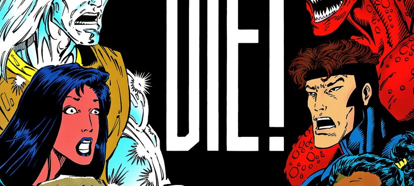
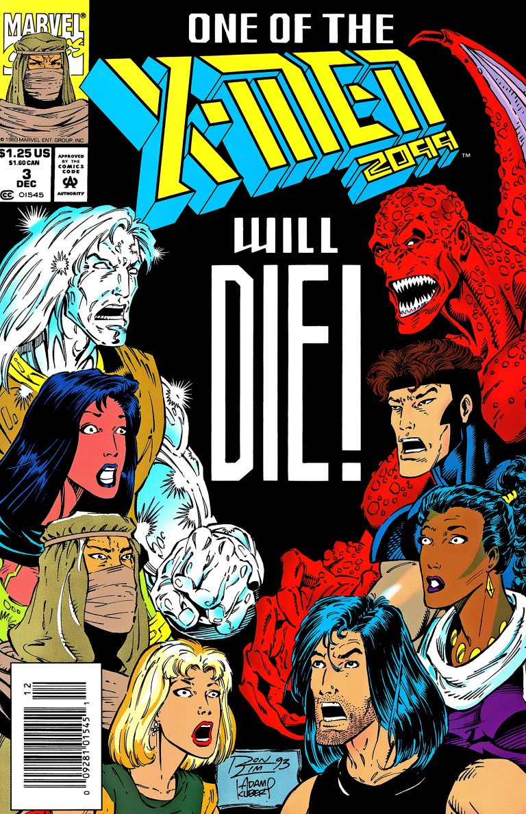
Cover of X-Men 2099 #1.

Before exploring a bit of the story, let me share that in my personal analysis, releasing X-Men 2099 #1 the same year as the 30th anniversary celebration of X-Men made sense even though the contemporary X comic books made no real story reference to the mutants of 2099. Back in 1993, an undisclosed amount of money was spent to promote, distribute and sell comics and merchandise in relation to the anniversary celebration. I’m confident someone behind the scenes at Marvel thought it was a smart idea to debut the X-Men 2099 series at a time when the X-Men brand was very strong among collectors.

Now on to the comic book.

Written by John Francis Moore and drawn by Ron Lim (with ink work by Adam Kubert), X-Men 2099 #1 opens with Timothy Fitzgerald/Skullfire alone and uncertain visiting a large, abandoned facility in the Nevada desert called Nuevo Sol. He stands in front of a large gate with an X marking. After a bumpy introduction with Junkpile, Tim enters and, to his surprise, there he finds a large gathering of people partying despite the deteriorating conditions of the place. He meets Tina/Serpentina who tells him that he is welcome and their gathering attracted mutants, and “nomads and fringers.”

“In Nuevo Sol, you’re not just some corporate bar code, sorted and filed like a product. Here, everyone has a name. Everyone’s equal–no matter where they’ve come from,” Tina tells him.

RCO007_1469507978~2.jpg
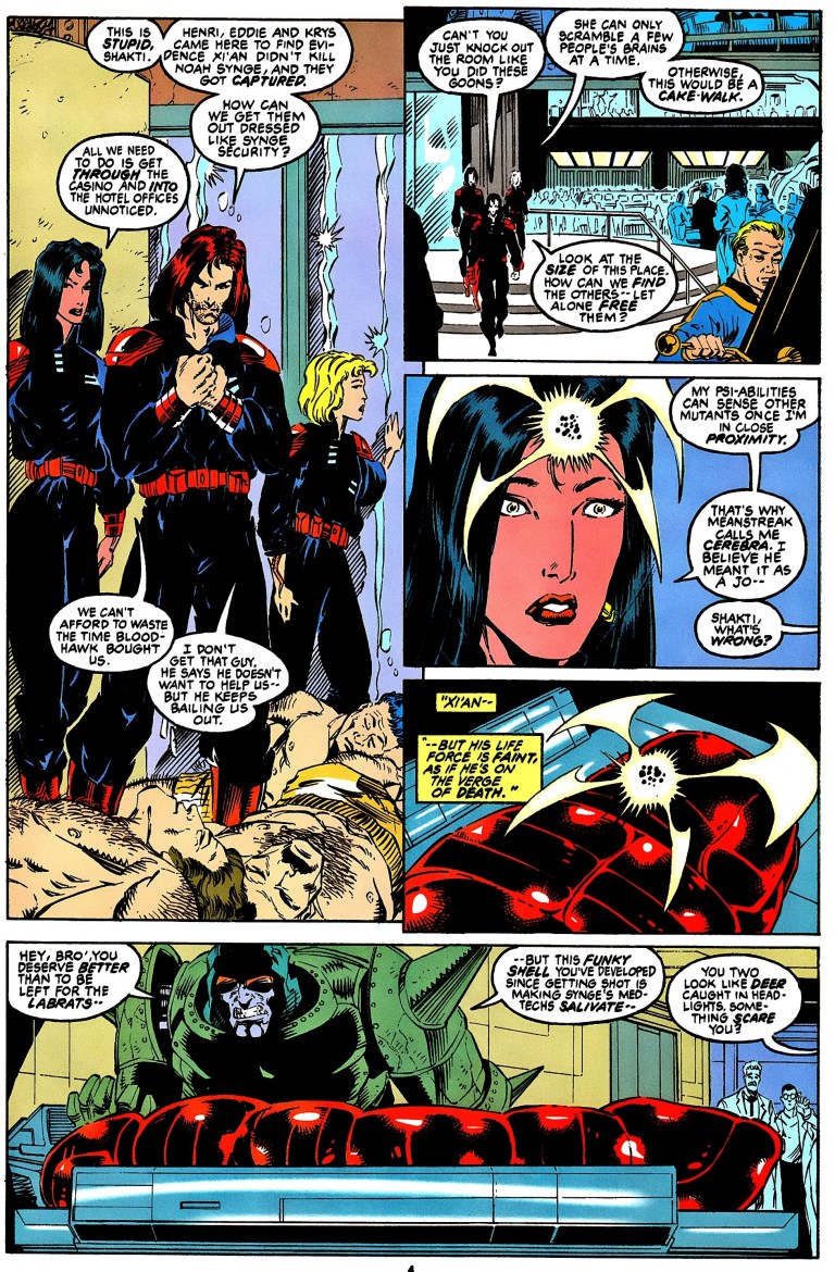
As Tim discovers Metalhead, so do the readers.

After the subsequent for-the-readers introductions of Eddie/Metalhead and Shakti/Cerebra, the narrative moves to Las Vegas where a horse-riding Noah Synge (an old man who “ruthlessly controls the greater Nevada syndicate”) gets confronted by Xi’an/Desert Ghost who tells him that his men (of Synge) continue to kidnap members of the nomad tribes for his decadent amusements. In other words, it’s an accusation about human trafficking.

After a harsh exchange of words, Xi’an shows to him his left, creepy looking fist telling him that the red market will fall, that the Synge empire will crumble and that if Synge seeks to hurt the affected people, he (Xi’an) will make him suffer.

Xi’an touches a short stone wall with his left hand which makes it crumble within seconds (as he walks away). This is all I have to share about the plot and if you want to know more, you better get and read this comic book.

So you must be wondering what I think about the quality of this 1993 comic book. When it comes to storytelling, it is well written, entertaining and engaging. John Francis Moore’s script really is good even by today’s standards. Moore managed to carefully introduce not only the X-Men of 2099 but also the supporting characters and the bad guys properly all within 23 story-and-art pages which is a very hard thing to achieve. While the writing was challenging, Moore managed to us symbolism to show “good versus evil”, especially with the conflict between Xi’an (representing the oppressed and the powerless) and Noah Synge (who, by today’s standards, is a caricature of the cruel and rich person).

Tim meanwhile symbolizes the reader’s perception. As he discovers Nuevo Sol, readers feel and see what he perceives. His discovery of the place, the culture and people serves as the eyes of us readers.

When it comes to the art work, this one shows that Ron Lim exerted a lot of effort to give the X-Men of 2099 a unique look of their own without taking any visual inspiration from the contemporary, mainstream X-Men of the 1990s. While it is easy to criticize Lim for the quality of art, we must remember that he worked on a whole lot of other comic book for Marvel back in 1993. During that year, he illustrated The Infinity Crusade which featured a whole bunch of Marvel’s superheroes and many other characters in each comic book. Could you imagine the headaches and stress an illustrator has to go through drawing so many characters in a comic book limited series?

Ron Lim also helped visualize what Nevada looks like in 2099 which is a nice change from the super futuristic, towers-filled New York City. In terms of society, the X-Men 2099 series further showed that America’s wilderness or the abandoned places are filled with outlaws and living there can be even more dangerous for people to do when compared with living in New York under the watch of Alchemax.

This old comic book, which has a solid cover with foil and a price of $1.75, also has a 15-page Marvel 2099 promo which includes a 2-page X-Men 2099 “coming at you” portrait by Lim. The promo includes short previews of the other 2099 feature characters and it also serves as a reminder that X-Men 2099 is part of the same universe with them.

Overall, I declare X-Men 2099 #1 is still a good, old comic book worthy of being added to your collection. Its financial value is not that high right now and the X-Men 2099 themselves pale in comparison to Spider-Man 2099 (easily the most popular 2099 feature character of them all) when it comes to today’s comic book environment.

What you have to keep in mind, however, is that X-Men 2099 #1 just might gain a boost in its financial value if ever the mutants of the future make a big comeback as part of Marvel’s official announcement that it will revive the 2099 line of comic books this November! Granted, X-Men of 2099 had appeared in X-Men comic books in the past few years but the revival of the 2099 line will be a more suitable place for readers to discover them in this age of social media and smartphones.

RCO026_1469507978~2.jpg
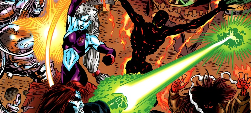
The X-Men of 2099.

Financial value aside, X-Men 2099 #1 is engaging and entertaining, and it has that 1990s charm to it.

X-Men 2099 #1 is highly recommended.


Thank you for reading. If you find this article engaging, please click the like button below and also please consider sharing this article to others. Also my fantasy book The World of Havenor is still available in paperback and e-book format. If you are looking for a copywriter to create content for your special project or business, check out my services and my portfolio. Feel free to contact me as well. Also please feel free to visit my Facebook page Author Carlo Carrasco and follow me at HavenorFantasy@twitter.com
A Look Back at X-Men Adventures #1

Back in 1991, Marvel Comics successfully launched X-Men #1 (Volume 2) which arguably marked what was back then a new era of the X-Men. That comic book was written by Chris Claremont and the art was done by Jim Lee with ink work by Scott Williams.

Lee was granted a lot of creative freedom and that could be seen in the way he redesigned and modernized the looks of the X-Men, especially with Cyclops (with that suspender), Rogue (that yellow-green tight suit plus brown jacket), Jean Grey (technically a swimsuit with those padding on the legs), etc.

Those re-designs were eventually adapted by the producers behind the memorable X-Men animated series of the decade which lasted five seasons.

Of course, Marvel Comics itself wanted to make more money as the said animated series launched. Alongside it, they launched a new comic book series that adapted stories from the animated series (which itself were adaptated stories from the past comic books, mainly Uncanny X-Men). This resulted the X-Men Adventures comic book series and here, I review the launch issue.

RCO001_1487469525.jpg
X-Men Adventures #1’s cover.

Released in 1992, X-Men Adventures #1 adapted the memorable launch episode of the animated series. The story begins with the Watcher doing some expository dialogue as Sabretooth causes some destruction in a city. As it turned out, it was a TV news feed of him as the narrative shifts into a home in suburbs wherein a married couple talk about Jubilee. The husband Martin thought about registering Jubilee with the government which turns off wife Martha. Jubilee overheard them and predictably agonizes over her situation (note: she melted the VCR and mutants like her have been viewed negatively).

Then a Sentinel arrives in the neighborhood searching for her. Strangely enough, the Sentinel simply crushes the bedroom of Jubilee only to find out she was not there and registered an “identification error.”

RCO007_1487469525.jpg
Jubilee in trouble at the mall.

Jubilee then spends time in the shopping mall only to discover the Sentinel crashing in to find her. Within that place, X-Men members Storm, Gambit and Rogue decide to take action against the Sentinel. This is where the story really takes off.

Creatively, this comic book retells the events of the launch episode of the animated series. Writer Ralph Macchio did a serviceable job translating the episode into a decent flowing comic book.  Like the animated episode, the aspect of mutants living in fear (expressed through Jubilee) was nicely captured.

What really stands out here is the artwork by Andrew Wildman. Not only did he do a good job drawing so many characters and giving them nice facial expressions, he pulled off a good effort to insert spectacle into the comic book. The Sentinel’s crashing into the shopping mall, Rogue’s punch on the Sentinel’s head, and Wolverine’s strike against a wall using his claws all have that strong impact.

RCO013_1487469525.jpg
Andrew Wildman’s approach to action had a lot of impact.
RCO018_1487469525.jpg
Team interaction of the X-Men.

I also like Wildman’s way of capturing the spirit and look of the X-Men, especially during the Danger Room sequence showing Beast, Morph and Gambit doing exercises. Even the scenes that feature no action but lots of talk had an interesting look and Wildman did not even rely on the method of making the characters beautiful.  No single boring moment with the art here.

Overall, X-Men Adventures #1 is a fun read. As of now, this old comic book from 1992 is not really valuable but that just might change if ever the Walt Disney Company (which now has the other media rights to X-Men due to their acquisition of 20th Century Fox) decides to have Marvel Entertainment revive or even continue the X-Men animated series.

Whether there will be a significant development or not, X-Men Adventures #1 is recommended.


Thank you for reading. If you find this article engaging, please click the like button below and also please consider sharing this article to others. Also my fantasy book The World of Havenor is still available in paperback and e-book format. If you are looking for a copywriter to create content for your special project or business, check out my services and my portfolio. Feel free to contact me as well. Also please feel free to visit my Facebook page Author Carlo Carrasco and follow me at HavenorFantasy@twitter.com


Is a Darna movie still needed?

This past summer, the production of the pending Darna movie project suffered a major setback when Liza Soberano dropped out due to a serious injury of her finger. I wrote about that months ago and the fact that Soberano cried during the ABS-CBN interview (she admitted she let the fans down) only showed how heavy and painful the loss of the Philippine pop culture icon was to her deep inside. Not only that, the original director Erik Matti is no longer involved and has since been replaced by Jerrold Tarog.

As of this writing, the filmmakers are still quietly searching for a suitable replacement for Soberano.

As the search goes on in this age of social media and Hollywood-produced superhero movies that dominated the Philippine box office, the hot question remains – is a Darna movie still needed?

To understand things better, let’s go back to the beginning.

The past

20190629_102806.jpg
Darna with the Philippine flag on display at the Ravelo Komiks Universe booth during the recent Toycon.

Created by the late Mars Ravelo, Darna debuted in 1950 in illustrated print media and went on to appear in comic books, comic strips, magazine special features, television and movies to name some. Through the decades, Darna went on to become a Philippine pop culture icon and there were those who even compared her with Wonder Woman.

In Philippine cinema, Vilma Santos (who is now a public servant) made her mark with the public when she played Darna more than once. Other actresses who played the superhero in other movies were Sharon Cuneta, Anjanette Abayari and Regine Velasquez to name a few.

The 21st century

In the 21st century, Darna was unsurprisingly modernized in a TV series starring Angel Locsin and produced by GMA Network. The series became a hit nationwide and helped keep Ravelo’s icon relevant to Filipinos while also boosting Locsin’s popularity. A few years later, GMA lost Locsin to its rival network ABS-CBN and “replaced” her with then newcomer Marian Rivera who went on to become a star. While still holding the rights to Darna, GMA launched in 2009 a new series with Rivera as the superhero. Like the 2005 series before it, it became a hit as well.

While it was a success, the deal between GMA and the surviving members of Mars Ravelo came to an end. Unsurprisingly, in 2015, the Ravelos signed up with rival network ABS-CBN with upcoming Darna projects in mind. What made this new deal different was that it was in the form of a motion picture project through its movie-making arm Star Cinema.

Making a live-action Darna movie turned out to be tricky and time-consuming. In 2017, the project generated a lot of buzz and excitement when the young and pretty Liza Soberano was hired to play Ravelo’s creation. She was easily referred to as the “Millennial Darna”.

Of course, in this age of social media and smartphones, Filipinos expressed their reactions online. While there were those who welcomed Soberano as Darna, there were some who had problems with the actress’ American accent and heritage (note: Soberano was born in the United States) and some even claimed that she was “not Filipina enough” to play Darna who in the realm of fantasy is Narda, who is often portrayed as a simple Filipina.

And then there were some people who preferred Angel Locsin over Soberano. Take note that almost a decade before Soberano signed up to play Darna, Locsin was hired by ABS-CBN and starred in many big projects with the network achieving lots of success in both television and movies. As such, it was no surprise that there were still many craving for Locsin to play Darna under the banner of ABS-CBN.

Before losing the role, Liza Soberano worked really hard to play Darna. Videos and images of her physically training for the role were released online and it has been reported that she researched the icon behind the scenes. Soberano, by the way, studied at SISFU (Southville International School Affiliated with Foreign Universities) in BF International, Las Pinas City.

Do people really want to see a Darna movie at all?

While Star Cinema is slowly making the Darna movie, it is only fair to ask if people really want to see the movie at all. Do Filipinos, who collectively paid a good amount of money to enjoy Hollywood-made superhero movies in local cinemas since the year 2000, really need to watch Darna on the big screen?

20190629_123043-1.jpg
Pick a Darna.

Now I am not a filmmaker nor have I gotten involved in the nation’s film industry but as a long-time geek, observer and former journalist, I should say that the odds are against Star Cinema.

Traditionally here in the Philippines, local film productions that became hits were the romantic comedy and horror types of movies. There were a few historical epic films that became hits along the way. A few fantasy movies were released and made some good money. Given the fact that these kinds of films became hits with Filipino moviegoers and given the fact that the Filipino action film genre has faded away since the early 2000s (note: Filipino action movies have been rarely produced since then), it comes to show that Filipino moviegoers are not that interested in locally made action scenes.

Action scenes combined with computer-generated images (CGI) are among the most attractive features of Hollywood superhero movies to Filipinos. There is nothing like watching Spider-Man’s classic fights with Doctor Octopus in Spider-Man 2 (2004), Wonder Woman leading the fight against the Germans in the No Man’s Land scene in Wonder Woman (2017), Batman fighting a gang of thugs in the warehouse in Batman v. Superman: Dawn of Justice (2016), and the massive battle between the superheroes and the evil ones in plains of Wakanda in Avengers: Infinity War (2018) all happen on the big screen!

Definitely those forms of spectacle look great, feel intense and were enjoyable to watch again and again. Moviegoers here in the Philippines paid good money to experience those sequences. For sure, all those on-screen action sequences were carefully crafted, choreographed and painstakingly laced with CGI at a high cost.

That being said, what can the Darna movie offer local moviegoers in terms of spectacle? Can the filmmakers come up with something stylish (if not original) with the action with Darna that can convince moviegoers to come back for more? How much money can the filmmakers afford to invest in such spectacle? For sure, there will be moviegoers who can’t help but make comparisons with Darna’s on-screen spectacle with those of movies from Marvel and DC.

There is also the challenge for the Darna filmmakers to tell a compelling story and have the moviegoers connect with the characters. Sure there is Darna (Narda is her civilian identity) but who else could they add as key cast members? The least the filmmakers could do is involve supporting characters who would end up annoying moviegoers. If the Darna movie would have humor, the producers should make sure that the comedy players should avoid annoying the viewers as they try to make comic relief.

Challenging also is the implementation of the villain to give Darna problems and compel her to act heroically. There is the long-time enemy Valentina but how can the filmmakers make her relevant and not look corny to the locally viewers who have gotten so used to villains in Hollywood superhero movies. Creating a brand new, all-original villain for Darna on the big screen could be a last resort if ever none of the Mars Ravelo-created villains would fit in. A weak cinematic villain is a big no-no.

And then there is the challenge of dramatizing and modernizing the origin of Darna on the big screen. This can make or break the movie because emphasizing the origin requires a good amount of build-up and however the story is written (with the expected big battle near the end) the movie should have balance. It is key to entertain the viewers, to connect them with the characters and make the plot relevant to them. If there is way too much build-up (read: Batman v. Superman: Dawn of Justice), moviegoers will end up getting burned out and the spectacle won’t save the movie. If the film has too much social commentary, it could turn off moviegoers.

Another issue is maintaining the relevance of Darna with the Filipinos as time passes. Each year that passes, a superhero movie of Marvel or DC Comics gets released in cinemas nationwide and adding more to the relevance of the superheroes in those movies is the presence of comic books and trade paperbacks of superheroes in retailers. I’m a comic reader and no matter how hard I try, I could not even find a Darna comic book at the retailers (including the comic book specialty stores) and not even reprints of old comics are available. As for the past TV series and movies of Darna, they can be viewed on YouTube but those productions are not too appealing to me.

Merchandise of Darna and the other Mars Ravelo heroes Lastikman and Captain Barbell are not that common commercially. The Ravelos however, in partnership with ABS-CBN, sell such merchandise (under the title Ravelo Komiks Universe) online.

During my time at the recent Toycon, there was a Ravelo Komiks Universe at the main exhibition floor which showcased statues and some merchandise of Darna, Captain Barbel and Lastikman. There were even hired models portraying the Ravelo superheroes in full costume.

One last issue to discuss here is movie competition. Hollywood superhero movies pretty much made tremendous commercial, and even social, impact here in the Philippines since the year 2000 when X-Men proved that superhero films can be taken seriously and be enjoyed for what they are. There is no denying that Marvel and DC Comics movies are major moneymakers among Filipinos. Wonder Woman grossed over P520 million nationwide in 2017. The disappointing X-Men: Apocalypse made over P400 million in 2016. Iron Man 3’s gross in 2013 was over P625 million. Lastly, Avengers: Endgame made over P1.6 billion this year!

Superhero movie competition is already tough and for sure moviegoers will compare Darna to those foreign superhero flicks on every detail. As if that was not hard enough, there is also movie competition with non-superhero flicks like Jurassic World (over P500 million) and the Star Wars movies to name a few. Some comedies and romantic comedies occasionally sell a lot. There are also those computer-generated animation films as well not to mention some Filipino movies that sometimes turn into major blockbusters.

Conclusion

20190629_102642.jpg
I wonder if this classic Darna design will actually be used in the delayed movie. Whoever gets hired as the star should be ready to wear this swimsuit-type costume.

With these issues discussed, making a Darna movie is hard to do and selling it, if ever it gets made at all, is an even bigger challenge for Star Cinema. As a movie market, the Philippines and its moviegoers have an undeniable appetite for foreign movies and if it is spectacle they crave for, they search for it from Hollywood from the superhero movies, the sci-fi movies, the hard action films, fantasy movies, etc. Adding further to the challenge of making the Darna movie succeed is the advanced publishing of schedules of releases of future movies like Wonder Woman 1984 which will be released worldwide on the first week of June 2020.

If ever the film will be made, could Star Cinema’s Darna turn out as the complete package of really special superhero fun, engaging storytelling, memorable characters and great spectacle in the near future? Will it be released during the Metro Manila Film Festival or during the January-November period? How can Star Cinema make Darna relevant to young moviegoers, geeks and the many Filipinos who love watching Hollywood superhero movies?

The answers should unravel in the near future. There is, however, the possibility that the Darna movie would end up getting cancelled. Personally, I would not be surprised if that happens.

Don’t get me wrong. While I am not a fan of Darna, I still am interested to see a modern day film adaptation of Mars Ravelo’s superhero and hope it will happen with an engaging story, characters worth connecting with and carry lots of entertainment value. While I enjoy watching Hollywood superhero movies, I still will give the Darna movie a chance if it ever gets made as a solid film.

How about you, readers? Do you want to see a Darna film on the big screen?


Thank you for reading. If you find this article engaging, please click the like button below and also please consider sharing this article to others. Also my fantasy book The World of Havenor is still available in paperback and e-book format. If you are looking for a copywriter to create content for your special project or business, check out my services and my portfolio. Feel free to contact me as well. Also please feel free to visit my Facebook page Author Carlo Carrasco and follow me at HavenorFantasy@twitter.com
 

X-Men at Toycon 2019

During my time at the Toycon 2019 at SMX Convention Center in Pasay City this past Saturday, I checked out the X-Men stuff. I am a long-time X-Men fan and that particular franchise is my favorite among all of Marvel’s superheroes.

As before, I looked for some back issues of X-Men at one of the few comic book sellers at the convention.

20190629_120630-1.jpg
Lots of old X-Men comic books displayed for sale.
20190629_121837.jpg
A copy of X-Men #1 (1991) drawn by Jim Lee featuring Magneto. I did not bother to buy this one.

After carefully searching what was available and calculating with my limited budget, I bought a few copies of Uncanny X-Men drawn in the early 1990s by Whilce Portacio. I intend to have these comic books signed by him in the near future.

As I went around the floor of the main exhibition hall of the convention center, I saw several X-Men statues and action figures. The one that caught my attention was the Dark Phoenix figure.

20190629_103252.jpg
Too bad the filmmakers could not find a way to replicate this classic Dark Phoenix form for the big screen. 

And then I went up to the 2nd level of the convention where there was one function hall that had several displays of toys and action figures for people to look at. Of course, the X-Men were there and here are some pictures I took for your viewing pleasure.

20190629_105852.jpg
I like this set up showing two opposing sides. I just wished Magneto had been placed closer fronting Charles Xavier.
20190629_105647.jpg
The 1990s X-Men look.
20190629_105836.jpg
Dazzler, X-Factor, Cable and some X-Men.
20190629_105843.jpg
Another 1990s X-Men set.
20190629_105635.jpg
I like the set up here with the X-Men and a fallen Sentinel.

For more X-Men insight, check out my Logan retro movie review, my X-Men #1 (1991) retro comic book review, my X-Men: Dark Phoenix movie review, my retro movie reviews of X-Men (2000), X2: X-Men United and X-Men: The Last Stand.

Check out my first Toycon 2019 article here.


Thank you for reading. If you find this article engaging, please click the like button below and also please consider sharing this article to others. Also my fantasy book The World of Havenor is still available in paperback and e-book format. If you are looking for a copywriter to create content for your special project or business, check out my services and my portfolio. Feel free to contact me as well. Also please feel free to visit my Facebook page Author Carlo Carrasco and follow me at HavenorFantasy@twitter.com
A Look Back At X-Men: The Last Stand

X-Men: The Last Stand is better than X-Men: Dark Phoenix? What a joke driven by hatred and uncontrolled emotions of negativity towards the latter.

Screenshot_20190613-151706_YouTube.jpg
Ian McKellen as Magneto.

Released in 2006, X-Men: The Last Stand was the third movie of Marvel’s mutants which made $459,359,555 worldwide establishing new box office records at the time including the Memorial Day weekend opening and a single-day record for Friday openings. It was also the highest grossing X-Men movie until X-Men: Days of Future Past exceeded it in 2014.

While the first two flicks were directed by Bryan Singer (who literally abandoned this movie in favor of the big letdown Superman: Returns), this one was done by Brett Ratner who is best known for Rush Hour films. For the superhero concept of the film, Ratner clearly depended on the script by Simon Kinberg (who directed X-Men: Dark Phoenix) and Zak Pen (X2: X-Men United).

The story begins some time in the past with Charles Xavier and Magneto visiting the house of a little girl named Jean Grey whose power of telepathy and telekinesis make her dangerous. Her own father thinks she has an illness. In another scene, a young boy desperately tries shaving off something on his back which turned out to be a mutation. To put it short, the prologue establishes the two concepts this movie tried to emphasize – the Dark Phoenix (from the classic comic book storyline by Chris Claremont and John Byrne) and the Mutant Cure (in reference to one particular episode of the 1990s X-Men animated series).

The result? A rather unfocused narrative that bogged the movie throughout. In the present day, Charles Xavier and the X-Men are no longer hiding from the federal government (which in turn has Hank McCoy/Beast as part of the US President’s cabinet). A cure that can neutralize the mutant gene has been revealed and eventually Jean Grey suddenly returns back to life in front of Scott Summers/Cyclops. Then trouble in the story (and for this film in particular) sets in.

Screenshot_20190613-151113_YouTube.jpg
Dark Phoenix and Professor X.

On storytelling, the lack of focus on a central concept really dragged this movie down even though the filmmakers made attempts to link them together. This is a very unfaithful adaptation of the Dark Phoenix Saga – instead of showing the Phoenix Force as a cosmic entity the filmmakers used the dual-personality concept in Jean Grey. There are no alien civilizations (read: no Lilandra) involved nor anything related to outer space (a key element in the comic book storyline). With regards to the cure concept, Rogue in this film makes a move to be cured loosely following what was shown in the animated series.

Having these two concepts connect to each other showed Magneto getting motivated to rally the mutants to oppose the humans. Jean Grey meanwhile gets controlled by the Phoenix personality and gets very destructive with power which makes her an asset to Magneto and his brotherhood of evil mutants.

As the filmmakers struggled to tell the story, the social relevance and symbolism emphasized in the first two films got weakened. The core concept of mutants getting isolated and discriminated by humanity simply because they are so different became much less relevant here.

As if that was not bad enough, the characterization also changed for the worse. Magneto here became one-dimensional as a villain and the way he reacted to Charles Xavier’s destruction in front of him and Jean Grey reflected bad screen writing. Any true X-Men fan would know that even though he and Xavier were adversaries with a past friendship, Magneto should have been outraged over his old rival’s destruction and strike at Jean Grey (even if it is suicidal for him to fight a more powerful entity, the Phoenix).

For his part, Charles Xavier turned out to be a manipulator of Jean Grey’s mind making him look as evil and manipulative as Magneto. Jean Grey, despite actress Famke Jansen getting more screen time than before, ended up as a visual tool and was clearly NOT the central figure of the story rather she ended up being a tool of power by Magneto. By today’s standards, Jansen’s portrayal of Jean Grey/Dark Phoenix pales in comparison with Sophie Turner’s performance in X-Men: Dark Phoenix.

More on characterization, the triangle between Iceman, Rogue and Kitty Pryde was executed with no real depth and only served to show Anna Paquin’s character search for the means to be normal (because Rogue absorbs the power and life of people she touches) which ended up being not so meaningful for viewing. Young adult Angel’s (one of the original X-Men in the comics) minutes-long presence in the movie only served to showcase special effects. Storm’s prospect of succeeding Xavier as leader of the X-Men and the school was sloppily done. Oh yes, the showing of multiple mutants (in supporting roles, non-speaking roles or as mere background characters) that weakened the narrative of the first two films was even worse here. As a result, there’s quite a lot of fan service in this movie.

Going back to storytelling, I should say that the early demise of Cyclops (played by James Marsden for too little screen time due to his work with Bryan Singer on Superman Returns) and Charles Xavier were attempts by the filmmakers to raise the stakes and even shock viewers. The problem is that the third act of the film became more of an action and CGI bonanza ultimately failing to justify the loss of Cyclops and Xavier. The story ended with not much impact on me as a viewer and the late scenes showing Magneto recovering a little of his power (plus the post-credit scene about Xavier’s survival) were unsatisfactory. By comparison, X-Men: Dark Phoenix concluded with satisfaction.

Performances? The actors did what they could with the weak screenplay. Patrick Stewart played Charles Xavier managing his school but gets burdened heavily as Jean Grey returns with the Phoenix in her (which makes Xavier feeling guilty over his past manipulation of Jean’s mind). Ian McKellen played a one-dimensional Magneto (forget about the reasonable fighter for mutants you saw in the first two films) and really had little room to flesh him out. Clearly this version of Magneto, even though he has a lot of screen time here, is rubbish when compared to the cinematic Magneto in X-Men: Dark Phoenix.

Hugh Jackman as Wolverine is clearly the hero of this movie and was given a lot to do showing a deeply concerned Wolverine as well as showing him with lots of action on-screen. His emotional reaction towards Jean Grey near the end of the movie was believable. Halle Berry meanwhile failed yet again to capture the leader in Storm from the comic books.

Another thing to mention regarding the weak script is the lame attempt at humor in the film. Just look at the exchanges of words between Wolverine and Beast which only made me frown instead of laughing.

Exchange 1

Dr. Hank McCoy: Wolverine. I hear you are quite an animal.

Logan: Look who’s talkin’.

Exchange 2

Logan: Well, for all we know, the government helped cook this up.

Dr. Hank McCoy: I can assure you, the government had nothing to do with this.

Logan: I’ve heard that before.

Dr. Hank McCoy: My boy, I have been fighting for mutant rights since before you had claws.

Logan: [to the Professor] Did he just call me boy?

If there is anything positive at all with this movie, it is the spectacle (action, stunts and special effects). If you want to watch an X-Men movie without thinking too much and just enjoy the spectacle, The Last Stand is heavily loaded! The scope of destruction (including the major showcase of Magneto’s power with the Golden Gate Bridge) is also great and helped this weak movie look epic (even more epic than the better film X-Men: Dark Phoenix). There is also a big battle of multiple members of Magneto’s brotherhood attacking the soldiers at the Alcatraz facility. Action is where director Brett Ratner is good at and it temporarily helped this film feel fun to watch. The visual design and special effects are of good quality as well.


One last positive thing to mention here is the casting of Kelsey Grammer as Hank McCoy/Beast and his performance was, indeed, superb. I really saw the scientist, the intellect and the fighter of Beast from the comics translated nicely in cinematic form.

Screenshot_20190613-151905_YouTube.jpg

A striking shot as a result of Magneto’s power.

By today’s standards of superhero movies, X-Men: The Last Stand unsurprisingly went from big-budget disappointment to what is now an overall bad movie that just happens to have some fun action sequences. As far as adapting the Dark Phoenix Saga from the comics, this film is definitely inferior to X-Men: Dark Phoenix. X-Men: The Stand does look good when compared to the terrible X-Men Origins: Wolverine.

If you are a true fan of the X-Men or if you are moviegoer who wants the best superhero cinematic experience, I won’t recommend watching X-Men: The Last Stand.

But then if you are a moviegoer who cannot do anything except hate and uncontrollably bash the new movie X-Men: Dark Phoenix, then maybe The Last Stand will be your bout of fun.


Thank you for reading. If you find this article engaging, please click the like button below and also please consider sharing this article to others. Also my fantasy book The World of Havenor is still available in paperback and e-book format. If you are looking for a copywriter to create content for your special project or business, check out my services and my portfolio. Feel free to contact me as well. Also please feel free to visit my Facebook page Author Carlo Carrasco and follow me at HavenorFantasy@twitter.com