Disclaimer: This is my original work with details sourced from reading the comic book and doing personal research. Anyone who wants to use this article, in part or in whole, needs to secure first my permission and agree to cite me as the source and author. Let it be known that any unauthorized use of this article will constrain the author to pursue the remedies under R.A. No. 8293, the Revised Penal Code, and/or all applicable legal actions under the laws of the Philippines.
Welcome back, superhero fans, comic book collectors, fans of 1990s arts and culture, and fans of Malibu Comics! Today we return to the Ultraverse for another tale of The Night Man, specifically from one of the early issues of its monthly series that launched in 1993.
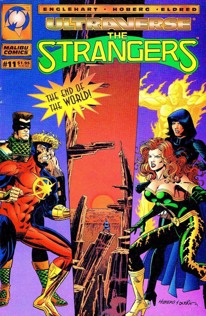
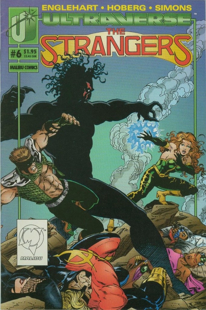
For the newcomers reading this, Night Man is a solo hero within the Ultraverse who is a musician by day and a crime fighter by night. He was involved in a major accident with a certain cable car in San Francisco that got hit by a bolt of energy from the sky (as told in The Strangers #1). His life was never the same.
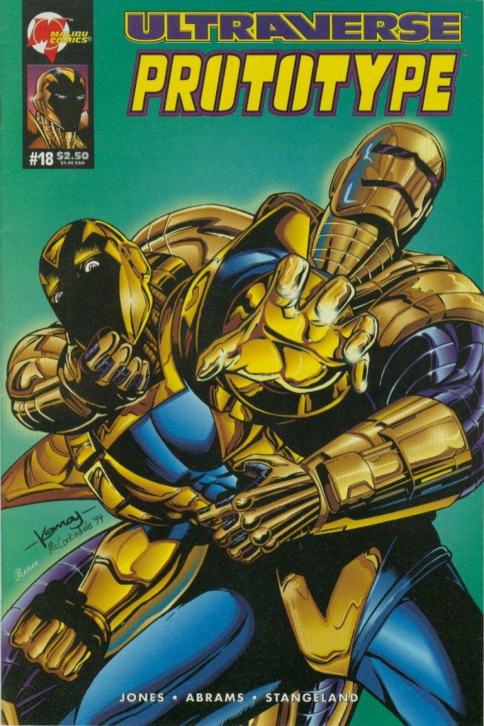
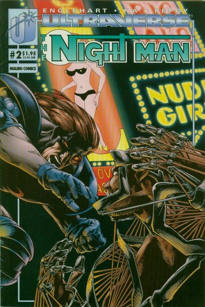
With those details laid down, here is a look back at The Night Man #2, published in 1993 by Malibu Comics with a story written by Steve Englehart and drawn by Gene Ha.
Early story
The story begins with Johnny Domingo (Night Man) failing to sleep during the night. The operation he had recently kept him awake and his mind is just racing. He could not even properly play his saxophone.
He dresses again as the Night Man, takes his motorcycle out of his place and then he speeds away. Shortly after, he senses another person’s thoughts…those of a man wearing a trench coat messing with a young boy. Night Man decides to jump in, intervene and save the boy but to his surprise, the man easily hit him moving him back and making him fall on the road.
Unwilling to give up, Night Man goes back to him and strikes back with a kick to the head. During their conflict, Night Man pulls the man’s trench coat revealing a rather shocking form for a body that looked inhuman. This shocks the costumed vigilante giving the man time to pull down scaffoldings in an attempt to hurt him and the boy…
Quality
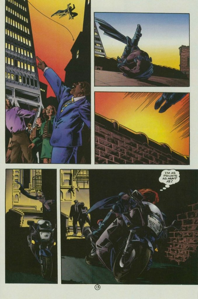
Focusing on the plot, while the first issue showed Night Man beginning as a vigilante and self-made detective, this comic book shows him struggling to do what he believes to be good (by means of saving another person’s life) and having to face both rejection and skepticism from people. Of course, Night Man himself is flawed with his execution and the way he presents himself to others (note: including doing the radical thing of climbing a tall building just to talk to someone powerful). It does not help that he is restless which clearly impacts his perception even though he has the will to be helpful and make local society a bit safer from dangerous people.
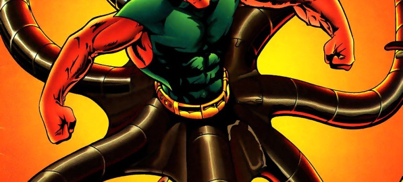
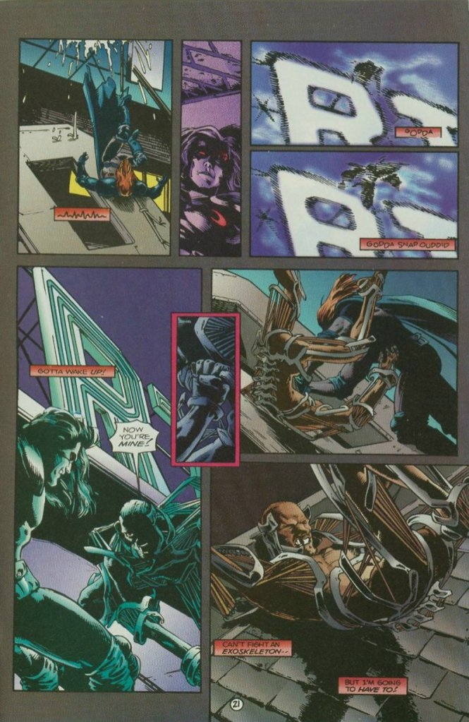
Back to the story, the introduction of a new villain named Mangle is quite intriguing and it seems very fitting that Night Man’s reaction to seeing him in his inhuman form would reflect the same shocked reaction on the part of the reader. Mangle is very distinct from the many other villains of the Ultraverse and he is indeed a powerful adversary to Night Man.
When it comes to the visuals, Gene Ha’s art style is excellent. He has this distinct, gritty style on drawing people as well as their facial expressions. His art on Mangle made the villain look really scary and intimidating. Gene Ha also proved to be good with framing the action scenes while keeping enough creative space for the dialogue or narration to come in for readers to follow.
Conclusion
The Night Man #2 (1993) is pretty compelling and as it is free from the baggage that came with building up the vigilante in issue #1, this one has a more cohesive story and shows more of the him doing his best to be helpful. The story is good enough to keep me interested for the next issue. I should also state that if readers love seeing a hero struggle in helping others, then there is a lot to like in this story.
If you are seriously planning to buy an existing hard copy of The Night Man #2 (1993), be aware that as of this writing, MileHighComics.com shows that the near-mint copy of the comic book costs $14.
Overall, The Night Man #2 (1993) is recommended.
+++++
Thank you for reading. If you find this article engaging, please click the like button below and also please consider sharing this article to others. If you are looking for a copywriter to create content for your special project or business, check out my services and my portfolio. Feel free to contact me as well. Also please feel free to visit my Facebook page Author Carlo Carrasco and follow me at HavenorFantasy@twitter.com