Disclaimer: This is my original work with details sourced from reading the comic book and doing personal research. Anyone who wants to use this article, in part or in whole, needs to secure first my permission and agree to cite me as the source and author. Let it be known that any unauthorized use of this article will constrain the author to pursue the remedies under R.A. No. 8293, the Revised Penal Code, and/or all applicable legal actions under the laws of the Philippines.
The X-Men of 2099 are struggling with their duty as a security force of Halo City while the Undead causes trouble nearby. Then Shakti’s father is wanted.
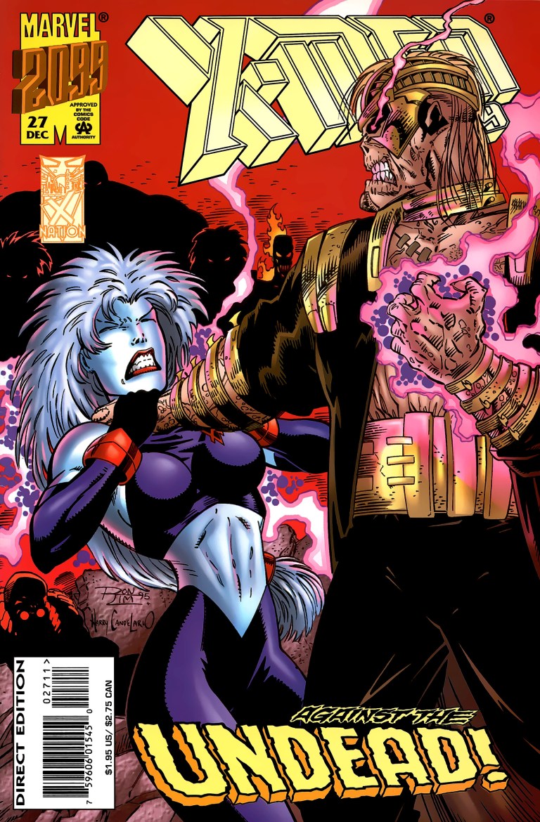
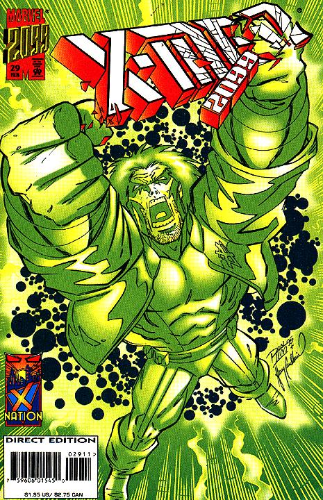
Here’s my retro comic book review of X-Men 2099 #29, published by Marvel Comics in 1996 with a story written by John Francis Moore and art by Ron Lim.
Early story
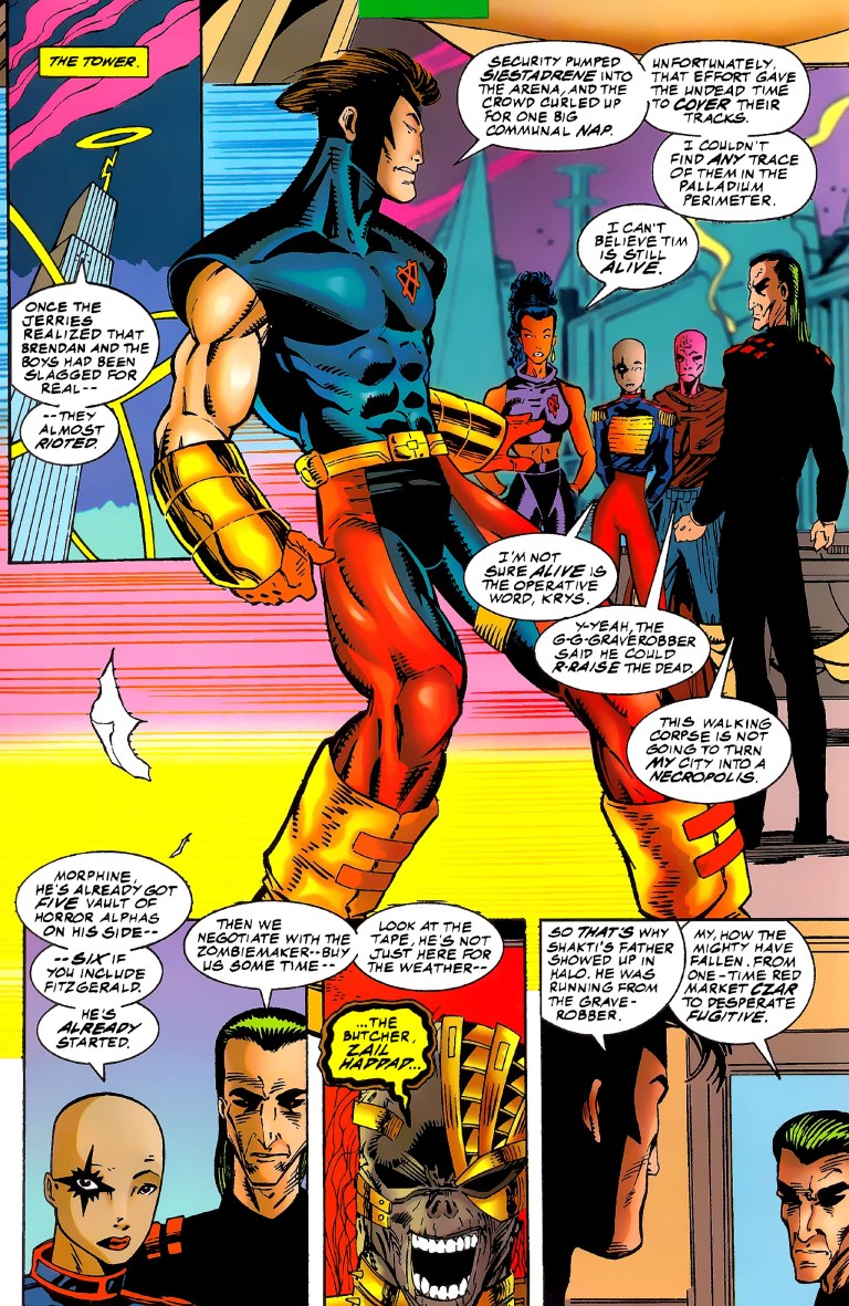
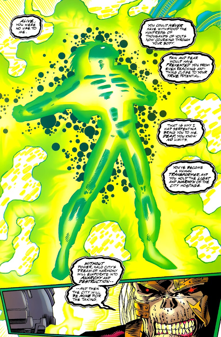
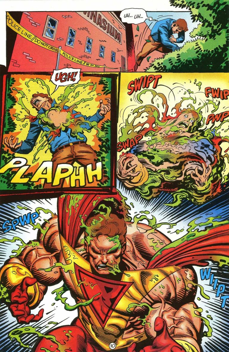
The story begins with the resurrected-but-turned-evil Skullfire doing the Graverobber’s bidding by tampering with Halo City’s power supply. The Graverobber is confident he will gain control of the city. Their gang, the Undead, has Luna (a close friend of Skullfire’s with the X-Men) captured.
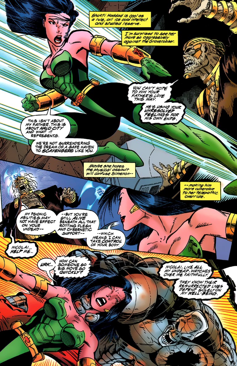
Suddenly, Meanstreak rescues Luna and brings her back to the X-Men who just arrived to face off with the Undead. Team leader Shakti tells the Graverobber that he has only one chance to relinquish his hold on Skullfire and leave the city. Meanstreak whispers to Krys his observation of Serpentina whom they witnessed died some time ago.

The Graverobber answers back to Shakti reminding her she renounced her father’s legacy and she should not protect him out of misguided family loyalty. Suddenly Meanstreak run towards the Graverobber offensively…
Quality
Another fun and engaging X-Men 2099 story made and also a worthy conclusion to the 4-part City of the Dead storyline (started with X-Men 2099 #26). No surprise that John Francis Moore and Ron Lim delivered the goods, complete with worthy payoffs to the build-up made not only with the storyline but also on the characters themselves. This issue connected nicely with what happened in X-Men 2099 #3 relating to Serpentina being with the Undead. Remember Tim/Skullfire’s past with his departed sweetheart Reiko? This comic book also touched into his inner self and it sure made me rethink if Skullfire really loves Luna even though there was no rivalry between her and Reiko.
By the end of this comic book, I really felt how much the X-Men of the far future have changed not simply because of their new roles as the security force of Halo City, but also with how their members – Skullfire and Shakti specifically – dealt with their respective connections to the past.
Conclusion
This 29th issue of the X-Men 2099 series of the 1990s is worth reading for as long as you knew the characters well enough, even before the 26th issue. It’s nice that John Francis Moore decided to creatively connect with dots from the past just as he crafted a story showing the X-Men struggling with being authorities themselves. The addition of Morphine as a superior of their added a lot of tension and it sure made up for the absence of Xi’an.

If you are seriously planning to buy an existing hard copy of X-Men 2099 #29, be aware that as of this writing, MileHighComics.com shows that the near-mint copy of the regular edition costs $4. The newsstand edition’s near-mint copy costs $8.
Overall, X-Men 2099 #29 is recommended.
Thank you for reading. If you find this article engaging, please click the like button below and also please consider sharing this article to others. If you are looking for a copywriter to create content for your special project or business, check out my services and my portfolio. Feel free to contact me as well. Also please feel free to visit my Facebook page Author Carlo Carrasco and follow me at HavenorFantasy@twitter.com