Disclaimer: This is my original work with details sourced from watching the movie and doing personal research. Anyone who wants to use this article, in part or in whole, needs to secure first my permission and agree to cite me as the source and author. Let it be known that any unauthorized use of this article will constrain the author to pursue the remedies under R.A. No. 8293, the Revised Penal Code, and/or all applicable legal actions under the laws of the Philippines.
Considering how long the Friday The 13th franchise of horror movies lasted throughout entertainment history, there were indeed chapters that proved to be good, bad or simply satisfactory towards its fans and other moviegoers.
Having seen ALL the Friday The 13th movies myself, I can say without hesitation that the most defining films of the franchise were the first four films (released 1980 to 1984) which eerily reminds me of the early stage of James Bonds movies released in the 1960s (read: Sean Connery and Albert Broccoli struck cinematic gold with 1964’s Goldfinger).
As I mentioned before, Friday The 13th Part 3 was indeed a fun horror movie and marked the time when the film franchise and its featured villain Jason Voorhees really started to take shape. It was the film that saw Jason wearing his now iconic hockey mask, and improved the creative formula (examples: Jason’s stalking and eliminating people, his encounter with the surviving protagonist or the final girl). In other words, Part 3 ended on a very strong note and high fun factor, setting the stage for the inevitable sequel Friday The 13th: The Final Chapter (AKA Part 4).

Before starting this retro movie review, it’s important to take note of what happened in Hollywood that led to the creation of the 1984 movie.
Background
After Friday The 13th Part 3 rode the 3D movie trend and made a lot of money on ticket sales alone, Paramount Pictures perceived that the slasher horror genre was waning with moviegoers and decided that the Friday The 13th franchise should end. Eventually Joseph Zito was hired to write and direct The Final Chapter. The funny thing was that Zito secretly hired Barney Cohen to write the screenplay, going as far to take phone conferences with one of the producers, share details with Cohen to produce the pages (Zito and Cohen collaborated on the script in a New York apartment) which were sent to the producer (who would go back to the director).
Because it was clear that the film was supposed to end the franchise, Zita wanted the film the be about the death of the newly masked Jason and this explains why The Final Chapter opened where Part 3 ended…at the Higgins property which Jason’s body in the barn. The director told Cohen to focus on developing the characters (as opposed to emphasizing kills). Of course, this did not stop Zito from ramping up the kill count, the gore and nudity. With the cast hired, veteran stunt performer Ted White hired as Jason and movie makeup specialist Tom Savini rehired (note: he worked on the 1980 Friday movie and created Jason’s look as a youth), Zito really wanted to end the franchise with a bang!
With those details already recorded in history, here now is my retro movie review of Friday The 13th: The Final Chapter.
Early story
Friday The 13th: The Final Chapter opened with a recap of Jason, the killings and how things turned out in the first three movies, cleverly using Part 2’s camp fire scene in which Paul told the camp trainees the legend of Jason.
The story begins on the evening of Monday the 16th. For some weird reason, the local police and other emergency personnel arrived at the Higgins property (note: this was the very same California location where Part 3 was filmed at) at least twelve hours after Part 3’s lone survivor Chris Higgins was picked up by the police during the morning.
After picking up the dead bodies and examining the venue for evidence, the medical personnel brought Jason’s unmoving body to the local medical center with his mask and clothes still intact. Some time into the night, Jason (Ted White) discreetly gets up and kills two medical personnel before leaving for the great area of Crystal Lake.
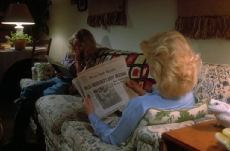
The next morning, Tuesday the 17th, Mrs. Jarvis (Joan Freeman) and her daughter Trish (Kimberly Beck) jog together in the woods heading towards their country home which is located some distance away from Crystal Lake. Inside the house is the young son Tommy Jarvis (Corey Feldman) who is a geek and collector of special stuff. The family is already aware of the killings Jason caused over the past few days (refer to Part 2 and Part 3) and Mrs. Jarvis referred to him as the psycho.
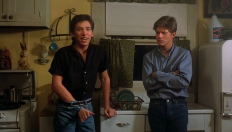
Meanwhile, a new group of teenagers riding a car are on their way to the Crystal Lake area for a group vacation completely unaware that Jason is on the loose. Their destination is a vacation house located very near the Jarvis home…
Quality
Even though the production team had a low budget, this film had improved production values which is literally only the tip of the iceberg. The real indicator of this movie’s quality is with the overall execution in terms of directing, storytelling, characterization (yes, there is character development here) and horror spectacle. The good news is that Friday The 13th: The Final Chapter’s overall quality is pretty good.
For starters, the creative team took the bold approach of having a family and a group of teenagers as targets for Jason’s killing spree. The presence of a likable family like the Jarvises made the Friday The 13th formula feel fresh since the old approach of having teenagers (and a few adults) getting killed off has gotten repetitive. Having good natured characters like Mrs. Jarvis, Trish and Tommy should remind you of the likable families living in your neighborhood. As such, the Jarvis family in the story will make you get concerned for them and despise Jason for the evil icon he truly is.
The new batch of teenagers in this film is an improvement over Part 3’s teenagers (which by the way are more likable than those in Part 2). Among them is Jimmy (Crispin Glover), a troubled young guy trying to achieve something important in his life. There is also Sara (Barbara Howard) who is sweet and appears reserved for Doug (Peter Barton). The pretty twins (Camilla More and Carey More), who just appeared into the film encountering the rest of the youth, added nice variety to the romance potential among them. On the other hand, Ted (Lawrence Monoson), is the stereotypical unlikable and pathetic guy meant for viewers to despise. Samantha (Judie Aronson) is the lady craving for sensual love with Paul (Clyde Hayes).
What this movie clearly had in bringing some of the above-mentioned characters to life is character development. Director Zito and team succeeded in making the Jarvis family worth caring for. Jimmy is the teenager that moviegoers would relate with and also root for him to succeed. The other cast members, notably the teenagers wanting fun and satisfaction (skinny dipping and partying, anyone?), were made to be interesting and were clearly not merely disposable. Sara is likable and she looks like she could rival Trish in terms of who would be worthy to be the film’s final girl, not to mention who would be more worthy of the care from the viewers.
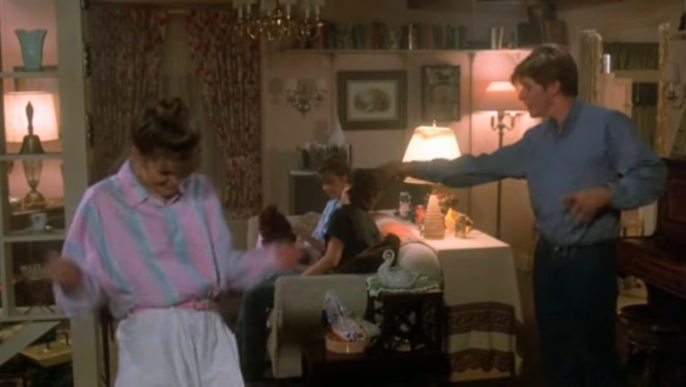
In terms of presentation, this film has a more serious tone. Other than Jimmy’s ever memorable dance, the approach to humor is noticeably weaker when compared to Part 3. At the same time, the killings of Jason are executed and made to really look visceral. When Jason kills a character who is likable or at least interesting, you will really feel bad or sorry, and then despise Jason. Speaking of Jason, the filmmakers made him look scarier with the visceral approach to killing on-screen and the fact that Ted White avoided speaking to the other cast members in between takes.

When it comes to the stunts, the film crew really went all-out and it involved a lot of pain on the part of the actors because of the lack of safety and stunt performers as a result of the low budget. The stunts in this movie were executed with a lot of intensity and when each stunt ends, you will feel something. Take note that Ted White is a veteran of stunt performing and even doubled for Clark Gable long ago.
Remember the traditional stunts of having a human body thrown into the house through the ground-floor window? Such a stunt in this movie had a lot more impact than what was shown in the first three films. As for the stunt involving the very young Corey Feldman, that one was real and there was a huge risk of injury due to the lack of safety measures. Regardless, the stunt was performed and Feldman’s surprise and shouting were genuine. Here’s a video clip for you to enjoy.
The presentation of the on-screen kills and stunts here are the absolute best of the Friday The 13th franchise. The scare factor is also much stronger.
As for the music, Harry Manfredini returned. His musical score proved to be excellent in terms of bringing life into the scenes complete with precise timing.
Conclusion
I declare that Friday The 13th: The Final Chapter is the best and the most definitive movie of its franchise. It’s also one of the best and most defining horror movies ever released in the 1980s. It’s not worthy of awards for film excellence but it still is a major standout among all horror movies of the 1980s. It should be noted that this movie implemented a twist to the final-girl-versus-Jason formula of the first three movies by having a key character involved during the climax.
Believe it or not, Friday The 13th: The Final Chapter actually had a lot of tension between the director and actors during production (Note: Ted White stood up for the younger actors who had to endure physical pain due to lack of safety, and this put him into direct conflict with the director. And then White was very annoyed with Corey Feldman who in turn was allegedly badly treated on location by Zito).
Even so, the movie turned out to be its franchise’s biggest highlight, the best of it all! Apart from the final results made by director Zito and his crew, Friday The 13th: The Final Chapter owes part of its success to Friday The 13th Part 3 since that movie (a clear improvement over Part 2) helped set the stage for the fourth movie on a creative manner.
At the same time, it was in this fourth Friday The 13th movie where Jason truly became a horror icon as well as one of America’s pop culture icons. Director Zito, Tom Savini and Ted White combined their efforts on making this the most definitive story of Jason Voorhees who was not a zombie but a living human killer who simply won’t stop due to the evil in him. This movie’s Jason is clearly a dramatic improvement over Part 3’s Jason (which in turn was a dramatic improvement over Part 2’s Jason-with-a-potato-sack-for-a-mask) and each time the villain was on screen, you can sense his evil force. The mere fact that Trish got frightened by Jason at different stages of the chase between them proves how intimidating and scary the masked killer really is.

Overall, Friday The 13th: The Final Chapter is highly recommended. For the best viewing experience and story immersion into Friday The 13th, I recommend watching Part 3 and this movie back-to-back.
Thank you for reading. If you find this article engaging, please click the like button below and also please consider sharing this article to others. If you are looking for a copywriter to create content for your special project or business, check out my services and my portfolio. Feel free to contact me as well. Also please feel free to visit my Facebook page Author Carlo Carrasco and follow me at HavenorFantasy@twitter.com