Retro Gaming Ads Blast – Part 23

Welcome back readers, fellow geeks and electronic gaming fans!

In this edition of the Retro Gaming Ads Blast (RGAB) series, we will take a look at another batch of retro gaming print ads – including arcade flyers – from the 1980s and 1990s.

For the newcomers reading this, Retro Gaming Ads Blast (RGAB) looks back at the many print ads of games (console, arcade, computer and handheld) that were published in comic books, magazines, flyers, posters and newspapers long before smartphones, social media, the worldwide web and streaming became popular. To put things in perspective, people back in the 1980s and 1990s were more trusting of print media for information and images about electronic games and related products.

With those details laid down, here is the newest batch of retro gaming print ads for you to see and enjoy…

1. Raiders of the Lost Ark game print ads

The print ad with strong Indiana Jones imagery.
The print ad with the movie theater exterior image and the small image of the Atari 2600 console.

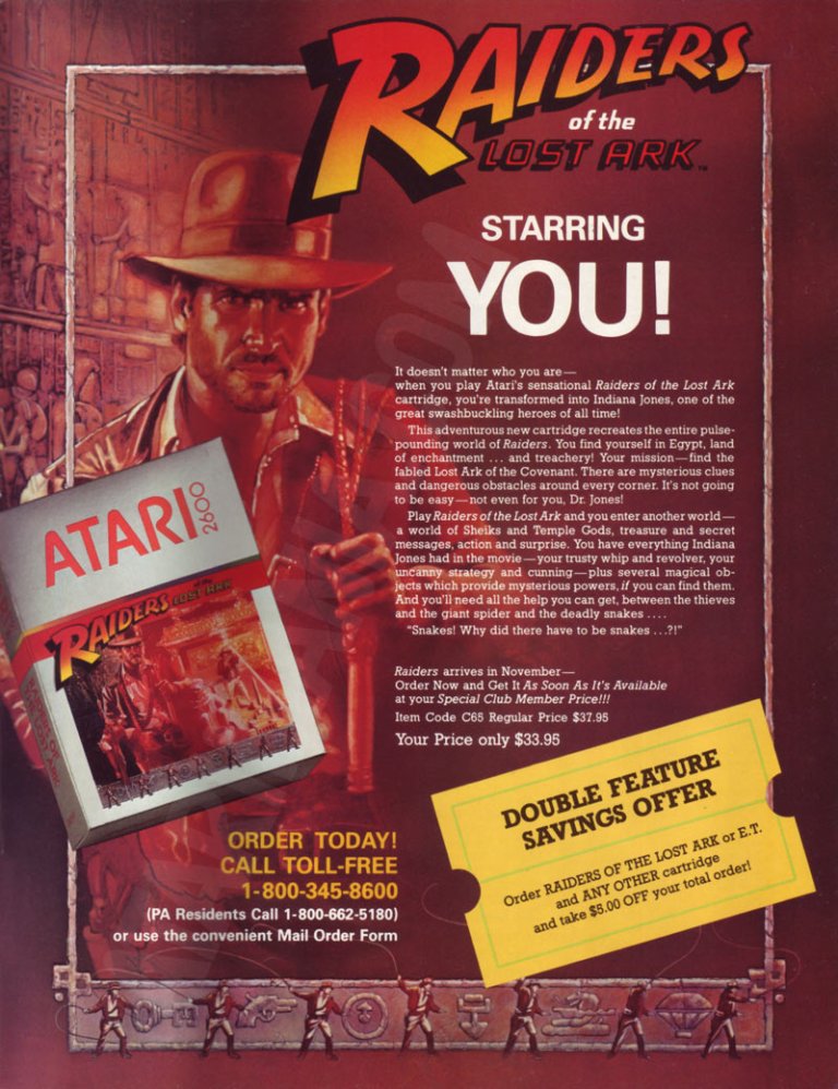
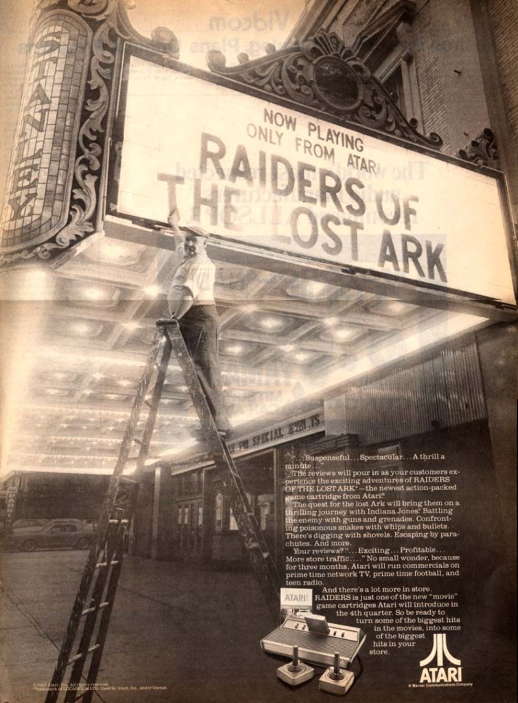
Directed by Steven Spielberg, Raiders of the Lost Ark was one of the best adventure movies ever made as well as the start of the iconic character Indiana Jones. Given its huge commercial success, an official video game adaptation for the Atari 2600 was released in 1982 and game designer Howard Scott Warshaw even met with Spielberg during the game’s development.

To promote the game, Atari released two print ads – one ad had a movie theater exterior visual concept to emphasize they have the official video game adaptation based on the movie while the other ad showed the game’s official artwork and game box cover while emphasizing a savings offer. Atari really did what they could to sell a game while riding on the success of Raiders of the Lost Ark.

2. Phoenix print ad

Even without any screenshots, this print ad’s art still gives viewers a clear idea of what to expect.

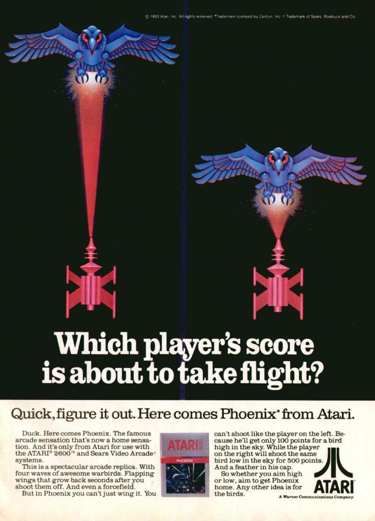
Similar to what they did with Galaxian and Joust, Atari made this print ad promoting Phoenix which was a 2D sci-fi shooting game that was similar with Space Invaders in design. Colorized, hand-drawn artwork resembling the 2D sprites of the game was done to capture the attention of people. The art is so good, it made up for the lack screenshots of the game. 

3. Moon Patrol arcade flyer

Front of the Moon Patrol flyer.
The other side of the arcade flyer.

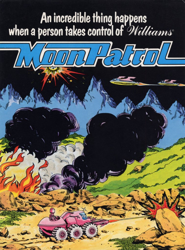
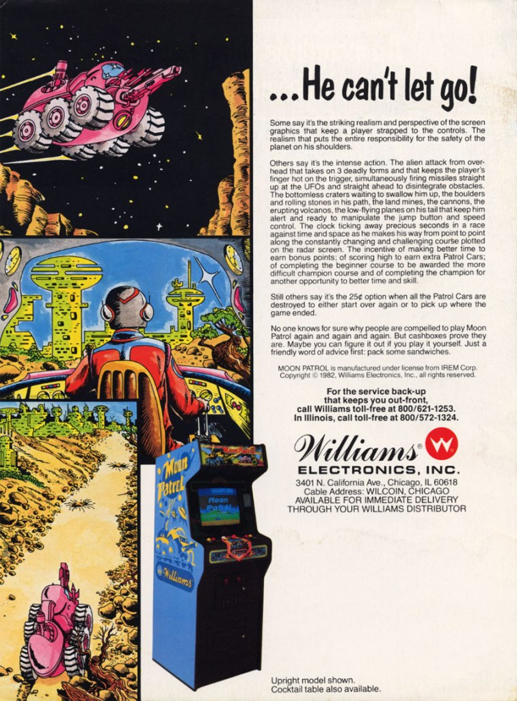
Moon Patrol was a 2D sci-fi side-scrolling adventure game first released in the arcades in 1982. To sell the game to arcade operators, publisher Williams created the North American arcade flyer that heavily used hand-drawn comic book-style artworks on both sides while using available space on the other side for the descriptive text, contact details and the image of an arcade machine. What is very clear is that no screenshots of the game were shown to stand out which explains why a lot of hand-drawn art was used. The picture of the machine showing a screen of Moon Patrol was the closest thing to see a screenshot on this flyer. Personally, I really like the style and quality of the hand-drawn artwork as it made the flyer look lively.

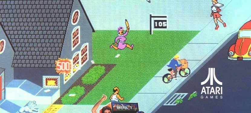
4. Paperboy arcade flyers

The arcade flyer showing the Paperboy machine and screenshots. The hand-drawn art is nice.
This one uses comedy showing a grown man riding a bike as a paper delivery “boy”.
I really like the stronger emphasis on the in-game graphics of Paperboy which dominates the space. What you see is what you get in the arcade.

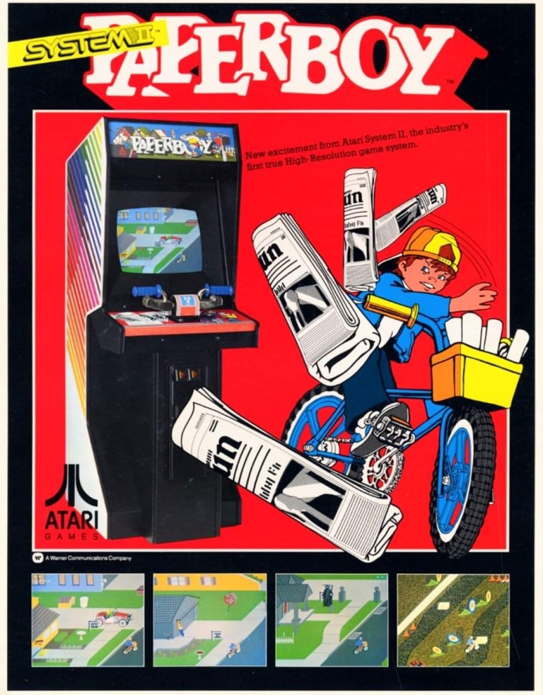
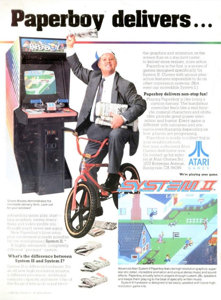
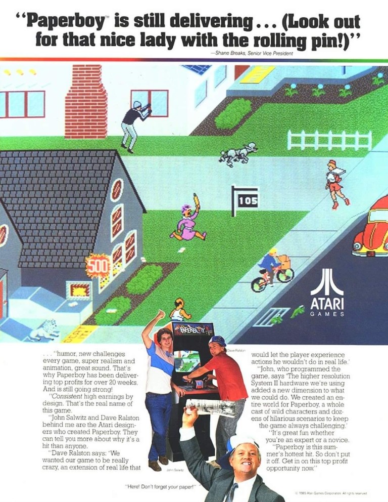
The first time I ever played the classic Paperboy was in the arcade inside a Las Vegas hotel way back in 1989, and it sure was a challenging yet fun experience. Before its arcade debut in 1985, the developers took a lot of risks making the game which includes coming up with a bicycle handle bar for each machine to have. To promote the game, Atari made at least three arcade flyers that creatively emphasized what the game’s concept was about, how did it play, why does the machine have bicycle handlebars and why players can expect fun. Atari’s promotional efforts paid off as Paperboy became a huge hit in the arcades not only in America but also in Japan.

5. Frogger multi-platform print ad

This print ad is still amusing to look at.

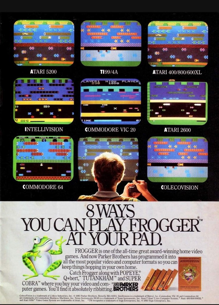
After Frogger became a hit in the arcades, Parker Brothers secured the rights to port the game on Atari consoles, the Intellivision, TI-99/4A, vic-20, the Commodore computers and ColecoVision. To promote their Frogger ports, the single-page print ad was made showing a player in the foreground playing in front of screens that each showed what the game looked like on each platform. Parker Brothers found tremendous success selling 4 million copies of Atari 2600 version of Frogger at a time when there were only 13 million units of Atari 2600 in existence. By the year 2005, video game sales of Frogger reached 20 million worldwide across different platforms.

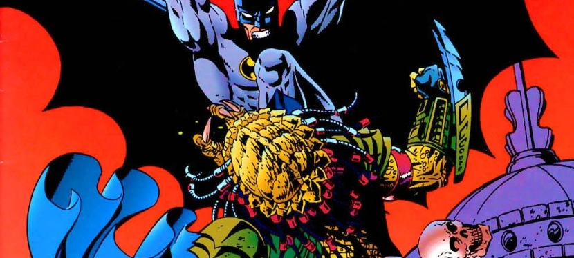
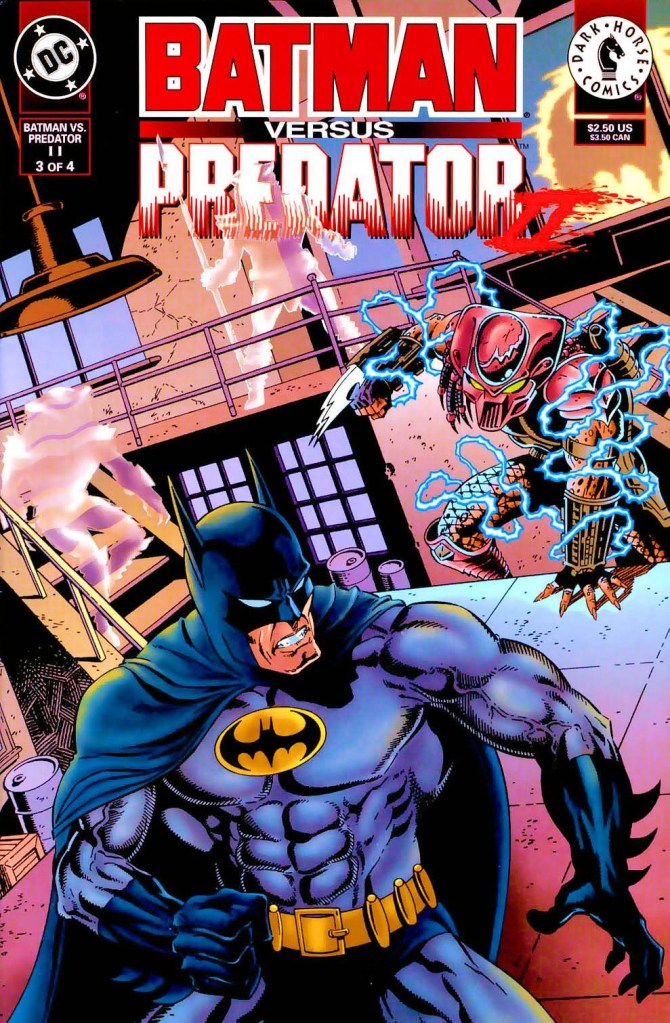
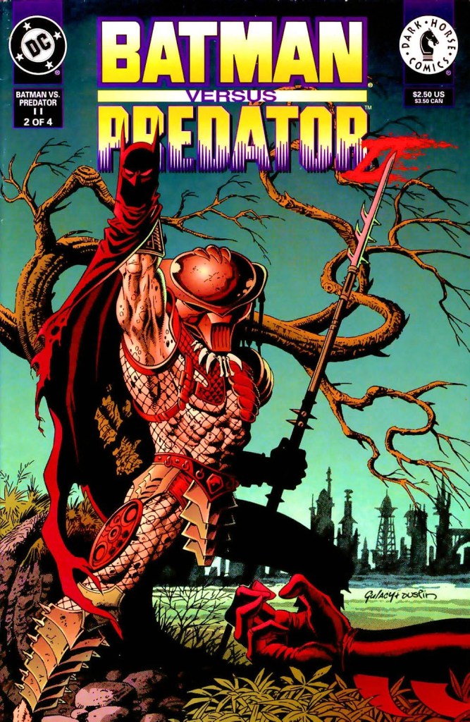
6. Predator 2 print ad

This is one very edgy print ad as used an official image from the movie.

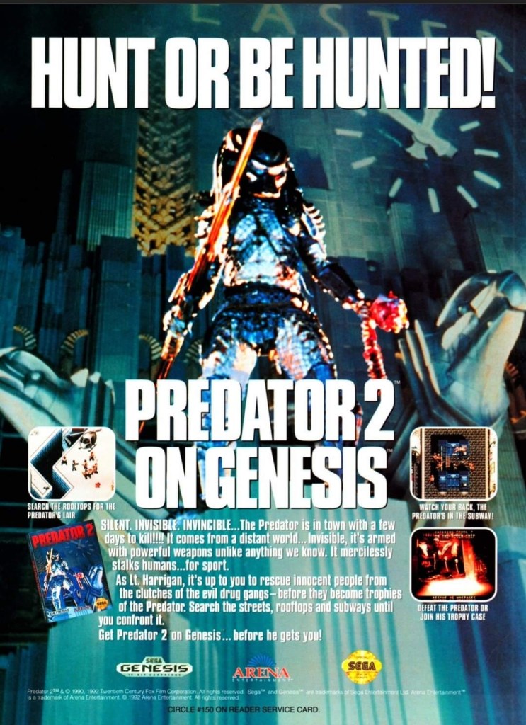
If there is anything memorable about the 1990 film Predator 2, it is the fact that it had the story and the alien hunter itself within a metropolitan setting. That being said, the Sega Genesis Predator 2 video game had a suitable design of shooting and adventuring within the urban settings. This video game ad really captured the vibe of the movie (even showing the reddish human skull with spine on the Predator’s left hand) and clearly showed what gamers could expect. This old ad is still captivating to look at and its edgy approach is still intact.

7. Atari Jaguar print ad

Did you ever own an Atari Jaguar console?

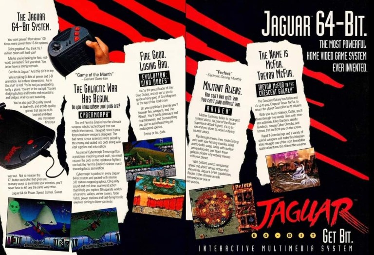
When I was reading video game magazines back in the 1990s, I always found print ads of the Atari Jaguar intriguing to look at. I was very young when I first played the Atari 2600 and its games at home, and later played some Atari games in the arcade. To me, seeing Atari Jaguar print ads like this one gave me moments of nostalgia and it made me wonder if Atari knew what it was doing with their so-called 64-bit game console. They did what they could to promote their console and the games within this 2-page print ad.

8. Vs. print ad

This print ad easily reminds me of the 1990s.

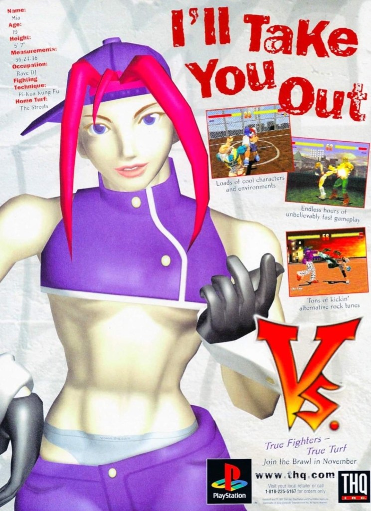
By 1997, both the arcades and the video game console market were filled with lots of 2D and 3D polygonal fighting games. Japan was the hot spot of the production of 3D polygon fighting games and the developer Polygon Magic (based in Japan) made Fighters’ Impact which Taito released in Japanese arcades and the PlayStation. The said game was picked up by THQ for a late-1997 release on the PlayStation in America under the title Vs. I never played this game but I heard that the game’s development included gang-oriented characters designed by Marvel Comics artist Kurtis Fujita. This Vs. ad is a lively reminder about the hip-hop fashion that made its way into video games.

9. GoldStar/LG Electronics 3DO print ad

This is a very weird way to market a video game machine.

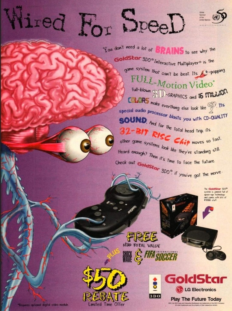
Back in the 1990s, the South Korean electronics company GoldStar (which was part of the umbrella of LG Electronics) had the license to produce 3DO game consoles with its own style. In some ways, the GoldStar 3DO console looked like a premium console on the outside. Unfortunately, the GoldStar 3DO print ad here had a very sloppy presentation as the ad makers used very weird art of a brain-with-eyes holding a 3DO controller leaving little space left to promote the console and games (without any screenshots). The text description was sloppily done. This is a bad example of promoting video game hardware and games.

10. Pandemonium 2 print ad

I saw this ad but never played the game.

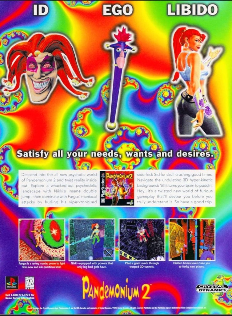
Looking back at 1997, I find it strange that I never got to play Pandemonium 2 on the PlayStation even though I saw its print ad in magazines. I had a lot of fun playing Pandemonium! on the console in 1996 but somehow missed out on its sequel. Looking back at the Pandemonium 2 print ad, I was surprised with how the game developers redesigned the two playable protagonists, especially Nikki who was clearly made to look very sexy. The word “libido” (meaning sexual drive) was deliberately placed above Nikki. The ad also had a hypnotizing mix of colors which I believe was also deliberately done by the ad makers. I can only wonder how the game played.

11. Mission: Impossible print ad

A captivating ad.

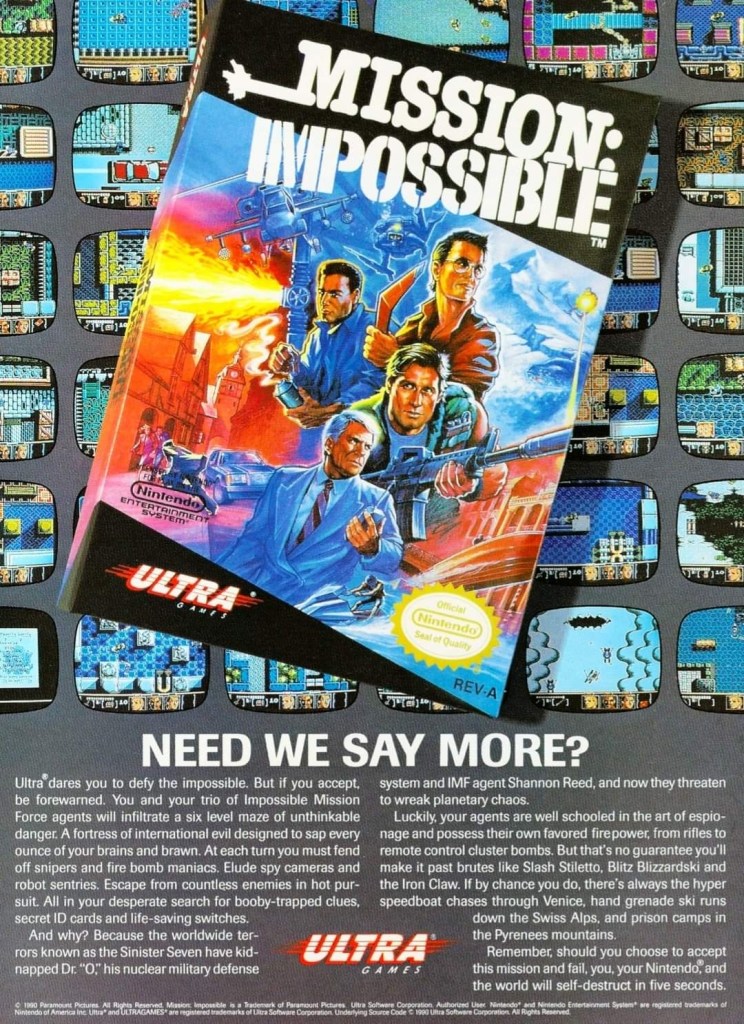
In 1990, Ultra Games (a label of Konami) released the Mission: Impossible video game on the Nintendo Entertainment System (NES) in America. Developed by Konami, the game was an adaptation of the 1988 TV series and it had an ambitious design with regards to level design and gameplay. To promote the game, the ad makers came up with a visual design showing the game’s box (which had a nice painted art on the cover) on the foreground and several screenshots resembling TV monitors on the background. Even by today’s standards, this print ad still looks good and captivating even if you are not too familiar with Mission: Impossible on TV.  

12. The Lawnmower Man Sega CD and Genesis print ad

Are you fan of The Lawnmower Man movie?

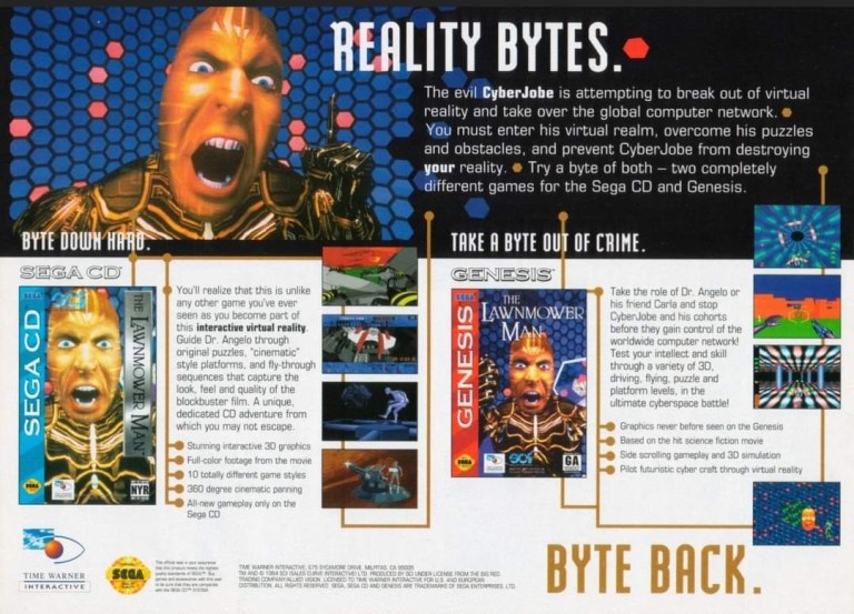
Back in 1992, there was a lot of buzz generated by the movie The Lawnmower Man as it had a disturbing concept that involved virtual reality and, more notably, author Stephen King sued the filmmakers to remove his name from the title because the film differed so much from the source material. Of course, those developments did not stop the production of video game adaptations of the movie. This print ad promoting the Sega CD and Sega Genesis versions of the game heavily used the images of CyberJobe which were among the most memorable images from the film. Looking at the ad, the ad makers could have made the screenshots look a little larger to really sell the games.

13. Ground Zero: Texas print ad

The shotguns really made this ad eye-catching.

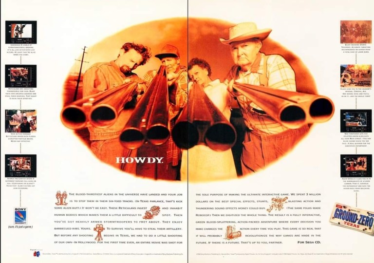
I never played the Sega CD video game Ground Zero: Texas but I knew that it was one of those games that heavily relied on video footage while giving players moments to interact. Back in 1993, there was an increase in the number of video games that carried lots of live action footage to drive the narrative and players were given options in order to progress. What is very notable about the game is not the game design but the very 2-page ad used to promote it. The image showing four people pointing their shotguns towards the viewer was easily the most captivating part of the ad. Even though there was vacant space in between, the screenshots of the game were displayed to be really small.

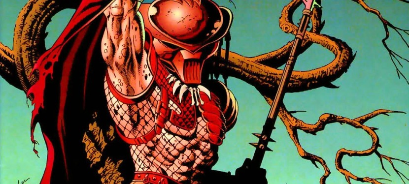
14. Alien vs. Predator for SNES and Game Boy print ad

This ad caught the attention of a lot of people back then.

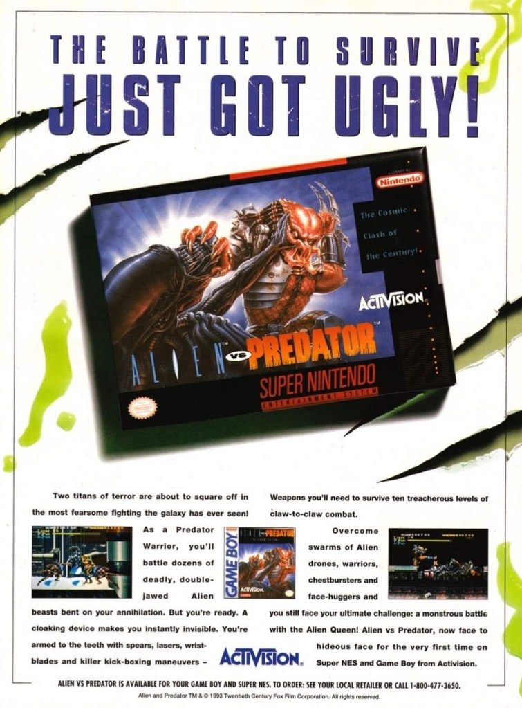
Back in 1990, Dark Horse Comics launched the 4-issue mini-series of Aliens vs. Predator which turned out to be a very intriguing and engaging crossover comic book tale featuring two iconic sci-fi species of monsters. The success of the comic books led to the production of many video games which delighted both fans of Predator and Aliens. In 1993, Activision released Alien vs. Predator on the Super Nintendo Entertainment System (SNES) and the single-page print ad they came up with was engaging to look at. The SNES game box with the fine looking painted art was the main visual highlight leaving just enough space for the descriptive text, the Game Boy cover and two screenshots. Believe it or not, this video game was not related at all with the Alien vs. Predator arcade game and Atari Jaguar console game.

+++++

Thank you for reading. If you find this article engaging, please click the like button below, share this article to others and also please consider making a donation to support my publishing. If you are looking for a copywriter to create content for your special project or business, check out my services and my portfolio. Feel free to contact me with a private message. Also please feel free to visit my Facebook page Author Carlo Carrasco and follow me on Twitter at  @HavenorFantasy as well as on Tumblr at https://carlocarrasco.tumblr.com/ and on Instagram at https://www.instagram.com/authorcarlocarrasco

A Look Back at Batman versus Predator II #4 (1995)

Disclaimer: This is my original work with details sourced from reading the comic book and doing personal research. Anyone who wants to use this article, in part or in whole, needs to secure first my permission and agree to cite me as the source and author. Let it be known that any unauthorized use of this article will constrain the author to pursue the remedies under R.A. No. 8293, the Revised Penal Code, and/or all applicable legal actions under the laws of the Philippines.

Do you happen to have any comic books of the Batman versus Predator II crossover in your collection? According to MileHighComics.com, their near-mint copies are valuable and you can sell them to make some much-needed money in this time of pandemic, government overreach and economic hardship.

Right now, I am about to finally end my review of the Batman versus Predator II mini-series and so far, I have enjoyed it a lot. To find out if this mini-series will come to a satisfying end, here is my retro review of Batman versus Predator II , published in 1995 by DC Comics and Dark Horse Comics with a story written by Doug Moench and drawn by Paul Gulacy.

The cover.

Early story

The story begins in the bat cave with Batman and Alfred discussing what happened lately. As it turned out, there were two other Predators on the lose apparently sent to stop the first one (who killed one of the mentioned two). Batman also mentioned the deaths of Song Sung and Terraro. Now there are two hunters remaining who may not know that the man who issued their contracts is dead.

Just before leaving with the motorcycle, Batman receives a call from Commissioner Gordon through the special line. Afterwards, he leaves.

In the city, a thug on a motorcycle starts chasing Batman which catches the attention of the local police…

Quality

From the final encounter with the hunter from space.

This comic book is a satisfying conclusion to the mini-series. In terms of writing, issue delivered the payoff for what was built-up in issue . This results the return of Batman’s trusted ally as well as some more involvement of the police force as the stakes were raised in issue with the involvement of more than one Predator. The hunter Predator – the one Batman and Huntress encountered in the first two issues – was indeed present and it was very interesting to see it pursue its encounter with the two heroes even though he was being hunted by a fellow Predator.

Having more than one Predator was initially confusing but the confusion did not last too long which readers will find relieving. As expected, the Huntress joined Batman in the final encounter and served nicely as a fighting partner whose assistance proved to be valuable. If there is any weak spot in the presentation, it’s the element of the gang and human hunters who only served to add to the death toll.

As with the first three issues of this mini-series, the action here remains very intense and quite uncompromising with its violence. Expect gunshot wounds and decapitations here and there. The hard action presented, especially in the encounters with the Predator, was indeed satisfying. I should state that the final encounter inside the space ship is very thrilling.

Conclusion

The Bat signal is an attraction to the Predator.

Batman versus Predator II (1995) is a pretty solid read. What was built-up previously, got paid off nicely here. With regards to raising the stakes and making this mini-series different from its predecessor, the creative team succeeded with the resolutions they came up with. In addition, Batman and the Huntress make a solid duo and their interactions together were compelling.

If you are seriously planning to buy an existing hard copy of Batman versus Predator II (1995) be aware that as of this writing, MileHighComics.com shows that the near-mint copy of the comic book costs $50.

Overall, Batman versus Predator II (1995) is highly recommended!

+++++

Thank you for reading. If you find this article engaging, please click the like button below and also please consider sharing this article to others. If you are looking for a copywriter to create content for your special project or business, check out my services and my portfolio. Feel free to contact me as well. Also please feel free to visit my Facebook page Author Carlo Carrasco and follow me at HavenorFantasy@twitter.com

A Look Back at Batman versus Predator II #3 (1995)

Disclaimer: This is my original work with details sourced from reading the comic book and doing personal research. Anyone who wants to use this article, in part or in whole, needs to secure first my permission and agree to cite me as the source and author. Let it be known that any unauthorized use of this article will constrain the author to pursue the remedies under R.A. No. 8293, the Revised Penal Code, and/or all applicable legal actions under the laws of the Philippines.

I am currently enjoying the Batman versus Predator II mini-series of the mid-1990s which was a joint effort between DC Comics and Dark Horse Comics. The first issue was great and nicely built up the energy for the first encounter between Batman and the Predator in issue #2. Along the way, I do enjoy the adulterated tone that came with the presentation. This made each issue look and feel like an R-rated cinematic segment.

Will the strong quality of this crossover continue in the third issue? Find out with me in this look back at Batman versus Predator II , published in 1995 by DC Comics and Dark Horse Comics with a story written by Doug Moench and drawn by Paul Gulacy.

The cover.

Early story

The story begins with Batman emerging from the sewer. He finds himself alone in the middle of a city street and senses danger is around him. Suddenly someone from one of the nearby buildings fires at Batman who dodges and takes cover by a car. He grabs a tool and throws it at the window which hits the rifle. And then, on the street, a man throws a grenade at the caped crusader who deflects it. The grenade enters a nearby establishment and explodes. Batman kicks the antagonist and then encounters a speeding vehicle heading towards him.

The detective fires his weapon which causes the car’s windshield to get smashed. He dodges the car and sees it crash. Suddenly the floor beneath him opens which compels him to use his grapnel to avoid falling down to spikes below.

Meanwhile at another location, the Predator dissolves the decapitated head of a man (killed in issue ) with hot liquid and keeps the skull for his collection of trophies.

Back at the Bat Cave, Batman and Alfred analyze what happened recently. Alfred states that the Predator killed two of the seven assassins hired by Terraro to kill Batman. The great detective wonders why…

Quality

The Huntress and Batman.

Let me start with the storytelling. The writing by Doug Moench is solid and, more importantly, there is a nice payoff here in relation what was gradually built up in the first two issues – Terraro’s assassins and operations getting more lively within the plot. This alone adds some nice variety into the ongoing Batman-Predator rivalry, and symbolically the Huntress (who is after Terraro) is involved with the mafia plot and the said rivalry between Gotham’s detective and the hunter from space.

More on Batman and the Huntress, I like the way Moench wrote these two heroes as being divided even though they both face threats from the crime gang and from the Predator. Both characters are vigilantes but Batman has justice in mind while the Huntress is focused on hunting the powerful crime boss. Adding more depth to the story is the subplot about Commissioner Gordon being helpless and recovering in the hospital which complicates matters for the Gotham City police department.

Another thing that makes this issue more unique is the in-depth presentation of Batman doing detective work in the Bat Cave with Alfred providing insight. This alone makes this issue an improvement over issue .

When it comes to the visuals, artist Paul Gulacy continues to provide really nice artwork backed with strong support by the colorists. Gulacy took his time pacing the story by following the script closely and made key action scenes look dynamic visually when needed.

Conclusion

Remember the armor Batman wore in the previous crossover story against the Predator?

Considering all the good stuff I enjoyed in it, Batman versus Predator II is a great read. It has a better balance on plotting, detective work, spectacle and intrigue. In fact, this comic book has a much more powerful ending than issues and , and the ironic thing is that this only leads to the 4th and final issue which I’ll review soon.

If you are seriously planning to buy an existing hard copy of Batman versus Predator II (1995), be aware that as of this writing, MileHighComics.com shows that the near-mint copy of the comic book costs $40.

Overall, Batman versus Predator II (1995) is highly recommended!

+++++

Thank you for reading. If you find this article engaging, please click the like button below and also please consider sharing this article to others. If you are looking for a copywriter to create content for your special project or business, check out my services and my portfolio. Feel free to contact me as well. Also please feel free to visit my Facebook page Author Carlo Carrasco and follow me at HavenorFantasy@twitter.com

A Look Back at Batman versus Predator II #2 (1995)

Disclaimer: This is my original work with details sourced from reading the comic book and doing personal research. Anyone who wants to use this article, in part or in whole, needs to secure first my permission and agree to cite me as the source and author. Let it be known that any unauthorized use of this article will constrain the author to pursue the remedies under R.A. No. 8293, the Revised Penal Code, and/or all applicable legal actions under the laws of the Philippines.

When done right with the comic book format, fantasy crossover concepts can become very entertaining and memorable. Such was the case with the comic book Batman versus Predator II: Bloodmatch which I enjoyed reading a lot.

Now we can find out if the creative team behind that memorable comic book could maintain the high quality of fun and engagement in this look back at Batman versus Predator II , published in 1995 by DC Comics and Dark Horse Comics with a story written by Doug Moench and drawn by Paul Gulacy.

The cover.

Early story

The story begins in the forest outside of Gotham City. A fake use of the Batman signal was lighted there by the Predator which was meant to lure Batman into a potential trap. As soon as he arrived, Batman believes that his old ally commissioner James Gordon bought a portable Batman signal meant to call him to a crime scene far away from the urbanized areas.

Expecting to see Gordon in the woods, Batman sees a tree with several men’s heads hanging each with a net. He realizes that the Predator lured him into what he calls the hunting ground. Batman is correct as the Predator, standing nearby, unleashes a weapon to attack him…

Quality

This one really looked out of place in this comic book.

A pretty good crossover comic book. When it comes to storytelling, the comic book starts paying off the anticipation built up in issue by presenting Batman in an early encounter with the Predator which, I must say, was smartly handled complete with key references to the previous Batman versus Predator crossover series from the early 1990s. What happened in the said encounter between the two pop culture icons will make you reflect about what you know about Batman and the Predator. Given how the story turned out, clearly the encounter (which was quite beefy) served as a sign of what is more to come between Batman and the Predator (or the race of Predators). The Huntress meanwhile has a slightly reduced spotlight which is not surprising but she still proved her worth in the conflict. When it comes to presenting the respective views of Batman and the Huntress, I admire the use of narration boxes (instead of the traditional thought balloons) which added depth to the story.

Meanwhile, there is a subplot about an assassin from Asia who came all the way to America for a key transaction. However, this subplot (which does not even look like it’s related to the Batman-Predator conflict) ended up looking like filler.  

Conclusion

An action-packed encounter between the Dark Knight and the warrior from outer space!

Batman versus Predator II (1995) is almost as good as issue but its first, action-packed encounter between the Dark Knight and the warrior from outer space alone makes it worth collecting.

If you are seriously planning to buy an existing hard copy of Batman versus Predator II (1995), be aware that as of this writing, MileHighComics.com shows that the near-mint copy costs $30.

Overall, Batman versus Predator II (1995) is recommended.

+++++

Thank you for reading. If you find this article engaging, please click the like button below and also please consider sharing this article to others. If you are looking for a copywriter to create content for your special project or business, check out my services and my portfolio. Feel free to contact me as well. Also please feel free to visit my Facebook page Author Carlo Carrasco and follow me at HavenorFantasy@twitter.com