A Look Back at X-Men #25 (1993)

Disclaimer: This is my original work with details sourced from reading the comic book and doing personal research. Anyone who wants to use this article, in part or in whole, needs to secure first my permission and agree to cite me as the source and author. Let it be known that any unauthorized use of this article will constrain the author to pursue the remedies under R.A. No. 8293, the Revised Penal Code, and/or all applicable legal actions under the laws of the Philippines.

As an X-Men fan, 1993 was a memorable year for me during my time of collecting comic books and enjoying what was believed to be the modernization of superhero comics in America. Gimmick covers of comic books, the post-event effects of the Death of Superman, the launch of the Ultraverse and then there was the 30th anniversary celebration of the X-Men which was wild.

To put things in perspective, Marvel Comics organized the celebration of the 30th anniversary of Spider-Man releasing lots of merchandise and, most notably, special issues of comic books that came with covers with holograms, more pages for content and a cover price that was more than double than what was normal (note: read my review of one of them). Such comic books were hot stuff for not only Spider-Man fans but also comic collectors who were often hunting for the next great collector’s item that would ensure them great wealth.

Marvel had the same business approach with the 30th anniversary of the X-Men, and there were multiple X-Men-related monthly series of comic book back then. X-Factor #92, X-Force #25, Uncanny X-Men #304, Wolverine #75 and Excalibur #71 all were released with covers with hologram cards on the front, more pages of content and inflated cover prices.

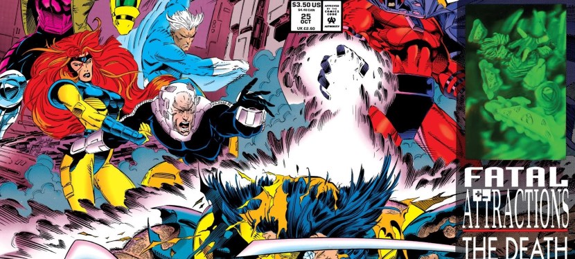
The one 30th anniversary celebration comic book of the X-Men that was most memorable to me was X-Men #25 (Volume 2) and to this day, its plot remains very memorable for its shock value. I bought my copy of this comic book at a store in BF Homes. With the history lesson over, he is my retro review of X-Men #25, published in 1993 by Marvel Comics with a story written by Fabian Nicieza and drawn by Andy Kubert.
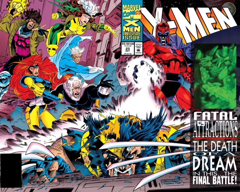
The cover.

Early story

The story begins with the United Nations Security Council’s approval to initiate the alpha and beta parameters of the Magneto Protocols which literally sent waves from the White House to the Kremlin. A short time later, several satellites orbiting the Earth activate and linked with each other to form a protective mesh of electro-magnetic fire. This provokes Magneto (accompanied by Acolytes and Exodus at Avalon) to react by generating a massive pulse wave that affects the entire world. Even the Fantastic Four and Excalibur were not spared.

At the School of Gifted Children, Charles Xavier organizes an urgent meeting with the X-Men. Together they discussed the impact of Magneto’s pulse wave which not only rendered world’s mechanical and technological resources useless but also caused trouble (plane crashes, medical equipment failure, etc.) and deaths. For Xavier, the mere fact their team survived (aided by Shi’ar technology) is a mistake on the part of Magneto considering his capability to wipe out life around the world.

In response to Wolverine’s question, Xavier stated, “We do not have the luxury of time, nor the occasion for nobility…at this point, we are not fighting for the philosophy of a cause, a hope, or a dream, we are fighting for our very survival and if we do not win this fight, this planet will be irrevocably lost to us!”

Quality
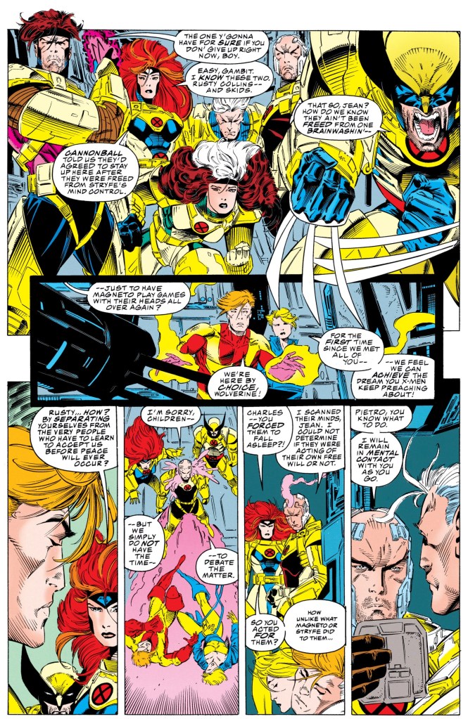
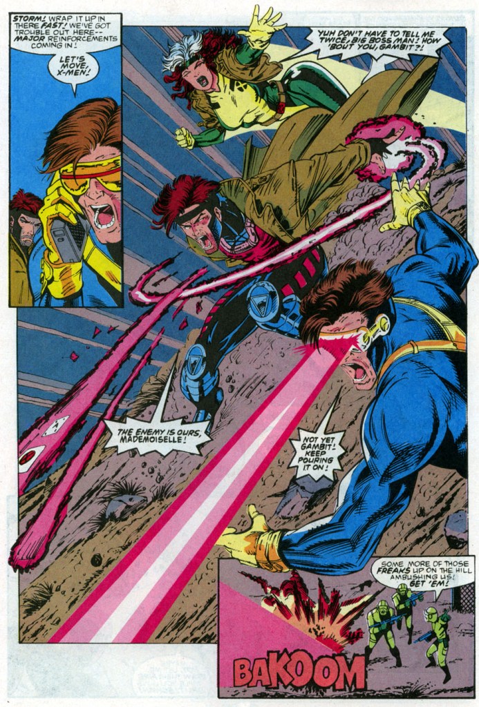
The X-Men during their daring mission.

I can clearly declare that when it comes to the combined works done by Fabian Nicieza and Andy Kubert with the X-Men, this particularly story was not only the most ambitious collaboration of theirs but also their most compelling and finest work at the time of publishing. Very strong writing (top-notch characterization, plotting and pacing) and great art really defined this comic book!

Characterization is spot-on! Wolverine is arrogant and gritty as usual, Gambit is still the smooth-talker, Cyclops is the focused leader serving under Xavier, etc.

Without spoiling the major details, I can say that the shocking moments executed were greatly done not for the mere intention of shocking but to break new ground with regards to the characters of Wolverine and Charles Xavier. The first time I read this comic book back in 1993, I was really stunned with those particular scenes and I started to question Wolverine’s durability as well as Xavier’s sanity. And then there was the state of Magneto at the end of the story. The thing about the shocking moments was that there was an adequate amount of build-up leading to them and the pay-off was excellently done.

Conclusion
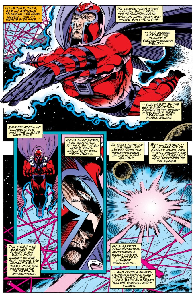
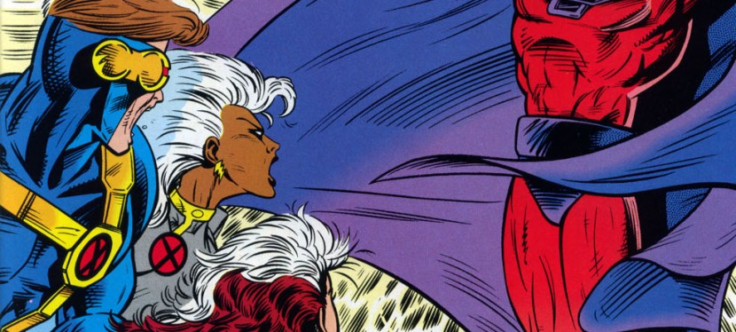
The immense power of Magneto.

There is no doubt in my mind that X-Men #25 (1993) is the true gem of the entire X-Men 30th anniversary celebration. The creative team led by Nicieza and Kubert really outdid themselves and what happened in this comic book had consequences that lasted for a good number of years. The creative team took big risks and pulled them off nicely as the impact of the story was eventually felt in the years that followed. Lastly, unlike Uncanny X-Men #304 (supposed to be the highlight of X-Men’s 30th anniversary celebration), this comic book is more focused and really had no creative baggage nor filler that got in the way of the storytelling.

If you are seriously planning to buy an existing hard copy of X-Men #25 (1993), be aware that as of this writing, MileHighComics.com shows that the near-mint copy of the regular edition costs $50 while the near-mint copy of the newsstand edition is priced at $150. The near-mint copies of the signed-and-numbered edition and the gold edition cost $210 and $368 respectively.

Overall, X-Men #25 (1993) is highly recommended!

+++++

Thank you for reading. If you find this article engaging, please click the like button below and also please consider sharing this article to others. If you are looking for a copywriter to create content for your special project or business, check out my services and my portfolio. Feel free to contact me as well. Also please feel free to visit my Facebook page Author Carlo Carrasco and follow me at HavenorFantasy@twitter.com
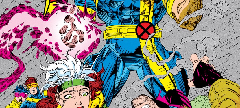
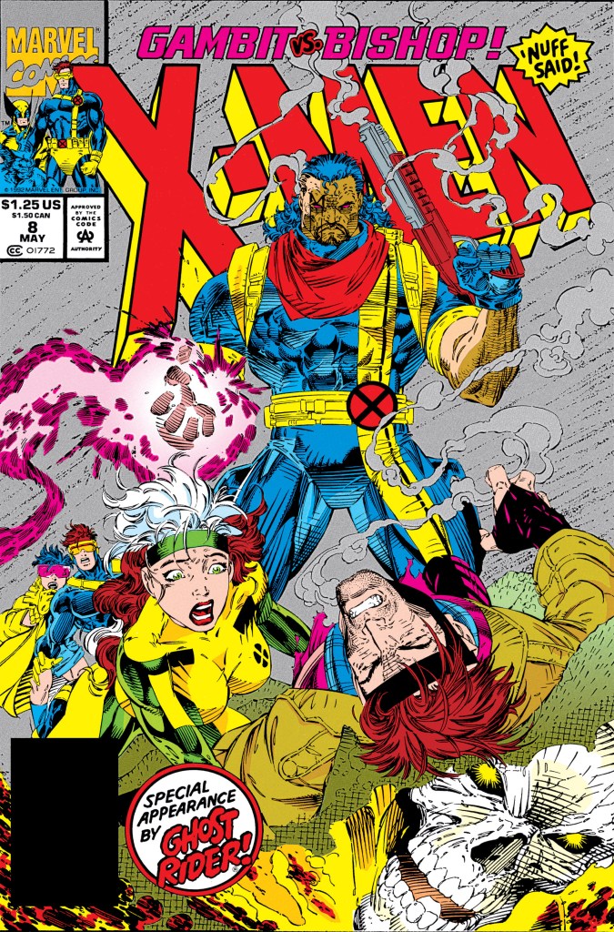
A Look Back at X-Men #8 (1992)

Disclaimer: This is my original work with details sourced from reading the comic book and doing personal research. Anyone who wants to use this article, in part or in whole, needs to secure first my permission and agree to cite me as the source and author. Let it be known that any unauthorized use of this article will constrain the author to pursue the remedies under R.A. No. 8293, the Revised Penal Code, and/or all applicable legal actions under the laws of the Philippines.

Do you remember the X-Men animated TV series episode – an adaptation of Days of Future Past – wherein Bishop (who came from the dark future) claimed that Gambit would betray the X-Men and lead them all to darkness? You will see Bishop and Gambit in conflict in this retro review of a Jim Lee-drawn X-Men comic book from the 1990s.

To put things in perspective, back in 1991 Bishop was formally introduced in the Uncanny X-Men monthly series. By that time, Gambit was already wildly popular with X-Men fans. It made sense back then to have the two conflict each other in comic book format as it would add variety and some freshness with the X-Men franchise of the time.

With the short history lesson over, here is a look back at X-Men #8, published in 1992 by Marvel Comics with a story done by Jim Lee and Scott Lobdell. The art was handled by Lee and Art Thibert.

The cover.

Early story

The story begins at the X-Men’s headquarters with Wolverine using the computer to gain access into something until he got interrupted by Jubilee who is accompanied by Cyclops. She tells him that Charles Xavier is about to introduce Bishop to their teammates. Wolverine tells them to go away.

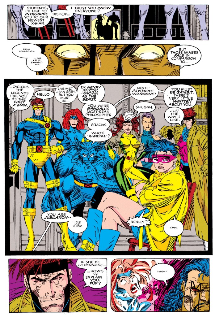
At the mansion, Storm welcomes Bishop in the presence of Xavier who explains to her that the newcomer is from the far future. Slowly Xavier and Storm guide Bishop around the mansion and introduce him to their members. Bishop, who still remembers the legends of the X-Men from his time in the far future, referred to Forge as Genesis. Moments later, Bishop meets Cyclops, Jean Grey, Beast, Rogue, Psylocke, Jubilee and Gambit.

After expressing that there was little know about Gambit, Bishop then claims that a certain someone was the last person to see the X-Men alive before they got betrayed by one of their own. Bishop then tells Xavier to scan Gambit’s thoughts…

Quality

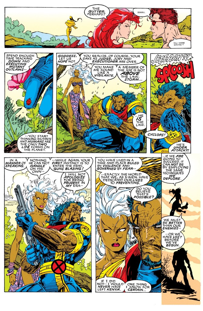
The interaction between Storm and Bishop is great!

What really defines this comic book apart from having art by Jim Lee and the lack of villains are the storytelling and characterization. The good news is that the respective qualities of the plotting (by Lee) and scripting (by Lobdell) were very solid. While there is a lack of a good-versus-evil plot element, characterization alone made this an engaging comic book to read. Without spoiling the plot, the story has a lot more than the promised Bishop-Gambit conflict (I’ll describe it as a short yet sweet part of the story). I also love the big twist that happened in the 2nd half of the story.

More on characterization, I love the fact that Gambit got more developed here complete with a few threads from his past that got visualized efficiently. I also enjoyed the interactions between Gold Team leader Storm and Bishop. Bishop comes from a future filled with violence and desperation which explains why he is always on the edge often thinking of action whenever something happens. Storm meanwhile tried hard to explain to Bishop that their present day society is more peaceful and that he could take things a bit easier, be more reasonable and try to level with others as he became a new part of the X-Men.

As for Jim Lee’s art, his work here is really beautiful to look at which is not surprising at all. As expected, he made the action scenes look dynamic and managed to draw some emotions from certain characters in key scenes.

Conclusion

Bishop meeting the X-Men.

X-Men #8 (1992) is a pretty good comic book to read. At the time of its publication, the integration of Bishop into the X-Men was done months after Chris Claremont’s departure and was clearly an effort by the X-Men creators to modernize the superhero team and keep it fresh. This comic book is not exactly a landmark read but it is pretty entertaining and engaging.

If you are seriously planning to buy an existing hard copy of X-Men #8 (1992), be aware that as of this writing, MileHighComics.com shows that the near-mint copy of the regular edition costs $50 while the near-mint copy of the newsstand edition costs $150.

Overall, X-Men #8 (1992) is recommended.

+++++

Thank you for reading. If you find this article engaging, please click the like button below and also please consider sharing this article to others. If you are looking for a copywriter to create content for your special project or business, check out my services and my portfolio. Feel free to contact me as well. Also please feel free to visit my Facebook page Author Carlo Carrasco and follow me at HavenorFantasy@twitter.com
A Look Back at Prime #12 (1994)

Disclaimer: This is my original work with details sourced from reading the comic book and doing personal research. Anyone who wants to use this article, in part or in whole, needs to secure first my permission and agree to cite me as the source and author. Let it be known that any unauthorized use of this article will constrain the author to pursue the remedies under R.A. No. 8293, the Revised Penal Code, and/or all applicable legal actions under the laws of the Philippines.

Hey Ultraverse fans and superhero comic book enthusiasts! Are you ready for another tale of Prime? What I am about to review is one of the anniversary Ultraverse issues published by Malibu Comics.

What could be new or special to justify the anniversary of the Prime monthly series? We can all find out in this look back at Prime #12, published by Malibu Comics with a story written by Len Strazweski and Gerard Jones, and drawn by the late Norm Breyfogle.

The cover.

Early story

The story begins with a young guy named Kuttner who tests his deadly ability to easily cut through solid objects with his powered blades on his hands. He is driven to get revenge against Prime who broke his hand previously. Kuttner, whose career in entertainment had declined, thinks he can establish a new career for himself as a powered being and Prime is his first target.

Meanwhile at school, Kevin Green (Prime) is struggling with the stress over his parents’ separation which he is guilty of. He finds it very weird to be back in school after everything he went through such as his struggles with Colonel Samuels, the Federal Government, Break-Thru and more. After slamming his locker shut, students begin to move away from him…

Quality

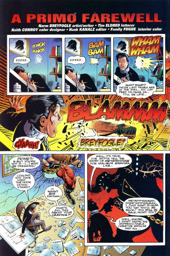
Symbolically, Prime meets Norm Breyfogle.

To begin with, the writing by Len Strazewski and Gerard Jones is very solid as expected. That being said, the real heart of the story in this comic book is Kevin Green’s personal struggle with life not just with the difficulty of balancing himself between his personal life and being a superhero, but also his place in local society being tainted as a result of his acts as Prime. The way that the events of the previous issues affected (in negative ways) the local community’s perception of Kevin was very compelling and straight to the point.

The strong writing, unsurprisingly, worked very well with the character development. Kevin was presented to be struggling with making the right decisions and he struggles to analyze what would happen if he presents himself to others as Prime or as simply himself. As for the scene between Prime and Kelly’s mother, there was that touch of awkwardness (through Prime) that was present as the scene raised the disturbing idea of the two possibly getting involved sexually.

When it comes to the spectacle of action, there is little to be seen here but the good news is that Norm Breyfogle illustrated them to be energetic and eye-catching. The late illustrator really knew hot to ramp up the energy for the readers making the most out of what it is limited.

Conclusion

The tremendous strength of Prime!

Prime #12 is a pretty engaging read. Was it worth the anniversary promotion? It is indeed! If you look back at Prime #1 and read all the succeeding issues leading to this one, you will notice how much Kevin Green changed as well as how his personal growth moved. In a way, Prime #12 symbolizes the growing-up pains Kevin keeps on having.

It should be stated that being 64-pages, Prime #12 is actually one of Malibu’s flip issues. The other side of this comic book is Ultraverse Premiere #3 which contains standalone short stories of Prime, War Strike and a certain villain. This comic book also has “A Primo Farewell” which is a nice tribute (by today’s standards) to Norm Breyfogle. For the newcomers reading this, Breyfogle was one of outstanding comic book artists in America and before joining Malibu Comics, he worked for other publishers like Marvel Comics, DC Comics, Eclipse Comics and First Comics. At DC Comics, his work on their icon Batman is widely remembered. Breyfogle passed away in 2018.

If you are seriously planning to buy an existing hard copy of Prime #12 (1994), be aware that as of this writing, MileHighComics.com shows that the near-mint copy of the comic book costs $8.

Overall, Prime #12 (1994) is highly recommended!

+++++

Thank you for reading. If you find this article engaging, please click the like button below and also please consider sharing this article to others. If you are looking for a copywriter to create content for your special project or business, check out my services and my portfolio. Feel free to contact me as well. Also please feel free to visit my Facebook page Author Carlo Carrasco and follow me at HavenorFantasy@twitter.com
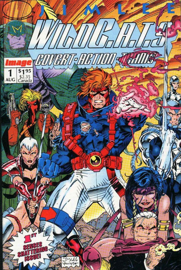
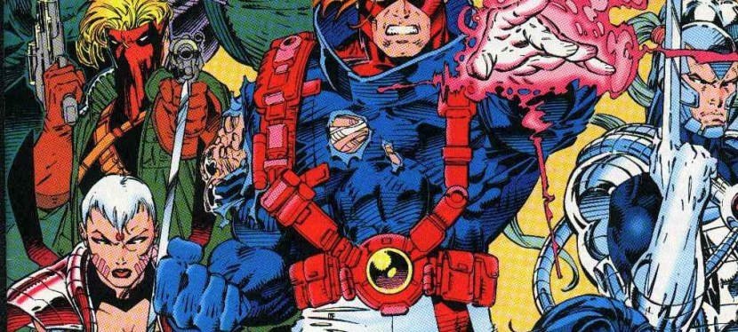
A Look Back at WildC.A.T.s: Covert Action Teams #1 (1992)

Disclaimer: This is my original work with details sourced from reading the comic book and doing personal research. Anyone who wants to use this article, in part or in whole, needs to secure first my permission and agree to cite me as the source and author. Let it be known that any unauthorized use of this article will constrain the author to pursue the remedies under R.A. No. 8293, the Revised Penal Code, and/or all applicable legal actions under the laws of the Philippines.

Before he became the co-publisher of DC Comics, the great Jim Lee made his debut in the comic book industry as an illustrator for Marvel Comics. Just a few short years after that, he became a fan-favorite of X-Men fans and was a major factor in the massive sales success of 1991’s X-Men #1 (Volume 2). Not only did that particular comic book established a long-lasting sales record for all comic books, Lee’s designs and visual concepts for the X-Men were adapted by the producers and creators of the fan-favorite X-Men: The Animated Series (1992-1997).

For the newcomers reading this, Jim Lee’s tenure with Marvel Comics ended in December 1991 when he, Rob Liefeld and Todd McFarlane met with the publisher and expressed that Marvel’s policies toward them were unfair and they were not rewarded well for their work. To put things in perspective, Jim Lee’s X-Men #1, Rob Liefeld’s X-Force #1 and Todd McFarlane’s Spider-Man #1 were respectively million-sellers. As such, Lee, Liefeld, McFarlane plus some more creators left Marvel and went on to establish Image Comics (which involved a production and distribution deal with Malibu Comics).

In 1992, Jim Lee’s dream project – with concepts first created in 1986 – came through free from the constraints he endured from Marvel’s editorial team and strict policies. That’s dream project was WildC.A.T.s: Covert Action Teams #1, which is the feature of this retro comic book review.

But before we start the review, here’s a quick look back at the conceptual history of WildC.A.T.s as written by Jim Lee himself.

“I created my first ‘professional’ comic book submission in the summer of 1986 entitled The Wild Boys involving an espionage agency called International Operations. The co-writer of that sublime piece of work was coincidentally enough – Brandon Choi – who at the time was still in college getting a double major in history and politics,” Lee wrote in the comic book’s intro.

Now that we’re done with the history, here is a look back at WildC.A.T.s: Covert Action Teams #1, published in 1992 through Image Comics with a story co-written by Jim Lee and Brandon Choi. Lee illustrated the comic book with ink work done by Scott Williams.

The cover.

Early story

The story begins in Antarctica in 1986. There, two men braved the cold weather searching for something with information they learned from IO (International Operations). Suddenly an orb rises from the snow and then an image of a lady wearing silver tights and wielding energy appears in front of them. After demanding them to let her have the orb, she and the energy field fade away.

In 1992, at the crisis control facility of IO in Virginia, IO’s executives carefully view video footage of Georgetown which was hit by an explosion. They suspect rogue C.A.T.s (covert action teams) could have been involved. Suddenly, the same energy field from six years earlier forms in their presence with the same lady appearing for a few moments. The energy field fades away.

In the present day, a dwarf named Jacob Marlowe wakes up in the middle of garbage in an alley. After getting hurt by two troublemakers, the same silver lady from the past appears and uses her energetic power to save Jacob. She introduces her to him as Void, claiming he came for him and she knows he was once a lord named Emp. She tells him the Cabal is a threat to humans on Earth…

Quality

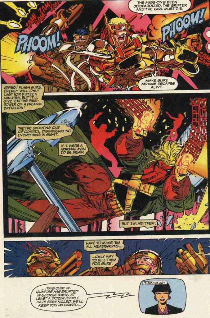
Clearly Jim Lee took inspiration from John Woo’s action movies.

When it comes to the presentation of the story, the comic book starts in a deliberately cryptic way. It’s like having very short prologues back to back and, fortunately, it works well to capture attention while building up slowly its concept. The story really begins when Jacob Marlowe arrives at his headquarters with Void as his enduring advisor and executor. The introductions of each of the team’s members – Spartan, Warblade, Maul, Grifter, Zealot and Voodoo – were decently done and never felt rushed as Jim Lee and Brandon Choi carefully paced the storytelling and really tried to balance exposition and spectacle. That being said, similar results happened with regards to the comic book’s spotlight on the Cabal and its evil leader.

With regards to the presentation of the classic conflict between good and evil, Lee and Choi came up with the concept of planet Earth being slowly infiltrated by Daemonites (who originated in outer space) with the Cabal serving like an anchor with an organized set-up for domination. Over at the WildC.A.T.s, Marlowe formed a team to fight and stop the Cabal since the lives of the people of Earth are at stake. This is a really nice concept serving as the foundation, and the irony is that, in this comic book specifically, IO was on the sideline.

When it comes to the visuals, Jim Lee must have enjoyed the liberty he had in illustrating this comic book…free from the editorial interference from Marvel and free too from the restrictions of the Comics Code Authority (CCA). The result here is a visual presentation showing more Lee’s creativity and a style different somewhat from his final works on X-Men. He clearly took more inspiration from action movies and the violence is somewhat more mature to look at. It should be noted that Scott Williams helped Lee’s art shine.

Conclusion

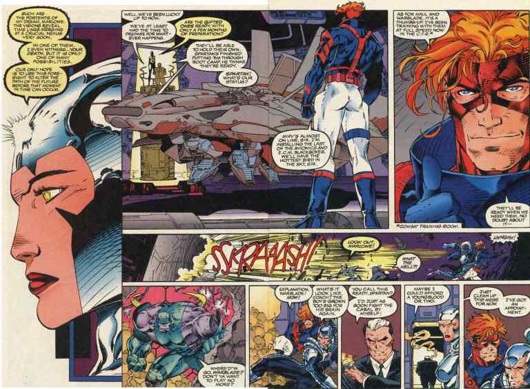
These two pages remind me somewhat of the X-Men, their jet and the Danger Room.

By today’s standards, WildC.A.T.s: Covert Action Teams #1 is surprisingly still a good superhero team comic book to read. It’s not a literary classic but it proved to be compelling and fun enough to read from start to finish. It has a decent amount of action here and there which is understandable since Choi and Lee had to build up the concepts and the plot. If there were any weak spots, this comic book is almost devoid of character development and the clear lack of a lead character (which is still needed even for a superhero team comic book).

If you are seriously planning to buy an existing hard copy of WildC.A.T.s: Covert Action Teams #1 (1992), be aware that as of this writing, MileHighComics.com shows that the near-mint copy of the regular edition costs $5 while the near-mint copy of the newsstand edition is priced at $16. The near-mint copy of the 3D edition costs $9 while the near-mint copy of the gold cover edition is priced at $42.

Overall, WildC.A.T.s: Covert Action Teams #1 (1992) is recommended.

+++++

Thank you for reading. If you find this article engaging, please click the like button below and also please consider sharing this article to others. If you are looking for a copywriter to create content for your special project or business, check out my services and my portfolio. Feel free to contact me as well. Also please feel free to visit my Facebook page Author Carlo Carrasco and follow me at HavenorFantasy@twitter.com
A Look Back at X-Men Adventures #3 (1993)

Disclaimer: This is my original work with details sourced from reading the comic book and doing personal research. Anyone who wants to use this article, in part or in whole, needs to secure first my permission and agree to cite me as the source and author. Let it be known that any unauthorized use of this article will constrain the author to pursue the remedies under R.A. No. 8293, the Revised Penal Code, and/or all applicable legal actions under the laws of the Philippines.

Who is the most definitive X-Men villain ever? That is none other than Magneto! Co-created by Stan Lee and Jack Kirby, Magneto made his literary debut alongside Marvel’s heroic mutants in The X-Men #1 way back in 1963. Magneto is capable of generating and controlling magnetic fields which make him dangerous since he has the power to manipulate metal and even use them as weapons against others, plus he can even cause destruction to buildings by moving the metal in them to bring them down.

What even makes Magneto more dangerous is his very strong belief that his fellow mutants are genetically superior over humans and he does not believe in the concept of mutants and humans co-existing. Character-wise, Magneto is the complete opposite of Charles Xavier/Professor X of the X-Men.

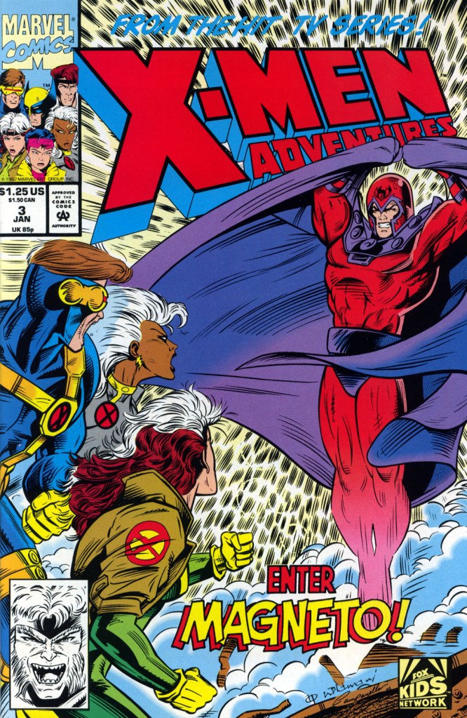
When it comes to pop culture influence, GamesRadar+ declared Magneto as the #1 best X-Men villain of all time. Even more intriguing was the super villain topping IGN’s Top 100 Comic Book Villains List. Beyond comic books, Magneto also appeared in the X-Men arcade game of 1992 made by Konami. On November 27, 1992, Magneto made his debut in the Enter Magneto episode of the popular X-Men animated series on TV. The said episode was, unsurprisingly, adapted into comic book form in issue #3 of the X-Men Adventures monthly comic book series.

How was Magneto’s debut in the said monthly series? We can find out in this look back at X-Men Adventures #3, published in 1993 by Malibu Comics with a story written by Ralph Macchio and drawn by Andrew Wildman.  

The cover.

Early story

The story begins in outer space where Asteroid M is orbiting above planet Earth completely undetected. As a meteor is on-course to collide with Asteroid M, the operator of the asteroid activates its guns and hits it. While Asteroid M got spared, a smaller meteor found itself falling into Earth’s atmosphere. As it burns through the atmosphere, Charles Xavier spots it from inside his mansion.

Xavier turns his attention to Jean Grey. As they travel together, the doors open and Sabretooth enters landing on the floor. The two have yet to know him.

Over at a prison, the captured Hank McCoy/Beast thinks deeply inside his prison cell only to suddenly witness one of the walls get smashed by some powerful force. Magneto arrives and tells him he came for him…

Quality

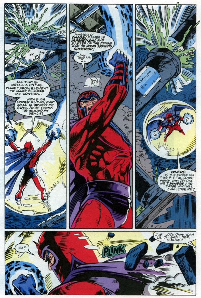
The power of Magneto.

The writing, with credit to the screenwriters behind the animated episode, is pretty solid and the essence of the said episode was very well adapted into this comic book. As this is Magneto’s debut in the X-Men Adventure series reflecting his debut in animated series, his character is portrayed very accurately and it only made perfect sense for him to approach Beast first to try to convince him join his pro-mutant movement. More on the writing, Beast’s restraint brought out more of Magneto’s hardcore beliefs and his complete opposition towards humans.

Of course, the creators did not let down their efforts to portray the struggle mutants have under the laws of human society which is strongly reflected in Beast’s court hearing with Wolverine and Cyclops (in civilian forms) observing powerlessly. The court room drama and arguments were intense.

I should also state that there really was a nice build-up leading to the first battle (first half, actually) between the X-Men and Magneto. Unlike the battles in issues #1 and #2, the conflict here showed the X-Men more in danger which is only fitting considering how great the villain is.

Conclusion

Magneto and Beast.

X-Men Adventures #3 is a strong adaptation of the Enter Magneto episode. There is no doubt about that and most notably, the comic book creators did another good job making the TV animated episode’s concept engaging and fun to read. This comic book should be part of the collection of anyone who is passionate about Magneto.

If you are seriously planning to buy an existing hard copy of X-Men Adventures #3 (1993), be aware that as of this writing, MileHighComics.com shows that the near-mint copy of the regular edition costs $8 while the near-mint copy of the newsstand edition costs $17.

Overall, X-Men Adventures #3 (1993) is highly recommended!

+++++

Thank you for reading. If you find this article engaging, please click the like button below and also please consider sharing this article to others. If you are looking for a copywriter to create content for your special project or business, check out my services and my portfolio. Feel free to contact me as well. Also please feel free to visit my Facebook page Author Carlo Carrasco and follow me at HavenorFantasy@twitter.com

A Look Back at Spider-Man #26 (1992)

Disclaimer: This is my original work with details sourced from reading the comic book and doing personal research. Anyone who wants to use this article, in part or in whole, needs to secure first my permission and agree to cite me as the source and author. Let it be known that any unauthorized use of this article will constrain the author to pursue the remedies under R.A. No. 8293, the Revised Penal Code, and/or all applicable legal actions under the laws of the Philippines.

In 1992, Marvel Comics organized a big celebration of what was back then the 30th anniversary celebration of Spider-Man. Behind the scenes, the Spider-Man editorial team organized their creators to make something special worthy of the anniversary. Back then there were four monthly series of Spider-Man – Amazing Spider-Man, Spectacular Spider-Man, Web of Spider-Man and Spider-Man – and in keeping with the 30th anniversary bonanza, each of the monthly series would see one special issue with a hologram on the cover.

What I read recently was one of those 30th anniversary celebration special comic books – Spider-Man #26. This comic book had a green cover and a hologram of Spider-Man upside-down. Its cover price is $3.50.

Was this old comic book’s content really worth the high cover price and the hologram? Did the creative team at Marvel do their job on making something special in line with the 30th anniversary celebration? We can find out in this look back at Spider-Man #26, published in 1992 by Marvel Comics with the main story written by Tom DeFalco and drawn by Mark Bagley and Ron Frenz.

The cover with a hologram.

Early story

The story begins on the street of New York when a man wearing a device runs down the sidewalk distracting and unintentionally pushing a few people out of the way. He is glowing as he moves. Someone from behind him calls him Stewart.

Soon enough, Peter Parker/Spider-Man and Mary Jane cross paths with him. Peter immediately leaves Mary Jane behind and starts pursuing the glowing Stewart. In the middle of the street, Stewart sees a speeding motorcycle heading towards him. He dives for cover which incidentally shapes his glowing field into a makeshift ramp causing the motorcyclist go over him. Spider-Man sees the flying motorcycle and its driver, and struggles to decide which one to save…

Quality

From the 2nd story.

Let me start with the main story. It sure is heavily worded almost all throughout but that is understandable because Tom DeFalco really pushed hard to emphasize the theme of responsibility as Spider-Man struggles to tackle criminals while trying to find quality time for his wife. There was even a scene in which Peter Parker recalls key events from his past (his becoming Spider-Man, letting a certain criminal get away, the death of his Uncle Ben, etc.) which, in terms of presentation, was a clear attempt by the creative team to bring readers back to the recorded history of Marvel’s icon. The main story is a genuine, heart-filled attempt to go beyond showing Spider-Man beating the bad guys to do local society good. There was also effort exerted to show that there are a few guys who do bad things not because they are inherently evil but rather they are desperate and/or misguided. The problem with the main story is that the other characters – Stewart, Bill, the gang leader Maxwell and others – are not so interesting at all. Of course, we cannot expect to see Spider-Man go head-to-head with another one of his major villains but this story was part of the 30th anniversary celebration.

The 2nd story, if you can all it that, is pretty much an exposition-filled exercise designed to give readers – both new and old – a review of Spider-Man’s powers and capabilities. To prevent it from becoming a total bore, some characters from the Marvel Comics universe were visually added.

When it comes to the quality of the artwork, Ron Frenz’s work here is serviceable at best. Mark Bagley’s art here improves the quality but that’s not saying much.

Conclusion

From the main story.

As a 30th anniversary celebration issue, Spider-Man #26 does not have much when it comes to being truly special. You love spectacle? You won’t find much in it. You wanted to see something groundbreaking in terms of character development? There’s none. Gripping storytelling? None! There was also no conflict with any prominent villain from the Marvel universe here. What you will get here is nostalgic stuff plus exposition about key elements that define Spider-Man. Truly the only thing special here is the hologram on the gimmick cover.

If you are seriously planning to buy an existing hard copy of Spider-Man #26 (1992), be aware that as of this writing, MileHighComics.com shows that the near-mint copy of the regular edition costs $27 while the near-mint copy of the newsstand edition costs $90.

Overall, Spider-Man #26 (1992) is serviceable. If you really want to buy this old comic book, I recommend waiting for its price to fall below $5 and I’m referring to the near-mint copy.

+++++

Thank you for reading. If you find this article engaging, please click the like button below and also please consider sharing this article to others. If you are looking for a copywriter to create content for your special project or business, check out my services and my portfolio. Feel free to contact me as well. Also please feel free to visit my Facebook page Author Carlo Carrasco and follow me at HavenorFantasy@twitter.com

A Look Back at UltraForce #6 (1995)

Disclaimer: This is my original work with details sourced from reading the comic book and doing personal research. Anyone who wants to use this article, in part or in whole, needs to secure first my permission and agree to cite me as the source and author. Let it be known that any unauthorized use of this article will constrain the author to pursue the remedies under R.A. No. 8293, the Revised Penal Code, and/or all applicable legal actions under the laws of the Philippines.

After reading issues #0 to #5 of the UltraForce series of the mid-1990s, I should say that I clearly enjoyed them all as creators Gerard Jones and legendary illustrator George Perez (plus their supporting crew) really delivered great stories, dynamic visuals and very engaging interactions between the UltraForce members.

So far, each and every UltraForce issue I reviewed here is fun and compelling to read. The high levels of artistic and literary quality in each issue is evident right from the start and, more importantly, it emphasizes the overall concept of the Ultraverse itself even deeper than what I discovered in its early stage (launch year 1993). Very clearly, UltraForce as a comic book series raised the stakes of the Ultraverse (much like Break-Thru did) when it comes to how the public perceived ultras (superheroes), who are the secretive sinister forces and how they impact the whole world, why being an ultra has lots of advantages and disadvantages, why ultras are hard to unite in the face of danger, and so on. These creative concepts were really great and it was in the year 1994 – the same year UltraForce launched – when the Ultraverse was at a stage to go further to a bolder direction with its creative evolution. Unfortunately all of that got screwed up after Marvel Comics acquired Malibu Comics.

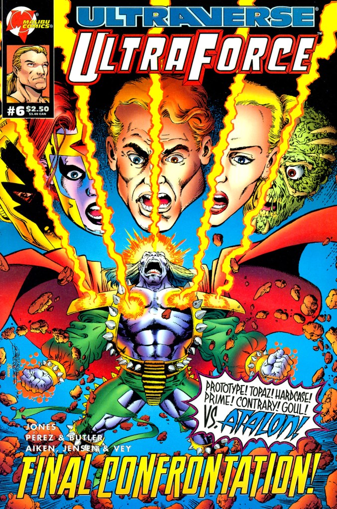
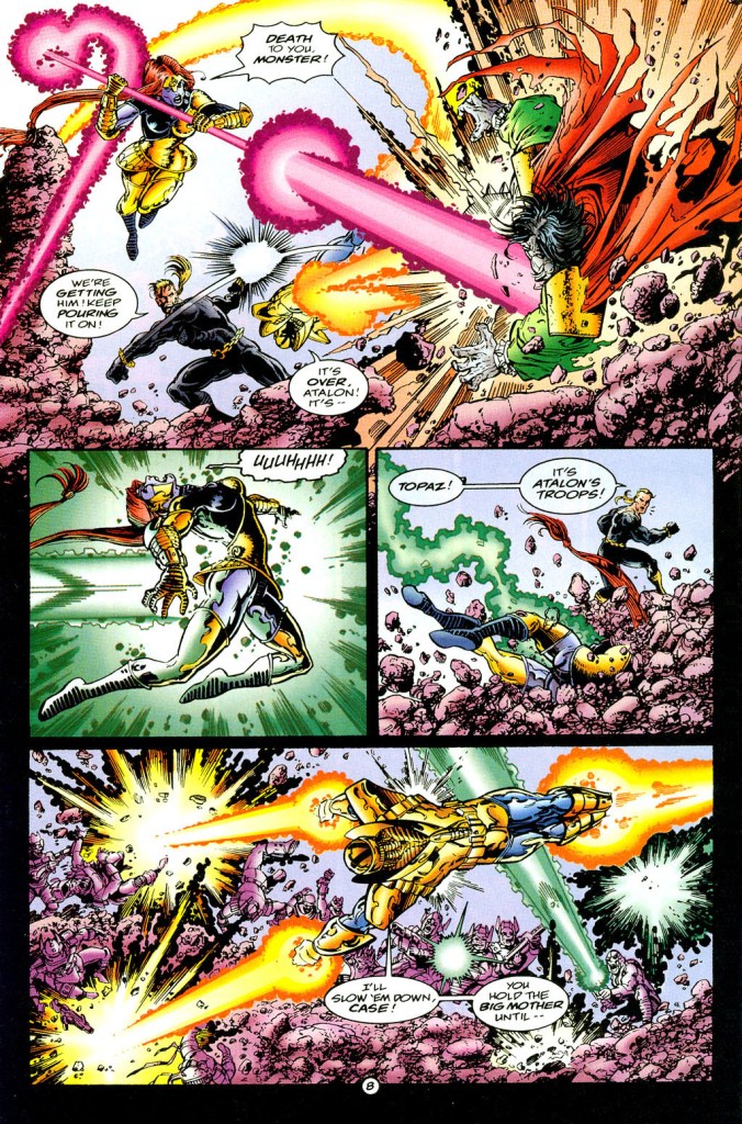
More on UltraForce, the saga of king Atalon’s fire people rising from the depths of the Earth and possessing nuclear missiles to attack people on the surface has lasted quite long and its narrative remained consistently engaging. In issue #5, something terrible happened to UltraForce member Pixx during a big battle. What transpired next, we can find out in this look back at UltraForce #6, published in 1995 by Malibu Comics with a story written by Gerard Jones and drawn by George Perez and Steve Butler.

The cover! They even misspelled Ghoul!

Early story

The story begins as tensions rise between Atalon and UltraForce over their respective losses. For Atalon, his grand dream involving the use of humanity’s nuclear weapons has been destroyed. For Prime, Hardcase, Prototype, Ghoul and Topaz, the hanging lifeless body of Pixx shocked them deeply.

Suddenly, out of intense anger, UltraForce jointly attack the king of the fire people. Topaz states that Pixx will not die unavenged as Prototype blasts Atalon. Hardcase strikes the king followed by blows delivered by Prime and Topaz. Prime is about to strike Atalon but gets distracted when the downed king mentioned he wants to reform the whole world. Atalon strikes Prime’s head and gets back up to keep fighting the rest of UltraForce.  

Their battle is so intense, the entire island shakes and the ground crumbles bringing the nuclear weapons down along with Pixx’s body. Ghoul goes down after her…

Quality

Dynamic action delivered with high detail!

Like all the previous issues released, this comic book has high-level qualities on its writing and artistry. This is not a surprise since the Jones-Perez creative team really pushed hard to keep telling what is clearly the epic event of the Ultraverse (post-Break-Thru). The consistency of quality up to this issue is very evident.

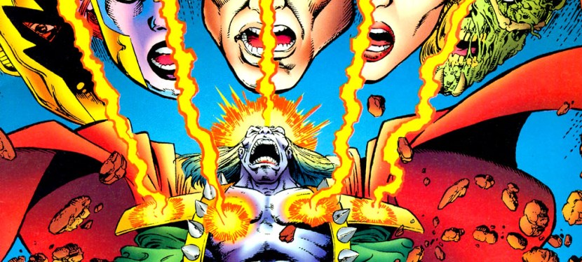
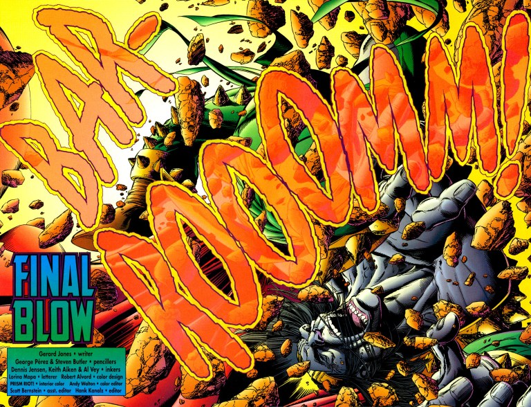
When it comes to the quality of this comic book’s story, which happens to be the conclusion of the Atalon saga, I can say that I’m very satisfied. As the events went on, a few but very significant twists happened which really shook the foundation of this particular saga backed with great visuals (although there are some pages that were clearly not drawn by George Perez), strong dialogue and a great presentation of the impact on the world and its people. What happened with king Atalon in the 2nd half of the story is very memorable and it definitely is one of the biggest twists in the entire Ultraverse. This one alone makes the comic book worth reading.

Conclusion

This is a great way to start the comic book along with the opening credits!

UltraForce #6 is indeed a great comic book and it is a strong conclusion to the saga (which started really in issue #0) that brought Prime, Hardcase, Prototype and others together as a team. This comic book is, in my honest view, also one of the finest UV stories Malibu Comics published in 1994. If there is anything to be regretful about, it is the fact that the Ultraverse got screwed up and ended in an undesirable state as a result of Marvel’s acquisition of Malibu. This is why there was no follow-up to the Atalon saga and UltraForce as a series turned for the worse shortly after (again, as a result of Marvel’s acquisition). Considering the events of the first major UltraForce saga, Atalon could have turned out as a more significant character of the Ultraverse and another epic follow-up (to the Atalon saga) could have happened.

More on the team itself, Prime, Prototype, Hardcase and their lesser known teammates were truly presented with a strong amount of balance. Ghoul and Contrary really had their nice share of the spotlight and how they worked in tandem with the others, as well as the very events of the comic book, was really fluid and believable. By the end of this comic book, you will realize the true values and the different personalities of the entire UltraForce!

If you are seriously planning to buy an existing hard copy of UltraForce #6 (1995), be aware that as of this writing, MileHighComics.com shows that the near-mint copy of the comic book costs $15.

Overall, UltraForce #6 (1995) is highly recommended!

+++++

Thank you for reading. If you find this article engaging, please click the like button below and also please consider sharing this article to others. If you are looking for a copywriter to create content for your special project or business, check out my services and my portfolio. Feel free to contact me as well. Also please feel free to visit my Facebook page Author Carlo Carrasco and follow me at HavenorFantasy@twitter.com
A Look Back at X-Men Adventures #2 (1992)

Disclaimer: This is my original work with details sourced from reading the comic book and doing personal research. Anyone who wants to use this article, in part or in whole, needs to secure first my permission and agree to cite me as the source and author. Let it be known that any unauthorized use of this article will constrain the author to pursue the remedies under R.A. No. 8293, the Revised Penal Code, and/or all applicable legal actions under the laws of the Philippines.

Having read lots of X-Men comic books, I should say that I always find the Sentinels (first appearance in The X-Men #14 in 1965) to be more memorable as enemies of Marvel’s mutants. On face value, they only look like oversized, human-like robots but I always find them to be formidable opponents of the X-Men. These machines are not only built with sophisticated technologies, they are able to push the X-Men to their limits during battle.

These anti-mutant robots, by the way, were ranked by IGN at #38 in their Greatest Comic Book Villains chart. Long before that, the Sentinels were the featured anti-heroes in the classic X-Men comic book storyline Days of Future Past and it was no surprise that they were also featured in the 2014 movie X-Men: Days of Future Past.

And then in the early 1990s, the Sentinels were shown in the first episode of the X-Men animated series on television. The said series was also adapted into an “as seen on TV” comic book series by Marvel called X-Men Adventures.

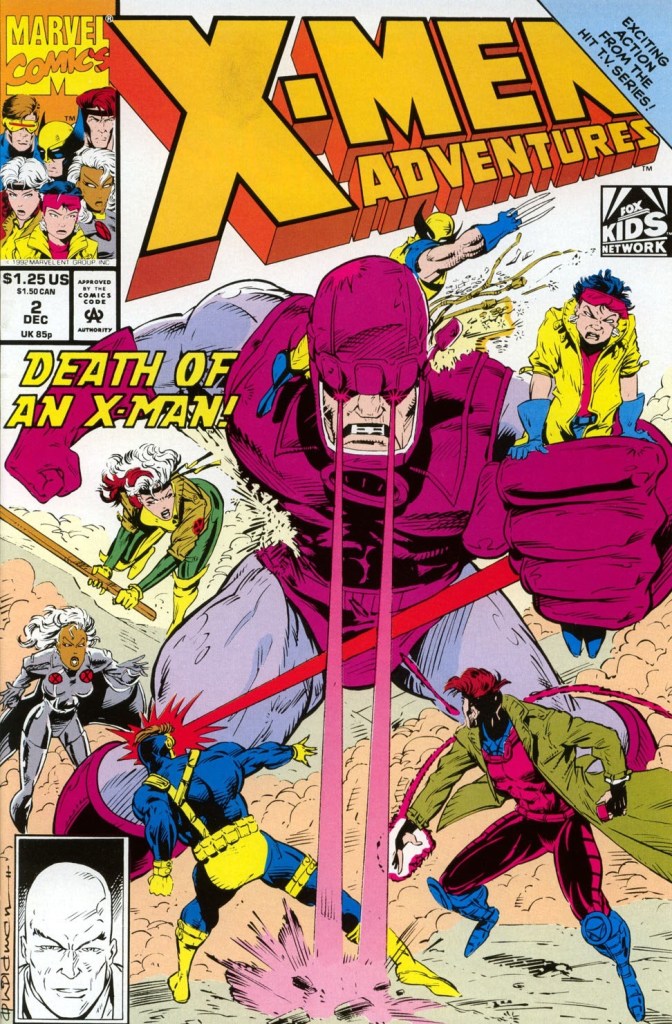
This brings me to this look back at X-Men Adventures #2, published in 1992 by Marvel Comics with a story by Ralph Macchio and drawn by Andrew Wildman.  

The cover.

Early story

The story begins with Morph suffering from a nightmare. As he emerged from the vision, he finds himself with Storm, Beast and Wolverine. Together they work to infiltrate a federal government facility which houses the Mutant Affairs Department. Outside the walls of the facility, Rogue Gambit and Cyclops watch from a distance. Cyclops fires his optic blast at the vehicle that just dropped reinforcements that he believes were sent to stop their teammates.

Storm and her teammates break through a door instantly pushing off the security personnel followed by Beast knocking an additional guard. At the room containing the computer, Beast begins to access key information their team has been seeking…

Quality

The Sentinels and the X-Men!

Let me start with the storytelling. As an adaptation of one of the early episodes of the animated series, this comic book does a fine job of recapturing its essence complete with a nice balance between plot, exposition and spectacle. Considering the fact that the animated series was aimed for children, it’s quite intriguing to see the TV episode carrying really heavy themes – apart from the prejudice the mutants suffer from – like top federal government operations, expensive defense and weapons programs, government intrusion into people’s private lives, attempts to require minorities to get registered, etc. Those themes also made it in this comic book which made it feel like it was part of the mainstream X-Men comics of the time.

Compared to the first episode as well as its literary adaptation, this one emphasizes the Sentinels as tools of the government as part of their very expensive program to seek and monitor mutants among their citizens. Mutant Affairs director Peter Gyrich is clearly the villain who has no super powers but has the resources of the federal government and their authority to take action on mutants he perceived to be dangerous.

On the visuals, Andrew Wildman performed a solid job making each page look interesting and detailed enough. While his drawings made each character recognizable to me, it is in the spectacular scenes where he really shines. Wildman’s drawing of the Watcher on the final page of the comic book, however, looks laughable.

Conclusion

Andrew Wildman’s dynamic drawing of the X-Men in action.

While X-Men Adventures #2 is not exactly a literary classic, it is indeed a very solid adaptation of one of the earliest episodes of the animated series of the 1990s. It succeeded on telling a compelling and enjoyable story even though it emphasized the above-mentioned serious themes. As for the iconic Sentinels, this one succeeded in explaining what they are and their place in Marvel’s universe is.

If you are seriously planning to buy an existing hard copy of X-Men Adventures #2 (1992), be aware that as of this writing, MileHighComics.com shows that the near-mint copy of the regular edition costs $8 while the near-mint copy of the newsstand edition costs $26.

Overall, X-Men Adventures #2 (1992) is recommended.

+++++

Thank you for reading. If you find this article engaging, please click the like button below and also please consider sharing this article to others. If you are looking for a copywriter to create content for your special project or business, check out my services and my portfolio. Feel free to contact me as well. Also please feel free to visit my Facebook page Author Carlo Carrasco and follow me at HavenorFantasy@twitter.com

A Look Back at Prototype #9 (1994)

Disclaimer: This is my original work with details sourced from reading the comic book and doing personal research. Anyone who wants to use this article, in part or in whole, needs to secure first my permission and agree to cite me as the source and author. Let it be known that any unauthorized use of this article will constrain the author to pursue the remedies under R.A. No. 8293, the Revised Penal Code, and/or all applicable legal actions under the laws of the Philippines.

Hey comic book fans and geeks! Do you enjoy reading comic books about armored superheroes that are not connected with Marvel’s Iron Man? The Ultraverse has an armored figure in Prototype but the big difference is that the said character is owned by a large corporation called Ultratech which in turns hired a young man named Jimmy Ruiz to pilot it. Oh yes, Jimmy Ruiz is actually the second person hired to pilot Prototype as his predecessor Bob Campbell was let go with one arm less.

Let’s revisit the Ultraverse by taking a look back at Prototype #9, published in 1994 by Malibu Comics with a story by Len Strazewski and Tom Mason with art done by Roger Robinson and Jeff Whiting.

The cover.

Early story

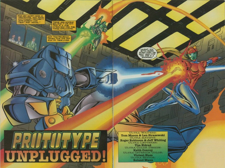
Set a short time after the hard battle between Prototype and Arena, the story begins in a secret facility somewhere in New York City where three armored figures engage in an intense session of flight, attacks and performance. The session is closely monitored by people watching from the observation deck. As it turns out, the session is actually a test for the three persons – two men and one lady – who applied to become the new Prototype which is the result of what happened at the end of issue #8.  Among the three, Donovan Jones was accepted as the new Prototype which Ultratech’s Stanley Leland confirms.

Over at Brooklyn, Jimmy Ruiz (Prototype) meets a lady from his past after paying respect to someone who was about to get buried. She tells him that since he left their old neighborhood, the local gangs have gotten worse. A short time later, the Prototype pilot meets an old gang he personally knows… 

Quality

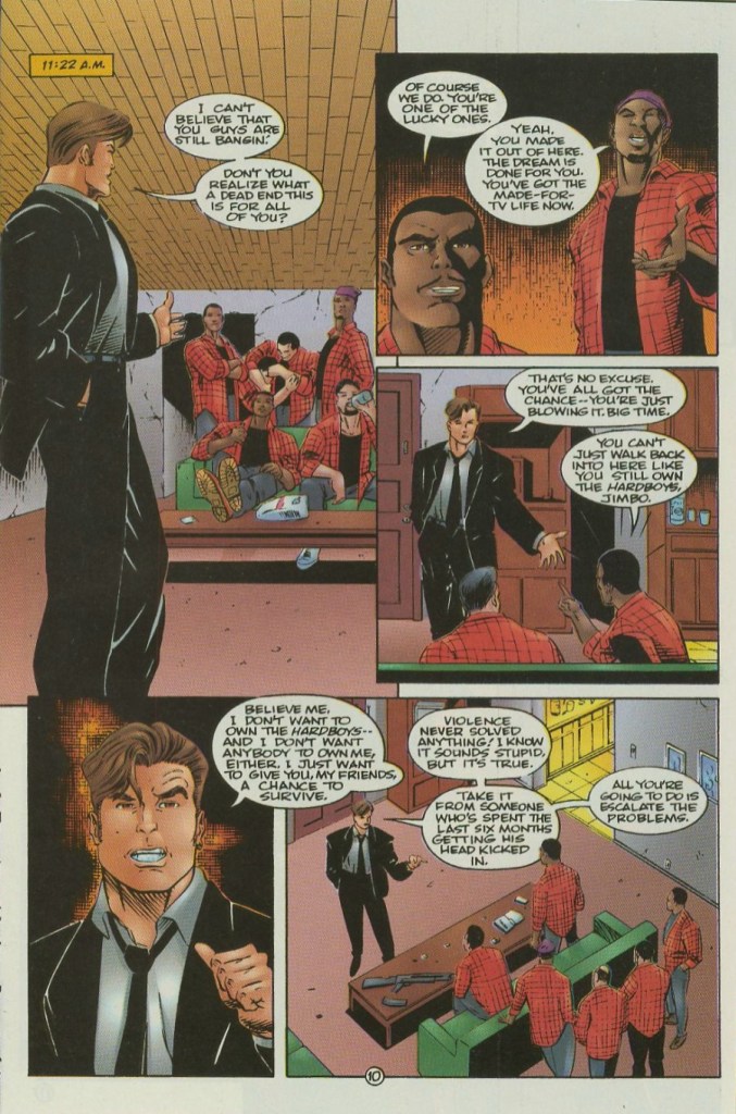
Jimmy Ruiz and the gang from his past.

Let me start with the storytelling. This comic book is more about Jimmy Ruiz out on his own without the armor than it is about Ultratech and its high-tech interests. Bob Campbell’s not even in the story. That being said, this is pretty much a character-driven piece focused on Jimmy Ruiz as a person than as a hero and I should say that Tom Mason and Len Strazewski did a good job developing his character a lot. The writing is pretty lively and the writers pulled the right moves to define Jimmy Ruiz as a believable human being. There was that notable moment when after Jimmy returned to his old community and spends time with the old gang he personally knew, he realizes how much he has and how his perception changed. By the time you reach the end of the story, you’ll get to know Jimmy much better.

Conclusion

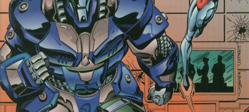
The money shot!

Prototype #9 is a character-driven comic book that succeeds in defining the personality and development of Jimmy Ruiz who is just one of two main characters in this series (which emphasized the struggles of two different persons involved with piloting Prototype). It lacks spectacle but that does not make this a boring comic book. Apart from Jimmy Ruiz, the corporate focus on Ultratech is short yet very intriguing.

If you are seriously planning to buy an existing hard copy of Prototype #9 (1994), be aware that as of this writing, MileHighComics.com shows that the near-mint copy of the regular edition costs $8.

Overall, Prototype #9 (1994) is recommended.

+++++

Thank you for reading. If you find this article engaging, please click the like button below and also please consider sharing this article to others. If you are looking for a copywriter to create content for your special project or business, check out my services and my portfolio. Feel free to contact me as well. Also please feel free to visit my Facebook page Author Carlo Carrasco and follow me at HavenorFantasy@twitter.com
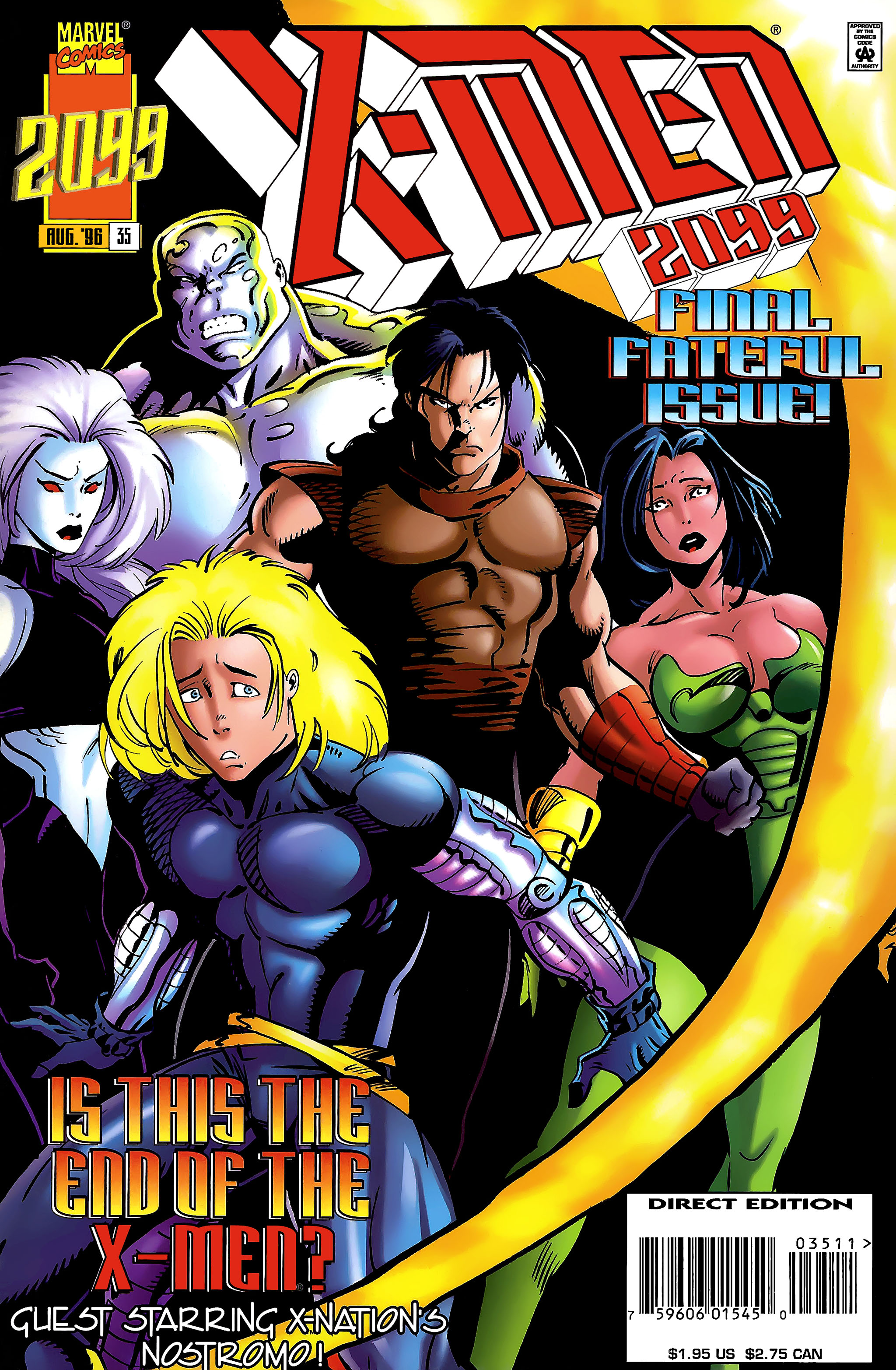
A Look Back at X-Men 2099 #35 (1996)

Disclaimer: This is my original work with details sourced from reading the comic book and doing personal research. Anyone who wants to use this article, in part or in whole, needs to secure first my permission and agree to cite me as the source and author. Let it be known that any unauthorized use of this article will constrain the author to pursue the remedies under R.A. No. 8293, the Revised Penal Code, and/or all applicable legal actions under the laws of the Philippines.

This is it! The thirty-fifth and final issue of the X-Men 2099 monthly series from Marvel Comics is at hand. How times have changed in the American comic book industry back in the 1990s. When X-Men 2099 #1 was released in 1993, there was still good demand and room for expanding the 2099 imprint beyond the pioneering characters Spider-Man 2099, Punisher 2099, Ravage 2099 and Doom 2099. By the time the X-Men 2099 series came to an end, Marvel Comics was in turmoil internally and several 2099 series talents behind the scenes left as a result of the termination of 2099 line editor Joey Cavalieri.

With the short history lesson done, we can now take a look back at X-Men 2099 #35, published in 1996 by Marvel Comics with a story written by John Francis Moore (who wrote ALL the series’ issues) and drawn by Jan Duursema.

Cover
The cover.

Early story

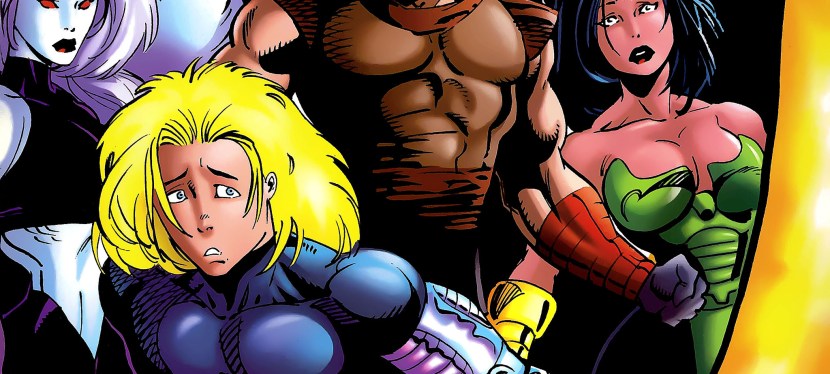
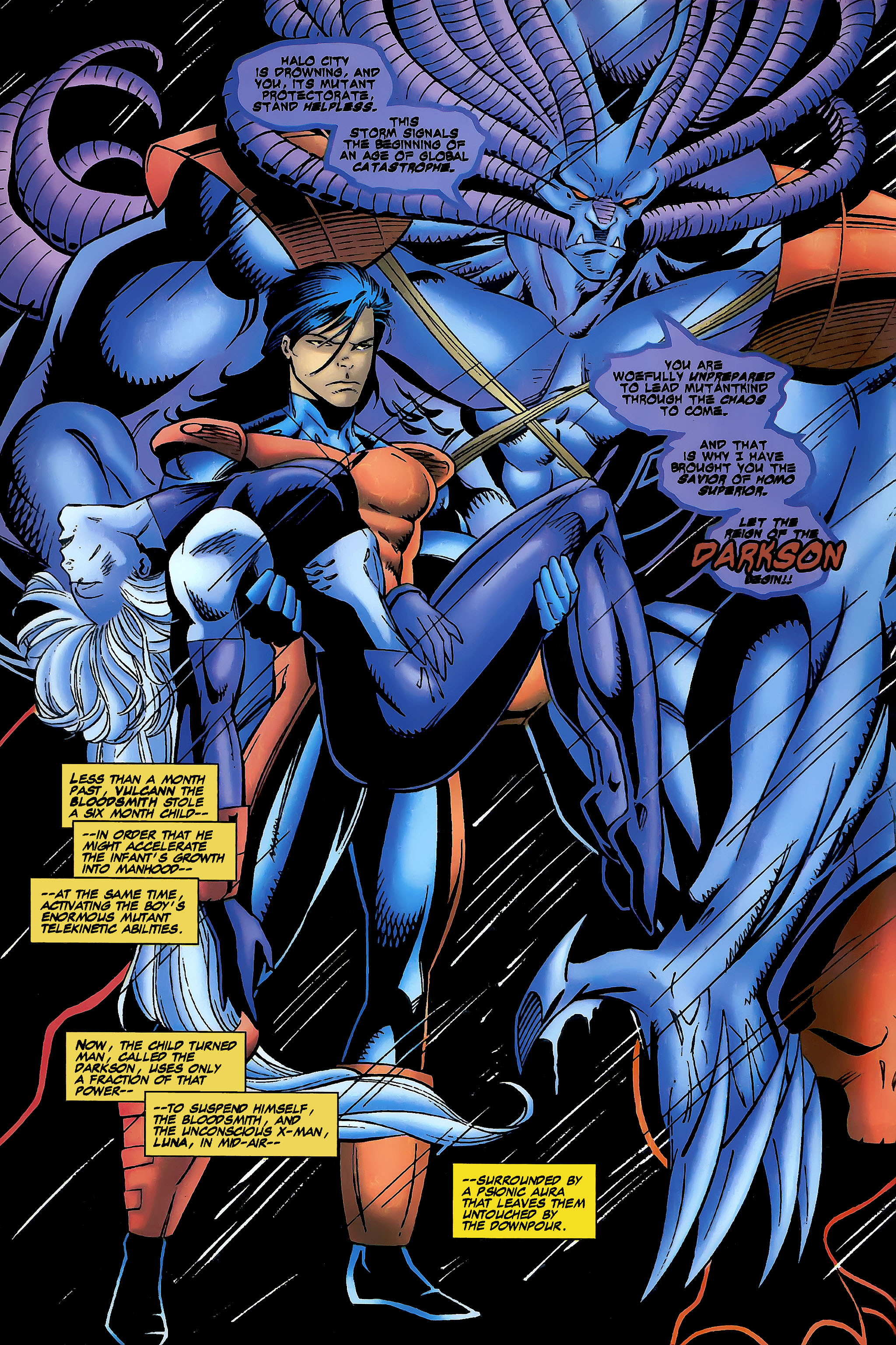
The story begins with some members of the X-Men facing off with Darkson (his name is Joaquim, the accelerated grown-up son of Metalhead and Rosa) and his evil mentor Vulcan. Following Vulcann’s command, Darkson lets go of Luna (who was carried earlier by him) who lands on the ground in a weakened state and was approached by Krystallin. In reaction, Krystallin launches some crystals to Vulcann and Darkson but got blocked by a protective aura.

The X-Men realize that Darkson is as potentially dangerous as Zhao. Darkson then strikes at Bloodhawk with a psionic blast and then attacks the other X-Men…

Quality

7
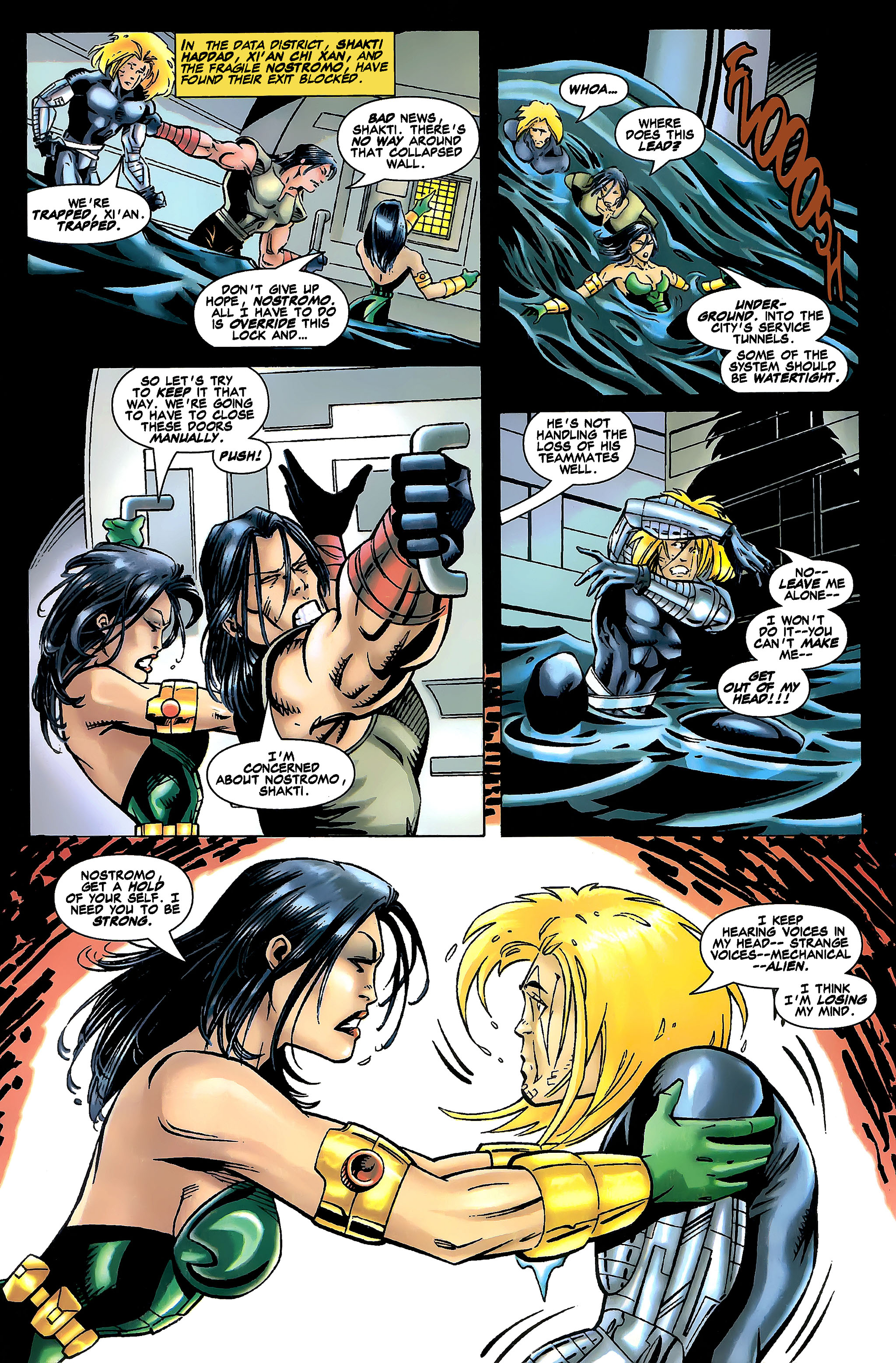
Two X-Men veterans and one X-Nation member in a scene.

In terms of storytelling, John Francis Moore did what he could with all the plot details and with what was built up during the previous issues leading to this issue’s final conflict. The problem, however, is that the pay-off was ultimately unsatisfactory.

Firstly, having Vulcann and Darkson parallel God and Jesus (complete with doing something about the destiny of people who need saving, which in this comic book referred to the futuristic mutants) in a twisted fashion was just hollow and never engaging. Secondly, the way the X-Men members got together was very rushed in execution. Thirdly and more importantly, the final conflict was pretty shallow and only led to a sequel-bait ending designed to lead into 2099: World of Tomorrow #1.

If you are looking for superhero spectacle, you will find some here but they all feel rushed and unsatisfying. If you care about key X-Men 2099 characters like Skullfire and Xi’an, the way they developed and appeared here will disappoint you. In fairness, Shakti remains the strong-willed mutant as before.

To say the least, there was an effort to emphasize what was at stake for the mutants of 2099 living in Halo City and there was also the idea that the world was coming to an end. The problem here was the execution as the comic book basically showed the X-Men in the presence of Vulcann and Darkson. There was no epic battle here at all and the climax at the end clearly showed rush and even a lack of creativity (note: most likely due to the internal turmoil at Marvel at the time).

Conclusion

2
Vulcan and Darkson (carrying the X-Men’s Luna).

I should say that X-Men 2099 #35 is indeed a disappointing conclusion not only to its series but also in the final conflict the X-Men had with Vulcann and Darkson. The pay-off was very unsatisfying and it did not help that this comic book served as just another build-up leading to another Marvel 2099 publication. By the time the conflict ended, I did not care much about the X-Men which, for the most part, became irrelevant. This is too bad because in issue #1 they were very interesting and (after some stories of misadventures showing the X-Men members separated) they became interesting again with the events in issue #25.

If you are seriously planning to buy an existing hard copy of X-Men 2099 #35 (1996), be aware that as of this writing, MileHighComics.com shows that the near-mint copy of the regular edition costs $17 while the near-mint copy of the newsstand edition costs $51.
Overall, X-Men 2099 #35 (1996) is unsatisfying. I don’t recommend spending a lot of money for it. Better save your money.


Thank you for reading. If you find this article engaging, please click the like button below and also please consider sharing this article to others. If you are looking for a copywriter to create content for your special project or business, check out my services and my portfolio. Feel free to contact me as well. Also please feel free to visit my Facebook page Author Carlo Carrasco and follow me at HavenorFantasy@twitter.com