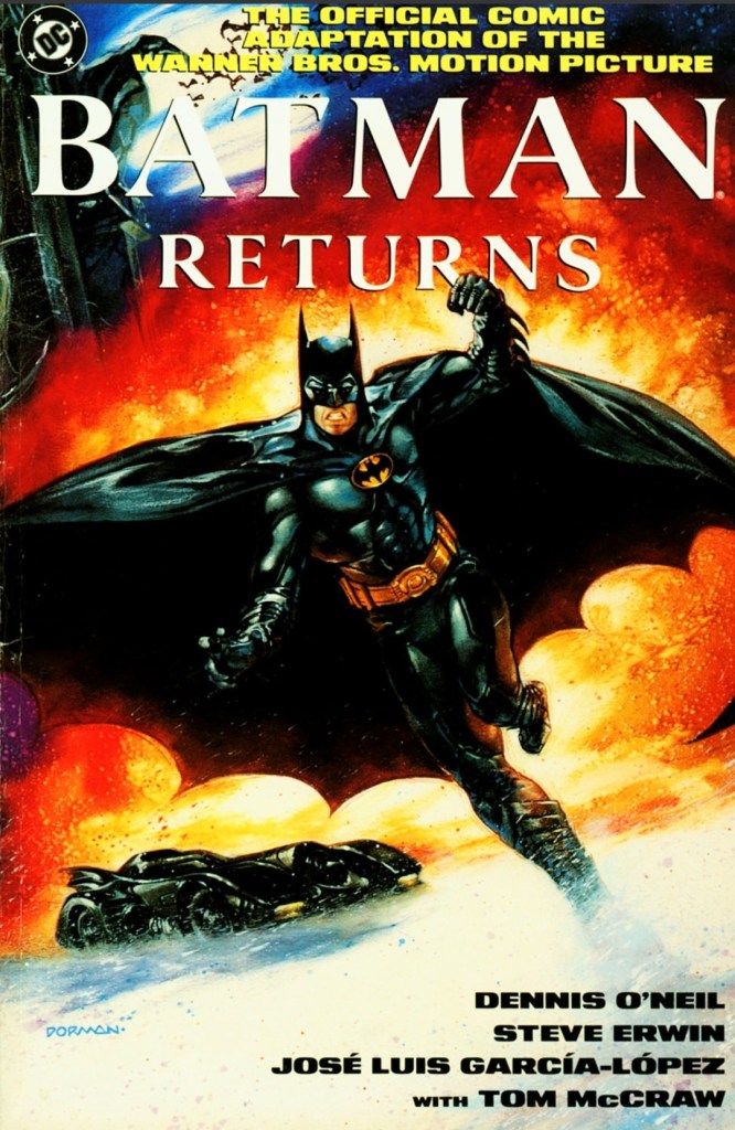
Disclaimer: This is my original work with details sourced from reading the comic book and doing personal research. Anyone who wants to use this article, in part or in whole, needs to secure first my permission and agree to cite me as the source and author. Let it be known that any unauthorized use of this article will constrain the author to pursue the remedies under R.A. No. 8293, the Revised Penal Code, and/or all applicable legal actions under the laws of the Philippines.
Welcome back superhero enthusiasts, 1990s culture enthusiasts and comic book collectors! Today we go back to the early 1990s and look at the official comic book adaptation of the 1992 superhero movie Batman Returns.
Way back in 1992, I managed to watch Batman Returns in a movie theater here in the Philippines. It was entertaining but I noticed it had an even darker tone, more violence (although the quality of physical action went down) and was more adulterated compared, at least, with its 1989 predecessor. What really stood out for me in the Tim Burton-directed movie were the great performances of Danny DeVito as the Penguin and Michelle Pfeiffer as Catwoman.
Even though I was already visiting comic book stores back then, I was not even aware that an official comic book adaptation of the movie was released by DC Comics. It was only recently I finally got to read a copy.
With those details laid down, here is a look back at Batman Returns: The Official Comic Book Adaptation of the Warner Bros. Motion Pictured published in 1992 by DC Comics with the adapted story written by Dennis O’Neil and drawn by Steve Erwin.
Early story
The story begins decades into the past in Gotham City. A wealthy couple (Cobblepot family) decide to reject and abandon their infant son (Oswald/Penguin) as he was born with freakish features. They placed their son into a metal container (which itself is contained in a large makeshift basket) and dropped it on a local waterway that leads deep into the city’s sewers. At the end of the journey, large penguins find the container.
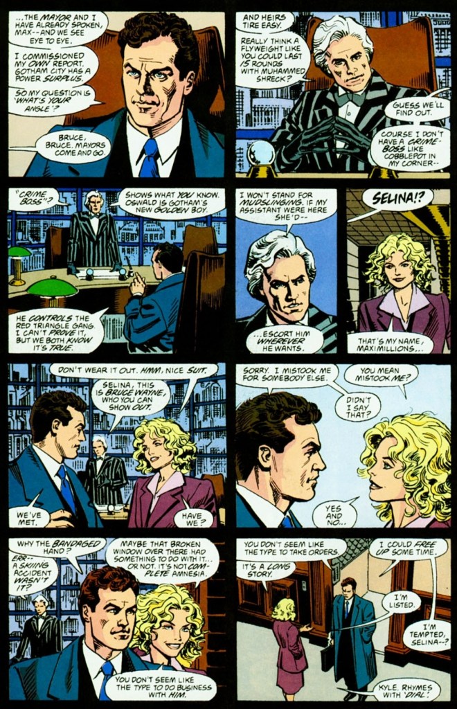
Decades later in Gotham City, tycoon Max Schreck talks to the mayor about his planned power plant project that needs permits and tax incentives from the local government to be realized. The mayor is doubtful about the project as he believes that the city has more than enough energy sources to sustain growth into the next century. Schreck insists that the local government’s analysts don’t realize the big picture about energy and economic growth. Then Chip Schreck (Max’s only heir) arrives with Selina Kyle (Catwoman) carrying coffee near him.
Minutes later, Max, Chip and the mayor arrive at Gotham Plaza for the local Christmas tree lighting. Even though he forgot to bring his speech, Max Schreck delivers remarks pretending to be caring and charitable to others. As his speech ends, two over-sized objects looking like giant gift boxes arrived nearby giving the mayor the false impression that those are clever gimmicks by Schreck.
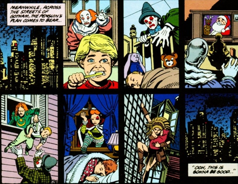
As soon as Schreck says that those objects were not his, the oversized gift box opens violently as thugs wearing circus costumes and masks suddenly come out causing violence and hysteria to the unprepared people.
The local police activate the Bat Signal to call Batman for his assistance. Nearby, the Penguin sees it and says, “Ooh, Batman. I’m trembling…”
Quality
To get straight to the point regarding the narrative, this comic book adaptation does have the same basic plot and concept of the movie but with noticeable differences (whether technical or creative) that happened here and there. For the most part, Dennis O’Neil captured the concept of the movie but with less of the flavor of Tim Burton’s creative touches (which should not be surprising).
Having seen the movie, it is clear that the comic book creators reduced the dialogue and took shortcuts on adapting scenes from the film not just for the sake of brevity but to ensure they could fill the limited amount of pages to work with. That being said, I can say that the reduced dialogue from the first conversation between Penguin and Max Schreck severely weakened the impact when compared to what was executed in the film. Speaking of dialogue, the comic creators had to down key words (think of it as creative censorship) to avoid offending readers.


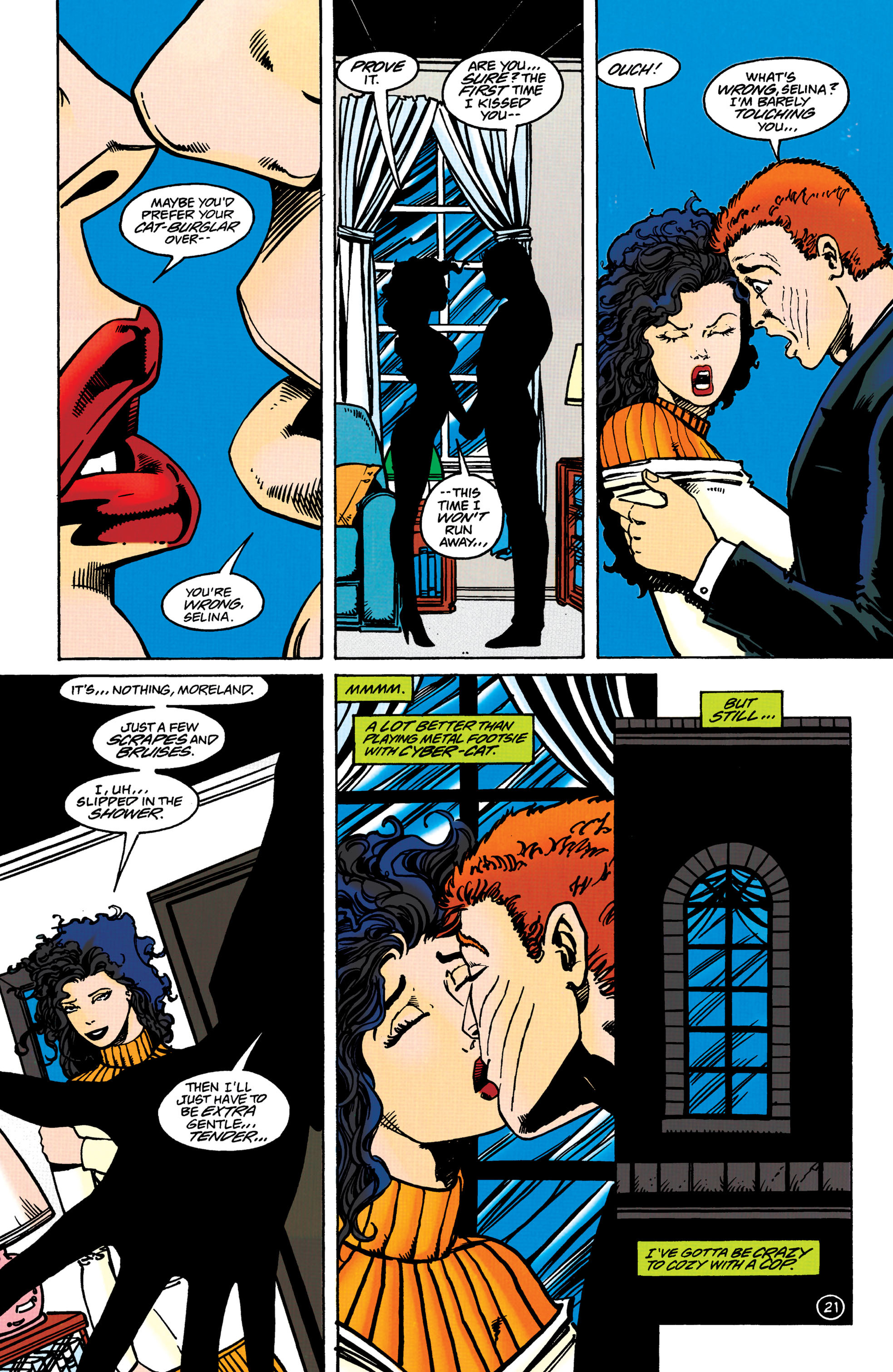
When it comes to scenes between the film and this comic book adaptation, I can say that the date between Bruce Wayne and Selina Kyle inside Wayne Manor does not appear in literary form at all. Ironically, there is one scene that appeared in this adaptation (the Penguin plotting chaos in Gotham while Catwoman mentions “An orgy of sex and violence,”) that never made the final cut in the movie itself. With regards to the aftermath of Max Schreck’s violent push of Selina Kyle through the high window, this adaptation showed Max’s son Chip present (implying he witnessed his father’s act just steps away) and he goes along with his father to ensure that none of them would be held accountable for Kyle’s fall (caused by “stress” and being “depressed”).
With the way the narrative was completed, this adaptation works well but much less of the theatrical touches of Tim Burton and without the power of the respective performances of Danny DeVito, Michelle Pfeiffer and Christopher Walken (Max Schreck). Ironically, I can easily imagine Bruce Wayne/Batman sounding like Michael Keaton through dialogue.
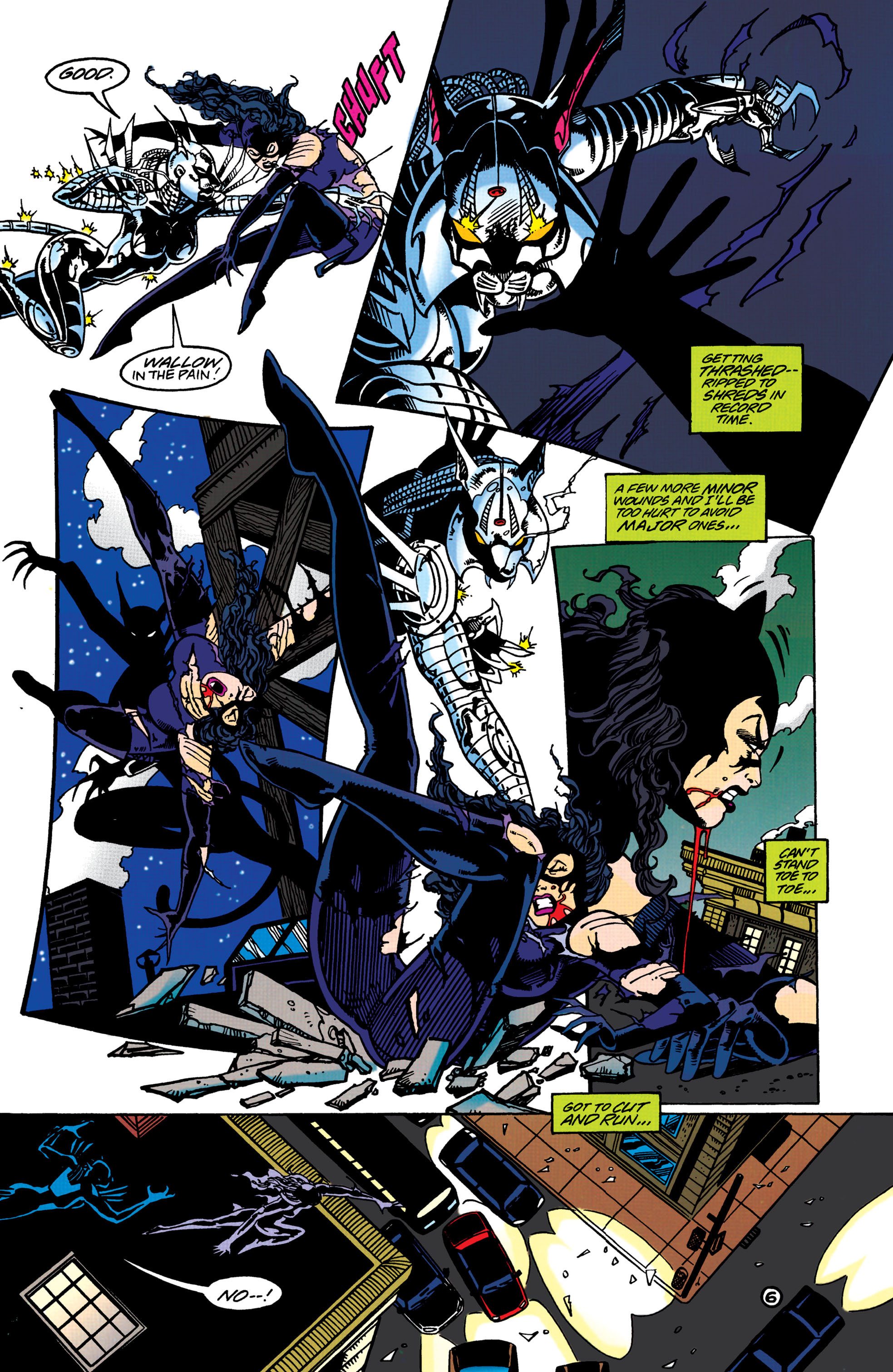
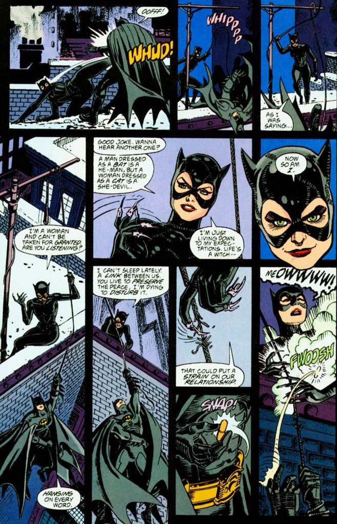
With regards to the visuals by Steve Erwin, he does a good job drawing the locations and help establish geography (albeit in limited scopes) for readers to grasp. In fact, there were drawings in which Erwin literally copied location spots, objects and even camera angles from the film which suggests he had confidential access to the footage. When it comes to visualizing action, Erwin’s approach is pretty simplistic and limited. There simply was no dynamism with the action which theoretically means he had no artistic freedom (sticking closely to script while working within the limits of images per page) or he simply had no intention to make the action look spectacular.
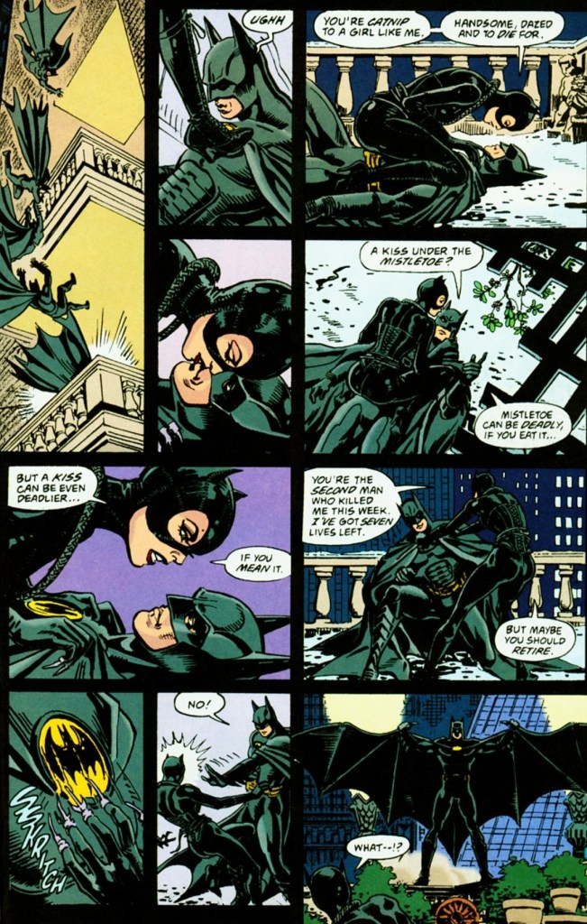
With regards to violence connected with the action, the comic creators had to resort to creative censorship apparently to make this adaptation more acceptable with younger readers. The fall of Selina Kyle from the high window had severely reduced intensity in comic form and the horrific moments of her being surrounded by cats in the film were completely gone. Oh yes, Batman’s use of the Batarang against multiple thugs on the street was executed with a simplistic and not-so-violent (read: little impact) manner by Erwin.
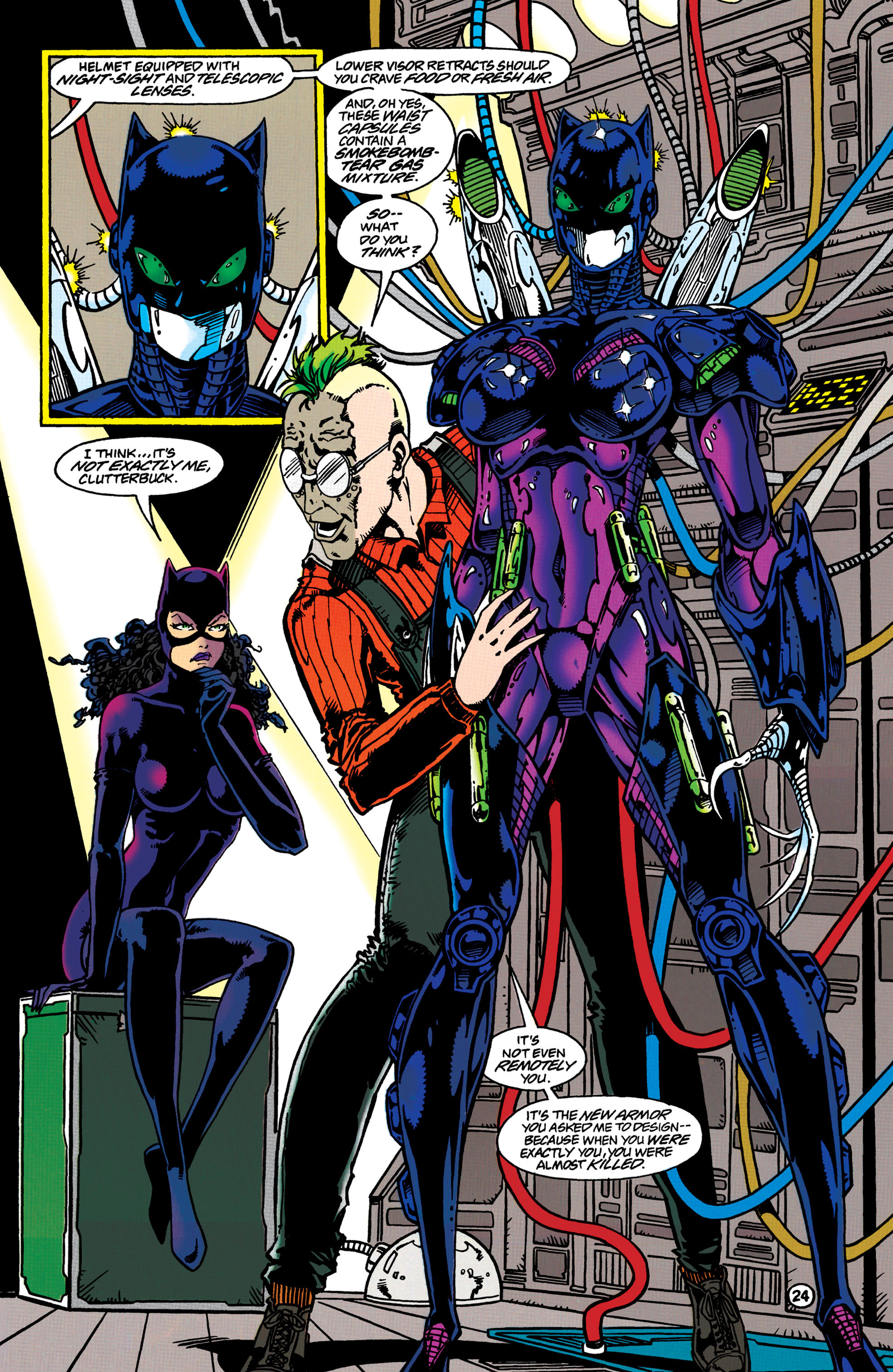
When it comes to drawing the major characters, Erwin really falls short here. His Bruce Wayne never came close to resembling Michael Keaton and the same can be said about Max Schreck (does not look much like Walken) and the Penguin (does not resemble Danny DeVito at all and with reduced facial details, he looks nowhere as scary as the cinematic villain). Ironically, Erwin’s take on Selina Kyle comes a bit close to looking like Michelle Pfeiffer. Erwin does, however, did a good job drawing Batman and Catwoman in their fully costumed, masked appearances.
Conclusion
Considering its flaws and compromises, Batman Returns: The Official Comic Adaptation of the Warner Bros. Motion Picture (1992) still works as an entertaining read and I myself have seen the movie many times. It captures the plot and several shots of the 1992 movie, but it certainly lacks Burton’s theatrical flavor and the powerful performances of DeVito and Pfeiffer. To its credit, this adaptation has several visual and literary differences compared with the movie which adds to its entertainment value. If you really want the full impact, full fun factor and artistry of Batman Returns at all, watching the movie itself is the best way. That being said, consider this adaptation as a cheaper accessible counterpart.
Overall, Batman Returns: The Official Comic Adaptation of the Warner Bros. Motion Picture (1992) is satisfactory.
+++++
Thank you for reading. If you find this article engaging, please click the like button below, share this article to others and also please consider making a donation to support my publishing. If you are looking for a copywriter to create content for your special project or business, check out my services and my portfolio. Feel free to contact me with a private message. Also please feel free to visit my Facebook page Author Carlo Carrasco and follow me on Twitter at @HavenorFantasy as well as on Tumblr at https://carlocarrasco.tumblr.com/ and on Instagram at https://www.instagram.com/authorcarlocarrasco