Retro Gaming Ads Blast – Part 22

Welcome back readers, fellow geeks and electronic gaming fans!

In this edition of the Retro Gaming Ads Blast (RGAB) series, we will take a look at another batch of retro gaming print ads – including arcade flyers – from the 1980s and 1990s.

For the newcomers reading this, Retro Gaming Ads Blast (RGAB) looks back at the many print ads of games (console, arcade, computer and handheld) that were published in comic books, magazines, flyers, posters and newspapers long before smartphones, social media, the worldwide web and streaming became popular. To put things in perspective, people back in the 1980s and 1990s were more trusting of print media for information and images about electronic games and related products.

With those details laid down, here is the newest batch of retro gaming print ads for you to see and enjoy…

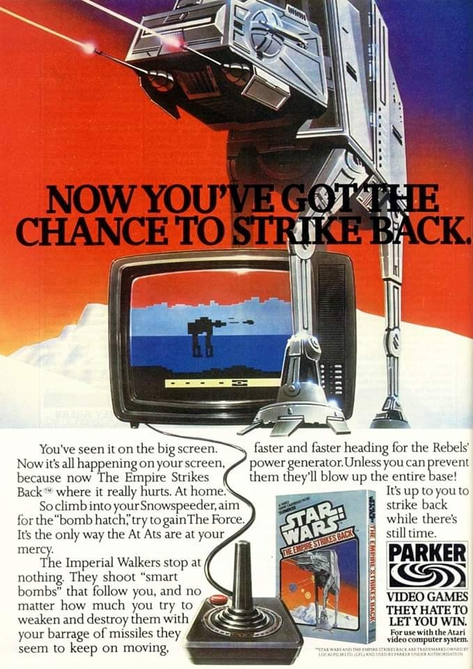
1. Star Wars: The Empire Strikes Back Atari print ads
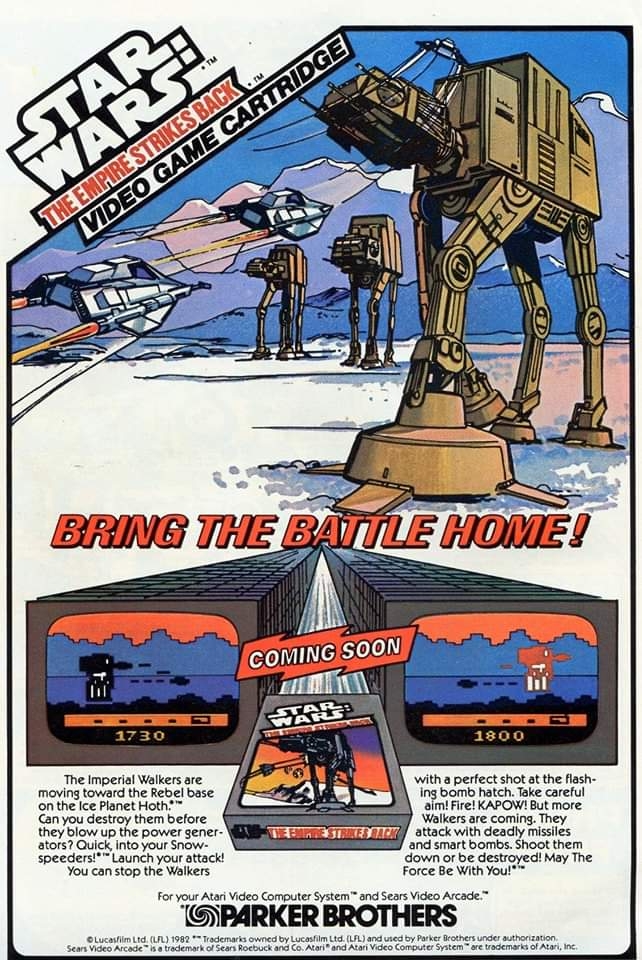
I could not forget the first time I saw this print ad while reading a comic book.
This ad showed the Atari 2600 controller.

Even during its early years under George Lucas, the Star Wars entertainment franchise made its way into video games due to its massive popularity and Parker Brothers really made moves to cash in. This resulted in the Atari 2600 video game adaptation (1982) of The Empire Strikes Back which focused mainly on the memorable Hoth battles between Rebel fighters and the Empire’s AT-AT walkers. Parker Brothers came up with two print ads and each had a different visual concept: one had nicely drawn art along with two screenshots shown while the other had painted art of the AT-AT while showing the Atari joystick. These old print ads still look great and exciting.

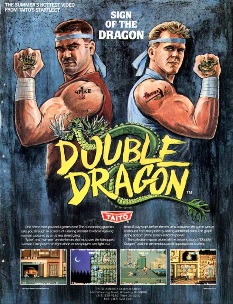
2. Double Dragon Japanese and North American arcade flyers
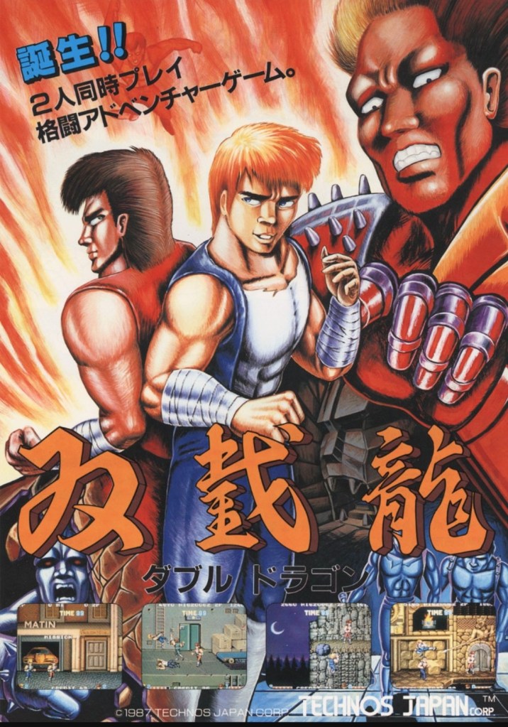
If you read manga (Japanese comics) in Japan, then the art style of this arcade flyer should look familiar to you.
The character designs seem inspired by 1980s Hollywood action cinema.

Released in 1987, Double Dragon became a huge hit in the arcades of Japan, America and Europe resulting in financial gains for developer Technōs Japan and publisher Taito. What I find intriguing was the fact that the Double Dragon arcade flyers for Japan and North America had drastically different art styles used to promote it. The Japanese flyer had art style that is more common with manga while the North American had artwork that seemed inspired by Hollywood action movies (as well as the rise of martial arts films in America during the 1980s). The American flyer even had the two characters identified as Hammer and Spike and they both looked American. This is a classic example of using different approaches to promote a game in each market.

3. Universal Soldier print ad
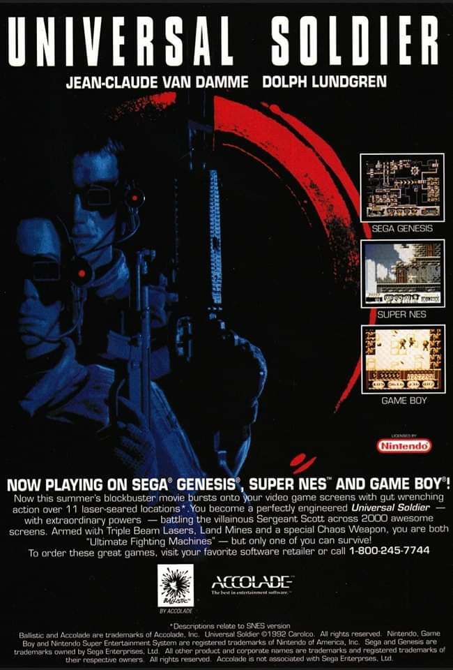
The people who made this print ad made sure to use the names of the stars to help sell the game.

Even though its worldwide ticket sales did not reach $100 million, the 1992 movie Universal Soldier still caught a lot of attention from moviegoers simply because it had Jean-Claude Van Damme and Dolph Lundgren as the stars. Unsurprisingly, the movie had a video game adaptation and because publisher Accolade wanted to cash-in on the film’s hype, they made some deceptive moves by rebranding one of its games (already development) as a tie-in. Advertised as an official adaptation, Universal Soldier was actually a rushed conversion of Turrican II: The Final Fight. This print ad – which even showed the stars’ names – is a reminder of the deception Accolade pulled off.

4. Sega CD print ad
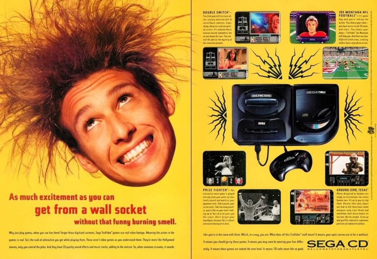
Do you find this Sega CD print ad hilarious?

When Sega was making waves with its Sega Genesis (Sega Mega Drive in Japan), the company was quick to react to the growing use of the compact disc (CD) format as a useful storage medium for video games. The Sega CD (Mega CD in Japan) was released as an add-on device to work with the Genesis console and Sega’s American team came up with a series of promotions. This print ad is just one of the promotions and ad makers came up with a “crazed” or “electrified” gamer dominating one page while showing the Genesis, the Sega CD and screenshots of games (running on CD) on the other page. By today’s standards, the Sega CD print ad is funny and catchy to look at.

5. Snatcher for Sega CD print ad
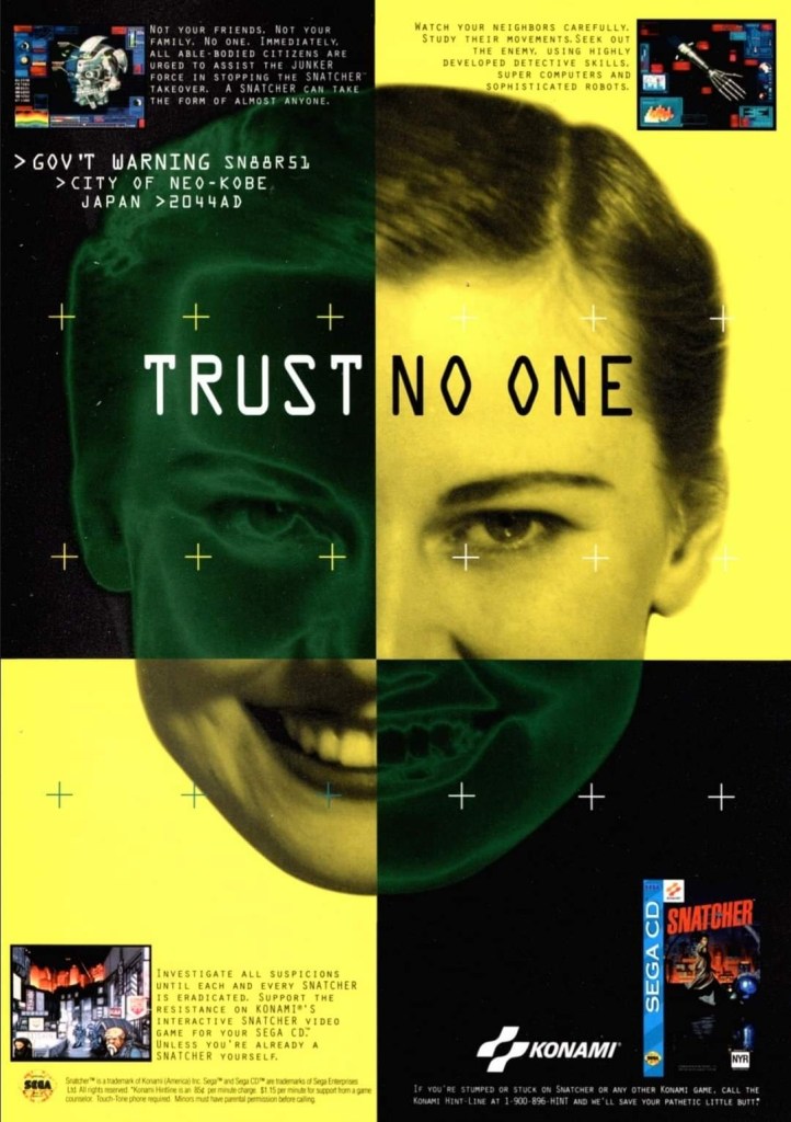
I find this Snatch print ad looking odd. The ad makers could have done more to focus on the game itself.

First released in Japan in 1988, Snatcher was a cyberpunk visual adventure game that was one of the early works of the famous Hideo Kojima (Metal Gear series). Due to its design and approach on visuals to tell a story, it was not surprising that a Sega CD version of it got released in 1994. To promote the game to the growing number of North American Sega CD gamers at the time, Konami came up with this rather unusual print ad showing the face of a smiling lady dominating the space leaving little room to show the screenshots and the game’s cover. The visual concept is engaging but it takes effort to notice it was promoting the Sega CD version of the video game. This old ad would have worked better had the ad makers increased the sizes of the screenshots and the game cover.

6. Jurassic Park for Sega CD print ad
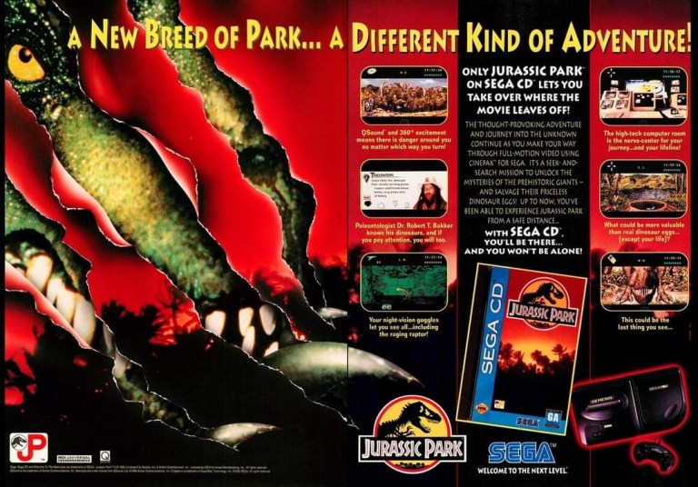
Does the T. Rex look scary to you?

As part of its drive to add more games to the Sega CD add-on and help it sell more units, Sega acquired the Jurassic Park license and went on to produce an adaptation utilizing the technological features of the Sega CD. To aggressively promote the game, Sega came up with this print ad that had a Tyrannosaurs Rex (looking through spaces) on one page and then several screenshots plus text descriptions on the other. For a click-and-point Jurassic Park game, this ad was really exciting and intriguing to look at.  

7. Atari Jaguar print ad
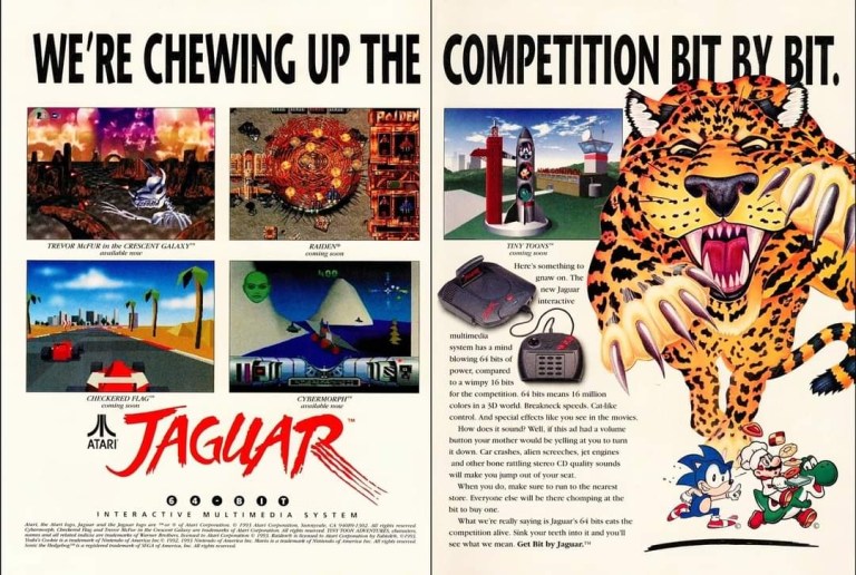
This was indeed an eye-catching ad.

In the early 1990s, Atari made an aggressive move to compete in the arena of video game consoles which they used to dominate from the late 1970s until 1983. This time around, they came up with the Jaguar console which had some pretty advanced technologies for the time. As part of their North American marketing campaign, Atari unleashed an ad showing game screenshots on the first page and huge artwork of a jaguar coming after Sonic, Mario and Yoshi (mascots of Sega and Nintendo respectively) symbolizing that the Atari Jaguar had more power and better technology than the Genesis and the Super Nintendo Entertainment System (SNS). While it was engaging to look at early on, this print ad is now an embarrassment as the Jaguar console failed terribly. Lastly, the marketing of the Jaguar as a 64-bit machine was never real.

8. George Foreman, The Simpsons and Spider-Man Game Gear print ad
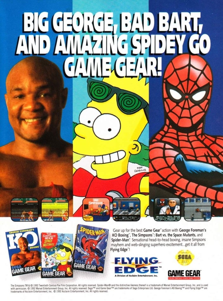
This ad appeared in a lot of comic books in the 1990s.

In the early 1990s, Sega released the Game Gear handheld gaming device which instantly placed them in competition with Nintendo’s Game Boy. Through its Flying Edge label, Acclaim Entertainment promoted George Foreman’s KO Boxing, The Simpsons: Bart vs. the Space Mutants, and Spider-Man for the Game Gear hoping to sell well. This 3-game print ad highlighted the popular figures who had a lot of space for attracting attention. The ad maker managed to insert two screenshots per game, the game covers and a text description to inform consumers what they were being offered. A good ad to look at.   

9. Time Gal for Sega CD print ad

The presentation here looks nice but Time Gal herself looked like she was drawn by a different artist.

Originally released in the arcades in Japan in 1985, Time Gal made its way to the Sega CD add-on in the early 1990s. It was a highly unusual video game as it was an interactive movie (with lots of anime footage) made with the use of Laserdisc technology for its arcade version. It played lots of anime scenes and players must choose the on-screen options to execute the character’s next action in order to progress. For the Sega CD version for North America, this print was made to capture the attention of consumers using the protagonist’s sex appeal on the cover art with four screenshots placed on the sides to show what to expect. I noticed that Time Gal on the cover art looked different from how she appeared in the anime sequences. At least the ad makers tried hard to sell the game.

10. Mortal Kombat print ad
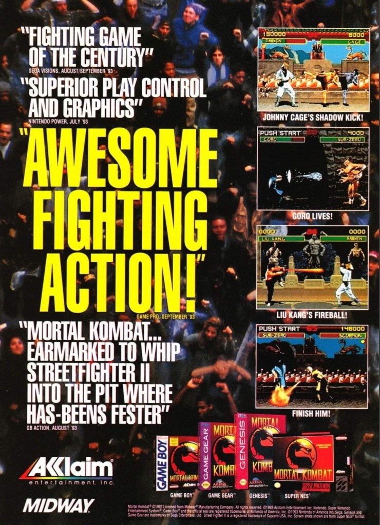
Still an effective ad to promote a blockbuster game and make people informed it was coming to multiple platforms.

Considering how successful it was in the arcades, the 1993 release of Mortal Kombat for game consoles and handhelds was unsurprisingly highly anticipated and publisher acclaim came up with this single-page ad. The presentation involved the use of a photographic background of many spectators (to emphasize excitement and popularity), media quotes and screenshots to effectively promote the game.

11. Equinox print ad
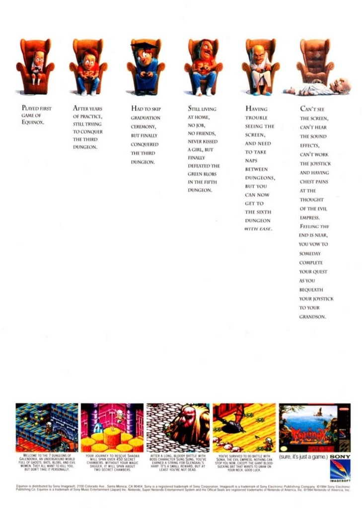
Take a close look. Tell me if you find it funny.

I never played Equinox but I heard the loud buzz about its design as a 3D isometric game that had elements of exploration, platform play and puzzle solving. The people responsible for this print ad emphasized the concept that the game is so addicting to play, players will still play it as they get older. This ad has a subtle yet effective approach with humor.

12. James Bond 007: The Duel print ad
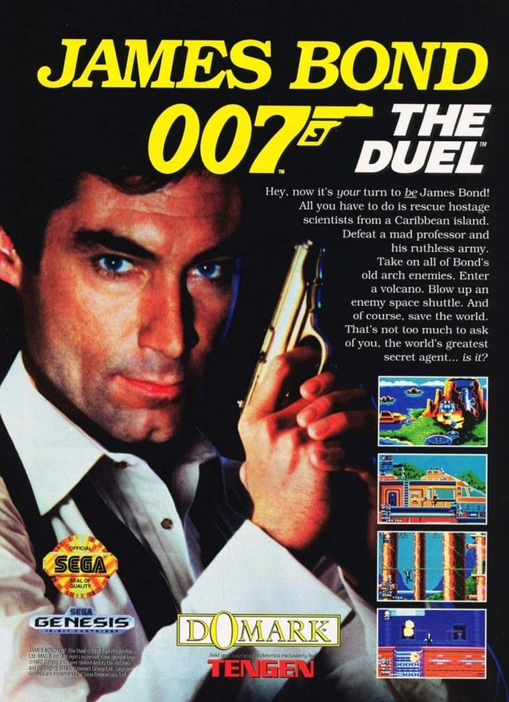
Timothy Dalton’s image as James Bond was sourced from Licence to Kill for this game’s ad.

Here is another decades-old James Bond video game print ad I found. Released a few years after Licence to Kill, James Bond 007: The Duel was notable not for its gameplay nor game design but for the fact that it used the image of Timothy Dalton as 007 for its print ad and the opening scenes in the game itself. Dalton’s Bond image here was never new nor originally taken for the game as it came directly from Licence to Kill’s publicity library. Each time I saw this ad, I was only reminded of the 1989 movie which I still enjoy watching.

13. Neo Geo AES console print ad
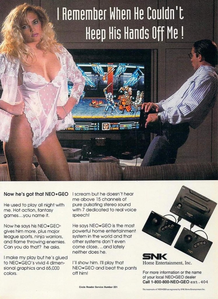
Do you find this ad both sexy and funny?

Decades ago, SNK made a huge splash in the arcades with lots of really fun games released with their Neo Geo (stylized as NEO GEO) hardware. In 1990, they released the cartridge-based Neo Geo AES console in Japan and America and it carried the same technology as the arcade hardware. To promote the console in North America (note: the Neo Geo console and its games were very expensive), SNK came up with this catchy and funny print ad showing a sexy woman feeling annoyed that her man spends more time with Neo Geo gaming than with her. This was a clever way of emphasizing the arcade-perfect experience in the comfort of home, and it was funny to look at.

14. Gradius II Japanese arcade flyer
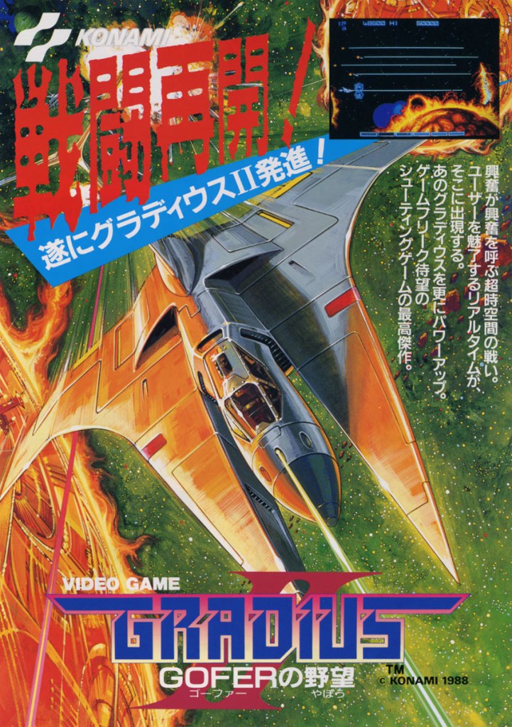
Great looking painted art was used for this 1988 arcade game.

Since the original Gradius was a big hit in arcades in Japan in 1985, it was not surprising that Konami released Gradius II three years later. With regards to the use of painted art, the artist showed the game’s spaceship in a dominating position emphasizing high-speed travel and excitement. The image, which also looks more colorful, is a complete reversal of the painted art used in the flyer of the previous which showed the rear of the spaceship as it moves towards a larger spaceship (the opposition). This arcade flyer art still looks great as it has a timeless charm.

+++++

Thank you for reading. If you find this article engaging, please click the like button below, share this article to others and also please consider making a donation to support my publishing. If you are looking for a copywriter to create content for your special project or business, check out my services and my portfolio. Feel free to contact me with a private message. Also please feel free to visit my Facebook page Author Carlo Carrasco and follow me on Twitter at  @HavenorFantasy as well as on Tumblr at https://carlocarrasco.tumblr.com/ and on Instagram at https://www.instagram.com/authorcarlocarrasco

Retro Gaming Ads Blast – Part 18 (Fighting Games Special)

Welcome back readers, fellow geeks and electronic gaming fans!

In this edition of the Retro Gaming Ads Blast (RGAB) series, we will take a look at another batch of retro gaming print ads – including arcade flyers – specifically about fighting games that were released in the 1990s. The said decade marked the time when Street Fighter II became a massive hit in the video arcades (and on game consoles) which sparked a wave of new fighting games from business competitors. In that same decade, 3D polygonal fighting games were also released which added greater choices of fighting games at the arcades and on game consoles that players could choose from.

For the newcomers reading this, Retro Gaming Ads Blast (RGAB) looks back at the many print ads of games (console, arcade, computer and handheld) that were published in comic books, magazines, flyers, posters and newspapers long before smartphones, social media, the worldwide web and streaming became popular. To put things in perspective, people back in the 1980s and 1990s were more trusting of print media for information and images about electronic games and related products.

With those details laid down, here is the newest batch of retro gaming print ads for you to see and enjoy…

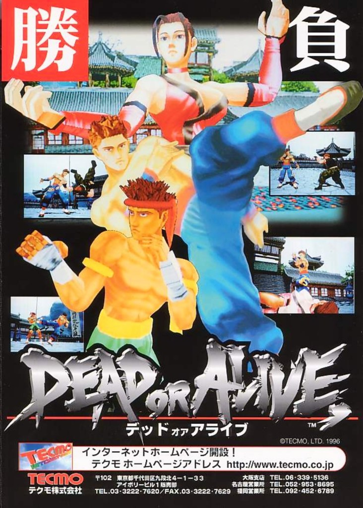
1. Dead or Alive Japanese arcade flyer

Dead or Alive was the start of new success that impacted the direction of Tecmo in the gaming industry.

The above arcade flyer of Dead or Alive gave Japanese arcade operators and gamers a taste of what to expect with the game. While the screenshots showed some resemblance with what gamers saw in Virtua Fighter 2, the character designs Tecmo and its developers came up with were unique.

Before Dead or Alive was released in Japanese arcades in 1996, company Tecmo was in financial trouble and they asked Tomonobu Itagaki to make a fighting game similar to Sega’s polygonal blockbuster Virtua Fighter. A breakthrough for Tecmo happened when Sega announced they were licensing their Model 2 arcade to third-party companies which paved the way for Itagaki’s team to make Dead or Alive with it. The game became a big hit and it paved the way for Tecmo to release it on Sega Saturn and PlayStation, and the sequels that followed years later.

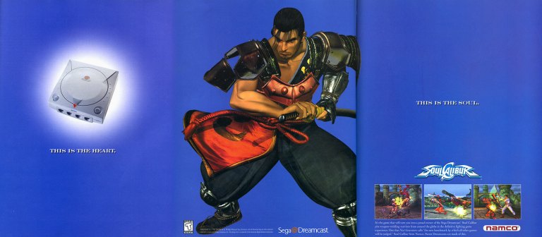
2. North American Soulcalibur Dreamcast version print ad

Namco came up with a creative approach to emphasize heart-and-soul promoting their game and the Dreamcast.

On September 9, 1999, Sega launched their Dreamcast console in America. With a gap of around ten months between the Japanese launch (November 1998) and the American launch, Sega had time to prepare Dreamcast’s release to American gamers with a huge lineup of games (both Sega’s games and from other publishers). Fortunately for Sega, they had Namco (their rival on arcade games) supporting their console.

Behind the scenes, Namco’s developers worked hard to not only port their arcade hit Soulcalibur to the Dreamcast, but to enhance the graphics using the console’s more advanced technology. The visual enhancements include rendering all of the games stages (and backgrounds) into full 3D polygonal environments. Namco also implemented different game modes and added even more content to ensure satisfaction to Dreamcast gamers.

The above 3-page print ad of Soulcalibur on Dreamcast was undeniably strategic and captivating to look at. The ad described the console as the heart, showed Soulcalibur character Mitsurugi (one of the game’s most popular characters) in the middle and then described the game (with 3 screenshots of game rendered with Dreamcast graphics) as the soul. It was a strong way to promote both the game and the console. In the years that followed, Soulcalibur grew into a popular fighting game franchise and the Dreamcast version will always be remembered as the crucial turning point.

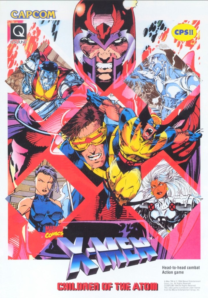
3. X-Men: Children of the Atom arcade flyer

Anyone who read lots of X-Men comic books in the 1990s should be able to tell which character was drawn by which artist.

When Capcom first released X-Men: Children of the Atom in the arcades in the mid-1990s, I was surprised because I did not anticipate the day would come when the company behind Street Fighter II would actually make a 2D fighting game showcasing the Marvel’s mutants. Even more intriguing was the X-Men art Capcom used for the arcade flyer to promote the game. I recognize Jim Lee’s artworks of Magneto, Cyclops and Colossus. The art of Wolverine shown was drawn by Andy Kubert. It was a wise move for Capcom (with Marvel as a business partner) to use established X-Men comic book artworks instead of having their internal illustrator draw the characters. That being said, this arcade flyer still looks great and captivating to look at.

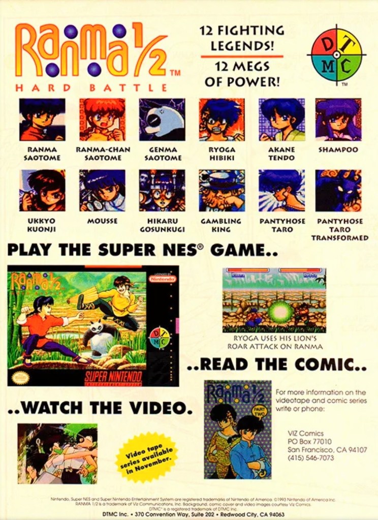
4. North American Ranma ½: Hard Battle print ad

A print ad promoting the game while saving some space to promote the anime and comic books.

By 1993, Street Fighter II and its upgraded follow-ups were wildly popular both in the arcades and on game consoles around the world. At the same time, there were many other 2D fighting games released to compete with and cash-in on Street Fighter II’s success. Believe it or not, the established anime franchise Ranma ½ saw a video game adaptation in the form of a 2D fighting game – Ranma ½: Hard Battle.

The North American print ad above published by DTMC (in cooperation with Viz Communications) promoted the game (one screenshot, the SNES game box and images of the characters as they appeared in the game) as well as Ranma ½ on anime videos and comic books. The way it was presented, the print ad promoted Ranma ½: Hard Battle without much heart nor passion.

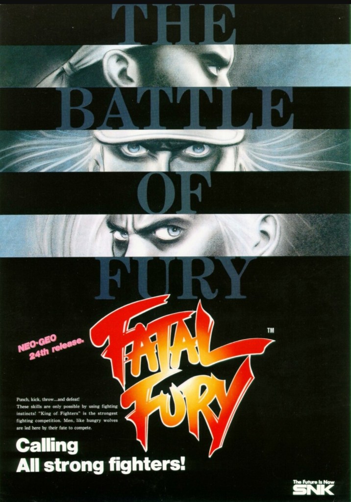
5. Fatal Fury: King of Fighters arcade flyer

An intriguing visual presentation on the front.
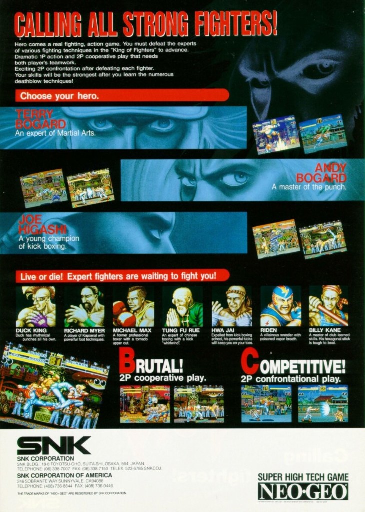
You get to know the characters and what the game features are.

There is no doubt that Fatal Fury: King of Fighters is the most significant game that SNK made. Apart from being the company’s first fighting game for the Neo Geo system, it established the fictional “king of fighters” tournament that became the core concept for The King of Fighters series of games in the years that followed. Fatal Fury itself is notable for being designed by Takashi Nishiyama, a former Capcom employee who created the original Street Fighter game. What Nishiyama could not do with Street Fighter, he accomplished while making SNK’s fighting game. Compared with the combo-oriented approach of Street Fighter II, Fatal Fury was designed to emphasize the timing of special moves, confrontational play, cooperative play and the 3D-like spacing between characters (background row and foreground row in each stage) while telling a story in a solid way.  

The above arcade flyer of Fatal Fury has this unique looking artwork on the front showing stylized rectangular shots of the major characters Terry Bogard, Andy Bogard and Joe Higashi. On the other side of the flyer are the details that emphasized the creative concept of the game, who the characters are and what they could expect with regards to gameplay features. This flyer is still captivating to look at and it could entice you to try playing the original Fatal Fury game before trying out the sequels and spin-offs.

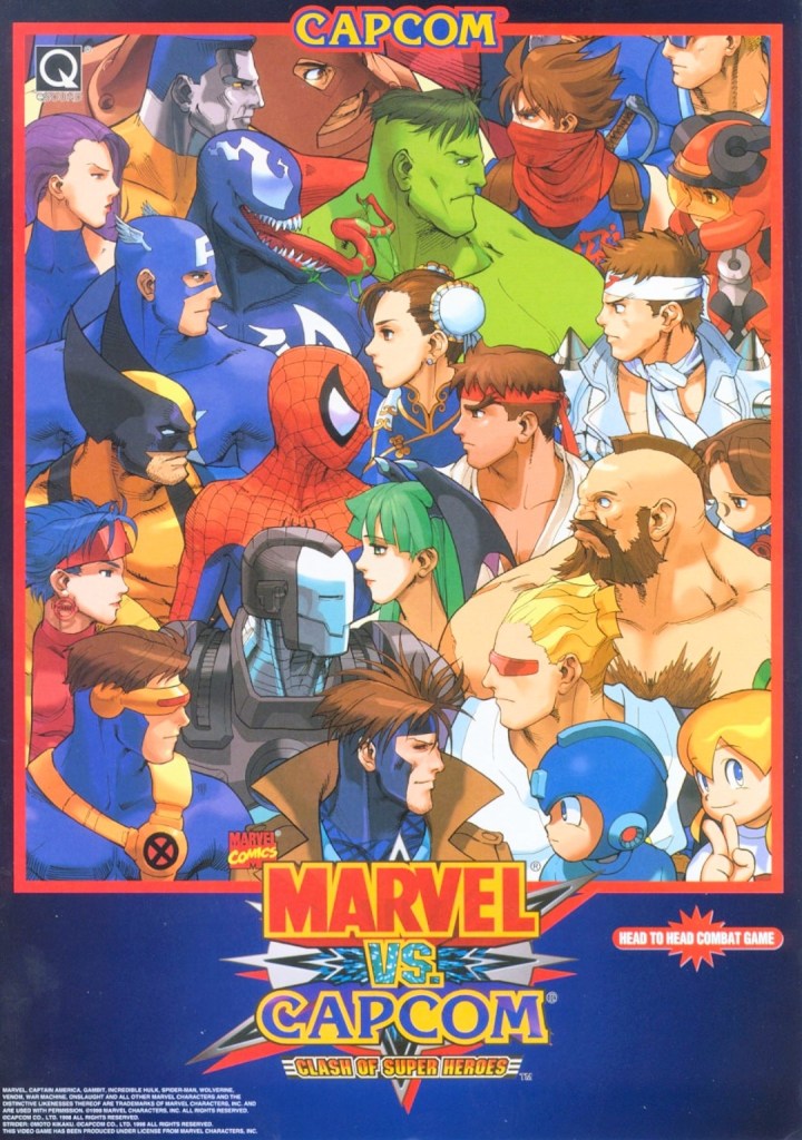
6. Marvel vs. Capcom: Clash of Super Heroes arcade flyer

This is NOT a comic book crossover.

If there is anything that truly emphasizes the essence of a fictional crossover in terms of visuals, it’s the art that Capcom and Marvel agreed to for Marvel vs. Capcom: Clash of Superheroes which is evident on the front of the above arcade flyer. By looking at how the Marvel characters were drawn, it looks like someone at Capcom illustrated the artwork as the Capcom characters still maintained that particular art style seen in the artworks of the Japanese company’s other games like Street Fighter, Darkstalkers, Mega Man and Strider. Regardless, the artwork still is amusing to look at.

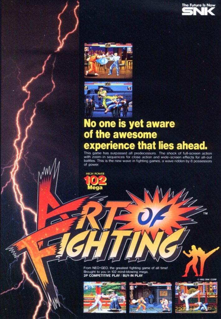
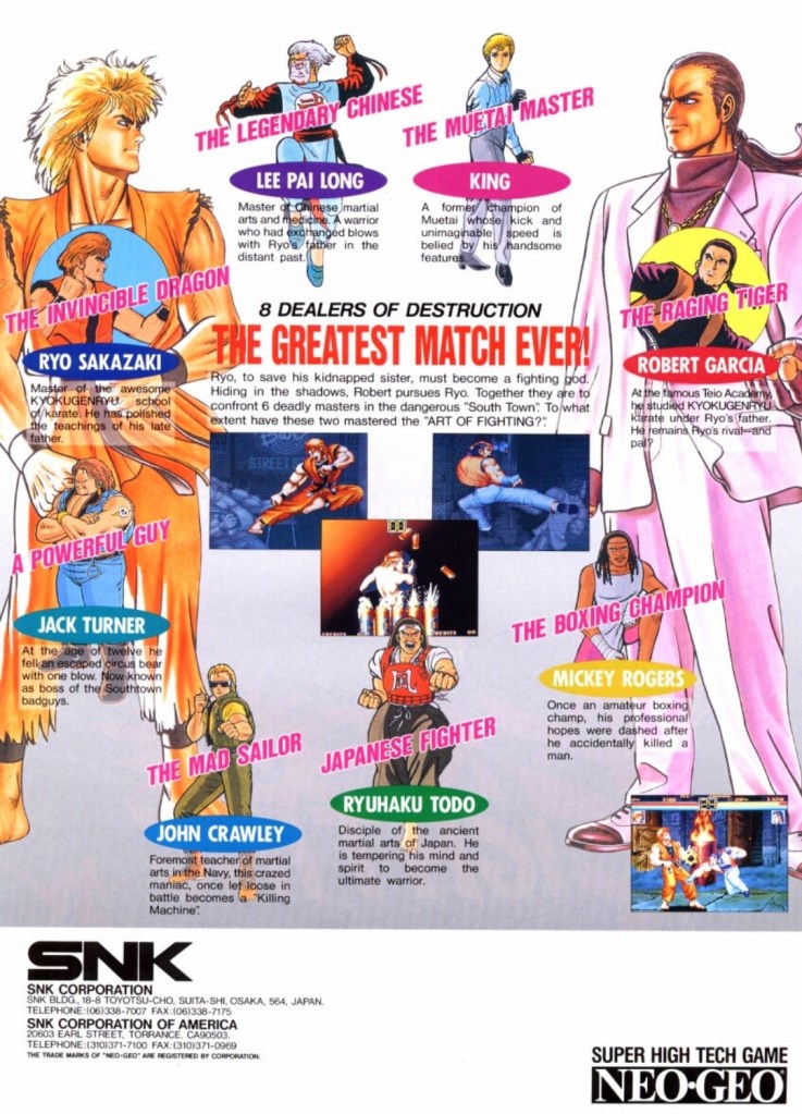
7. Art of Fighting arcade flyer

The front of the flyer.
The cast of characters showcased on the other side of the flyer.

Following the success of Fatal Fury, SNK went on to release Art of Fighting in arcades in 1992 and it became successful enough for the company to make sequels. With regards to the realm of fantasy, Art of Fighting was part of the same fictional universe as Fatal Fury and The King of Fighters, and there were times when its own characters appeared in other SNK games.

Art of Fighting’s arcade flyer had an energetic visual concept on the front with a rectangular lightning portion on the left balanced with five screenshots of the game itself. Once you get to the other side of the flyer, you will see really nice art of the characters with Ryo Sakazaki and Robert Garcia as the most dominating figures. Sakazaki and Garcia are the major characters of the Art of Fighting series. This flyer confidently introduced the characters and succeeded in making them look interesting.

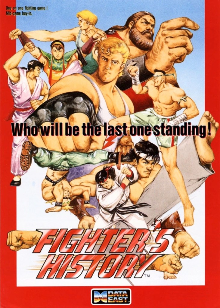
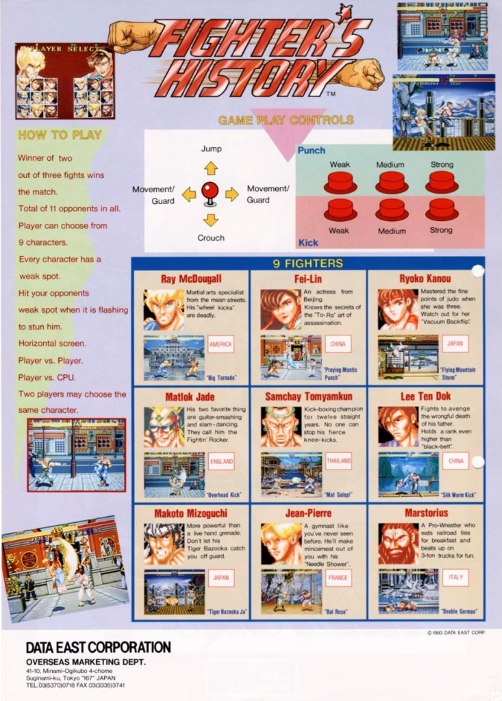
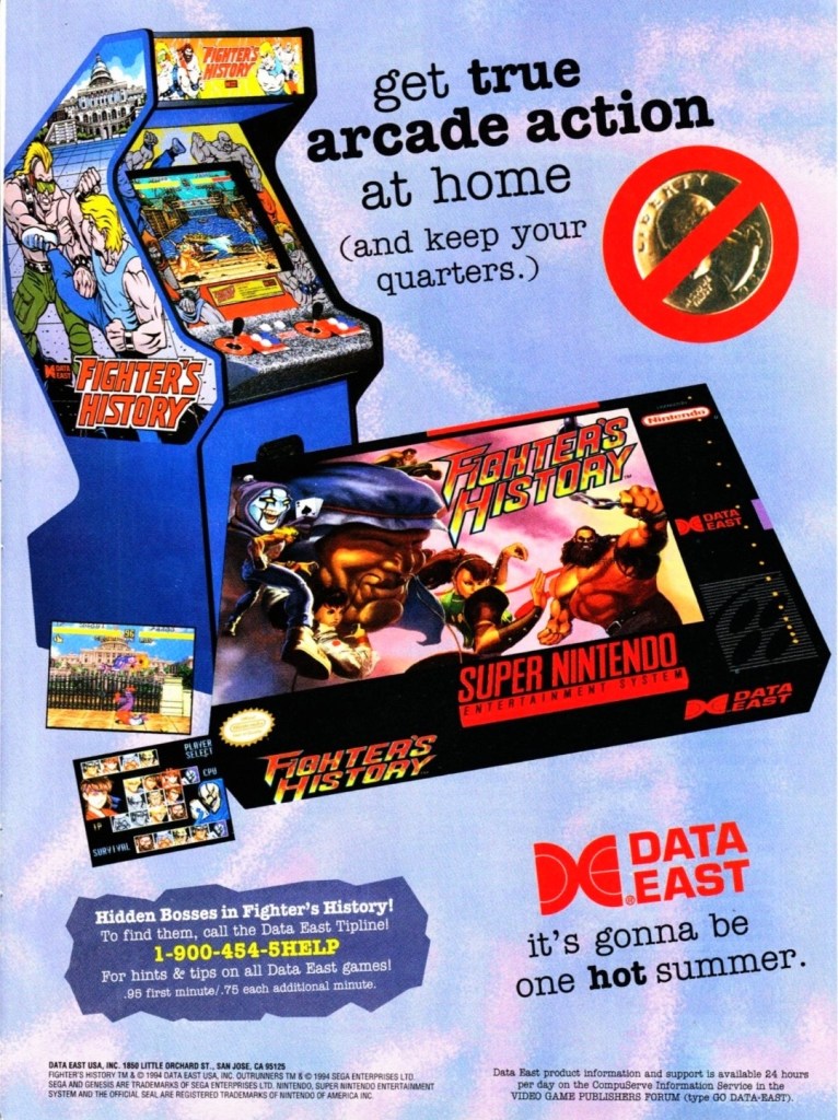
8. Fighter’s History arcade flyer and print ad

Great looking front artwork showing the game’s characters, posing and some action.
If you look closely at the controls, you will see the six-button layout and functions which are the same with those used in Street Fighter II.
Data East offered two ways for gamers to enjoy Fighter’s History – pay a high price for the SNES version or gamers can go play the game in the arcade by dropping a few coins.

In 1993, Data East released their fighting game Fighter’s History in the arcades around the world. Along the way, the company released their arcade flyer which had a very captivating art work on the front featuring their characters and some action. The other side of the flyer showed the technical details on how to play, how the control works and who the characters are. Fighter’s History was nicely received in the arcades and the success led Data East into porting the game for the Super Nintendo Entertainment System (SNES). If you look at the print ad above, you can see how clever Data East was promoting the SNES version of the game while keeping an image of the arcade machine which serves like a subtle reminder that the same game is still available in video arcades.

Shortly after the release of Fighter’s History in the arcades, there were gamers who noticed that it had certain visual and gameplay elements that made it so familiar with what Street Fighter II had. When Capcom became aware of the similarities, they sued Data East claiming that Fighter’s History was too similar to their game and that copyright infringement was committed. Capcom lost the case ultimately and Data East went on to release two more Fighter’s History games.

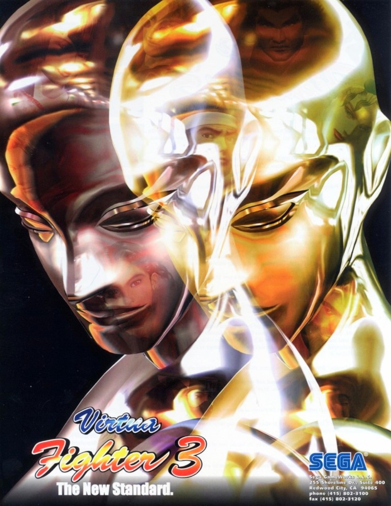
9. Virtua Fighter 3 arcade flyer

Virtua Fighter 3 truly raised the standards for arcade game graphics back in 1996.

When it comes to gaming innovation and standing out among the rest, Sega did exactly those when they released Virtua Fighter 3 in arcades in 1996 and it had the best-looking and really mind-blowing graphics at the time. Developed by AM2 (led by Yu Suzuki) on the very expensive Model 3 arcade hardware, Virtua Fighter 3 broke new ground on graphics as it moved over 1 million polygons per second, had highly detailed visuals on the characters and surroundings, realistic reflection effects, detailed shining, parallel lighting and high-specular Gouraud shading to name some. Even the characters’ eyes followed the opponent’s position.

The Virtua Fighter 3 arcade flyer showcased their reflective, metallic character Dural who in turn was part of the graphical showcase (emphasizing reflections, smooth animation and liquid metal effects) when the game was previewed in the 1996 AOU event in Japan. The words “The New Standard” written on the lower-left corner of the front of the flyer was justified and truthful.

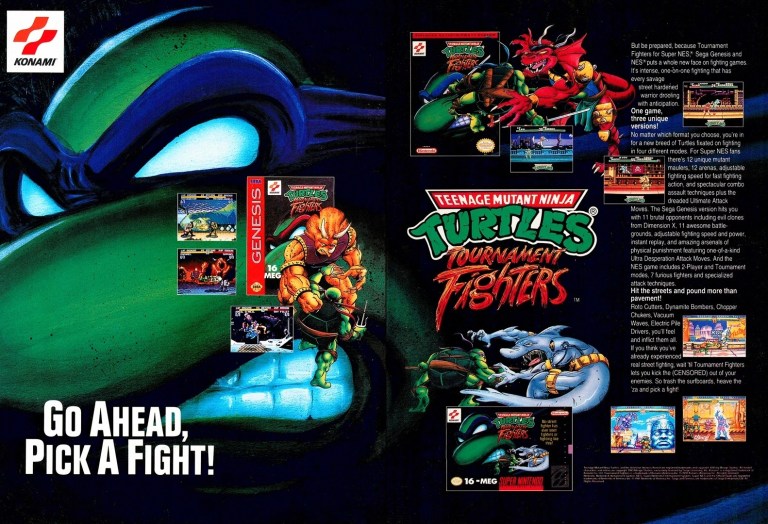
10. Teenage Mutant Ninja Turtles: Tournament Fighters print ad

This print ad had a nice visual presentation and was easily recognizable to the many TMNT fans.

In 1989, the Teenage Mutant Ninja Turtles (TMNT) franchise made quite a splash on video games which is not surprising as the multimedia franchise was already a popular in the West. More video game adaptation of TMNT were released in the early 1990s providing fans and gamers a lot of fun gameplay at the arcades (click here) and on consoles. Konami had the video game rights of TMNT and in a clear response to the sudden popularity of fighting games, they released Teenage Mutant Ninja Turtles: Tournament Fighters on the most popular game consoles of the time achieving varying levels of success critically and commercially (note: the SNES version stood out as the best). This print ad of the fighting game was effective in visually promoting the three console versions and the displayed text contained enough information to lure the attention of both fans and gamers.

+++++

Thank you for reading. If you find this article engaging, please click the like button below, share this article to others and also please consider making a donation to support my publishing. If you are looking for a copywriter to create content for your special project or business, check out my services and my portfolio. Feel free to contact me with a private message. Also please feel free to visit my Facebook page Author Carlo Carrasco and follow me on Twitter at  @HavenorFantasy as well as on Tumblr at https://carlocarrasco.tumblr.com/ and on Instagram at https://www.instagram.com/authorcarlocarrasco