Disclaimer: This is my original work with details sourced from reading the comic book and doing personal research. Anyone who wants to use this article, in part or in whole, needs to secure first my permission and agree to cite me as the source and author. Let it be known that any unauthorized use of this article will constrain the author to pursue the remedies under R.A. No. 8293, the Revised Penal Code, and/or all applicable legal actions under the laws of the Philippines.
There is no doubt that George Perez’s famous handling of Wonder Woman (that became a key part of the Post-Crisis era of DC Comics) is influential for other creators. Over at Comic Book Resources, I read a 2017 article in which Wonder Woman movie director Patty Jenkins confirmed that Perez’s work on the Queen of Superheroes helped influence the movie.
Below is what Jenkins said in response to CBR’s question involving George Perez:
I think it was the fact that he expanded the role of the gods. It was always there — nothing he did contradicted what William Marston did and created, I think it only expanded upon and fleshed out who the gods are. What that relationship is, and how that works. What was a wonderful thing for us to take from.
I personally love the Wonder Woman movie and truly Gal Gadot IS Wonder Woman! As George Perez’s work on the Queen of Superheroes was influential to the director, it is clear that he set the standard on presenting Wonder Woman to the world.
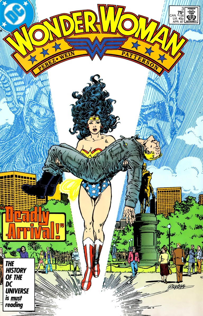
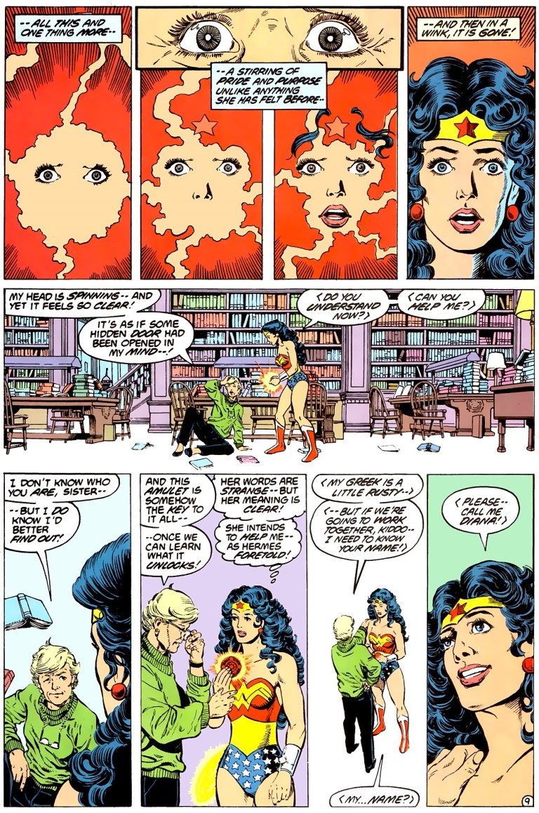
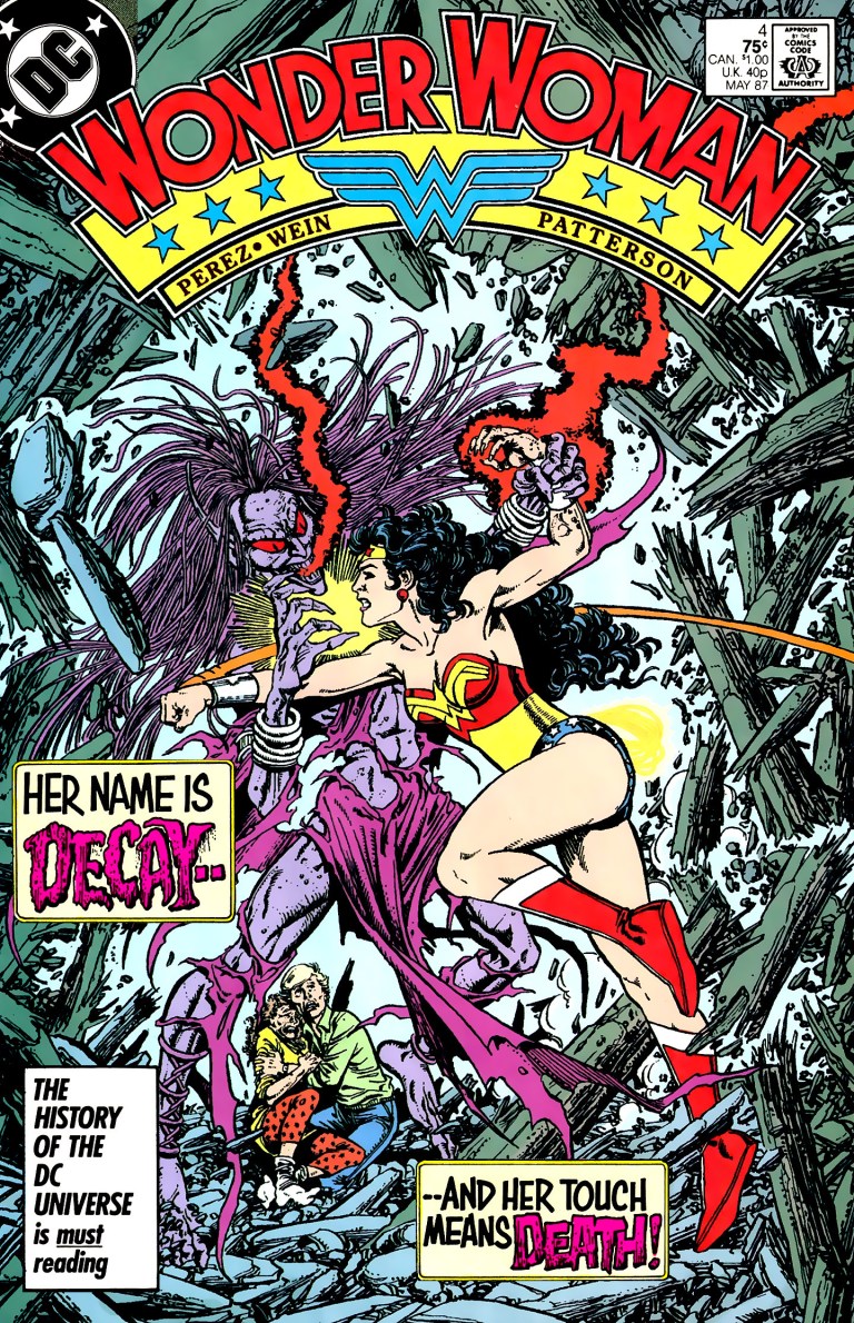
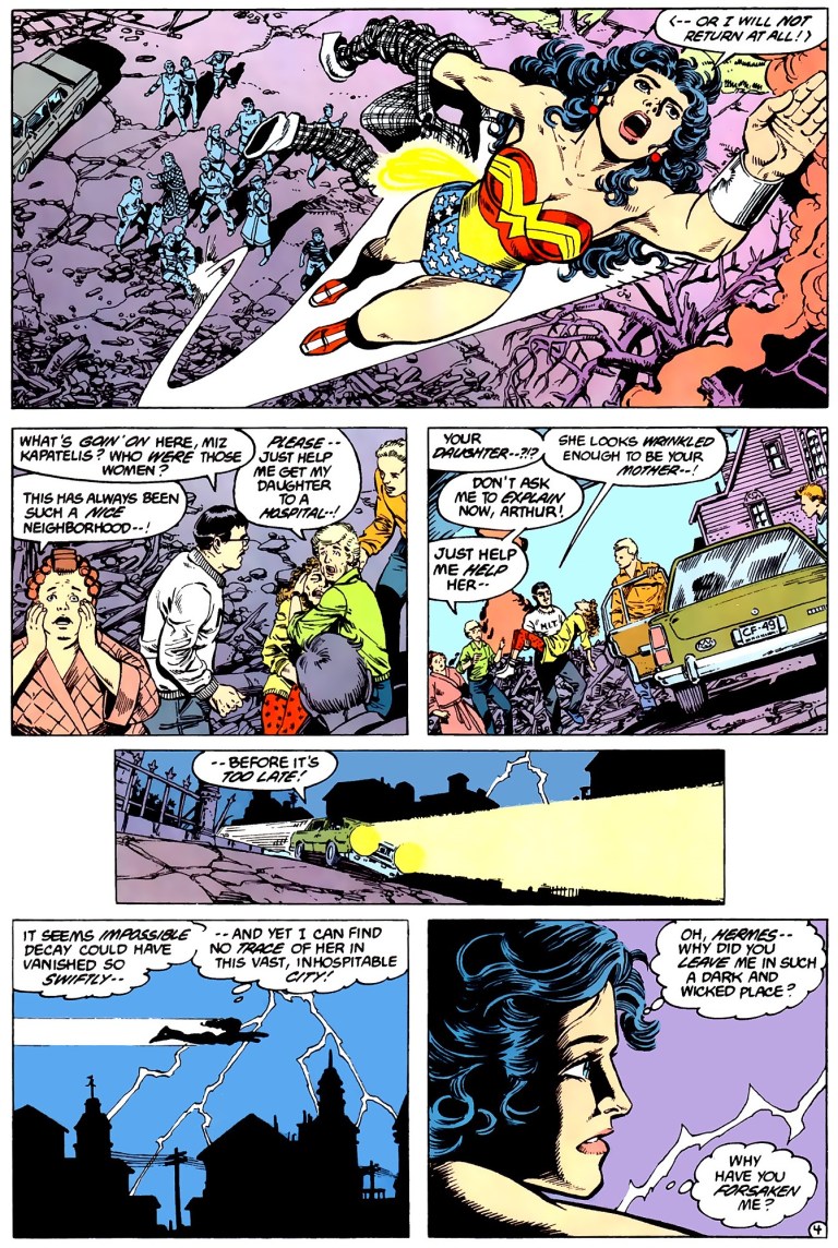
With the movie and history talk over, we can now proceed on revisiting the Post-Crisis era of DC Comics with this look back at Wonder Woman #4, published in 1987 by DC Comics with a story by George Perez and Len Wein (script) and art by Perez (inked by Bruce D. Patterson).
Early story
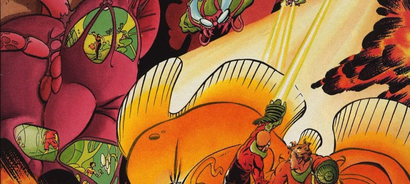
The story begins with Wonder Woman carrying Julia Kapatelis and her daughter Vanessa moving away from the villainess Decay (daughter of Medusa) as a huge portion of the Kapatelis home collapses. As expected, the next-door neighbors got disturbed and went out of their homes to see what’s going on.
While taking a break just out of the rubble, Julia checks on Vanessa and asks: “What has that monster done to her?”
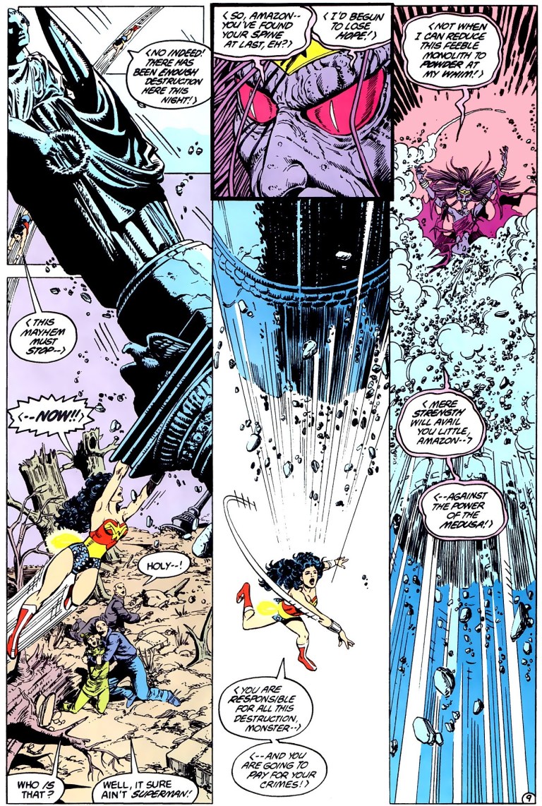
Suddenly, Decay rises from the rubble and answers Julia’s question directly stating she will do the same thing to her and Wonder Woman. Decay has Wonder Woman’s tiara with her.
Decay’s appearance scares many onlookers. Wonder Woman tells Julia to keep the neighbors back. Decay says that she came only for the symbol of Wonder Woman’s power (the tiara specifically) which she will use to symbolize her power. Decay then flies away.
Before flying off, Wonder Woman tells Julia that she will return with a cure for her teenage daughter whose body got heavily wrinkled by Decay…
Quality
Once again, George Perez and Len Wein crafted another excellent Wonder Woman comic book that is timeless and symbolic. While Wonder Woman #3 marked Princess Diana’s arrival in man’s world, this comic book marked her first-ever battle in the same world complete with disturbance on the local society. Take note that at this point, Wonder Woman still has yet to understand and speak English and she has not fully adjusted to the local culture and society. She also just befriended Julia, the university professor and only person who could communicate with her by talking in Greek. Even with all the trouble caused by Decay, Wonder Woman’s heroism laced with love and compassion backed by her Amazon values remains intact and this aspect alone makes this comic book worth reading.
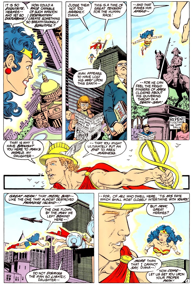
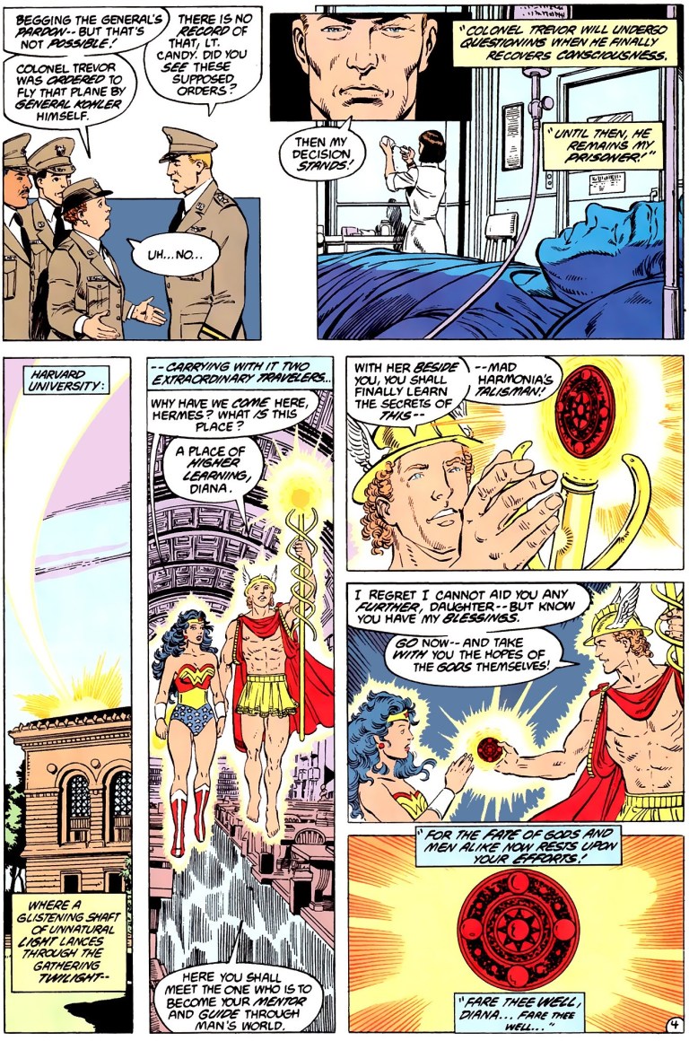
Apart from focusing on Wonder Woman and the supporting players, the comic book gives a close look at what has been happening at Mount Olympus where the Greek gods and goddesses discuss the situation of Princess Diana. There are also a few scenes set in the American military base wherein Lieutenant Etta Candy secretly does detective work to find out what caused the anomaly that led the higher-ups to suspect Steve Trevor of wrongdoing.
As for the artwork, George Perez’s work here is excellent as expected. When destruction is shown, there is a strong sense of danger. When hard superhero action occurs, there is a lot of impact shown! I just love looking at scenes showing Wonder Woman saving people from certain death. Also there were some really powerful executions of action here (involving Wonder Woman) that I wish future Wonder Woman movies will someday replicate.
Conclusion
Wonder Woman #4 of 1987 is excellent! Apart showing the first time ever that Wonder Woman engaged in battle in man’s world, this comic book also has an intimate look on how Princess Diana struggles with focusing on her mission while adjusting to the local culture and making sure that evil beings from her culture would not succeed in destroying the people of man’s world.
If you are seriously planning to buy an existing hard copy of Wonder Woman #4, be aware that as of this writing, MileHighComics.com shows that the near-mint copy of the regular edition and the newsstand edition cost $25 and $51 respectively.
Overall, Wonder Woman #4 (1987) is highly recommended!
Thank you for reading. If you find this article engaging, please click the like button below and also please consider sharing this article to others. If you are looking for a copywriter to create content for your special project or business, check out my services and my portfolio. Feel free to contact me as well. Also please feel free to visit my Facebook page Author Carlo Carrasco and follow me at HavenorFantasy@twitter.com