Since the successful release of John Carpenter’s Halloween in 1978, the slasher horror sub-genre grew dramatically and made its mark in Hollywood. The 1980s saw the release of multiple low-budget films that shared lots of common elements with Halloween. Among them was a cheaply made flick (distributed by Paramount Pictures) that made almost $60 million worldwide.
The film was Friday The 13th which was released on May 1980. Unsurprisingly the Sean Cunningham-directed movie was poorly received by movie critics but moviegoers still flocked to the theaters to watch the cinematic horror unfold not in a suburb but in a summer camp.
This is my review of the movie.
Story
The film begins way back in the past. The late 1950s to be precise. During one night at Camp Crystal Lake, a male and female councilor attempt to make love only to find out that someone had been watching them. Both councilors got killed setting the stage for Camp Crystal Lake’s dark legacy.
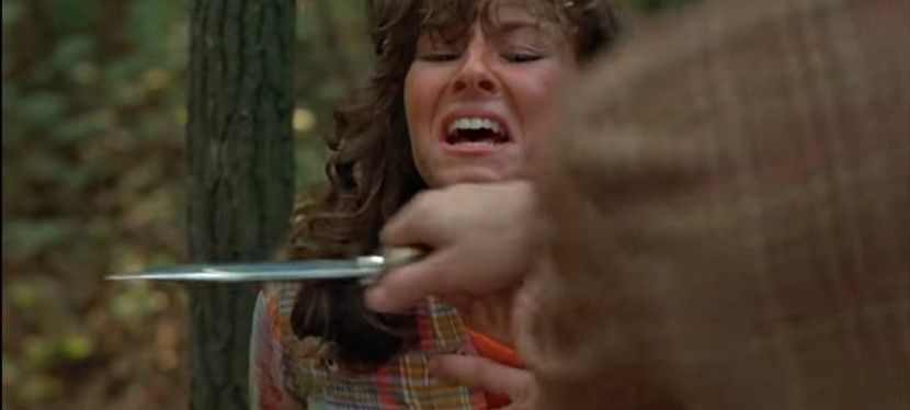
Decades later, an effort was launched to reopen Camp Crystal Lake. A cute lady named Annie (played by Robbi Morgan) travels alone to the camp and along the way, people in the small town warn her about the camp’s history of murder. After hitching a 2nd ride, Annie realizes that the driver (off-camera) did not take the path to the camp. Realizing that the driver has no intention of letting her go, Annie desperately jumps off the speeding vehicle injuring herself in the process. To her horror, the driver went back, got down the vehicle and chased her into the woods. After getting caught, the driver slashes Annie’s neck.
At Camp Crystal Lake, teenagers (including a very young Kevin Bacon) arrived to take part in the reopening. What they don’t realize is that someone vicious is watching them from a distance and stalking them.
Quality
In my honest opinion, Friday The 13th is not worthy of being called a classic even though its commercial success added greatly to the slasher horror sub-genre and led to the production of multiple sequels eventually establishing Jason Voorhees (a victim in this movie) as a horror icon. By today’s standards, this movie is generic at best.
The script written by Victor Miller is serviceable. The characters are, unsurprisingly, mostly written to be killed off. What makes the movie bad is that the story is dragging for the most part and what saved it from turning into a disaster was the use of suspense, gore and shock when Alice (played by Adrienne King) got isolated on-screen.
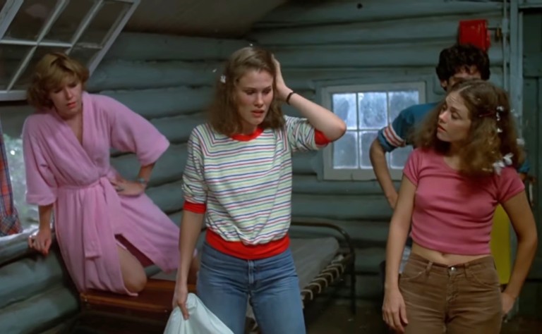
The characters during the snake scene. At left is Adrienne King as Alice.
As mentioned above, Jason Voorhees is the NOT the cinematic killer here at all and those who discovered the character in the later films (and wanted to go back to the beginning of this film franchise) will be disappointed to realize how irrelevant he was in this old movie.
For the sake of those discovering this movie, I won’t say who the killer is but I can say that screenwriter Victor Miller’s concept of NOT using a masked killer is creatively unique.
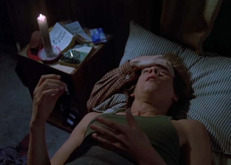
Kevin Bacon in trouble!
In terms of performance, the clear standouts are Adrienne King as Alice and another actress (note: I won’t name her here due to spoiler potential) as the killer. Alice was decently built-up from the early part of the film while the killer, who arrived late in the film, was well presented to be evil, even psychotic (clearly inspired by a certain 1960 slasher movie).
With regards to stunts and kills, this movie is pretty tame when compared to its sequels. This should not be a surprise at all because nobody anticipated the movie would be a box office success to kick start a franchise. The film crew used a really small budget and they did what they could with it although they excelled with some of the gore effects (read: Tom Savini). The physical struggle between Alice and the killer was pretty raw which worked well in the context of the film since the protagonist was no fighter. The killer’s man-like aesthetic in terms of physical appearance added nicely to the suspense and horror as Alice struggled.
When it comes to cinematic concepts, Friday The 13th was written to emphasize how vulnerable people are to getting murdered in an isolated location far away from the reach of the local police and even farther away from the security of the American suburb. At Camp Crystal Lake, the teenagers had a whole lot of freedom to exploit the facilities, to engage in casual sex, make fools of themselves and the like. This is clearly the one factor that defined it and the film franchise went on to establish its legacy with the “horror at the summer camp” concept.
Conclusion
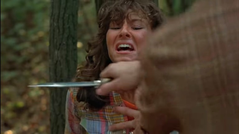
Robbi Morgan as Annie cornered by the killer.
This is tricky. I would recommend Friday The 13th to moviegoers who are willing to endure slow-paced, mystery and suspense-filled horror flicks, and also to die-hard fans of the film franchise. However, if you discovered Jason Voorhees in the sequels and thought about watching this film (the very beginning of the franchise) to see him do what he is known for (read: killing), you will be disappointed.
As a horror movie, Friday The 13th is the product of its era and at the time of its release, the slasher horror sub-genre was just taking off. I would not recommend this movie if you are searching for more Jason but rest assured, you will get to know the complete backdrop regarding what happened to Jason, why the killings happened in the years that followed and so on. This movie also showed, in my opinion, one of the most definitive depictions of Camp Crystal Lake on the big screen.
Overall, Friday The 13th is serviceable. Not a classic, just serviceable. Nothing special at all. It’s a wonder why moviegoers back in 1980-1981 spent almost $60 million to watch this movie.
Thank you for reading. If you find this article engaging, please click the like button below and also please consider sharing this article to others. Also my fantasy book The World of Havenoris still available in paperback and e-book format. If you are looking for a copywriter to create content for your special project or business, check out my services and my portfolio. Feel free to contact me as well. Also please feel free to visit my Facebook page Author Carlo Carrasco and follow me at HavenorFantasy@twitter.com
When a filmmaker has high concepts but ends up receiving insufficient resources to realize them, disaster normally strikes not only the film crew but also the fans.
This was precisely what happened in the horror movie Friday The 13th Part VIII: Jason Takes Manhattan, written and directed by Rob Hedden. Released on July 28, 1989 in the United States, the movie was the result of Paramount Pictures’ rejection of proposals on making a direct sequel to Friday The 13th Part VII: The New Blood involving that film’s lead character Tina Shepard (played by Lar Park Lincoln).
Hedden, who previously worked for another movie studio and participated in the unrelated Friday The 13th TV series, was hired to make the sequel and he had the idea of bringing the horror icon Jason Voorhees out of Camp Crystal Lake (and its related locations) and came up with concepts of having one story set on a cruise ship (for a claustrophobic horror experience) and another story set in New York City (which includes ideas of having notable locations there as key places for misadventures and action).
“Everything about New York was going to be completely exploited and milked,” Hedden said in an interview. “There was going to be a tremendous scene on the Brooklyn Bridge. A boxing match in Madison Square Garden. Jason would go through department stores. He’d go through Times Square. He’d go into a Broadway play. He’d even crawl onto the top of the Statue of Liberty and dive off.”
The movie studio liked Hedden’s concepts and gave him a budget. The big problem was that there simply was not enough money granted (a little over $5 million) and it was too expensive to film on location in New York (I wonder if Hedden actually made some research about the city as he came up with his New York ideas). Although the given budget was the BIGGEST for a Friday The 13th film at the time, Hedden had no choice but to combine the two concepts into one single narrative. As if insufficient funds were not bad enough, Hedden implemented another concept to look at Jason as a child through the hallucinations of the film’s lead – Rennie Wickham (played by Jensen Daggett). Of course, the hallucinations led to spending some money on “special” effects, make-up, and set-up.
Now, we can start taking a close look at Friday The 13th Part VIII: Jason Takes Manhattan.
Kane Hodder as Jason on location at Times Square in New York.
The movie begins with shots of New York City (with several spots of Vancouver, Canada pretentiously presented as spots of the more famous city). Over at Camp Crystal Lake far away, a guy and his girl prepare to make love riding a boat floating on the lake unaware that Jason is deep underwater (following the events of Part VII). Through expository dialogue, the guy tells his girl about the legend of Jason who had murdered several people who came near the camp.
Due to an anchor cutting an underwater power cable, loose electricity reanimates Jason (played by Kane Hodder) who went up to the boat to kill the guy and the lady, one by one.
Very soon, a group of graduates from Lakeview High School prepares to embark on a cruise ship for their much-awaited visit to New York. Beyond logic, the scene shows that Crystal Lake is magically connected to the Atlantic Ocean and the background scenery shows that they are in Canada (note: back then it was more affordable to shoot scenes in Canada and pretend to be in the US).
At this point, the film introduces the final girl Rennie who is a gifted student but remains terrified about water since childhood. The leading man meanwhile is Sean (played by Scott Reeves) who is handsome but lacks the heart to follow the footsteps of his successful father who is the captain of the ship. Rennie and Sean both show signs of pain and lack from their respective past and these elements, predictably, make them a matching pair for moviegoers to follow.
Aside from the two, the film introduces mostly disposable characters like Rennie’s overbearing uncle (who happens to be a teacher in the same high school she attends and was clearly written to be the one character to irritate moviegoers into being sympathetic with Rennie and others), the good-natured lady teacher, the hard rock musician, the aspiring filmmaker, the jock, the pretty bad girl, the dude who talks without taking a look, the doomsayer, etc.
Just before the ship leaves, Jason climbs his way up to join the trip. Then he’s stalking starts.
Quality
Friday The 13th Part VIII: Jason Takes Manhattan was very bad when it was first released more than thirty years ago. By today’s standards, this film has aged terribly. Its quality is even worse now.
Let’s start with the most obvious flaw – the movie failed to live up to its promise of Jason’s taking Manhattan. The film’s subtitle is a big lie as much of the movie is set in the ship and New York (including the fake NYC spots that were filmed in Vancouver) does not appear as the definitive location until late in the story!
While the story was set on the ship, the film crew seem to focus on producing on-screen fillers creatively. Sure we get to see Jason stalk and kill characters (with some off-screen death blows) but the dialogue scenes, the transition scenes and character “development” stuff in between were very cheaply and poorly handled.
With Rennie, however, the team managed to make her somewhat engaging as the lead of the film by slowly defining her personality (nicely done by Daggett) and creating on-screen hallucination sequences emphasizing the emotional and psychological damage she suffered from encountering Jason when she was a young girl. The flashback of little Rennie encountering little Jason (which does not make sense at all as far as in-story history is concerned) under Crystal Lake was not only badly done but done without any sense of logic. One can argue that little Rennie only hallucinated of seeing kid Jason (supposedly out of fear and paranoia) but that sequence was just a waste of time even though the filmmakers tried to make moviegoers connect and feel with her. Sean, the other lead, was literally protected by plot armor (note: he was not one of the disposable characters) but his character was not written to do much except serving as a supporter for Rennie.
Lousy stuff? Lots of them here and there! Even though he saw his captain father dead, Sean does not show very much emotion and even worse, he easily forgets about him even as he sees Jason quite a number of times later. He should at least show some deep anger (if not lust for revenge) against Jason. Even though he did not witness Jason killing his father, it was made clear to him and the rest that Jason (and not the doomsayer) was responsible.
How about Wayne, the film-obsessed guy? Even though he and his pals took weapons to go around and hunt Jason, he still bothered to use his camera (while clumsily holding the gun) and film his way around! That is so stupid and it was no surprise that he ends up getting disposed of! Being obsessed with filming, Wayne could have decided to accompany one of his armed pals and used his camera for both video documenting and even help an armed guy see something (example: zooming at a spot or object far away).
As for lousy stuff reflecting the very low budget of the movie, I can point out that the scene in which Sean, Rennie, the uncle and lady school teacher board a lifeboat clearly looked fake and was shot on a studio set. The same thing can also be said about Rennie’s fall into the water (pushed over the deck by Tamara) and she was NOT left behind by the ship that was supposedly moving. The location where JJ played rock music before getting killed looked cheap.
More on production cheapness, either the filmmakers ran out of money or they became too lazy with the wardrobe and hoped moviegoers would be too stupid to notice anything. Look back at the scene when Rennie got pushed off by Tamara into the water and was saved by Sean (who jumped to do his heroic act). Even though they got wet, both Rennie and Sean STILL WORE THE EXACT SAME CLOTHES until the end of the film! Those characters did not change clothes even though Rennie returned to her room!
Speaking of which, the filmmakers disregarded the fact that, in the story, the ship was filled with a lot of students going to New York. There were guys and gals partying, playing games, enjoying the scenery (of Canada!), etc. And yet as the film played on, the filmmakers literally abandoned those many other students. The only exception here was the short scene in which the good-natured lady teacher brought some students with her and told them to stay and wait in the restaurant. A short time later, as she mentioned to her companions that there were students left in the restaurant, Sean replied to her depressingly, “There is no more restaurant.” Without showing any scenes, the filmmakers creatively and nonsensically got rid of the others. I suppose Hedden and team had no more time and money left to show what happened to them all.
The cheapness also affected the look of Jason. Adult Jason in Friday The 13th Part VII had a very menacing, gritty and rotten face design. In this movie, adult Jason’s face looks melted and cartoony! And then there was the inaccuracy with regards to how the film presented little Jason. In the early flashback scene, a kid Jason with a normal looking face was shown drowning (which contradicts the fact that Jason always had a deformed face). There was a ladies’ rest room scene wherein kid Jason (with a slightly deformed face this time) appeared to Rennie via a hallucination. Then there was another kid Jason, more deformed, during the flashback of little Rennie. Whatever the filmmakers did, none of those physical presentations of Jason proved to be scary. Clearly whatever little amount of money they spent here ended up wasted.
On the presentation, the film’s pacing was inconsistent and it sure had several dragging moments. Granted, this was Rob Hedden’s debut as a movie director but I’ve seen other slasher horror films that were paced better and had kills that were executed satisfactorily. The fear factor of this movie was weak overall. Meanwhile, Jason illogically has the ability to teleport in this film which is complete nonsense. I believe that the teleportation was implemented as a convenient way of cutting down on time and expense to complete the production. I suppose showing Jason physically moving from one place to the next to get to his running victim was too expensive and too inconvenient for Hedden’s team.
If there are any good points in this film, I should say that Rob Hedden and his team at least tried to be creative with Jason’s kills (but the teleporting still makes no sense). Tamara (whose mirror got dropped and broke into pieces) got stabbed with a sharp mirror piece. A guy in the sauna gets killed with a hot rock forced into his body. And then there was the city thug who got killed with a syringe piercing through his body (which is impossible and cartoony to look at).
The most memorable kill sequence by Jason was the “boxing fight” with Julius. In that sequence, Hedden told the actor to punch Jason many, many times with real physical contact. That sequence lasted rather long but Jason’s kill of Julius was undeniably good and with impact. Too bad that kill sequence could not carry this movie up.
Another good point to take note is Kane Hodder’s improved take on Jason in terms of action and looking threatening. This was his 2nd time to play Jason and he showed more confidence playing him.
Kelly Hu was only 20-years-old at the time of production. Jason Voorhees, not Wolverine, was the first pop culture icon she encountered on the big screen.
The stunt done inside a diner (with a particular stuntman who would later have his moment playing Jason in a certain 2003 movie) was at least satisfying to see. Last but not least, this movie featured a very young Kelly Hu who is now a successful and popular Hollywood actress. Fourteen years before she got to fight superhero icon Wolverine on the big screen, she encountered the horror icon Jason right here. What happened to Hu’s character and Jason? You should take time out to watch her scene here.
Conclusion
Symbolically speaking, Jensen Daggett realized that the film was doomed and it took Jason to catch her attention from behind!
Overall this movie is very, very bad. I can only recommend this to die-hard Friday The 13th fans who are more than willing to set aside logic all for the sake of seeing Jason stalk and kill people. There is little entertainment value here and drastic cheapness will disturb viewers along the way. Not even the short Time Square on-location sequence could save the film. The kills of Jason are a mixed-bag at best and clearly this movie is not even scary to watch. I remember the very first time I saw this way back in the summer of 1990 on laser disc format and there was not even a single moment I got scared. I got to replay this movie on DVD to take a closer look and still I did not get much entertainment value in return.
Friday The 13th Part VIII: Jason Takes Manhattan should be skipped as it is a clear waste of time. If you plan to watch it at all, play the movie only when you want to bore yourself to sleep.
Thank you for reading. If you find this article engaging, please click the like button below and also please consider sharing this article to others. Also my fantasy book The World of Havenoris still available in paperback and e-book format. If you are looking for a copywriter to create content for your special project or business, check out my services and my portfolio. Feel free to contact me as well. Also please feel free to visit my Facebook page Author Carlo Carrasco and follow me at HavenorFantasy@twitter.com
Disclaimer: This is my original work with details sourced from reading the comic book and doing personal research. Anyone who wants to use this article, in part or in whole, needs to secure first my permission and agree to cite me as the source and author. Let it be known that any unauthorized use of this article will constrain the author to pursue the remedies under R.A. No. 8293, the Revised Penal Code, and/or all applicable legal actions under the laws of the Philippines.
I miss the old times when big rivals Marvel and DC Comics would set aside competition temporarily to team up and rely on their respective comic creators to make superhero crossover comic books that the fans can enjoy.
Back in the 1970s, key developments related to the comic book adaptation of The Wizard of Oz brought the two rivals together as partners. In 1976, Marvel and DC’s first superhero crossover Superman vs. The Amazing Spider-Man got published and to this day many comic book collectors and geeks I encountered still enjoy it. A few of them even called it a classic.
The collaboration between Marvel and DC continued in 1981 with Superman and Spider-Man which was published as issue number 28 of the Marvel Treasury Edition series.
The cover.
This is my look back at Superman and Spider-Man.
The comic book
Scripted by then Marvel Comic editor-in-chief Jim Shooter (with Marv Wolfman mentioned for plot suggestions) with art drawn by John Buscema and inkwork done by Terry Austin, Al Milgrom, Steva Leialoha, Walt Simonson, Bob Layton, Joe Rubinstein and Bob Wiacek, the comic book begins when Spider-Man swings into a construction site where he encounters several armed men and stops them singlehandedly.
Even though he stopped the bad guys, Spider-Man’s spider sense bothers him making him speculate that, because there’s no clear danger around him, the construction site seemed to be a threat.
After Spider-Man swings away from the police who just arrived, classic Marvel supervillain Doctor Doom watches via surveillance video and he was bother by the way things turned out.
“I did not like the way Spider-Man paused and look around after subduing the thieves – – as if he sensed something unusual about the excavation! Those accursed spider instincts of his,” Doom said before proceeding with his master plan.
A day later, the Hulk arrives in Metropolis causing lots of damage. Separately Superman and Spider-Man arrive to contain the green guy. However, things are not what they seem. This is where the story description ends.
Quality
What this comic book lacked compared to the 1976 Superman-Spider-Man crossover is visual impact. Clearly John Buscema had to follow closely the script which called for multiple panels per page and that left him little room to draw scenes dynamically. That’s not to see the art is weak. In fact, Buscema’s art is pretty good and he has deep knowledge about how the characters (including those many supporting characters and other minor characters from both Marvel and DC Comics) really looked from the size of Hulk’s body, the details on Wonder Woman’s costume, the distinctive look of J. Jonah Jameson, Perry White, etc. In short, I recognized the characters very easily.
This remains fun to read.Peter Parker in Metropolis along with the Superman supporting characters. This is one great element that made this comic book worth reading.
While the high number of panels per page limited him, Buscema managed to come up with some action shots that packed some impact.
When it comes to writing and storytelling, this comic book exceeds that of the 1976 Superman-Spider-Man crossover big time! To start with, the plot is much more elaborate, more detailed and yet consistently remained easy to follow.
While the 1976 crossover had the most popular villains of Superman and Spider-Man as the representation of evil, this one instead had Dr. Doom and Parasite. The great news is that these two super villains complement each other nicely and that itself adds good depth into the plot. Dr. Doom is a major schemer and Parasite fitted nicely within his master plan for global chaos.
Regarding dialogue, the script had a lot of strength and was also specific in capturing the personalities of the superheroes, the super villains and the supporting cast. I can easily identify J. Jonah Jameson, Perry White, Lois Lane and others through the dialogue.
Not to be outdone is the deeper approach to the crossover aspect of the story. Right from the start, the comic book creators expected us readers to suspend disbelief and start believing that while the story is non-canon, the respective universes of Marvel and DC Comics co-existed. Because there were TV shows of Wonder Woman and the Hulk playing, the two characters were included in the comic book adding depth to the crossover.
Speaking of crossovers, this comic book was not limited to Superman and Spider-Man. The encounter between the Hulk and Superman was a short but sweet spectacle to read. The encounter between Wonder Woman and Spider-Man meanwhile was short yet fun.
Adding more to the fun in this comic book was how Clark Kent interacted with the Spider-Man supporting characters while Peter Parker interacted with the Superman supporting characters. I enjoyed every moment of these scenes.
As far as narrative is concerned, this comic book is slightly slanted towards Superman. One factor behind this was the implementation of how local authorities interact with Superman and Spider-Man. Whenever he solves crime, Superman is highly respected by the public and the police. This is not the case with Spider-Man who is often perceived to be a social menace even though he helps solve crimes. Another factor was that Superman did more detective-type work (including a visit to Latveria) while Spidey hardly contributed anything to the plot’s development.
Nothing can be more frustrating than getting attacked by police officers when you try to help them solve their problems.
Regardless, the two icons got a fair share of the spotlight during the final stages of the story and there was enough spectacle to enjoy.
If there is any complaint I have, it would be the comic book creators’ reluctance on fully connecting itself to the 1976 crossover. In the scene wherein Peter Parker was guided into the film editing room by Jimmy Olsen, he recognized Lois Lane and remembered meeting her in the 1976 crossover (which ended with socializing). And yet when Spider-Man and Superman get together in this comic book, there was a noticeable lack of friendliness and personal cooperation between them even though they bonded nicely in the 1976 story.
Conclusion
Overall, Superman and Spider-Man is indeed a highly engaging, fun-filled superhero crossover comic book. For me, it is a true literary classic and definitely worth searching for out there. I read this crossover many times from start to finish and even though I knew the plot and the dialogue, I still had a lot of fun reading along the way. With the combined talents of Shooter, Buscema and many others, this superhero crossover was indeed one of the very best stories ever told by Marvel and DC Comics.
Given the current corporate climate Marvel and DC Comics are now in, it is very unlikely we will see another creatively fun superhero crossover collaboration between them happening soon. For the newcomers reading this, Marvel is owned by the Walt Disney Company while DC Comics is owned by Warner Bros.
Thank you for reading. If you find this article engaging, please click the like button below and also please consider sharing this article to others. Also my fantasy book The World of Havenoris still available in paperback and e-book format. If you are looking for a copywriter to create content for your special project or business, check out my services and my portfolio. Feel free to contact me as well. Also please feel free to visit my Facebook page Author Carlo Carrasco and follow me at HavenorFantasy@twitter.com
During my high school days, I heard some buzz about the launch of Image Comics. The year was 1992 and public Internet access in the Philippines was still years away. The buzz of Image in the Philippines was produced through comic book industry magazines read by local geeks who mostly expressed their excitement.
Image Comics was the result of seven high-profile comic book illustrators who left Marvel Comics over issues such as low compensation, low royalties and the company’s immediate ownership of characters they created. Image officially launched with Rob Liefeld’s Youngblood #1.
I should say that I never had the opportunity to buy a copy of Youngblood #1 nor was I able to read a copy of it from a fellow comic reader. However I was fortunate enough to buy an existing old copy of Youngblood #2 which is the subject of this retro comic book review.
The story begins with a prologue introducing readers to a group called the Berzerkers fighting a group of metallic beings. The Berzerkers meet Kirby, a short muscular guy who seems to be inspired somewhat by the late comic book legend Jack Kirby (died in 1994). In fact, written on the lower part of page 1 was a message: Respectfully dedicated to Jack “The King” Kirby.
Then the spotlight finally moves to Youngblood who are discussing the newly discovered body of Prophet, a muscular man sleeping in suspended animation. Prophet was described as “the product of a groundbreaking bio-genetic experiment conducted under the supervision of Dr. Garnet Wells sometime around the Second World War.”
Soon enough, Prophet wakes up and then things really get moving. You just have to read the comic book to find out what happened.
When it comes to quality, I should say this comic book does not have much of a story. What I described above was pretty much it. The comic book had a descent build-up however mainly for Prophet and all the expository dialogue and visuals made clear that the character was designed to be important.
When it comes to art, Youngblood #2 clearly shows Rob Liefeld with a lot of heart and passion. The elements that defined not only his style but also 1990s superhero comic book culture are here – big futuristic guns, muscular bodies, pupil-less eyes, weird looking feet, disproportionate body parts, armor, shoulder pads and the like.
Superhero action? This comic book is heavily loaded and the action scenes drawn by Liefeld packed a lot of punch. Seeing Prophet getting punched by the giant guy looked exaggerated but it still had a lot of visual impact.
Hard hitting action, visceral looks, muscles, shoulder pads, pupil-less eyes and Prophet.Really passionate work by Liefeld.
Adding more value to the comic book was a 5-page preview of Shadowhawk done by Image Comics co-founder Jim Valentino. Without spoiling the details, I should say that the preview does a good job selling ShadowHawk. Lastly, Youngblood #2 has two covers and one end has to be flipped to read the opening content properly.
Overall, Youngblood #2 is worth reading even though its story is very light. To say this comic book is terrible is just wrong. To say the least, it is a nice showcase of the talent and creativity of Rob Liefeld who not only illustrated and inked it, he also wrote the story! Youngblood 2 sure has a light story and heavy action content but ultimately it succeeded on introducing Prophet as well as setting up the excitement for the next issue.
Read Liefeld’s words from a long post he made in Facebook on August 2.
Youngblood represented some of my finest work, I’m proud of all the work that was produced. Sadly, film companies will be reluctant to invest the time and money in a venture without the support and blessing of its creator.
Youngblood #2 is recommended.
Thank you for reading. If you find this article engaging, please click the like button below and also please consider sharing this article to others. Also my fantasy book The World of Havenoris still available in paperback and e-book format. If you are looking for a copywriter to create content for your special project or business, check out my services and my portfolio. Feel free to contact me as well. Also please feel free to visit my Facebook page Author Carlo Carrasco and follow me at HavenorFantasy@twitter.com
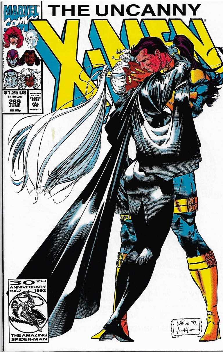
Released in 1992 by Marvel Comics, Uncanny X-Men #289 was written by Scott Lobdell and drawn by Whilce Portacio (with ink work by Scott Williams). Its concept focused on the Gold Team of the X-Men (composed of Jean Grey, Storm, Colossus, Ice Man and Archangel) dealing with Bishop who at the time was still a newcomer.
Cover of the comic book.
It begins when Bishop looks at a framed picture of the original X-Men followed by Storm telling him every student who graduated to the role of an X-Man remains dedicated to the ideal of peaceful coexistence between mutants and humans.
As the Gold Team X-Men enjoy their peaceful time at the mansion of Xavier, elsewhere someone spies on William and Maddy Drake who talk about Bobby (Iceman). Back at the mansion, Archangel encounters a spitting image of his younger self (as Angel and with normal skin color) which raises tension attracting the attention of Storm, Bishop and Forge.
A touching scene between Jean Grey and Charles Xavier.
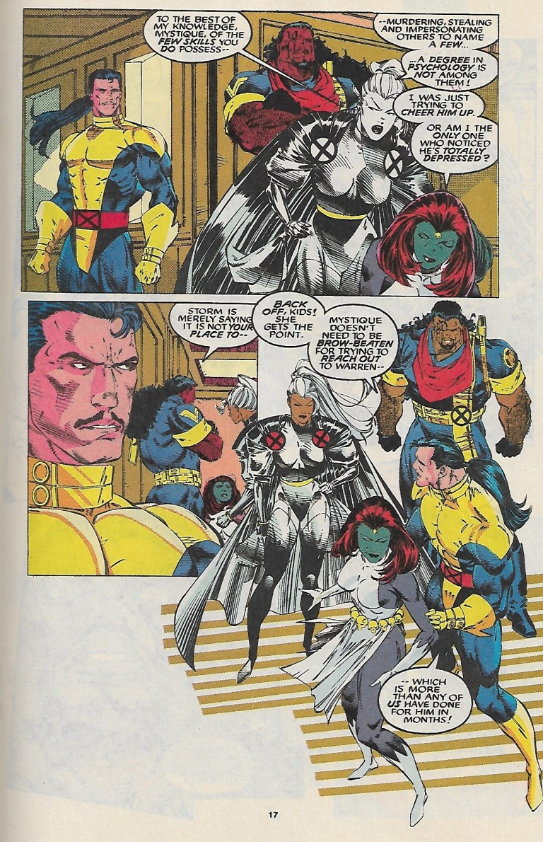
To describe Uncanny X-Men #289 clearly, the comic book is more focused on character development as it lacks a strong conflict between good and evil. Anyone craving for superhero action will most likely feel unsatisfied here. However, if you want to know the X-Men more passionately and watch the romance between Storm and Forge develop, then this comic book will be engaging.
Scott Lobdell did a good job developing the characters through drama and Whilce Portacio’s art really brought the script to life. I enjoyed reading the interaction between Jean Grey and Charles Xavier who realizes that as he led the X-Men, he took a bit of something from their respective lives.
Nice layout and style by Whilce Portacio on the team.
Take note of the following exchange of dialogue.
Charles Xavier: Jean, did you ever hate me for having taken away your childhood?
Jean Grey: Professor, please. What child is given the opportunity to fly to the stars? How many children battle alongside Asgardian thunder gods or super soldiers? You gave me…all of us…more than you took away.
That was really nice writing there by Lobdell. There was drama and harmony between the two characters.
Overall, Uncanny X-Men #289 is recommended. Think of it as a comic book that will help you – the reader – get to know the characters more closely.
Thank you for reading. If you find this article engaging, please click the like button below and also please consider sharing this article to others. Also my fantasy book The World of Havenoris still available in paperback and e-book format. If you are looking for a copywriter to create content for your special project or business, check out my services and my portfolio. Feel free to contact me as well. Also please feel free to visit my Facebook page Author Carlo Carrasco and follow me at HavenorFantasy@twitter.com
Burgers have long been popular here in the Philippines and they can be bought from several makers like the fast food joints which are quite numerous.
At the expanded area of Festival Mall, Filinvest City, Alabang, Muntinlupa City, Union Jack Tavern has been selling and serving burgers to customers. Just open the menu when you visit them and then you will find the UJT Burger.
The UJT Burger served to me in open sandwich fashion.
Sold for less than P300 as of this writing, the UJT Burger comes with a large plate filled with fries (which are thicker and less greasy compared to the fries sold by others) and the open sandwich with one half of the bun with the vegetables on top and the other half with the onions and beef covered with melted cheese.
In my recent stop at Union Jack Tavern, I had the UJT Burger and I started first with the fries which are quite filling and I like the fact that they are not too greasy to handle.
With the burger itself, considering the size, I took me a little effort to put the two buns (with their respective toppings) on top of each other to form the burger.
Then I took a bite on what parts are suitable for biting because this one is not the usual burger. The burger patty itself is quite thick and certainly not flat. After biting down the bread with the vegetables, I finally got to bite the cheese-covered burger patty. The result? The burger patty was quite tasty on its own and definitely worth going for. Then there is also that nice taste when biting the bread, the burger patty, the cheese and the vegetables altogether.
The UJT Burger in its full form.
It may not be too visible for those who like burgers but failed to check Union Jack Tavern’s menu, but there is no doubt that the UJT Burger is a delicious and filling burger meal just waiting to be discovered.
The UJT Burger is highly recommended and I encourage you visit Union Jack Tavern at Festival Mall.
Thank you for reading. If you find this article engaging, please click the like button below and also please consider sharing this article to others. Also my fantasy book The World of Havenoris still available in paperback and e-book format. If you are looking for a copywriter to create content for your special project or business, check out my services and my portfolio. Feel free to contact me as well. Also please feel free to visit my Facebook page Author Carlo Carrasco and follow me at HavenorFantasy@twitter.com
Every great movie franchise starts small and as the decades pass by, its place in history will be marked and revisited.
This is my review of the first-ever James Bond movie Dr. No.
Ursula Andress and Sean Connery as Honey Ryder and James Bond respectively.
Released in 1962 based on the sixth novel written by James Bond creator Ian Fleming, Dr. No brought Agent 007 to the big screen worldwide and its success led to a series of big moneymaking sequels, merchandise, novels, comic books, video games and other forms of contributions to pop culture. This movie also marked the beginning of Sean Connery’s journey towards becoming a cinematic icon as, arguably, the best cinematic James Bond ever.
The movie begins when British agents in Jamaica get killed off by henchmen who eventually retrieved highly confidential files. In England, the secret service sends Agent 007 to Jamaica to do detective work and he gets armed with a Walter PPK. Once in Jamaica, Bond starts talking to people, gathering clues and traveled to different places to find out who is responsible for killing his fellow British intelligence operatives. If you want to know more, you just have to watch the movie.
If you are a newcomer to the James Bond franchise or if you never saw this movie before, then you have to keep in mind that this very old movie is NOT an action film but rather it is a detective story laced with suspense and some action that follows James Bond performing his mission for Queen and Country.
Chances are, you must have seen many other James Bond movies that are heavy on action, stunts and explosions. As it was the first of the film franchise, Dr. No is nothing like those other movies of Agent 007.
Being a detective story, Dr. No is character-driven and laced with mystery and suspense. To describe it without spoiling the story, the narrative shows Bond searching for answers and as the suspense builds up, something or someone gets revealed which adds to the deepening of the plot. There is some action, stunts and explosions to spice up the movie which were pretty enjoyable for the early 1960s. However the car chase is very outdated and never believable. Naturally, the spectacle is tame by today’s standards but still, this movie is not boring at all for me.
The movie is nicely paced and makes clear what is going on. There is sufficient build-up leading to the next revelation or the next part of the chain of mystery or the next twist. By the time James Bond encounters Dr. No himself well after the 60-minute mark into the movie, I became oriented with both characters as their conflict finally starts. This will work for you if you take time with the movie’s pace and pay close attention to details.
Sean Connery as Agent 007 is charming, cool and cruel. The filmmakers and Ian Fleming himself really oriented the actor on how to portray the literary Bond in cinematic form. Connery’s Bond is charming and the filmmakers make it very believable on-screen that ladies would fall for his charm which in turn would give him the opportunity to advance in his pursuit of accomplishing his goals in the line of duty.
Ursula Andress, who had to be dubbed in post-production due to her accent, caught the world’s attention wearing the bikini on the big screen (in color, no less) as Honey Ryder who came out from the water with her equipment and sea shells. This was a daring scene to show back in the early 1960s. Of course, Honey is not just a pretty face but also a brave lady with a history of adventure and exploring. This makes her believable as a Bond girl who has what it takes to keep up with Agent 007 in the story, even going face to face with Dr. No.
Joseph Wiseman as Dr. No.
Joseph Wiseman‘s performance as Dr. No is subtle and yet he remains creepy as a cinematic villain. When compared to other villains in the James Bond film franchise, he does not do much action but his portrayal as a very powerful sinister human being who controls a loyal group of personnel still makes him a competent franchise villain in by today’s standards. Having seen all the James Bond movies, I find Wiseman’s Dr. No a more engaging villain compared to Col. Moon (the dreadful Die Another Day), Hugo Drax (Moonraker), Kamal Khan (Octopussy), Alec Trevelyan (GoldenEye) and the 21st century Ernst Blofeld (Spectre) to name some.
In terms of production values, Dr. No is a mixed bag. There are some props that looked fake and cheap. The rear projection in the car chase is so fake looking. Ironically, the film shines with the sets designed by Ken Adams. The big room visited by Professor Dent to communicate with Dr. No, the hotel-like lair of the villain (where Honey and Bond are treated like special guests) and the elaborate room of the table meeting with Dr. No all are visually striking.
When it comes to presentation, Dr. No marked the beginning of many things that would later become cinematic traditions – the gun barrel opening, “Bond, James Bond”, the James Bond theme music, the mission meeting between Bond and M. (plus the nice chat between Bond and Moneypenny), the appearance of Felix Leiter during the mission etc.
The screenplay written by Richard Maibaum, Johanna Harwood and Berkley Mather has quality in it not just with the narrative but also with the dialogue.
I love this exchange of words between Bond and Dr. No.
Dr. No: I’m a member of SPECTRE.
James Bond: SPECTRE?
Dr. No: SPECTRE – Special Executive for Counter Intelligence, Terrorism, Revenge, Extortion. The four great cornerstones of power headed by the greatest brains in the world.
James Bond: Correction – criminal brains.
And there was also this exchange.
Dr. No: The Americans are fools. I offered my services; they refused. So did the East. Now they can both pay for their mistake.
James Bond: World domination. The same old dream. Our asylums are full of people who think they’re Naploeon. Or God.
Overall, Dr. No is a classic movie and it is the kind of film that filmmakers today don’t make anymore because they know people won’t be satisfied without excessive action and spectacle. It is a James Bond flick in the form of a detective story which has a good amount of mystery, suspense and some action.
For sure, people who have gotten used to action-heavy James Bond movies won’t feel engaged with Dr. No. The best way to enjoy this film is to treat it the way it is meant to be – a piece of cinematic history that built the James Bond film franchise in the very first place.
Thank you for reading. If you find this article engaging, please click the like button below and also please consider sharing this article to others. Also my fantasy book The World of Havenoris still available in paperback and e-book format. If you are looking for a copywriter to create content for your special project or business, check out my services and my portfolio. Feel free to contact me as well. Also please feel free to visit my Facebook page Author Carlo Carrasco and follow me at HavenorFantasy@twitter.com
Disclaimer: This is my original work with details sourced from reading the comic book and doing personal research. Anyone who wants to use this article, in part or in whole, needs to secure first my permission and agree to cite me as the source and author. Let it be known that any unauthorized use of this article will constrain the author to pursue the remedies under R.A. No. 8293, the Revised Penal Code, and/or all applicable legal actions under the laws of the Philippines.
When it comes to the Ultraverse, there is often something enjoyable to read. I enjoy reading about superhero teams, specifically X-Men from Marvel Comics and Justice League from DC Comics to name a few. I also enjoyed Freex and UltraForce from the Ultraverse. What I like about superhero teams is that I get to discover varied characters (the good, the evil and the ones in between), witness how they develop and act when something big or problematic happens.
With The Strangers #1, published by Malibu Comics in 1993 as one of the launch books of the Ultraverse, I experienced another bout of enjoyment and engagement but in a rather unique way.
Cover of The Strangers #1 with art by Rick Hoberg.
Written by Steven Englehart with illustration done by Rick Hoberg (whose work was inked by Tom Burgard), the story begins with a shot of life going on in San Francisco. Several characters riding a jammed cable car get distracted when a man and a pretty lady (both seated) do the “wild thang”.
Because of the disturbance, three guys grab the arrogant guy (separating him from the lady) threw him out of the cable car. Immediately after that, the cable car suddenly gets hit by a bolt of energy (perceived as lightning) from the clear sky causing the vehicle to start slipping downwards until it hits a car and its passenger.
Bob and Hugh start to notice something strange.
Then a series of things begin to happen. Candy (the lady earlier) acted strangely as the arrogant guy called her attention. Art students Bob and Hugh witnessed the sudden formation of a bag of apples. The kid Leon discovers his new ability to run fast and make sudden turns. Dave witnesses a momentary transformation of himself. Fashion designer Elena gets inspired to create something heroic.
Leon’s ultra speed realized while Candy walks pretty.
You must be wondering – how is the quality of this old comic book?
In terms of storytelling and characterization, this is pretty good work done by Steve Englehart. The way I see it, this is a story about strangers (truly living up to the title) who got changed as a result of a single incident that affected them. Each of the members of The Strangers were nicely and efficiently introduced. A creative approach was used to present their respective abilities which made sense as the events unfolded. By the end of the comic book, I really felt very engaged and excited to anticipate the next issue.
When it comes to dialogue, I like this exchange between Bob and Hugh.
“You know what I think?”
“No, what do you think?”
“I think it must have something to do with the lightning that hit us!”
“Nonsense! Lightning does not work like that!”
“You got a better idea?”
As for the visuals, Rick Hoberg’s art (inked by Burgard) combined with the color design by Paul Mounts is still very wonderful to look at. The facial expressions are convincing, the action has impact, the visualization of the super powers is pretty creative and there are lots of small details on the backgrounds (people, city environment, etc.) that are worth examining.
Overall, The Strangers #1 is a fun and engaging old comic book to read. Never mind the financial value it carries right now. Focus more on its story and art, as well as the other details that reflect the talents of its creators. More importantly, the experiences of discovering something fresh and getting to know brand new characters really defined this comic book.
The Strangers #1 is highly recommended.
Thank you for reading. If you find this article engaging, please click the like button below and also please consider sharing this article to others. Also my fantasy book The World of Havenoris still available in paperback and e-book format. If you are looking for a copywriter to create content for your special project or business, check out my services and my portfolio. Feel free to contact me as well. Also please feel free to visit my Facebook page Author Carlo Carrasco and follow me at HavenorFantasy@twitter.com
1993 was a special year for X-Men fans. It was the year Marvel Comics celebrated what was back then the 30th anniversary of the X-Men which explains why they released not only a lot of X-Men-related comic books but also issues with hologram cards on the covers of specific issues of X-Force, X-Factor, X-Men, Uncanny X-Men and Excalibur. While superhero movies were not that many at the time, fans had the X-Men animated series to enjoy on TV.
Along the way, the comic book speculator boom continued and Marvel Comics exploited the trend as its creators worked to expand what was back then their still-young 2099 lineup of comic books. This led to the release of X-Men 2099 #1 in the 2nd half of 1993, the comic book of which I bought on a weekday during a short visit to the comic book store in BF Homes, Parañaque.
Cover of X-Men 2099 #1.
Before exploring a bit of the story, let me share that in my personal analysis, releasing X-Men 2099 #1 the same year as the 30th anniversary celebration of X-Men made sense even though the contemporary X comic books made no real story reference to the mutants of 2099. Back in 1993, an undisclosed amount of money was spent to promote, distribute and sell comics and merchandise in relation to the anniversary celebration. I’m confident someone behind the scenes at Marvel thought it was a smart idea to debut the X-Men 2099 series at a time when the X-Men brand was very strong among collectors.
Now on to the comic book.
Written by John Francis Moore and drawn by Ron Lim (with ink work by Adam Kubert), X-Men 2099 #1 opens with Timothy Fitzgerald/Skullfire alone and uncertain visiting a large, abandoned facility in the Nevada desert called Nuevo Sol. He stands in front of a large gate with an X marking. After a bumpy introduction with Junkpile, Tim enters and, to his surprise, there he finds a large gathering of people partying despite the deteriorating conditions of the place. He meets Tina/Serpentina who tells him that he is welcome and their gathering attracted mutants, and “nomads and fringers.”
“In Nuevo Sol, you’re not just some corporate bar code, sorted and filed like a product. Here, everyone has a name. Everyone’s equal–no matter where they’ve come from,” Tina tells him.
As Tim discovers Metalhead, so do the readers.
After the subsequent for-the-readers introductions of Eddie/Metalhead and Shakti/Cerebra, the narrative moves to Las Vegas where a horse-riding Noah Synge (an old man who “ruthlessly controls the greater Nevada syndicate”) gets confronted by Xi’an/Desert Ghost who tells him that his men (of Synge) continue to kidnap members of the nomad tribes for his decadent amusements. In other words, it’s an accusation about human trafficking.
After a harsh exchange of words, Xi’an shows to him his left, creepy looking fist telling him that the red market will fall, that the Synge empire will crumble and that if Synge seeks to hurt the affected people, he (Xi’an) will make him suffer.
Xi’an touches a short stone wall with his left hand which makes it crumble within seconds (as he walks away). This is all I have to share about the plot and if you want to know more, you better get and read this comic book.
So you must be wondering what I think about the quality of this 1993 comic book. When it comes to storytelling, it is well written, entertaining and engaging. John Francis Moore’s script really is good even by today’s standards. Moore managed to carefully introduce not only the X-Men of 2099 but also the supporting characters and the bad guys properly all within 23 story-and-art pages which is a very hard thing to achieve. While the writing was challenging, Moore managed to us symbolism to show “good versus evil”, especially with the conflict between Xi’an (representing the oppressed and the powerless) and Noah Synge (who, by today’s standards, is a caricature of the cruel and rich person).
Tim meanwhile symbolizes the reader’s perception. As he discovers Nuevo Sol, readers feel and see what he perceives. His discovery of the place, the culture and people serves as the eyes of us readers.
When it comes to the art work, this one shows that Ron Lim exerted a lot of effort to give the X-Men of 2099 a unique look of their own without taking any visual inspiration from the contemporary, mainstream X-Men of the 1990s. While it is easy to criticize Lim for the quality of art, we must remember that he worked on a whole lot of other comic book for Marvel back in 1993. During that year, he illustrated The Infinity Crusade which featured a whole bunch of Marvel’s superheroes and many other characters in each comic book. Could you imagine the headaches and stress an illustrator has to go through drawing so many characters in a comic book limited series?
Ron Lim also helped visualize what Nevada looks like in 2099 which is a nice change from the super futuristic, towers-filled New York City. In terms of society, the X-Men 2099 series further showed that America’s wilderness or the abandoned places are filled with outlaws and living there can be even more dangerous for people to do when compared with living in New York under the watch of Alchemax.
This old comic book, which has a solid cover with foil and a price of $1.75, also has a 15-page Marvel 2099 promo which includes a 2-page X-Men 2099 “coming at you” portrait by Lim. The promo includes short previews of the other 2099 feature characters and it also serves as a reminder that X-Men 2099 is part of the same universe with them.
Overall, I declare X-Men 2099 #1 is still a good, old comic book worthy of being added to your collection. Its financial value is not that high right now and the X-Men 2099 themselves pale in comparison to Spider-Man 2099 (easily the most popular 2099 feature character of them all) when it comes to today’s comic book environment.
What you have to keep in mind, however, is that X-Men 2099 #1 just might gain a boost in its financial value if ever the mutants of the future make a big comeback as part of Marvel’s official announcement that it will revive the 2099 line of comic books this November! Granted, X-Men of 2099 had appeared in X-Men comic books in the past few years but the revival of the 2099 line will be a more suitable place for readers to discover them in this age of social media and smartphones.
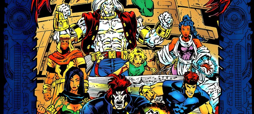
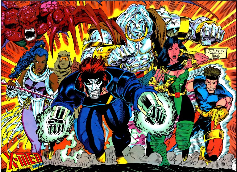
The X-Men of 2099.
Financial value aside, X-Men 2099 #1 is engaging and entertaining, and it has that 1990s charm to it.
X-Men 2099 #1 is highly recommended.
Thank you for reading. If you find this article engaging, please click the like button below and also please consider sharing this article to others. Also my fantasy book The World of Havenoris still available in paperback and e-book format. If you are looking for a copywriter to create content for your special project or business, check out my services and my portfolio. Feel free to contact me as well. Also please feel free to visit my Facebook page Author Carlo Carrasco and follow me at HavenorFantasy@twitter.com
Back in the 1990s, there was a flood of superhero comic books that introduced brand new heroes, teams and even anti-heroes. A strong contributor to this was the market presence of Image Comics, Valiant Comics, Malibu Comics and other smaller publishers that tried their best to gain shares in what was back then the highly lucrative superhero comic book market which was long dominated by Marvel Comics and DC Comics.
With Malibu Comics, their Ultraverse franchise of superhero comics was a blast and I had a lot of fun reading comic books of The Strangers, Prime, Hardcase, UltraForce, Mantra, etc.
For this review, here is my look back at the Ultraverse team comic book The Solution #1 (September 1993).
The front cover.
Written by the late James Hudnall and drawn by Darick Robertson (inked by John Lowe), the story begins when Russian personnel get killed by a team of deadly people whose purpose is to raid the nuclear storage buildings.
As a result, several nuclear warheads were taken away without a trace. A KGB agent discusses the tragedy with an Aladdin agent and seeks help. In response, the Aladdin agent recommends to him The Solution.
“We’d like to (help) but our agency can’t give you any direct assistance. You know how it is. However these people might be what you need. Just remember…I never told you about them,” the Aladdin agent said.
Meet The Solution.
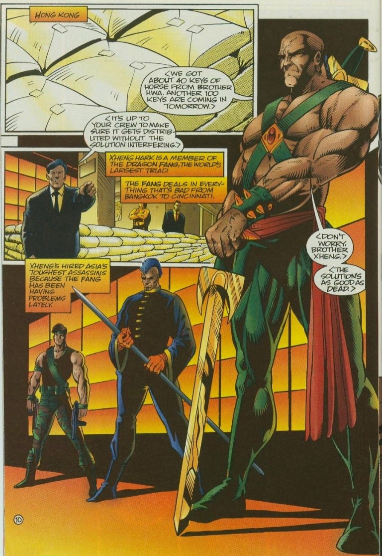
In Hong Kong, a member of the triad instructs his hired assassins to distribute a shipment of illegal substances without getting any interference from The Solution. Predictably, the said team happens to be with them in their secret venue which starts a wave of martial arts, shooting and use of magic.
Enough with the plot. The Solution is a team of super-human mercenaries composed of Lela Cho/Tech (the leader), Eara/Shadowmage, Vurk/Outrage and Dropkick. Quite literally, whenever a major problem happens someone will call The Solution (the answer) to solve it for a fee.
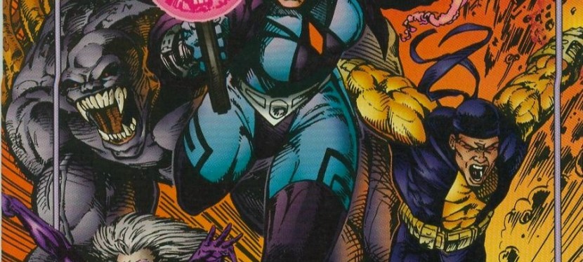
In terms of character design, The Solution has a rather visceral look which was clearly emphasized on the cover art. Outrage, for example, looks very monstrous and one could easily mistake him for an evil figure.
Obvious antagonists.
Illustrator Darick Robertson’s art is nice to look at and when the action happens, he sure delivers the goods making the hard action moves look intense. Even showing characters firing their guns look intense. The violence in this comic book is quite bloody and the opening scenes really show that.
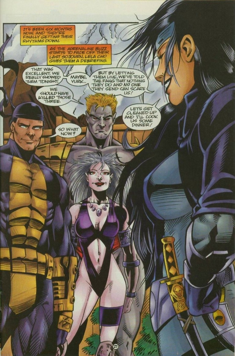
Even with the non-action, talking scenes, Robertson’s art makes the members of The Solution look believably human. Facial expressions are good and they quite match the dialogue written. The team shot on page 21, which shows Lela Cho in the foreground talking to her teammates in the background, really looks nice.
In terms of writing, I found this comic book to be a bit bloated in terms of details and plot. Most notably, the pace of the story moves very fast and while it does its job establishing The Solution (and part of its purpose as a team-for-hire), the circumstances and the team’s place within the Ultraverse, the story felt really crammed even though there were 28 pages of story and art. I noticed that while the comic book is about The Solution, it ended up showing a total of three different teams (including the hired assassins).
In terms of character development, there was clear focus on Lela Cho which is not a surprise since she is the team leader. It turns out Lela has lots of vested interests in the corporate world and instead of being in a fancy office, she goes out in the field to get things done. She has a very direct, personal access to information online by means of wetware embedded in her skull. She also has a touch of business in her approach with leading The Solution.
“Our potential client has a problem with some Ultras. They want us to take care of it,” Lela Cho said on page 23.
You got a problem? Call The Solution!
While it may not look as prominent as The Strangers or UltraForce as far as Ultraverse superhero teams go, The Solution stands out nicely for it is unique and its team-for-hire concept is very interesting. When I first read this comic book long ago, I was convinced to pursue the succeeding issues. Even by today’s standards, this old comic book remains fun and engaging.
The Solution #1 is recommended.
Thank you for reading. If you find this article engaging, please click the like button below and also please consider sharing this article to others. Also my fantasy book The World of Havenoris still available in paperback and e-book format. If you are looking for a copywriter to create content for your special project or business, check out my services and my portfolio. Feel free to contact me as well. Also please feel free to visit my Facebook page Author Carlo Carrascoand follow me at HavenorFantasy@twitter.com




















 Author Carlo Carrasco